
A button initiates an instantaneous action.
버튼을 누르면 작업이 즉시 시작됩니다.
Versatile and highly customizable, buttons give people simple, familiar ways to do tasks in your app. In general, a button combines three attributes to clearly communicate its function:
버튼은 사용자가 지정하기 편리하게 되어있으며, 다양한 형태가 있습니다. 버튼은 앱 안에서 작업을 수행하기 위해 사용자에게 간단하고 친숙한 방법을 제공합니다. 버튼은 기능을 명확히 전달하기 위해 일반적으로 다음과 같은 세 가지의 속성을 지닙니다:
→ 다양한 형태를 가진 버튼은 앱 안에서 작업을 수행하기 위한 역할을 하기 때문에, 기능을 명확히 전달해야한다. 그러한 목적을 달성하기 위해 세 가지 속성을 지닌다.
•
Style. A visual style based on size, color, and shape.
•
Content. The symbol (or interface icon), text label, or both that a button displays to convey its purpose.
•
Role. A system-defined role that identifies a button’s semantic meaning and can affect its appearance.
•
스타일(Style). ‘스타일’은 크기, 색상, 모양에 따른 시각적 스타일입니다.
•
콘텐츠(Content). ‘콘텐츠’는 버튼 안에 있는 요소들로, ‘기호(또는 인터페이스 아이콘)’, ‘텍스트 레이블’ 또는 ‘둘 다’를 의미하며, 버튼의 목적을 전달하기 위해 표시됩니다.
•
역할(Role). ‘역할’은 시스템이 제공하는 것으로, 이를 통해 버튼이 가진 속성의 의미를 나타내며 이는 버튼 모양에 영향을 줍니다.
In addition to all-purpose buttons, many common button styles — like Info, Close, and Contact Add — perform familiar tasks throughout the system. There are also many button-like components that have distinct appearances and behaviors for specific use cases, like toggles, pop-up buttons, and segmented controls.
다양한 목적을 가진 버튼 외에, ‘정보(Info)’, ‘닫기(Close)’ 및 ‘연락처 추가(Contact Add)’와 같이 일반적인 버튼 스타일을 사용하면 전체 시스템 안에서 작업을 사용자 친화적으로 수행할 수 있습니다. 또한 특정한 용도를 수행하기 위한 버튼과 컴포넌트인 ‘토글(toggles)’, ‘팝업 버튼(pop-up buttons)’ 및 ‘세그먼트 컨트롤(segmented controls)’ 등은 뚜렷한 스타일과 콘텐츠를 가집니다.
→ 다양한 목적을 가진 버튼들이 있는데, 일반적인 버튼 스타일은 정보보기, 닫기, 추가버튼 등이 있고, 특정한 용도를 수행하기 위한 버튼 또는 컴포넌트에는 토글, 팝업 버튼 및 세그먼트 컨트롤 등이 있다. 특정한 용도를 수행하기 위한 버튼은 뚜렷한 스타일과 콘텐츠를 가진다.
When buttons are instantly recognizable and easy to understand, an app tends to feel intuitive and well designed.
사람들은 버튼이 바로 인식되고 이해하기 쉬울 때, 앱이 직관적이고 잘 설계된 것처럼 느낍니다.
Make buttons easy for people to use. It’s essential to include enough space around a button so that people can visually distinguish it from surrounding components and content. Giving a button enough space is also critical for helping people select or activate it, regardless of the method of input they use. As a general rule, a button needs a hit region of at least 44x44 pt — in visionOS, 60x60 pt — to ensure that people can select it easily, whether they use a fingertip, a pointer, their eyes, or a remote.
사람들이 버튼을 쉽게 선택할 수 있도록 만듭니다. 버튼은 터치스크린 안에서 손가락 터치를 위해 적어도 44x44 포인트의 공간을 필요로 합니다. 모든 화면에서 사람들이 터치를 사용하든, 포인터를 사용하든, 버튼을 확장하는 방법을 사용하든, 버튼과 주변 요소 및 콘텐츠를 시각적으로 구분할 수 있도록 버튼 주위에 충분한 공간을 포함하는 것이 중요합니다.
→ 사람들이 버튼을 쉽게 선택할 수 있도록 버튼 주위에 충분한 공간을 포함해라.
Ensure that each button clearly communicates it purpose. A button always includes a text label or a symbol (or interface icon) — and sometimes a combination of both — to help people predict what it does.
각 버튼이 기능을 명확하게 전달하는지 확인하세요. 버튼에는 항상 텍스트 레이블이나 기호(또는 인터페이스 아이콘)가 포함되어 있으며, 때로는 이 두 개의 요소가 조합하여 사용자가 버튼의 기능을 예상하고 이해하는 데 도움을 줍니다.
→ 버튼 내에 기호나 설명의 조합으로 각 버튼의 기능이 명확하게 전달되도록 하라
System buttons offer a range of styles that support extensive customization while providing built-in interaction states, accessibility support, and appearance adaptation. Different platforms define different styles that help you communicate hierarchies of actions in your app.
시스템 버튼은 사용자가 지정할 수 있는 광범위한 기능을 지원하며, 이와 동시에 상호작용 상태(interaction states), 접근성(accessibility) 지원, 모양 적응(appearance adaptation)등 다양한 스타일을 제공합니다. 다양한 플랫폼은 앱 내 작업의 계층 구조를 전달하는 데 도움이 되는 다른 스타일을 정의합니다.
→ 시스템 버튼은 사용자가 지정할 수 있는 광범위한 기능을 지원하며, 이와 동시에 상호작용 상태, 접근성 지원, 모양 적응 등 다양한 스타일을 제공한다.
역자첨언
You can configure a system button to use any combination of style and size. By default, a system button uses a size-specific corner radius and your app’s accent color. If necessary, you can change these attributes, in addition to attributes that control content layout and the presence of an activity indicator.
사용자는 시스템 버튼을 구성하여 타일과 크기를 임의로 조합해 사용할 수 있습니다. 기본적으로 시스템 버튼은 크기별 모서리 반지름(radius)과 앱의 메인 강조 색상(accent color)을 사용합니다. 필요한 경우, 속성 외에도 버튼을 구성하며 ‘콘텐츠 레이아웃(content layout)’ 및 ‘활동 표시기(activity indicator)’ 등의 속성을 변경할 수 있습니다.
→ 사용자는 시스템 버튼을 구성하여 타일과 크기를 임의로 조합해 사용할 수 있다.
역자첨언
In general, use a button that has a visible background for the most likely action in a view. Buttons that have a fill or background shape tend to be the most visually prominent, helping people quickly identify the action they’re most likely to want.
화면 안에서 사용자들이 제일 원하는 기능을 색이 채워진 버튼으로 보여주세요. 색이 채워진 버튼 스타일은 시각적으로 가장 두드러지기 때문에 사람들이 가장 필요한 동작을 빠르게 식별할 수 있도록 도와줍니다. 동시에 화면 안에서 색이 채워진 버튼 스타일을 너무 많이 사용하지 않도록 합니다. 사람들은 선택을 하기 전 여러 개의 색이 채워진 버튼을 보며 옵션을 비교하는 데 시간을 소비해야 하기 때문에 불편함을 느낄 수 있습니다.
→ 화면 안에서 사용자들이 제일 원하는 기능을 색이 채워진 버튼으로 보여줘라
Consider keeping the number of visually prominent buttons to one or two per view. Giving people too many prominent buttons increases their cognitive load, requiring them to spend more time considering options before making a choice.
한 뷰 당 시각적으로 두드러지는 버튼 수를 하나 또는 두 개로 구성하세요. 두드러진 버튼 수를 많이 제공하면 사용자의 인지 부하가 증가하며, 선택을 하기 전에 더 많은 시간을 필요로 할 수 있습니다.
→ 사용자의 인지부하를 예방하기 위해, 한 화면 당 시각적으로 두드러지는 버튼 수를 하나 또는 두개로만 구성해라.
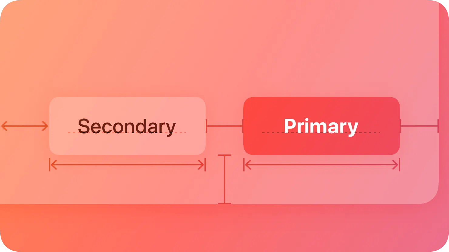
Use style — not size — to visually distinguish the preferred choice among multiple options. When you use buttons of the same size to offer two or more options, you signal that the options form a coherent set of choices. If you want to highlight the preferred or most likely option in a set, use a more prominent button style for that option and a less prominent style for the remaining ones.
여러 옵션 중에서 사용자들이 가장 많이 선택할 버튼을 구분하기 위해서 크기가 아닌 스타일을 사용합니다. 두 개 이상의 옵션을 제공하는 경우 동일한 크기의 버튼을 사용하면, 서로 일관된 역할의 버튼 세트로 보입니다. 여러개 중 선호하거나 가장 수행 가능성이 높은 옵션을 강조하려면, 해당 옵션에 더 강조되는 버튼 스타일을 사용하고 나머지 옵션에는 덜 강조되는 스타일을 사용하는 것이 좋습니다.
→ 여러 옵션 중에서 사용자들이 가장 많이 선택할 버튼을 구분하기 위해 스타일을 다르게 적용하여 구분해라.
역자첨언
Create button content that helps people instantly understand what the button does. Depending on the platform, a button can contain an icon, text, or both.
사람들이 버튼이 하는 일을 즉시 이해할 수 있도록 버튼 콘텐츠를 만들어 보세요. 플랫폼에 따라 버튼에 아이콘, 텍스트 또는 둘 다 포함될 수 있습니다.

Note
In macOS and visionOS, the system displays a tooltip after people hover over a button for a moment. A tooltip displays a brief phrase that explains what a button does; for guidance, see Offering help.
macOS와 tvOS에서는 사용자가 버튼 위에 잠시 호버하면 시스템이 툴팁을 표시합니다. 툴팁은 버튼의 기능을 설명하는 간단한 문구를 표시합니다. 자세한 내용은 '도움말 제공'을 참조하십시오.
역자 첨언
Consider using an icon when a button performs a familiar action that people associate with the icon. For example, people can predict that a button containing the square.and.arrow.up symbol will help them perform share-related activities. If it makes sense to use an icon in your button, consider using an existing or customized symbol.
버튼이 아이콘과 관련된 작업을 수행할 때, 해당 아이콘을 사용하는 것을 고려해보세요. 예를 들어, 사람들은 'square.and.arrow.up' 기호를 포함한 버튼이 공유 관련 작업을 수행하는 데 도움이 될 것으로 예측할 수 있습니다. 버튼에 아이콘을 사용하는 것이 합리적인 경우, 기존의 아이콘 또는 사용자 정의 기호를 사용하는 것을 고려해보세요.
→ 버튼이 아이콘과 관련된 작업을 수행할 때, 그 아이콘을 포함하는 것을 고려해라
Consider using text when a short label communicates more clearly than an icon. To use text, write a few words that succinctly describe what the button does. Using title-style capitalization, consider starting the label with a verb to help convey the button’s action — for example, a button that lets people add items to their shopping cart might use the label “Add to Cart.”
아이콘보다 짧은 레이블이 더 명확하게 전달되는 경우 텍스트를 사용하는 것을 고려하세요. 텍스트를 사용하려면 버튼이 하는 작업을 간결하게 설명하는 몇 마디의 단어를 작성하세요. 타이틀 스타일 대문자 사용을 고려하여 레이블을 동사로 시작하여 버튼의 작업을 전달하는 데 도움을 줄 수 있습니다. 예를 들어, 사람들이 쇼핑 카트에 항목을 추가할 수 있는 버튼은 '장바구니에 추가'라는 레이블을 사용할 수 있습니다.
→ 아이콘보다 짧은 텍스트로 구성된 레이블이 더 명확하게 전달되는 경우에는 텍스트만 포함해서 구성하라
A system button can have one of the following roles:
시스템 버튼은 다음과 같은 의미를 가집니다:
•
Normal. No specific meaning.
•
Primary. The button is the default button — the button people are most likely to choose.
•
Cancel. The button cancels the current action.
•
Destructive. The button performs an action that can result in data destruction.
•
평범한(Normal). 특정한 의미가 없습니다.
•
기본적인(Primary). 사람들이 가장 많이 선택하는 버튼입니다.
•
취소(Cancel). 현재 작업이 취소됩니다.
•
파괴적인(Destructive). 데이터를 삭제할 수 있는 작업을 수행합니다.
역자 첨언
A button’s role can have additional effects on the appearance you configure. For example, the system can use bold text for the label in a primary button, whereas a destructive button uses a red color.
시스템 버튼의 역할(Role)은 버튼 스타일에 추가적인 영향을 미칠 수 있습니다. 예를 들어, 시스템은 기본적인(Primary) 버튼의 레이블에 굵은 텍스트를 사용하고, 파괴적인(Destructive) 버튼에는 빨간색을 사용합니다.
→ 시스템 버튼의 역할(Role)은 버튼 스타일에 추가적인 영향을 미친다.
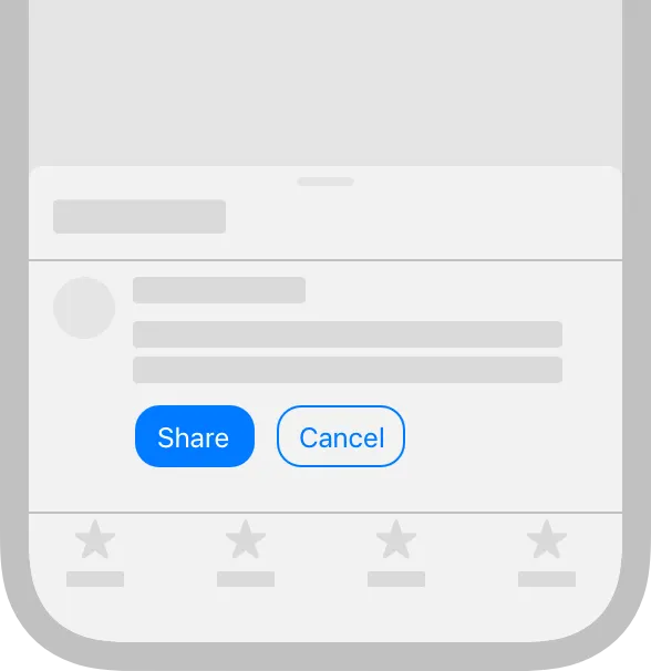
Assign the primary role to the button people are most likely to choose. When a primary button responds to the Return key, it makes it easy for people to quickly confirm their choice. In addition, when the button is in a temporary view — like a sheet, an editable view, or an alert — assigning it the primary role means that the view can automatically close when people press Return.
→ 사용자가 선택할 가능성이 가장 높은 버튼에 기본(Primary)역할을 할당하라
Don’t assign the primary role to a button that performs a destructive action, even if that action is the most likely choice. Because of its visual prominence, people sometimes choose a primary button without reading it first. Help people avoid losing content by assigning the primary role to nondestructive buttons.
사용자들이 가장 많이 선택할 버튼이더라도 파괴적인(Destructive) 작업을 수행하는 버튼에는 기본적인(Primary)역할을 할당하지 않는 것이 좋습니다. 사람들은 시각적으로 강조된 버튼을 때때로 읽지 않고 선택합니다. 기본적인(Primary)를 파괴적인(destructive) 작업을 수행하지 않은 버튼에 할당하여 사용자가 중요한 작업에 손실이 발생하지 않도록 하는 것이 좋습니다.
→ 사용자들이 가장 많이 선택할 버튼이더라도 파괴적인(Destructive) 작업을 수행하는 버튼에는 기본적인(Primary)역할을 할당하지 않는 것이 좋다.
No additional considerations for tvOS.
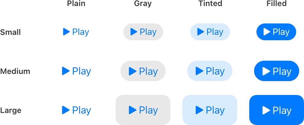
iOS and iPadOS have four button styles, each available in three sizes. Each combination of size and style has a different level of visual prominence.
iOS와 iPadOS에는 네 가지 버튼 스타일이 있으며, 각각 세 가지 크기로 사용할 수 있습니다. 크기와 스타일의 각 조합은 서로 다른 시각적 대비를 가지고 있어서 앱 내에서 작업의 계층을 나타내는 데 도움이 됩니다.
Include additional text below the label only if it provides useful details. Additional text uses a smaller text size than the label, showing that the information is secondary to the button’s action. For example, you might add text to update an Add to Cart button with the number of items in the cart. Avoid writing a subtitle that explains more about what the button does; make sure a button’s containing view, label or image, style, and role provide all the information people need to understand its action.
레이블 아래에 추가 텍스트를 포함하는 경우 유용한 세부 정보를 제공하는 경우에만 포함하세요. 추가 텍스트는 레이블보다 작은 텍스트 크기를 사용하여 정보가 버튼의 작업에 비해 보조 정보임을 나타냅니다. 예를 들어, 장바구니에 항목을 추가하는 버튼을 업데이트하기 위해 카트에 있는 항목 수를 표시할 수 있습니다. 버튼이 하는 작업에 대한 자세한 설명을 제공하는 부제목을 작성하지 마세요. 버튼이 포함된 뷰, 레이블 또는 이미지, 스타일 및 역할이 버튼의 작업을 이해하는 데 필요한 모든 정보를 제공하도록 해야 합니다.
→ 레이블 아래에 추가 텍스트를 포함하는 경우 유용한 세부 정보를 제공하는 경우에만 포함한다.
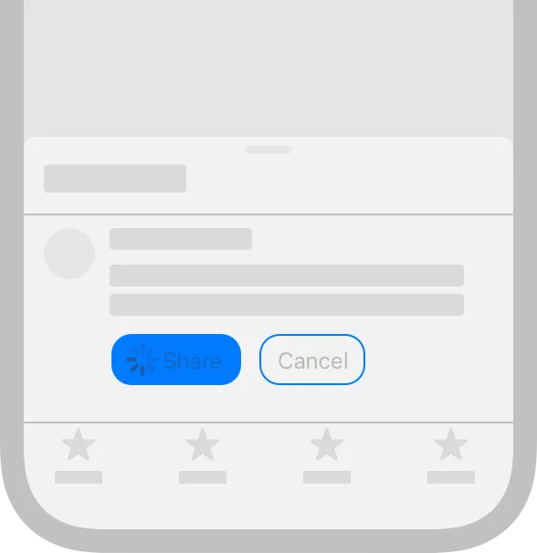
Configure a button to display an activity indicator when you need to provide feedback about an action that doesn’t instantly complete. Displaying an activity indicator within a button can save space in your user interface while clearly communicating the reason for the delay. To help clarify what’s happening, you can also configure the button to display a different label alongside the activity indicator. For example, the label “Checkout” could change to “Checking out…” while the activity indicator is visible. When a delay occurs after people click or tap your configured button, the system displays the activity indicator next to the original or alternative label, hiding the button image, if there is one.
즉시 완료되지 않는 작업에 대해 알려주는 피드백을 제공할 때, 활동 표시기(activity indicator)를 버튼에 보여주세요. 버튼 안에 활동 표시기(activity indicator)를 표시하면 사용자 인터페이스 공간을 절약하는 동시에 지연 이유를 명확하게 전달할 수 있습니다. 발생하는 작업을 명확히 하기 위한 버튼을 설정하여 활동 표시기(activity indicator) 옆에 다른 레이블을 표시할 수도 있습니다. 예를 들어, 활동 표시기(activity indicator)가 표시되는 동안 "체크아웃" 레이블이 "체크아웃 중..."으로 변경될 수 있습니다. 사용자가 설정된 버튼을 클릭한 후, 지연이 발생하면 시스템은 기본 또는 대체 레이블 옆에 활동 표시기(activity indicator)를 나타내며, 버튼 이미지가 있었던 경우 이를 숨깁니다.
→ 즉시 완료되지 않는 작업에 대해 알려주는 피드백을 제공할 때, 활동 표시기(activity indicator)를 버튼에 보여줘라
역자첨언
Several specific button types are unique to macOS.
The standard button type in macOS is known as a push button. You can configure a push button to display text, a symbol, an interface icon, or an image, or a combination of text and image content. Push buttons can act as the default button in a view and you can tint them.
맥 OS의 기본 버튼 유형은 푸시 버튼(Push buttons)으로 알려져 있습니다. 푸시 버튼(Push buttons)을 사용하여 텍스트, 기호, 인터페이스 아이콘 또는 이미지를 나타내거나, 텍스트와 이미지 콘텐츠의 조합을 보여줄 수 있습니다. 푸시 버튼(Push buttons)은 화면에서 기본(default) 버튼으로 작동할 수 있으며, 사용자는 이 버튼을 틴트(tint)할 수 있습니다.
→ 푸시 버튼(Push buttons)을 사용하여 텍스트, 기호, 인터페이스 아이콘 또는 이미지를 나타내거나, 텍스트와 이미지 콘텐츠의 조합을 보여줄 수 있다.
역자첨언
Use a flexible-height push button only when you need to display tall or variable height content. Flexible-height buttons support the same configurations as regular push buttons — and they use the same corner radius and content padding — so they look consistent with other buttons in your interface. If you need to present a button that contains two lines of text or a tall icon, use a flexible-height button; otherwise, use a standard push button. For developer guidance, see NSBezelStyleRegularSquare.
높이가 있거나 다양한 콘텐츠를 표시해야 할 경우에, 높이 조절이 가능한 푸시 버튼(Push buttons)을 사용하세요. 높이조절이 가능한 푸시 버튼(Push buttons)은 일반 푸시 버튼(Push buttons)과 동일한 구성을 제공하므로 모서리 반경(radius) 및 콘텐츠 패딩(padding)이 동일하여 일반 버튼들과 일관적입니다. 두 줄 이상의 높이가 있는 텍스트, 또는 높이가 있는 아이콘이 포함된 버튼을 표시해야 하는 경우, 높이조절이 가능한 버튼을 사용하고, 그렇지 않은 경우 기본적인 푸시 버튼(Push buttons)을 사용하는 것이 좋습니다. 개발자 가이드는 NSBezelStyleRegularSquare를 참고하세요.
→ 높이가 있거나 다양한 콘텐츠를 표시해야 할 경우에만, 높이 조절이 가능한 푸시 버튼(Push buttons)을 사용하라.
Append a trailing ellipsis to the title when a push button opens another window, view, or app. Throughout the system, an ellipsis in a control title signals that people can provide additional input. For example, the Edit buttons in the AutoFill pane of Safari Settings include ellipses because they open other views that let people modify autofill values.
푸시 버튼(Push buttons)을 클릭하여 창이나 뷰 또는 앱이 열릴 때, 제목 뒤에 줄임표(trailing ellipsis)를 추가하는 것이 좋습니다. 시스템에서, 사람들은 설정의 제목에 달린 줄임말 기호를 통해 추가 입력을 할 수 있다는 것을 알 수 있습니다. 예를 들어 Safari 설정의 자동 완성 창(AutoFill pane)에 있는 편집 버튼에는 사람들이 자동 완성의 값을 수정할 수 있는 다른 뷰가 열리기 때문에 줄임표(trailing ellipsis)가 포함되어 있습니다.
→ 푸시 버튼(Push buttons)을 클릭하여 창이나 뷰 또는 앱이 열릴 때, 제목 뒤에 줄임표(trailing ellipsis)를 추가해라
역자첨언
Consider supporting spring loading. On systems with a Magic Trackpad, spring loading lets people activate a button by dragging selected items over it and force clicking — that is, pressing harder — without dropping the selected items. After force clicking, people can continue dragging the items, possibly to perform additional actions.
스프링 로딩(spring loading)을 사용하는 것을 고려해보세요. 매직 트랙패드가 있는 시스템에서는 스프링 로딩을 사용하여 선택한 항목을 끌어다 놓으면 선택한 항목을 떨어뜨리지 않고 버튼을 강제로 클릭(더 세게)할 수 있습니다. 강제로 클릭한 후에도 사용자는 항목을 계속 끌 수 있으며, 추가 작업을 수행할 수도 있습니다.
역자첨언
도움말 버튼(Help buttons)
A help button appears within a view and opens app-specific help documentation.
화면 안에서 도움말 버튼이 나타나며, 앱 안에서 도움말 설명서가 열립니다.
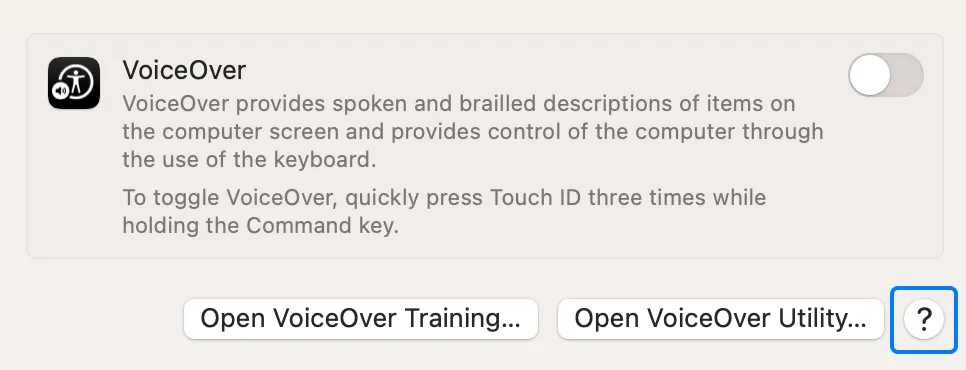
Help buttons are circular, consistently sized buttons that contain a question mark. For guidance on creating help documentation, see Offering help.
Use the system-provided help button to display your help documentation. People are familiar with the appearance of the standard help button and know that choosing it opens help content.
시스템에서 제공하는 도움말 버튼을 사용하여 도움말 문서를 표시합니다. 사람들은 기본 도움말 버튼 형태에 익숙하며, 이 버튼을 선택하면 도움말 내용이 열린다는 것을 알고 있습니다.
When possible, open the help topic that’s related to the current context. For example, the help button in the Rules pane of Mail settings opens the Mail User Guide to a help topic that explains how to change these settings. If no specific help topic applies directly to the current context, open the top level of your app’s help documentation when people choose a help button.
최대한 현재 사용 맥락과 관련된 도움말 항목이 열리도록 합니다. 예를 들어, 메일 설정에서 도움말 버튼을 통해 메일 사용자 안내서를 열 수 있습니다. 특정 도움말이 현재 사용 맥락에 직접 적용되지 않는 경우에, 도움말 버튼을 선택하면 최상위 문서의 앱 도움말이 열립니다.
Include no more than one help button per window. Multiple help buttons in the same context make it hard for people to predict the result of clicking one.
창(window) 별로 하나의 도움말 버튼만 제공하는 것이 좋습니다. 같은 맥락에서 여러 개의 도움말 버튼을 사용하면 하나를 클릭했을 때의 결과를 사용자들이 예상하기 어렵습니다.
Position help buttons where people expect to find them. Use the following locations for guidance.
사용자가 쉽게 예상할 수 있는 위치에 도움말 버튼을 배치합니다. 다음 하단의 위치(Location)를 통해 가이드라인을 참고하세요.
View style | Help button location |
Dialog with dismissal buttons (like OK and Cancel) | Lower corner, opposite to the dismissal buttons and vertically aligned with them |
Dialog without dismissal buttons | Lower-left or lower-right corner |
Settings window or pane | Lower-left or lower-right corner |
스타일 보기 | 도움말 버튼 위치 |
닫기 버튼이 있는 대화상자 (예: 확인 및 취소) | 닫기 버튼 반대쪽 하단 모서리와 세로로 정렬됨 |
닫기 버튼이 없는 대화상자 | 왼쪽 하단 또는 오른쪽 하단 모서리 |
설정 창 또는 창 | 왼쪽 하단 또는 오른쪽 하단 모서리 |
Use a help button within a view, not in the window frame. For example, avoid placing a help button in a toolbar or status bar.
창 프레임(window frame)이 아닌 뷰 안에서 도움말 버튼을 사용합니다. 예를 들어 도구 모음(toolbar)이나 상태 표시줄(status bar)에 도움말 버튼을 배치하지 않는 것이 좋습니다.
Avoid displaying text that introduces a help button. People know what a help button does, so they don’t need additional descriptive text.
도움말 버튼을 소개하는 텍스트는 표기하지 않는 것이 좋습니다. 사용자는 도움말 버튼의 기능을 알고 있으므로, 추가적인 설명을 하는 텍스트가 필요하지 않습니다.
An image button appears in a view and displays an image, symbol, or interface icon. You can configure an image button to behave like a push button, toggle, or pop-up button.
이미지 버튼(Image buttons)은 화면 안에 보이며, 이미지, 기호 또는 인터페이스 아이콘을 표시합니다. 푸시 버튼(push buttons), 토글(toggles) 또는 팝업 버튼(pop-up buttons)처럼 작동하도록 구성할 수 있습니다.
Use an image button in a view, not in the window frame. For example, avoid placing an image button in a toolbar or status bar. If you need to use an image as a button in a toolbar, use a toolbar item. See Toolbars.
창 프레임(window frame)이 아닌 뷰에서 이미지 버튼(Image buttons)을 사용합니다. 예를 들어 이미지 버튼(Image buttons)을 도구 모음(toolbar)이나 상태 표시줄(status bar)에 배치하지 않는 것이 좋습니다. 이미지를 도구 모음(toolbar)의 버튼으로 사용해야 하는 경우 도구 모음 항목(toolbar item)을 사용합니다. Toolbars를 참고하세요.
Include about 10 pixels of padding between the edges of the image and the button edges. An image button’s edges define its clickable area even when they aren’t visible. Including padding ensures that a click registers correctly even if it’s not precisely within the image. In general, avoid including a system-provided border in an image button; for developer guidance, see isBordered.
이미지 가장자리와 버튼 가장자리 사이에 약 10픽셀의 패딩(padding)을 포함하는 것이 좋습니다. 이미지 버튼의 가장자리는 보이지 않는 경우에도 클릭 가능한 영역을 포함해야 합니다. 패딩을 포함하면 이미지를 정확히 클릭하지 않더라도 사용자가 원하는 데로 올바르게 작동됩니다. 일반적으로 이미지 버튼에 시스템에서 제공하는 테두리를 포함하지 않는 것이 좋습니다. 개발자 가이드라인은 isBordered를 참고하세요.
If you need to include a label, position it below the image button. For related guidance, see Labels.
An visionOS button typically includes a visible background that can help people see it, and the button plays sound to provide feedback when people interact with it.
visionOS 버튼은 일반적으로 사람들이 볼 수 있는 시각적 배경을 포함하며, 사람들이 상호작용할 때 피드백을 제공하기 위해 소리를 재생합니다.
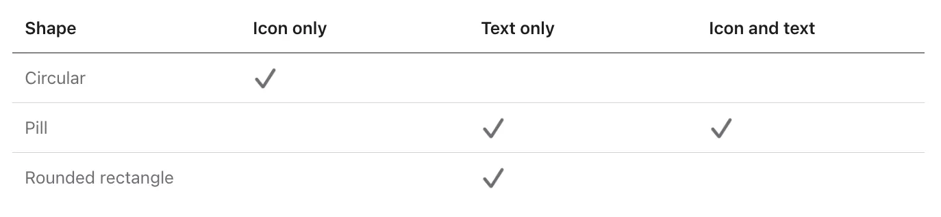
visionOS defines three standard button shapes, each of which supports the following types of labels.
visionOS에서는 세 가지 표준 버튼 모양을 정의하며, 각각 다음과 같은 유형의 레이블을 지원합니다.
역자첨언
visionOS buttons use different visual styles to communicate five different interaction states.
visionOS 버튼은 다섯 가지 다른 상호작용 상태를 전달하기 위해 다른 시각적 스타일을 사용합니다.
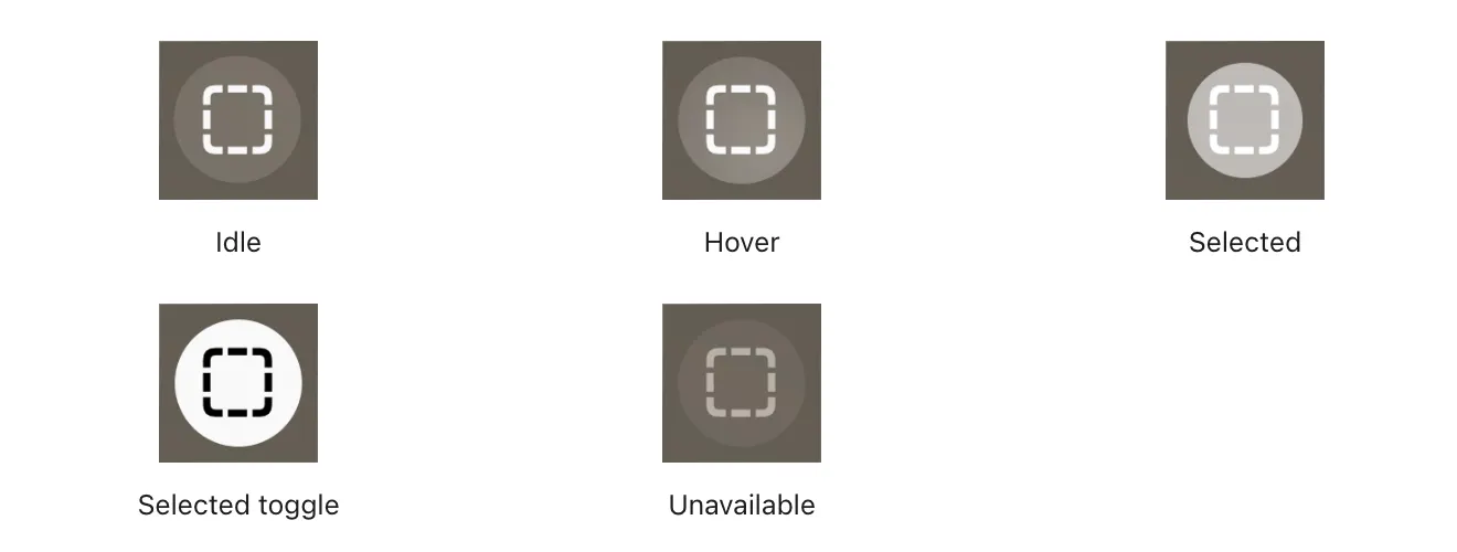
In addition to the five states shown above, circular buttons can also reveal a tooltip when people look at the button for a brief time. In contrast, buttons that contain text don’t display a tooltip because the button’s descriptive label communicates what it does.
위에 표시된 다섯 가지 상태 외에도, 원형 버튼은 사용자가 버튼을 잠시 보았을 때 툴팁을 표시할 수 있습니다. 반면에 텍스트를 포함하는 버튼은 버튼의 설명 레이블이 그 역할을 전달하기 때문에 툴팁을 표시하지 않습니다.
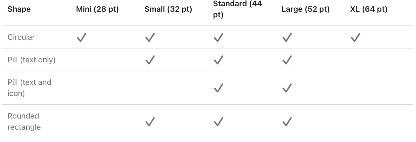
visionOS provides buttons in several sizes, depending on shape and contents.
visionOS는 모양과 내용에 따라 여러 크기의 버튼을 제공합니다.
visionOS provides buttons in several sizes, depending on shape and contents.
visionOS는 모양과 내용에 따라 여러 크기의 버튼을 제공합니다.
Prefer buttons that have a discernible background shape and fill. It tends to be easier for people to see a button when it’s enclosed in a shape that uses a contrasting background fill. The exception is a button in a toolbar, context menu, alert, or ornament where the shape and material of the larger component make the button comfortably visible. The following guidelines can help you ensure that a button looks good in different contexts:
버튼이 뚜렷한 배경 모양과 채움을 가지도록 하는 것이 좋습니다. 일반적으로 대비가 뚜렷한 배경 채움을 사용한 모양 안에 있는 버튼은 사람들이 눈에 더 잘 띄게 됩니다. 특별한 경우로는 툴바, 컨텍스트 메뉴, 경고 또는 장식과 관련된 버튼이 큰 구성 요소의 모양과 재료로 인해 편안하게 보일 때가 있습니다. 다음 가이드라인은 버튼이 다양한 상황에서 잘 어울리도록 도와줍니다:
•
•
유리재질을 가진 창 위에 버튼이 나타날 때 버튼의 배경에 밝은 재료를 사용하세요.
역자첨언
•
•
버튼이 공간에서 떠있게 나타날 때, 버튼의 배경에 '유리 재질'을 사용하세요.
Avoid creating a custom button that uses a white background fill and black text or icons. The system reserves this visual style to convey the selected toggle state.
흰 배경 채움과 검은 텍스트 또는 아이콘을 사용하는 사용자 정의 버튼을 만들지 마세요. 시스템은 이 시각적 스타일을 선택된 토글 상태를 전달하는 데 사용하기 때문입니다.
In general, prefer circular or pill-shape buttons. People’s eyes tend to be drawn toward the corners in a shape, making it difficult to keep looking at the shape’s center. The more rounded a button’s shape, the easier it is for people to bring focus to it. When you need to display a button by itself, prefer a pill-shape button.
일반적으로 원형 또는 알약 모양 버튼을 선호합니다. 모양의 모서리로 사람들의 시선이 자연스럽게 이동하기 때문에 모양의 중앙을 계속 보는 것이 어려울 수 있습니다. 버튼의 모양이 둥글면 둘레로부터 초점을 맞추는 것이 사람들에게 더 쉽습니다. 버튼을 홀로 표시해야 할 때, 알약 모양 버튼을 선호하세요.
→ 둥근 사각형 버튼보다 원형 또는 알약 모양 버튼을 중점적으로 사용해라.
Provide enough space around a button to make it easy for people to bring focus to it. To help make focusing comfortable, place buttons so their centers are always at least 60 points apart. If your buttons are 60 points or larger, add four points of padding around them to keep the hover effect from overlapping. Also, it’s usually best to avoid displaying small or mini buttons in a vertical stack or horizontal row.
버튼 주변에 충분한 공간을 제공하여 사용자가 버튼에 초점을 맞추기 쉽게 만드세요. 초점을 편안하게 맞추도록 돕기 위해 버튼을 배치할 때 항상 버튼의 중심이 최소 60 포인트 이상 떨어져 있도록 하세요. 버튼이 60 포인트 이상인 경우 주위에 4 포인트의 패딩을 추가하여 호버 효과가 겹치지 않도록 해야 합니다. 또한, 작은 또는 미니 버튼을 수직 스택 또는 수평 행에 표시하는 것을 피하는 것이 일반적으로 가장 좋습니다.
→ 사용자가 버튼에 초점을 맞추기 쉽게하기 위해 버튼 주변에 충분한 공간을 제공하라
Choose the right shape if you need to display text-labeled buttons in a stack or row. Specifically, prefer the rounded-rectangle shape in a vertical stack of buttons and prefer the pill shape in a horizontal row of buttons.
만약 여러 개의 텍스트 레이블이 달린 버튼을 세로로 나열하거나 가로로 배열해야 할 경우, 적절한 모양을 선택하세요. 구체적으로, 버튼을 세로로 나열할 때는 둥근 사각형 모양을 선호하고, 가로로 배열할 때는 알약 모양을 사용하는 것이 좋습니다.
Design feedback sounds for custom buttons. visionOS doesn’t play haptics, so it’s important to provide audible feedback for interactions with custom buttons.
사용자 정의 버튼에 대한 디자인 피드백 소리를 만드세요. visionOS는 햅틱(진동)을 재생하지 않으므로 사용자 정의 버튼 상호작용에 대한 청취 가능한 피드백을 제공하는 것이 중요합니다.
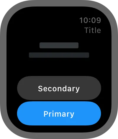
watchOS displays all buttons using the capsule button shape. In watchOS 10, the buttons are larger and have material backgrounds that adapt to underlying content to ensure legibility.
watchOS에서는 모든 버튼을 '캡슐' 버튼 모양으로 표시합니다. watchOS 10에서는 버튼이 더 크고, 기본 내용에 맞게 적응하는 재질 배경이 있는 버튼을 사용하여 가독성을 보장합니다.
Use the toolbar to place buttons in the corners. The system automatically moves the time and title to accommodate toolbar buttons.
버튼을 모서리에 배치하려면 '툴바'를 사용하세요. 시스템은 툴바 버튼을 수용하기 위해 시간과 제목 항목을 자동으로 이동시킵니다.
Toolbar buttons automatically inherit the app’s tint color. Only change the tint color when you need to convey important information, such as when a button performs a destructive action.
툴바 버튼은 앱의 틴트 색상에 따라 자동으로 적용됩니다. 버튼이 파괴적인(결정적인) 작업을 수행하는 경우와 같이 중요한 정보를 전달해야 할 때만 틴트 색상을 변경하세요.
역자첨언
Prefer buttons that span the width of the screen for primary actions in your app. Full-width buttons look better and are easier for people to tap. If two buttons must share the same horizontal space, use the same height for both, and use images or short text titles for each button’s content.
앱의 주요 작업에 대한 버튼은 화면 너비를 가로지르도록 하는 것이 좋습니다. 전체 너비 버튼은 미관적으로 더 나아 보이며, 누르기 쉬워 사용자에게 편리합니다. 두 개의 버튼이 동일한 수평 공간을 공유해야 하는 경우 두 버튼의 높이를 동일하게 하고, 각 버튼의 콘텐츠에 이미지 또는 짧은 텍스트 제목을 사용하세요.
→ 앱의 주요 작업에 대한 버튼은 화면 전체 너비 버튼으로 적용해라. (one button 형식)
역자첨언
Use toolbar buttons to provide either navigation to related areas or contextual actions for the view’s content. These buttons provide access to additional information or secondary actions for the view’s content.
툴바 버튼을 사용하여 관련 영역으로의 탐색 또는 뷰 내용의 문맥적 작업 중 하나를 제공하세요. 이러한 버튼은 뷰 내용에 대한 추가 정보 또는 보조 작업에 접근할 수 있게 해줍니다.
역자첨언
Use the same height for vertical stacks of one- and two-line text buttons. As much as possible, use identical button heights for visual consistency.
한 줄과 두 줄 텍스트 버튼을 세로로 나란히 나열할 때, 이 두 버튼의 높이를 동일하게 유지하세요. 시각적으로 일관된 디자인을 유지하기 위해 버튼의 높이를 같게 하는 것이 좋습니다.
역자첨언
Change Log
작성 날짜 | 작성자 | 수정사항 |
2023/09/26 | 예나 | 초기 번역 |
2023/12/22 | 예나 | 배포 |