
A split view manages the presentation of multiple adjacent panes of content, each of which can contain a variety of components, including tables, collections, images, and custom views.
스플릿 뷰는 인접한 여러 콘텐츠 창의 프레젠테이션을 관리하며, 각 창에는 테이블, 컬렉션, 이미지 및 사용자 지정 뷰를 포함한 다양한 구성 요소가 포함될 수 있습니다.
→ 스플릿 뷰는 여러 개의 콘텐츠 창을 옆으로 나란히 배치하고 표시하는 사용자 인터페이스 요소이다
역자 첨언
Typically, you use a split view to support navigation through a hierarchy of information. In this scenario, selecting an item in the view’s primary pane displays the item’s contents in the secondary pane. Similarly, a split view can display a tertiary pane if items in the secondary pane contain additional content.
일반적으로 스플릿 뷰는 정보의 계층 구조를 통한 탐색을 지원하는 데 사용됩니다. 이 상황에서 뷰의 주요 창에서 항목을 선택하면 해당 항목의 내용이 보조 창에 표시됩니다. 마찬가지로 보조 창의 항목에 추가 콘텐츠가 포함된 경우 스플릿 뷰는 세 번째 창을 표시할 수 있습니다.
→ 스플릿 뷰는 일반적으로 정보의 계층 구조를 통한 탐색을 지원하는 데 사용된다
역자 첨언
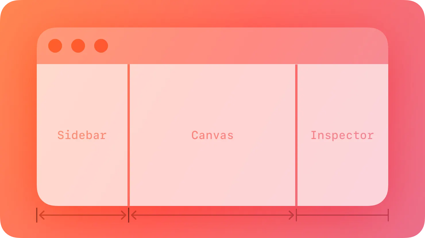
It’s common to use a split view to create a sidebar interface, where the leading pane lists the top-level items or collections in an app, and the secondary and optional tertiary panes can present child collections and item details. For example, Mail in iPadOS lists accounts and mailboxes in the primary pane, a selected mailbox’s messages in the secondary pane, and a selected email in the tertiary pane. Rarely, you might also use a split view to provide groups of functionality that supplement the primary view — for example, Keynote in macOS uses split view panes to present the slide navigator, the presenter notes, and the inspector pane in areas that surround the main slide canvas.
스플릿 뷰를 사용하여 사이드바 인터페이스를 생성하는 것은 흔한 일입니다. 이 인터페이스에서 주요 창은 앱의 최상위 항목이나 컬렉션을 나열하고, 보조 및 선택적인 세 번째 창은 하위 컬렉션 및 항목의 세부 정보를 표시할 수 있습니다. 예를 들어, iPadOS의 메일 앱에서는 주요 창에 계정 및 메일함을 나열하고, 선택된 메일함의 메시지를 보조 창에, 선택된 이메일을 세 번째 창에 표시합니다. 드물게, 스플릿 뷰를 사용하여 주요 뷰를 보완하는 기능 그룹을 제공하기도 합니다. 예를 들어, macOS의 Keynote 앱은 슬라이드 네비게이터, 프리젠터 노트, 인스펙터 창을 주요 슬라이드 캔버스 주변 영역에 표시하기 위해 스플릿 뷰 창을 사용합니다.
*inspector pane : 사용자가 선택한 항목 또는 콘텐츠의 속성, 설정 또는 세부 정보를 편집할 수 있는 패널
→ 스플릿 뷰를 사용해 사이드바 인터페이스를 생성하거나 주요 뷰를 보완하는 기능 그룹을 제공할 수 있다
역자 첨언
Prefer using a split view in a regular — not a compact — environment. A split view needs horizontal space in which to display multiple panes. In a compact environment, such as iPhone in portrait orientation, it’s difficult to display multiple panes without wrapping or truncating the content, making it less legible and harder to interact with.
일반적인 환경에서(컴팩트한 환경이 아닌 경우) 스플릿 뷰를 사용하는 것이 좋습니다. 스플릿 뷰는 여러 창을 표시할 수 있는 가로 공간이 필요합니다. 아이폰의 세로 방향과 같은 컴팩트한 환경에서는 내용을 감싸거나 일부를 생략하지 않고 여러 창을 표시하는 것이 어렵기 때문에 내용이 덜 읽기 쉽고 상호 작용하기 어려울 수 있습니다.
→ 화면 크기가 작은 디바이스에서 스플릿 뷰를 사용하면 여러 창을 표시하는 것이 어렵기 때문에 컴팩트한 환경이 아닌 일반적인 환경에서 스플릿 뷰를 사용해야 한다
To support navigation, persistently highlight the current selection in each pane that leads to the detail view. The selected appearance clarifies the relationship between the content in various panes and helps people stay oriented.
탐색을 지원하기 위해, 디테일 뷰로 이어지는 각 창에서 현재 선택된 항목을 지속적으로 강조하세요. 선택된 모습은 다양한 창의 콘텐츠 간의 관계를 명확하게 해주며 사용자가 방향을 잃지 않도록 도와줍니다.
→ 사용자가 방향을 잃지 않고, 다양한 창의 콘텐츠 간의 관계를 명확히 해주기 위해서 각 창에서 선택된 항목을 지속적으로 강조해야 한다
역자 첨언
Consider letting people drag and drop content between panes. Because a split view provides access to multiple levels of hierarchy, people can conveniently move content from one part of your app to another by dragging items to different panes.
사용자가 콘텐츠를 패널 간에 드래그앤드롭으로 이동시킬 수 있도록 고려하세요. 스플릿 뷰는 다중 레벨의 계층에 접근할 수 있게 해주므로 사용자는 항목을 다른 패널로 드래그하여 앱의 다른 부분으로 콘텐츠를 편리하게 이동시킬 수 있습니다.
→ 사용자가 패널 간 콘텐츠를 드래그앤드롭으로 이동시킬 수 있도록 고려해야 합니다
역자 첨언
No additional considerations for iOS, iPadOS, or visionOS.
iOS, iPad OS 또는 비전 OS에 대한 추가 고려 사항은 없습니다.
In macOS, you can arrange the panes of a split view horizontally, vertically, or both. A split view includes dividers between panes that can support dragging to resize them. For developer guidance, see HSplitView and VSplitView.
macOS에서는 스플릿 뷰의 패널을 수평, 수직 또는 둘 다로 배열할 수 있습니다. 스플릿 뷰에는 패널 사이에 드래그하여 크기를 조정할 수 있는 분할자(divider)가 포함되어 있습니다. 개발자 안내를 위해, HSplitView와 VSplitView를 참조하세요.
→ macOS에서는 스플릿 뷰의 패널을 수평, 수직 또는 둘 다로 배열할 수 있으며, 분할자를 이용해 패널 사이의 크기를 조절할 수 있다
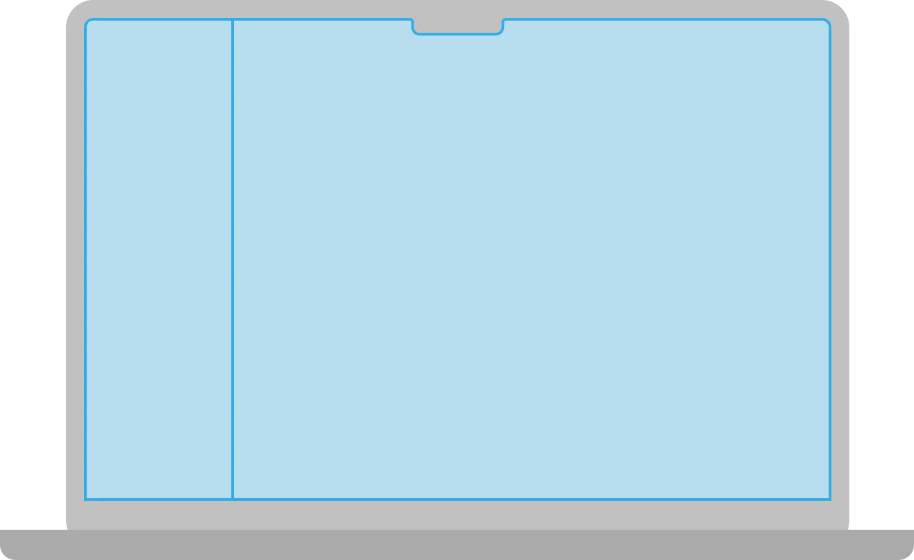
Vertical
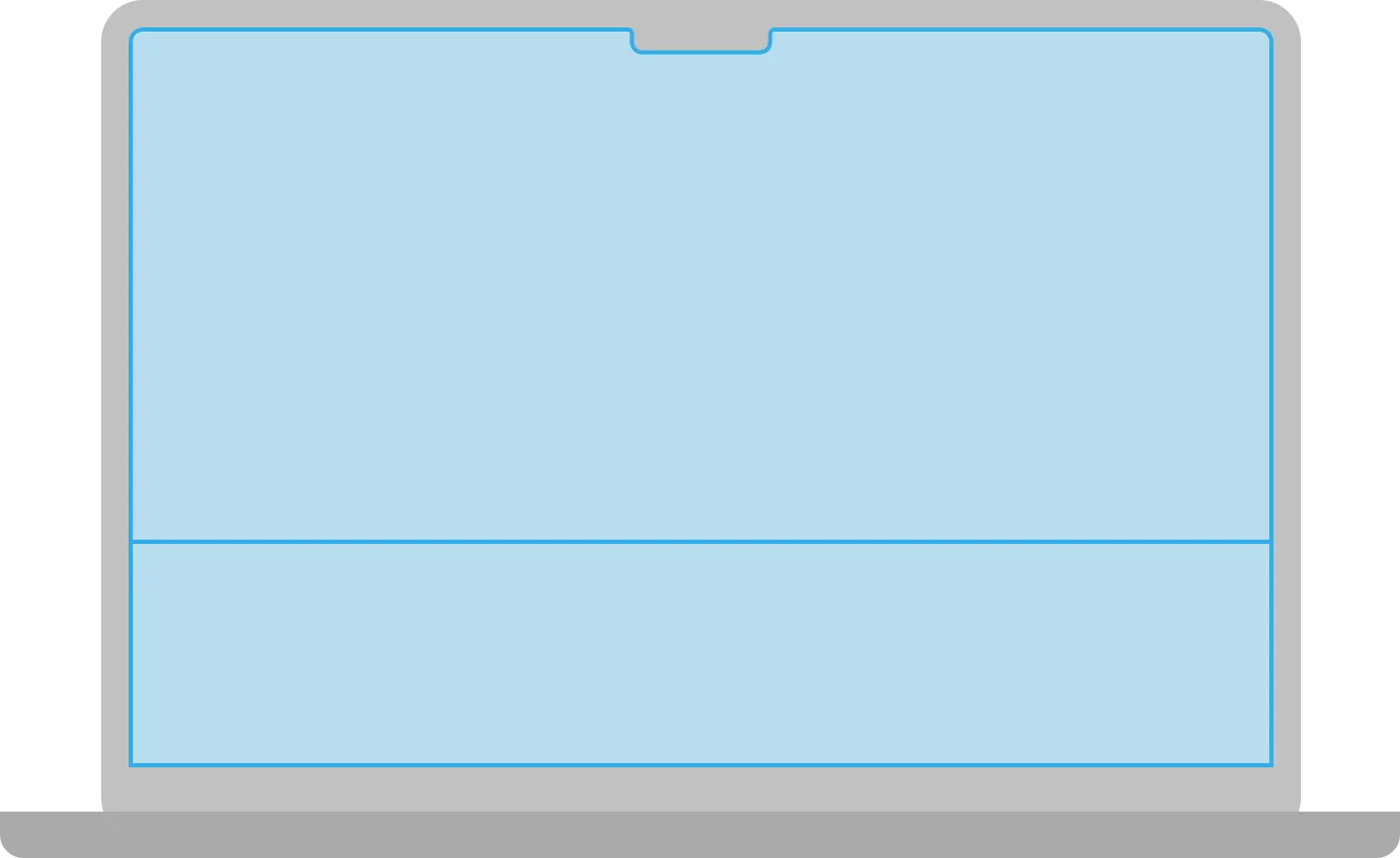
Horizontal
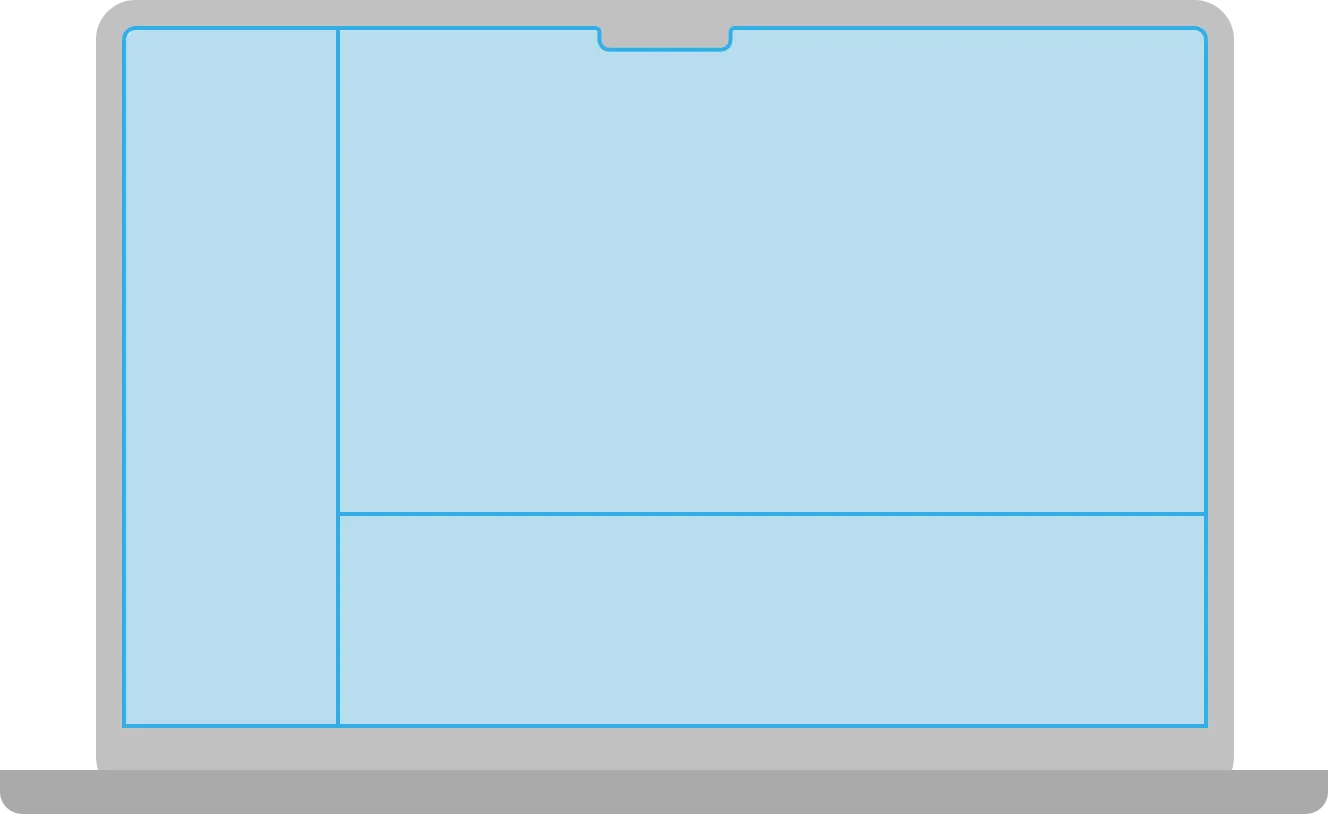
Multiple
Set reasonable defaults for minimum and maximum pane sizes. If people can resize the panes in your app’s split view, make sure to use sizes that keep the divider visible. If a pane gets too small, the divider can seem to disappear, becoming difficult to use.
최소 및 최대 패널 크기에 합리적인 기본값을 설정하세요. 사용자들이 앱의 스플릿 뷰의 패널 크기를 조정할 수 있는 경우, 분할자(divider)가 보이도록 크기를 설정해야 합니다. 패널 크기가 너무 작아지면 분할자가 사라져서 사용하기 어려워질 수 있습니다.
→ 패널 크기가 너무 작아지면 분할자가 사라지니, 분할자가 보이도록 합리적인 크기로 설정해야 한다
Consider letting people hide a pane when it makes sense. If your app includes an editing area, for example, consider letting people hide other panes to reduce distractions or allow more room for editing — in Keynote, people can hide the navigator and presenter notes panes when they want to focus on editing slide content.
합리적인 경우에 패널을 숨기는 것을 고려해보세요. 예를 들어 앱에 편집 영역이 포함된다면, 다른 pane을 숨길 수 있도록 하는 것이 고려될 수 있습니다. 이렇게 함으로써 사용자들은 주의를 산만하게 하지 않거나 편집을 위한 공간을 더 확보할 수 있습니다. Keynote에서는 사용자가 슬라이드 콘텐츠 편집에 집중하고자 할 때 네비게이터와 프레젠터 노트 패널을 숨길 수 있습니다.
→ 합리적인 경우에 패널을 숨기는 것을 고려해보면 좋다
역자 첨언
Provide multiple ways to reveal hidden panes. For example, you might provide a toolbar button or a menu command — including a keyboard shortcut — that people can use to restore a hidden pane.
숨겨진 패널을 드러내는 여러 가지 방법을 제공하세요. 예를 들어, 숨겨진 패널을 복원하는 데 사용할 수 있는 도구 모음 버튼이나 메뉴 명령을 제공할 수 있습니다. 이 명령에는 키보드 단축키도 포함될 수 있습니다.
→ 숨겨진 패널을 드러내게 하는 데에 여러 가지 방법을 제공해야 한다
역자 첨언
Prefer the thin divider style. The thin divider measures one point in width, giving you maximum space for content while remaining easy for people to use. Avoid using thicker divider styles unless you have a specific need. For example, if both sides of a divider present table rows that use strong linear elements that might make a thin divider hard to distinguish, it might work to use a thicker divider. For developer guidance, see NSSplitView.DividerStyle.
얇은 분할자 스타일을 선호하세요. 얇은 분할자는 1포인트 폭을 가지며, 사용자에게 편리한 사용성을 제공하면서도 콘텐츠에 최대한의 공간을 제공합니다. 특별한 필요가 없는 경우 두꺼운 분할자 스타일을 사용하지 않는 것이 좋습니다. 예를 들어, 분할자 양쪽이 얇은 분할자를 구별하기 어려울 수 있는 강한 선형 요소를 사용하는 테이블 행을 나타내는 경우 두꺼운 분할자를 사용하는 것이 유용할 수 있습니다. 개발자 가이드는 NSSplitView.DividerStyle을 참조하세요.
→ 사용자에게 편리한 사용성과 콘텐츠에 최대한의 공간을 제공하기 위해서, 1포인트 폭을 가지는 얇은 분할자 스타일을 사용해야 한다
In tvOS, a split view can work well to help people filter content. When people choose a filter category in the primary pane, your app can display the results in the secondary pane.
tvOS에서는, 분할 뷰(split view)를 사용하여 사용자가 콘텐츠를 필터링하는 데 도움이 될 수 있습니다. 사용자가 주요 패널(primary pane)에서 필터 카테고리를 선택할 때, 귀하의 앱은 결과를 보조 패널(secondary pane)에 표시할 수 있습니다.
→ tvOS에서는 스플릿 뷰를 사용해 사용자가 콘텐츠를 필터링하는 데 도움이 될 수 있다
Choose a split view layout that keeps the panes looking balanced. By default, a split view devotes a third of the screen width to the primary pane and two-thirds to the secondary pane, but you can also specify a half-and-half layout.
패널이 균형있게 보이는 스플릿 뷰 레이아웃을 선택하세요. 기본적으로, 스플릿 뷰는 화면 너비의 1/3을 주요 패널에 할당하고, 2/3을 보조 패인에 할당합니다. 하지만 반반(50:50) 레이아웃도 지정할 수 있습니다.
→ 패널이 균형있게 보이는 스플릿 뷰 레이아웃을 선택해야 한다
Display a single title above a split view, helping people understand the content as a whole. People already know how to use a split view to navigate and filter content; they don’t need titles that describe what each pane contains.
스플릿 뷰 위에 하나의 제목을 표시하여 사용자가 전체 콘텐츠를 이해할 수 있도록 도와주세요. 사용자들은 이미 스플릿 뷰를 사용하여 콘텐츠를 탐색하고 필터링하는 방법을 알고 있습니다. 따라서 각 패널이 무엇을 포함하고 있는지 설명하는 제목은 필요하지 않습니다.
→ 사용자들은 이미 스플릿 뷰에 대한 이해가 있기 때문에, 각 패널별로 무엇을 포함하고 있는지 설명하지 말고 전체를 아우르는 하나의 제목만을 표시해 전체 콘텐츠를 이해할 수 있도록 도와줘야 한다
Choose the title’s alignment based on the type of content the secondary pane contains. Specifically, when the secondary pane contains a content collection, consider centering the title in the window. In contrast, if the secondary pane contains a single main view of important content, consider placing the title above the primary view to give the content more room.
제목의 정렬은 보조 패널이 어떤 유형의 콘텐츠를 포함하고 있는지에 따라 선택하세요. 특히, 보조 패널이 콘텐츠 컬렉션을 포함하는 경우, 제목을 창 중앙에 가운데로 정렬하는 것을 고려해보세요. 그러나 반면에, 보조 패널이 중요한 콘텐츠의 단일 주요 뷰를 포함하는 경우, 콘텐츠에 더 많은 공간을 제공하기 위해 제목을 주요 뷰 위에 배치하는 것을 고려하세요.
→ 제목의 정렬은 보조 패널이 어떤 유형의 콘텐츠를 포함하고 있는지에 따라 선택해야 한다
역자 첨언
Prefer a split view — not an ornament — for offering supplementary controls or information.A split view pane gives people convenient access to information and actions they need while continuing to interact with the main view. If you need to request a small amount of information from people or present a simple task that they can complete before returning to their main task, consider using a sheet.
부가적인 컨트롤이나 정보를 제공할 때, (장식이 아닌) 분할 뷰를 선호하세요. 분할 뷰 패널은 사용자가 주된 뷰와 계속 상호작용하면서 필요한 정보와 작업에 편리하게 접근할 수 있게 해줍니다. 사용자로부터 소량의 정보를 요청하거나 주된 작업으로 돌아가기 전에 완료할 수 있는 간단한 작업을 제시해야 할 때는 시트를 사용하는 것을 고려하세요.
→ 부가적인 컨트롤이나 정보를 제공할 때 분할 뷰를 선호하면 좋다
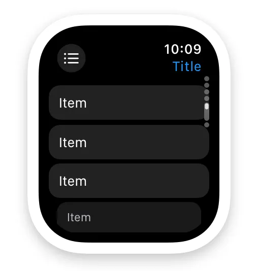
In watchOS, the split view displays either the sidebar or the detail view as a full-screen view.
watchOS에서 스플릿 뷰는 사이드바 또는 디테일 뷰를 전체 화면으로 표시할 수 있습니다.
Automatically display the most relevant detail view. When your app launches, show people the most pertinent information. For example, display information relevant to their location, the time, or their recent actions.
가장 관련 있는 디테일 뷰를 자동으로 표시하세요. 앱을 시작할 때 사용자에게 가장 적합한 정보를 보여주세요. 예를 들어, 위치, 시간 또는 최근 활동과 관련된 정보를 표시할 수 있습니다.
→ 앱을 시작할 때, 사용자에게 가장 적합할만한 가장 관련 있는 디테일 뷰를 자동으로 표시해야 한다
역자 첨언
If your app displays multiple detail pages, place the detail views in a vertical tab view. People can then use the Digital Crown to scroll between the detail view’s tabs. watchOS also displays a page indicator next to the Digital Crown, indicating the number of tabs and the currently selected tab.
만약 여러 디테일 페이지를 표시하는 앱이라면, 디테일 뷰들을 수직 탭 뷰에 배치하세요. 사용자들은 디지털 크라운을 사용하여 디테일 뷰의 탭 간을 스크롤할 수 있습니다. 또한 watchOS는 디지털 크라운 옆에 page indicator를 표시하여 탭의 수와 현재 선택된 탭을 나타냅니다.
→ 여러 디테일 페이지를 표시해야 한다면, 수직 탭 뷰에 배치해야 한다
역자 첨언
NavigationSplitView — SwiftUI
UISplitViewController — UIKit
NSSplitViewController — AppKit
Change Log
작성 날짜 | 작성자 | 수정사항 |
2023/09/19 | 린 | 초기 번역 |
2023/12/22 | 린 | 배포 |