
Presenting data in a chart can help you communicate information with clarity and appeal.
데이터를 차트로 표현하면 정보를 명확하고 매력적으로 전달하는 데 도움이 될 수 있습니다.
→ 데이터를 차트로 표현해야 하는 이유

Charts provide efficient ways to communicate complex information without requiring people to read and interpret a lot of text. The graphical nature of charts also gives you additional opportunities to express the personality of your experience and add visual interest to your interface. To learn about the components you use to create a chart, see Charts.
차트는 사람들이 많은 텍스트를 읽고 해석할 필요 없이 복잡한 정보를 효과적으로 전달하는 방법을 제공합니다. 차트의 그래픽적인 특성은 경험의 개성을 표현하고 인터페이스에 시각적인 흥미를 더하는 추가적인 기회를 제공합니다. 차트를 생성하는 데 사용하는 구성 요소에 대한 자세한 내용은 Charts를 참조하세요.
→ 차트가 제공하는 방법 및 기회들
A chart can range from a simple graphic that provides glanceable information to a rich, interactive experience that can form the centerpiece of your app and encourage people to explore the data from various perspectives. Whether simple or complex, you can use charts to help people perform data-driven tasks that are important to them, such as:
차트는 한눈에 볼 수 있는 정보를 제공하는 간단한 그래픽부터, 앱의 핵심 요소가 되어 다양한 관점에서 데이터를 탐색하도록 사람들을 유도하는 풍부하고 상호작용적인 경험까지 다양한 범위를 가질 수 있습니다. 간단하거나 복잡한 경우에도 차트를 사용하여 다양한 관점에서 데이터를 탐색하고 사용자가 중요하게 생각하는 데이터 기반 작업을 수행하는 데 도움을 줄 수 있습니다. 이러한 작업에는 다음과 같은 것들이 포함될 수 있습니다:
→ 차트는 다양한 범위를 가지며, 데이터 기반 작업을 수행하는데 도움을 준다
•
Analyzing trends based on historical or predicted values
•
과거 경험을 통해 얻은 값이나 예측 값을 기반으로 추세를 분석하는 것
•
Visualizing the current state of a process, system, or quantity that changes over time
•
시간이 지남에 따라 변화하는 프로세스, 시스템 또는 양의 현재 상태를 시각화하는 것
•
Evaluating different items — or the same item at different times — by comparing data across multiple categories
•
다양한 범주를 통해 데이터를 비교함으로써 서로 다른 항목(혹은 다른 시간대의 동일한 항목)을 평가하는 것
→ 차트를 통해 추세를 분석하거나, 프로세스 및 현재 상태를 시각화하거나, 데이터를 비교할 수 있다
역자 첨언
Not every collection of data needs to be displayed in a chart. If you simply need to provide data — and you don’t need to convey information about it or help people analyze it — consider offering the data in other ways, such as in a list or table that people can scroll, search, and sort.
모든 데이터 집합을 차트로 표시할 필요는 없습니다. 단순히 데이터를 제공하기만 하고 정보를 전달하거나 사람들이 분석하는 데 도움이 필요하지 않은 경우에는 스크롤, 검색, 정렬 등을 할 수 있는 목록이나 표와 같은 다른 방식으로 데이터를 제공하는 것을 고려해보세요.
→ 단순히 데이터를 제공하기만 하는 경우에는, 차트 외에 다른 방식으로도 제공하는 것도 고려해야 한다
Use a chart when you want to highlight important information about a dataset. Charts are visually prominent, so they tend to draw people’s attention. Take advantage of this prominence by clearly communicating what people can learn from the data they care about.
데이터셋(dataset)에 대한 중요한 정보를 강조하고자 할 때 차트를 사용하세요. 차트는 시각적으로 두드러지기 때문에 사람들의 관심을 끌기 쉽습니다. 이를 활용해 사람들이 신경쓰는 데이터에서 어떤 정보를 얻을 수 있는지 명확하게 전달해보세요.
*데이터셋: 컴퓨터가 처리하거나 분석할 수 있는 형태로 존재하는 관련 정보의 집합체
→ 중요한 정보를 강조하고자 할 때 차트를 사용하면 시각적으로 두드러지기 때문에 관심을 끌기 쉽다
Keep a chart simple, letting people choose when they want additional details. Resist the temptation to pack as much data as possible into a chart. Too much data can make a chart visually overwhelming and difficult to use, obscuring the relationships and other information you want to convey. If you have a lot of data to present — or a lot of functionality to provide — consider giving people a way to reveal it gradually. For example, you might let people choose to view different levels of detail or subsets of data to match their interest. To help people learn how to use an interactive chart, you might offer several versions of the chart, each with more functionality than the last.
차트를 심플하게 유지하고, 사람들이 추가적인 디테일을 원할 때 선택할 수 있도록 하세요. 가능한 한 많은 데이터를 차트에 담으려는 유혹을 떨쳐내세요. 데이터가 너무 많으면 차트가 시각적으로 압도적이고 사용하기 어려워져 전달하고자 하는 관계 및 기타 정보가 모호해질 수 있습니다. 많은 양의 데이터를 제시하거나 많은 기능을 제공해야 할 경우, 사용자에게 점진적으로 데이터를 공개할 수 있는 방법을 고려해보세요. 예를 들어, 사람들이 관심사에 맞게 다양한 수준의 세부 정보나 데이터의 하위 집합을 볼 수 있도록 선택할 수 있습니다. 상호작용하는 차트의 사용 방법을 쉽게 배울 수 있도록 차트의 여러 버전을 제공할 수 있습니다. 각각의 버전은 이전 버전보다 기능이 향상되었습니다.
→ 차트에 데이터가 너무 많으면 전달이 어렵기 때문에 심플하게 유지하되, 사용자가 추가적인 디테일을 원할 때 선택할 수 있도록 해야 한다
Make every chart in your app accessible. A chart communicates visually through graphical representations of data and visual descriptions. In addition to the visual descriptions you display, it’s crucial to provide both accessibility labels that describe chart values and components, and accessibility elements that help people interact with the chart. For guidance, see Enhancing the accessibility of a chart.
앱에 있는 모든 차트에 액세스할 수 있도록 하세요. 차트는 데이터의 시각적인 표현과 시각적인 설명을 통해 시각적으로 정보를 전달합니다. 시각적 설명 외에도 차트의 값 및 구성 요소를 설명하는 접근성 레이블과 사용자가 차트와 상호 작용하는 데 도움이 되는 접근성 요소를 제공하는 것이 매우 중요합니다. 자세한 내용은 차트의 접근성 향상을 참조하세요.
→ 시각적인 정보를 제한받는 사람들도 차트의 내용을 이해할 수 있도록 돕기 위해 접근성 요소를 제공해야 한다
역자 첨언
In general, prefer using common chart types. People tend to be familiar with common chart types — such as bar charts and line charts — so using one of these types in your app can make it more likely that people will already know how to read your chart. For guidance, see Charts.
일반적으로 흔히 사용되는 차트 유형을 사용하는 것이 좋습니다. 사람들은 막대 그래프나 선 그래프와 같은 흔히 사용되는 차트 유형에 익숙하기 때문에 이러한 유형 중 하나를 앱에서 사용하면 사람들이 이미 차트를 읽는 방법을 알고 있을 가능성이 높아집니다. 자세한 내용은 차트를 참조하세요.
→ 흔히 사용되는 차트 유형을 사용할 경우, 사용자가 이미 차트를 읽는 방법을 알고 있을 가능성이 높아진다
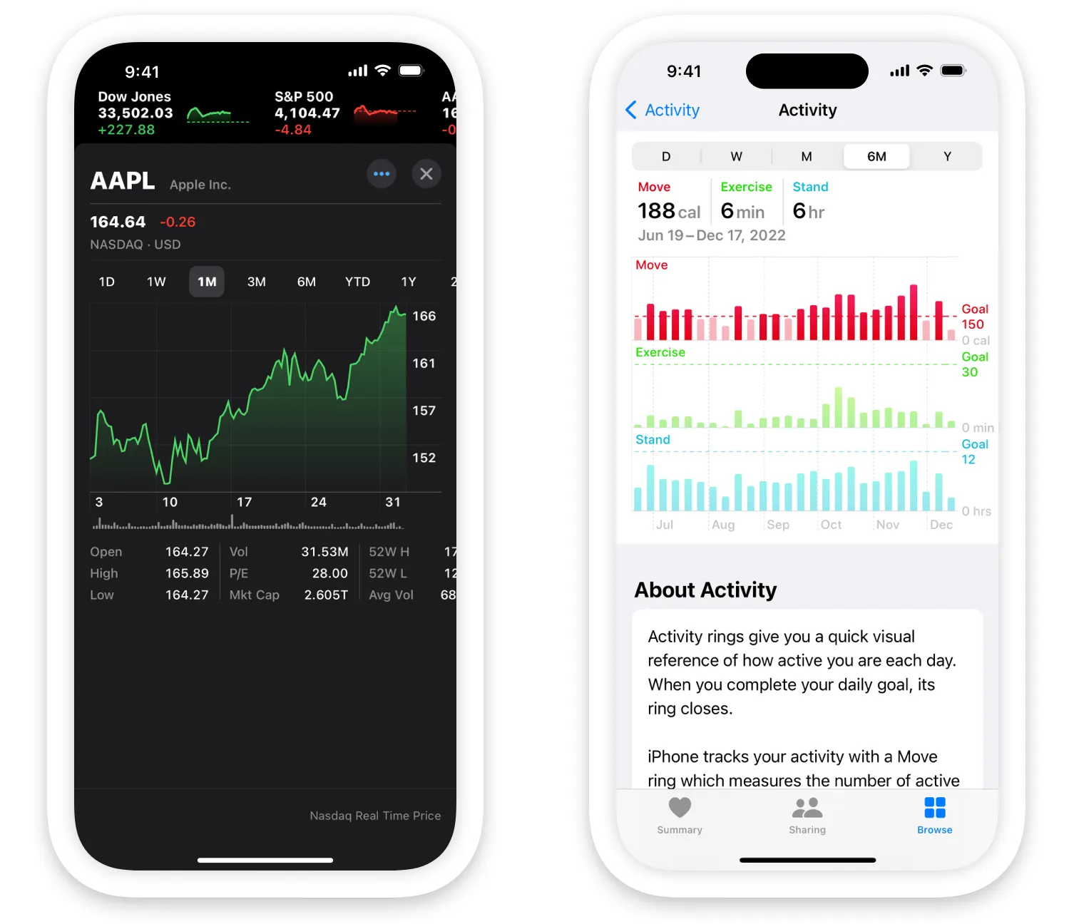
If you need to create a chart that presents data in a novel way, help people learn how to interpret the chart. For example, when a Watch pairs with iPhone, Activity introduces the Activity rings by animating them individually, showing people how each ring maps to the move, exercise, and stand metrics.
만약 새로운 방식으로 데이터를 표현하는 차트를 만들어야 하는 경우, 사람들이 차트를 해석하는 방법을 배울 수 있도록 도와주는 것이 중요합니다. 예를 들어, Apple의 Watch와 iPhone이 연결되었을 때, Activity 앱은 각각의 활동 링이 움직이면서 개별적으로 애니메이션되며, 각 링이 활동, 운동, 서있기 지표와 어떻게 연결되는지 보여줍니다.
→ 새로운 방식으로 데이터를 표현하는 차트를 사용할 경우, 사용자가 해석하는 방법을 배울 수 있도록 도와줘야 한다
역자 첨언
Examine the data from multiple levels or perspectives to find details you can display to enhance the chart. For example, viewing the data from a macro level can help you determine high-level summaries that people might be interested in, like totals or averages. From a mid-level perspective, you might find ways to help people identify useful subsets of the data, whereas examining individual data points might help you find ways to draw people’s attention to specific values or items. Displaying information that helps people view the chart from various perspectives can encourage them to engage with it.
여러 수준 또는 관점에서 데이터를 검사하여 차트를 향상시키기 위해 표시할 수 있는 세부 정보를 찾아보세요. 예를 들어, 데이터를 매크로 수준에서 살펴보면 합계나 평균과 같이 사용자가 관심을 갖을 수 있는 높은 수준의 요약 정보를 결정하는 데 도움이 될 수 있습니다. 중간 수준에서는 데이터의 유용한 하위 집합을 식별하는 데 도움이 되는 방법을 찾을 수 있는 반면, 개별 데이터 포인트를 조사하면 특정 값이나 항목에 사람들의 주의를 끌 수 있는 방법을 찾을 수 있습니다. 다양한 관점에서 차트를 보는데 도움이 되는 정보를 표시함으로써 사용자가 차트와 상호 작용하도록 유도할 수 있습니다.
*매크로: 크거나 대규모임을 나타냄
→ 다양한 관점에서 차트를 보는데 도움이 되는 정보를 표시함으로써, 차트를 향상시키고 사용자가 차트와 상호 작용할 수 있도록 유도해야 한다
역자 첨언
Aid comprehension by adding descriptive text to the chart. Descriptive text titles, subtitles, and annotations help emphasize the most important information in a chart and can highlight actionable takeaways. You can also display brief descriptive text that serves as a headline or summary for a chart, helping people grasp essential information at a glance. For example, Weather displays text that summarizes the information people need right now — such as “Chance of light rain in the next hour” — above the scrolling list of hourly forecasts for the next 24 hours. Although a descriptive headline or summary can make a chart more accessible, it doesn’t take the place of accessibility labels.
차트에 설명 텍스트를 추가하여 이해를 도우세요. 제목, 부제목, 주석과 같은 설명 텍스트는 차트에서 가장 중요한 정보를 강조하고 실행 가능한 요약 내용을 강조하는 데 도움이 됩니다. 또한 간결한 설명적인 텍스트를 표시하여 차트의 제목 또는 요약으로 사용하면 사람들이 한눈에 핵심 정보를 파악할 수 있습니다. 예를 들어, 날씨 앱은 24시간 동안의 시간별 예보를 스크롤하는 리스트 위에 "다음 시간 동안 가벼운 비가 내릴 가능성"과 같이 현재 필요로 하는 정보를 요약하는 텍스트를 표시합니다. 설명 헤드라인이나 요약은 차트에 더욱 접근 가능하기 쉽게 만들어 줄 수 있지만, 접근성 레이블의 자리를 대신할 수는 없습니다.
→ 차트에 설명 텍스트를 추가해 사용자의 이해를 도와야 한다
Match the size of a chart to its functionality, focus, and level of detail. In general, a chart needs to be large enough to comfortably display the details you need to include and expansive enough for the interactivity you want to support. For example, you always want to make it easy for people to read a chart’s details and descriptive text — like labels and annotations — but you might also want to give people enough room to change the scope of a chart or investigate the data from different perspectives. On the other hand, you might want to use a small chart to offer glanceable information about an individual item or to provide a snapshot or preview of a larger version of the chart that people can reveal in a different view.
차트의 크기는 기능, 초점 및 세부 정보에 맞게 조절되어야 합니다. 일반적으로 차트는 포함해야 할 세부 정보를 편안하게 표시할 수 있을 만큼 충분히 크고 지원하려는 상호 작용을 위해 충분히 확장되어야 합니다. 예를 들어, 항상 사용자가 차트의 세부 정보와 레이블, 주석과 같은 설명 텍스트를 쉽게 읽을 수 있도록 해야 하지만, 동시에 차트의 범위를 변경하거나 데이터를 다양한 관점에서 조사할 수 있는 충분한 공간을 제공해야 할 수도 있습니다. 반면, 개별 항목에 대한 간단한 정보를 제공하거나 차트의 큰 버전에 대해 미리 보기를 제공하기 위해 작은 차트를 사용할 수도 있습니다. 이 경우 사람들이 다른 뷰에서 자세한 차트를 확인할 수 있도록 차트의 스냅샷이나 미리 보기를 제공할 수 있습니다.
→ 적절한 크기의 차트를 사용함으로써, 사용자들이 차트를 쉽게 이해하고 활용할 수 있도록 해야 한다
Prefer consistency across multiple charts, deviating only when you need to highlight differences. If multiple charts in your app serve a similar purpose, you generally don’t want to imply that the charts are unrelated by using a different type or style for each one. Also, using a consistent visual approach for the charts in your app lets people use what they learn about one chart to help them understand another. Consider using different chart types and styles when you need to highlight meaningful differences between charts.
여러 차트 사이에서 디자인 일관성을 유지하되 차이점을 강조해야 할 때만 차이를 두어야 합니다. 앱 내에서 여러 차트가 유사한 목적을 가진다면, 각각에 대해 다른 유형이나 스타일을 사용하여 두 차트가 관련이 없다는 느낌을 주고 싶지 않을 것입니다. 또한, 앱 내 차트에 일관된 시각적 접근 방식을 사용하면 사람들이 한 차트에 대해 학습한 내용을 다른 차트를 이해하는 데 도움이 됩니다. 차트 간에 의미 있는 차이를 강조해야 할 때에만 다른 차트 유형과 스타일을 사용하는 것이 좋습니다.
→ 여러 차트에 걸쳐 일관성을 유지하고 차이점을 강조해야 할 경우에만 차이를 두어야 한다
Maintain continuity among multiple charts that focus on the same data. When you use multiple charts to help people explore one dataset from different perspectives, it’s important to use one chart type and consistent colors, annotations, layouts, and descriptive text to signal that the dataset remains the same. For example, the Heath Trends screen shows small charts that each use a specific visual style to depict a recent trend in an area like steps or resting heart rate. When people choose a chart to reveal all their data in that area, the expanded version uses the same style, colors, marks, and annotations to strengthen the relationship between the versions.
동일한 데이터에 초점을 맞춘 여러 차트 간의 일관성을 유지하세요. 사람들이 서로 다른 관점에서 동일한 데이터 집합을 탐색하는 데 여러 차트를 사용할 때, 데이터 집합이 동일하다는 신호를 주기 위해 한 가지 차트 유형과 일관된 색상, 주석, 레이아웃 및 설명 텍스트를 사용하는 것이 중요합니다. 예를 들어, 건강 추세(Heath Trends) 화면에서는 단계나 휴식 심박수와 같은 영역의 최근 추세를 나타내기 위해 각각 특정 시각적 스타일을 사용하는 작은 차트가 표시됩니다. 사람들이 해당 영역의 모든 데이터를 확인하기 위해 차트를 선택할 때, 확장된 버전은 동일한 스타일, 색상, 표식 및 주석을 사용하여 버전 간의 관계를 강화합니다.
→ 일관된 색상, 주석, 레이아웃 및 설명 텍스트 등을 사용해, 동일한 데이터에 초점을 맞춘 여러 차트 간의 일관성을 유지해야 한다
역자 첨언
No additional considerations for iOS, iPadOS, macOS, tvOS, or watchOS.
iOS, iPadOS, macOS, tvOS, 또는 watchOS에 대해 추가적인 고려 사항은 없습니다.
Change Log
작성 날짜 | 작성자 | 수정사항 |
2023/06/20 | 린 | 초기 번역 |
2023/12/22 | 린 | 배포 |