
People use Apple’s accessibility features to personalize how they interact with their devices in ways that work for them.
사람들은 Apple의 접근성 기능을 사용하여 자신에게 맞는 방식으로 장치와 상호 작용하는 방법을 개인화합니다.

An accessible app or game supports accessibility personalizations by design and gives everyone a great user experience, regardless of their capabilities or how they use their devices.
액세스 가능한 앱 또는 게임은 디자인에 의한 접근성 개인화를 지원하며 기능이나 장치 사용 방법에 관계없이 모든 사람에게 훌륭한 사용자 경험을 제공합니다.
Approximately one in seven people have a disability that affects the way they interact with the world and their devices. People can experience disabilities at any age, for any duration, and at varying levels of severity. For example, situational disabilities — such as a wrist injury from a fall or voice loss from overuse — can affect the way almost everyone interacts with their devices at various times.
약 7명 중 1명은 그들의 장치와 상호작용하는 방식에 영향을 미치는 장애를 가지고 있습니다. 사람들은 어떤 나이, 어떤 기간, 그리고 다양한 수준의 장애를 경험할 수 있습니다. 예를 들어, 낙상으로 인한 손목 부상이나 과도한 사용으로 인한 음성 손실과 같은 상황 장애는 거의 모든 사람이 다양한 시간에 장치와 상호 작용하는 방식에 영향을 줄 수 있습니다.
역자 첨언
Design with accessibility in mind. Accessibility is not just about making information available to people with disabilities — it’s about making information available to everyone, regardless of their capabilities or situation. Designing your app with accessibility in mind means prioritizing simplicity and perceivability and examining every design decision to ensure that it doesn’t exclude people who have different abilities or interact with their devices in different ways.
접근성을 고려한 설계를 하세요. 접근성은 단순히 장애를 가진 사람이 정보를 이용할 수 있도록 하는 것이 아니라 능력이나 상황에 관계없이 모든 사람이 정보를 이용할 수 있도록 하는 것입니다. 접근성을 염두에 두고 앱을 설계한다는 것은 단순성과 지각성을 우선시하고 모든 설계 결정을 검토하여 다른 능력을 가지고 있거나 다른 방식으로 기기와 상호 작용하는 사람들을 배제하지 않는다는 것을 의미합니다.
Simplicity — Enabling familiar, consistent interactions that make complex tasks simple and straightforward to perform.
심플함 — 친숙하고 일관된 상호 작용을 통해 복잡한 작업을 간단하고 쉽게 수행할 수 있습니다.
Perceivability — Making sure that all content can be perceived whether people are using sight, hearing, or touch.
지각가능성 — 사람들이 시각, 청각 또는 촉각을 사용하는지 여부에 관계없이 모든 콘텐츠를 인식할 수 있도록 합니다.
Support personalization. You already design your experience to adapt to environmental variations — such as device orientation, screen size, resolution, color gamut, and split view — because you want people to enjoy it in any context and on all supported devices. With minimal additional effort, you can design your app to support the accessibility features people use to personalize the ways they interact with their devices.
개인화를 지원하세요. 여러분은 사용자가 모든 상황에서 모든 지원 장치에서 앱을 즐길 수 있도록 장치 방향, 화면 크기, 해상도, *색재현율 및 분할 보기와 같은 환경 변화에 맞게 앱을 설계했을 것입니다. 최소한의 추가 작업만으로 사용자가 장치와 상호 작용하는 방식을 개인화하는 데 사용하는 접근성 기능을 지원하도록 앱을 설계할 수 있습니다.
*color gamut(색재현율): 자연의 색을 얼마나 실제에 가깝게 표현하는지 가늠할 수 있는 척도
When you use standard components to implement your interface, text and controls automatically adapt to several accessibility settings, such as Bold Text, Larger Text, Invert Colors, and Increase Contrast.
표준 구성 요소를 사용하여 인터페이스를 구현하면 텍스트 및 컨트롤들이 볼드 텍스트, 큰 텍스트, 반전색 및 대비 증가와 같은 여러 가지 접근성 설정에 따라 자동으로 적용됩니다.
Audit and test your app or game for accessibility. An audit examines every element in your experience and gives you a comprehensive list of issues to fix. Testing helps you ensure that everyone can complete the most important tasks in your app, no matter how they interact with their devices.
앱 또는 게임의 접근성을 감사하고 테스트하세요. 감사는 경험의 모든 요소를 검사하고 해결해야 할 문제의 포괄적인 목록을 제공합니다. 테스트를 통해 모든 사용자가 장치와 어떻게 상호 작용하든 앱에서 가장 중요한 작업을 완료할 수 있습니다.
When you test important user flows with accessibility features turned on, you gain an appreciation for the challenges of interacting with a device in different ways. You also discover places where your app might fail to deliver a great user experience.
접근성 기능을 켜두고 중요한 사용자 플로우를 테스트하면 다양한 방법으로 장치와 상호 작용할 때 생기는 문제에 대한 인식을 얻을 수 있습니다. 또한 당신의 앱이 훌륭한 사용자 경험을 제공하지 못할 수도 있는 곳을 발견할 수 있습니다.
For example, a common user flow in a social media app might be “post a response to a comment.” The tasks that make up this flow could include:
예를 들어, 소셜 미디어 앱의 일반적인 사용자 흐름은 "댓글에 대한 반응 게시"일 수 있습니다. 이 흐름을 구성하는 작업에는 다음이 포함될 수 있습니다.
•
Read posted comments
•
게시된 댓글 읽기
•
Choose a comment for a response
•
반응할 댓글 선택
•
Open the response view
•
반응하기 화면 열기
•
Edit the response
•
반응 편집
•
Post the response
•
반응 게시
For each critical user flow in your app or game, turn on an accessibility feature, such as VoiceOver, Reduce Motion, or Large Text Size, and make sure that you can complete every task in the flow without difficulty. After you fix the problems you uncover, turn on a different accessibility feature and run through the user flow again. To help you audit, test, and fix your app or game, consider using Xcode’s Accessibility Inspector.
앱이나 게임의 각 중요한 사용자 플로우에 대해 VoiceOver, Reduce Motion 또는 Large Text Size와 같은 접근성 기능을 켜고 해당 플로우의 모든 작업을 어려움 없이 완료할 수 있는지 확인하세요. 발견한 문제를 해결한 후 다른 접근성 기능을 켜고 사용자 플로우를 다시 실행하세요. 앱이나 게임을 감사, 테스트 및 수정하는 데 도움이 되려면 Xcode의 접근성 검사기를 사용하는 것을 고려하세요.
→ 테스트할 때 다양한 상황을 연출하고, 문제가 발견되면 해결하고 또 테스트 해라.
Assistive technologies like VoiceOver, Assistive Touch, Pointer Control, and Switch Control expand the ways people can interact with their devices. Because these technologies and features integrate with system-provided interactions, it’s essential that you support the system interactions correctly in your app.
VoiceOver, Assistive Touch, Pointer Control, and Switch Control과 같은 보조 기술들은 사용자가 기기와 상호 작용할 수 있는 방법을 확장해 줍니다. 이러한 기술과 기능은 시스템에서 제공하는 상호 작용과 통합되므로 앱에서 시스템 상호 작용을 올바르게 지원해야 합니다.
Don’t override the platform gestures. People expect system gestures — such as swiping down to reveal Notification Center or the macOS trackpad gestures available in System Settings — to work regardless of the app they’re using.
플랫폼 제스처를 변경하지 마세요. 사용 중인 앱에 관계없이 알림 센터를 표시하도록 아래로 쓸어내리거나 시스템 설정에서 사용할 수 있는 macOS 트랙패드 제스처와 같은 시스템 제스처가 작동하기를 기대합니다.
역자 첨언
Prefer simplified gestures for common interactions. Complex gestures such as multifinger gestures, long presses, or repeated button presses can be challenging for many people. Using the simplest gestures possible improves the experience for everyone who interacts with your app.
일반적인 상호 작용을 위해 단순화된 제스처를 선호하세요. 여러 손가락 제스처, 길게 누르거나 버튼을 반복적으로 누르는 것과 같은 복잡한 제스처는 많은 사람들에게 어려울 수 있습니다. 가능한 한 간단한 제스처를 사용하면 앱과 상호 작용하는 모든 사용자의 경험이 향상됩니다.
역자 첨언
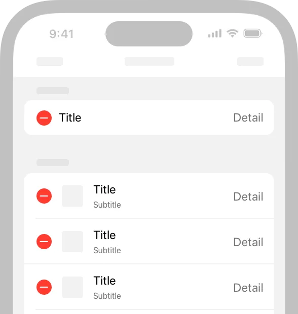
Provide alternative ways to perform gesture-based actions. Include an option for people who may not be able to perform a specific gesture. For example, if swiping deletes a row in a table, you can also provide an alternative way to delete items through an edit mode or by offering a Delete button in an item detail view.
제스처 기반 작업을 수행하는 다른 방법을 제공하세요. 특정 제스처를 수행할 수 없는 사용자를 위한 옵션을 포함합니다. 예를 들어, 스와이프를 사용하여 테이블의 행을 삭제하는 경우 편집 모드를 통해 또는 항목 세부 정보 보기에서 삭제 단추를 제공하여 항목을 삭제할 수도 있습니다.
역자 첨언
Edit to delete.
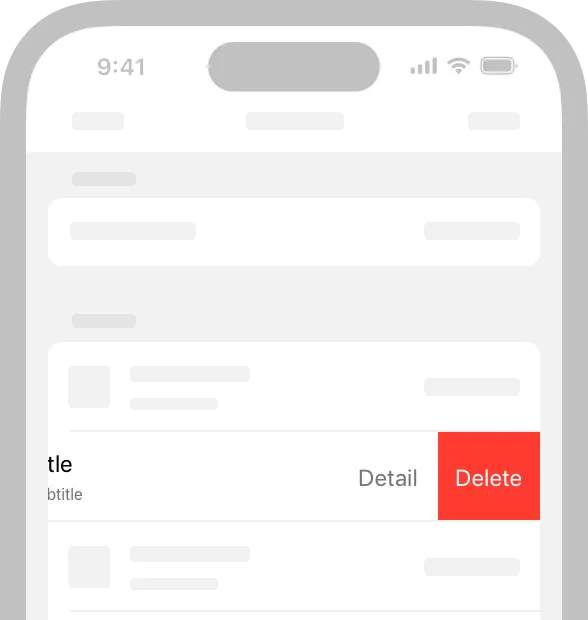
Swipe to delete.
When possible, make your app’s core functionality accessible through more than one type of physical interaction. For example, Camera on iPhone and iPad lets people take a photo by tapping the onscreen button or by pressing the device's volume down button. In addition to making photo-capture more convenient for everyone, these alternative interactions provide options to people who might have limited grip strength or dexterity.
가능한 경우 두 가지 이상의 물리적 상호 작용을 통해 앱의 핵심 기능에 액세스할 수 있도록 하세요. 예를 들어, iPhone과 iPad의 카메라를 사용할 때 화면에 있는 버튼을 누르거나 기기의 볼륨 낮추기 버튼을 이용해 사진을 찍을 수 있습니다. 이러한 대체 상호 작용은 사진 촬영을 모두를 더 편리하게 할 뿐만 아니라 악력이 낮거나 손이 자유롭지 않은 사용자들에게 옵션을 제공합니다.
Make drag and drop accessible in your iOS or iPadOS app. When you use the accessibility APIs to identify drag sources and drop targets in your app, assistive technologies can help people drag and drop onscreen items. For developer guidance, see accessibilityDragSourceDescriptors and accessibilityDropPointDescriptors.
여러분의 iOS 또는 iPadOS 앱에서 드래그 앤 드롭을 사용할 수 있도록 하세요. 접근성 API를 사용하여 앱에서 드래그 소스와 드롭 대상을 식별해 보조 기술은 사람들이 화면 항목을 드래그 앤 드롭하는 것을 도울 수 있습니다. 개발자 가이드는 accessibilityDragSourceDescriptors와 accessibilityDropPointDescriptors를 참고하세요.
Give all touchscreen controls and interactive elements a hit target that measures at least 44x44 pt. People with limited mobility need larger hit targets to help them interact with your app. It can be frustrating to interact with too-small controls in any platform, even when people use a pointer.
모든 터치스크린 컨트롤과 대화형 요소에 최소 44x44pt의 터치 영역을 제공하세요. 이동성이 제한된 사용자는 앱과 상호 작용할 수 있도록 더 큰 영역이 필요합니다. 사람들이 포인터를 사용하는 경우에도 어떤 플랫폼에서든 너무 작은 컨트롤과 상호 작용하는 것은 답답할 수 있습니다.
역자 첨언
Characterize the accessibility of custom elements. You can use system APIs to tell assistive technologies how a component behaves. For example, using button or NSAccessibilityButton to characterize a view as a button means that VoiceOver speaks the view’s description followed by the word button, which tells people that the view behaves like a button.
커스텀 요소의 접근성에 특성을 부여하세요. 시스템 API를 사용하여 보조 기술에 구성 요소가 어떻게 동작하는지 지정할 수 있습니다. 예를 들어, button 또는 NSAccessibilityButton을 사용하여 view에 버튼의 특성을 부여하면 VoiceOver가 view의 description과 버튼을 붙인 단어를 말해줍니다. 따라서 사용자들이 해당 view가 버튼처럼 작동한다는 것을 알 수 있게 됩니다.
역자 첨언
Use a consistent style hierarchy to communicate the relative importance of buttons. When you use a consistent hierarchy of button styles, people can grasp the importance of buttons based on their appearance. In iOS, iPadOS, and tvOS, for example, you can use the visually prominent filled style for the button that performs the most likely action in a view, using less prominent styles — such as gray or plain — for buttons that enable less important actions. (For developer guidance, see UIButton.Configuration.) People can also turn on Button Shapes to make it easier to distinguish active buttons from surrounding content.
일관된 스타일 계층을 사용하여 버튼의 상대적 중요성을 전달하세요. 버튼 스타일의 일관된 계층 구조를 사용할 때 사람들은 모양에 따라 버튼의 중요성을 파악할 수 있습니다. 예를 들어 iOS, iPadOS 및 TVOS에서는 보기에서 가장 가능성이 높은 작업을 수행하는 버튼에 시각적으로 눈에 띄는, 채워진 스타일을 사용할 수 있으며, 덜 중요한 작업을 사용하는 버튼에는 회색 또는 일반 스타일을 사용할 수 있습니다(개발자 가이드는 UIButton.Configuration 을 참고하세요.). 또한 버튼 모양을 설정하여 활성된 버튼를 주변 내용과 쉽게 구분할 수 있습니다.
역자 첨언
Prefer the system-provided switch component. SwiftUI provides a switch that indicates its state by the position of its knob and its fill color. For some people, however, the addition of labels makes it easier to perceive whether a switch is on or off. When you use system-provided switches, iOS, iPadOS, tvOS, and watchOS automatically displays on/off glyphs within them when people turn on On/Off Labels.
시스템에서 제공하는 스위치 구성 요소를 선호하세요. SwiftUI는 노브의 위치와 채우기 색상으로 상태를 표시하는 스위치를 제공합니다. 그러나 일부 사람들에게는 라벨을 추가하면 스위치가 켜져 있는지 또는 꺼져 있는지를 더 쉽게 인식할 수 있습니다. 시스템 제공 스위치를 사용하면 iOS, iPadOS, tvOS 및 watchOS가 사람들이 On/Off 라벨을 켤 때 자동으로 그 안에 있는 글리프를 표시합니다.
역자 첨언
Consider giving links a visual indicator in addition to color, such as an underline. It’s fine to use color to identify a link, but if you use it as the only indicator, people — such as those with color blindness or cognitive or situational attention impairments — may not be able to perceive the distinction.
링크에 밑줄과 같은 색상 외에 시각적 표시기를 제공하는 것을 고려하세요. 링크를 식별하기 위해 색을 사용하는 것은 괜찮지만, 그것을 유일한 지표로 사용하면 색맹이나 인지 또는 상황 주의력 장애가 있는 사람들과 같은 사람들이 구별을 인식하지 못할 수 있습니다.
역자 첨언
Let people input information by speaking instead of typing. Adding a dictation button in a text entry field lets people choose speech as their preferred input method. If you create a custom keyboard, be sure to include a microphone key for dictation.
사람들이 입력하는 대신 말로 정보를 입력할 수 있도록 하세요. 텍스트 입력 필드에 받아쓰기 단추를 추가하면 사용자가 선호하는 입력 방법으로 음성을 선택할 수 있습니다. 사용자 지정 키보드를 만드는 경우 받아쓰기를 위한 마이크 키를 포함해야 합니다.
역자 첨언
Support Siri or Shortcuts for performing important tasks by voice alone. To learn more about enabling Siri interactions in your app, see Siri.
When possible, don’t prevent people from selecting plain text. Many people rely on using selected text as input for translations and definitions.
가능한 경우 일반 텍스트를 선택하는 것을 금지하지 마세요. 많은 사용자들은 번역과 뜻을 보기 위해 선택된 텍스트를 입력해 사용합니다.
역자 첨언
Support the system-defined haptics. Many people rely on haptics to help them interact with apps when they can’t see the screen. For example, system apps play haptics to notify people when a task has succeeded or failed or when an event is about to happen. Be sure to use the system-defined haptics consistently in your app so that you don’t confuse people. For guidance, see Playing haptics.
시스템이 제공하는 햅틱을 지원하세요. 많은 사람들이 화면을 볼 수 없을 때 앱과 상호 작용하기 위해 햅틱에 의존합니다. 예를 들어, 시스템 앱은 작업이 성공했거나 실패했을 때 또는 이벤트가 발생할 때 사람들에게 알리기 위해 햅틱을 재생합니다. 시스템 정의 햅틱을 앱에서 일관되게 사용하여 사람들을 혼동하지 않도록 하세요. 자세한 내용은 Playing haptics을 참조하세요.
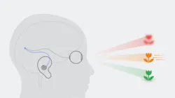
VoiceOver gives audible descriptions of onscreen content, helping people get information and navigate when they can’t see the screen. In visionOS, VoiceOver uses Spatial Audio to help communicate the location of accessible objects.
VoiceOver는 화면 콘텐츠에 대한 음성 설명을 제공하여 사람들이 화면을 볼 수 없을 때 정보를 얻고 탐색하는 데 도움이 됩니다. visionOS에서는 VoiceOver가 공간음향을 사용해 접근 가능한 요소들의 위치를 알려줍니다.

Important
When VoiceOver is on in visionOS, apps that define custom gestures don’t receive hand input by default. Instead, people can perform VoiceOver gestures to explore apps without worrying about an app interpreting their hand input. In VoiceOver’s Direct Gesture mode, VoiceOver doesn’t process its standard gestures, instead letting an app process hand input directly. For developer guidance, see Improving accessibility support in your visionOS app.
VisionOS에서 VoiceOver가 켜져 있는 경우 커스텀 제스처를 정의한 앱은 기본적으로 손의 입력을 받지 않습니다. 대신에 사람들은 손이 입력될 것을 걱정하지 않고 VoiceOver 제스처를 수행하여 앱을 탐색할 수 있습니다. VoiceOver의 직접 제스처 모드에서는 VoiceOver가 표준 제스처를 처리하지 않고 앱이 손 입력을 직접 처리하도록 합니다. 개발자 가이드는 Improving accessibility support in your visionOS app를 참고하세요.
Provide alternative descriptions for all images that convey meaning. If you don’t describe the meaningful images in your content, you prevent VoiceOver users from fully experiencing your app. To create a useful description, start by reporting what would be self-explanatory to someone who is able to see the image. Because VoiceOver reads the text surrounding the image and any captions, focus your description on information that’s conveyed by the image itself.
모든 의미있는 이미지에 대해 대체 설명을 제공하세요. 콘텐츠에서 의미 있는 이미지를 설명하지 않으면 VoiceOver 사용자가 앱을 완전히 경험하지 못하게 됩니다. 유용한 설명을 만들려면 이미지를 볼 수 있는 사람에게 설명할 내용을 알려주는 것으로 시작하세요. VoiceOver는 이미지와 캡션을 둘러싼 텍스트를 읽기 때문에 이미지 자체가 전달하는 정보에 설명을 집중하세요.
→ 이미지에 대체 음성 설명 제공을 꼭 하자.
역자 첨언
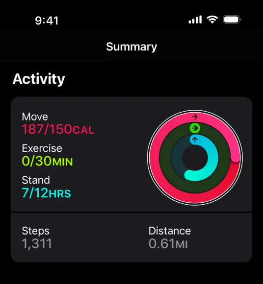
The alternative description for this element is “Moving: 125 percent; Exercise: zero percent; Standing: 58 percent.”
Make infographics fully accessible. Provide a concise description of the infographic that explains what it conveys. If people can interact with the infographic to get more or different information, you need to make these interactions available to VoiceOver users, too. The accessibility APIs provide ways to represent custom interactive elements so that assistive technologies can help people use them.
인포그래픽에 완전히 액세스할 수 있도록 하세요. 인포그래픽이 전달하는 내용을 설명하는 간결한 설명을 제공하세요. 사람들이 인포그래픽과 상호 작용하여 더 많거나 다른 정보를 얻을 수 있다면 VoiceOver 사용자도 이러한 상호 작용을 사용할 수 있도록 해야 합니다. 접근성 API는 보조 기술이 사람들이 사용하는 것을 도울 수 있도록 사용자 지정 대화형 요소를 나타내는 방법을 제공합니다.
→ 인포그래픽 또한 완전히 이해할 수 있게 해야 한다.
역자 첨언
When an image is purely decorative and isn't intended to communicate anything, hide it from assistive technologies. Making VoiceOver describe a purely decorative image can waste people’s time and add to their cognitive load without providing any benefit.
이미지가 순전히 장식적이고 어떤 것도 전달하기 위한 것이 아니라면 보조 기술로부터 숨기세요. VoiceOver가 순전히 장식적인 이미지를 묘사하도록 만드는 것은 사람들의 시간을 낭비하고 아무런 이점도 제공하지 않고 그들의 인지적 부담을 가중시킬 수 있습니다.
→ 데코를 위한 요소는 voiceover로부터 숨겨라
Give each screen a unique title and provide headings that identify sections in your information hierarchy. When people arrive on a screen, the title is the first piece of information they receive from an assistive technology. To help people understand the structure of your app, create a unique title for each screen that succinctly describes its contents or purpose. Similarly, people need accurate section headings to help them build a mental map of the information hierarchy of each screen.
각 화면에 고유한 제목을 지정하고 정보 계층에서 섹션을 식별하는 제목을 제공하세요. 제목은 사용자들이 화면에서 보조 기술로부터 받는 첫 번째 정보입니다. 사람들이 앱의 구조를 이해할 수 있도록 각 화면의 내용이나 용도를 간결하게 설명하는 고유한 제목을 만드세요. 마찬가지로, 사람들은 각 화면의 정보 계층 구조에 대한 정신적 지도를 구축하는 데 도움이 되는 정확한 섹션 제목이 필요합니다.
→ 보이스오버에서 뿐만 아니라 어떤 화면이든 유저가 “지금 내가 어떤 페이지에서 어떤 정보를 얻을 수 있는지”를 직관적으로 알게하는 것은 참 중요하다.
Help everyone enjoy your video and audio content. When you provide closed captions, audio descriptions, and transcripts, you can help people benefit from audio and video content in ways that work for them.
모든 사용자가 비디오 및 오디오 콘텐츠를 즐길 수 있도록 하세요. 자막, 오디오 설명 및 스크립트를 제공하면 사용자에게 적합한 방식으로 오디오 및 비디오 콘텐츠의 이점을 제공할 수 있습니다.
Closed captions give people a textual equivalent for the audible information in a video. You can also use closed captions to provide multiple translations for the same content, letting the system choose the version that matches the device’s current settings. Because closed captions aren’t always available, it’s important to provide subtitles, too.
폐쇄 자막은 사람들에게 비디오의 가청 정보와 동등한 텍스트를 제공합니다. 또한 폐쇄 캡션을 사용하여 동일한 콘텐츠에 대해 여러 개의 번역을 제공하여 시스템에서 장치의 현재 설정과 일치하는 버전을 선택할 수 있습니다. 자막을 항상 사용할 수 있는 것은 아니므로 자막을 제공하는 것도 중요합니다.
Audio descriptions provide a spoken narration of important information that’s presented only visually.
오디오 설명은 시각적으로만 표시되는 중요한 정보의 음성 나레이션을 제공합니다.
A transcript provides a complete textual description of a video, covering both audible and visual information, so that people can enjoy the video in different ways.
녹취록은 사람들이 다양한 방법으로 비디오를 즐길 수 있도록 청각 및 시각 정보를 모두 포함하는 비디오에 대한 완전한 텍스트 설명을 제공합니다.
→ 비디오나 오디오 콘텐츠 또한 잘 전달할 수 있도록 완전한 설명 및 스크립트를 제공하라.
Make sure VoiceOver users can navigate to every element. VoiceOver uses accessibility information from onscreen elements to help people understand the location of each element and what it can do. System-provided UI components include this accessibility information by default, but VoiceOver can’t help people discover and use custom elements unless you provide the information. For developer guidance, see Accessibility modifiers.
VoiceOver 사용자가 모든 요소를 탐색할 수 있는지 확인하세요. VoiceOver는 화면 요소의 접근성 정보를 사용하여 사람들이 각 요소의 위치와 수행할 수 있는 작업을 이해하는 데 도움을 줍니다. 시스템에서 제공하는 UI 구성 요소에는 기본적으로 이러한 접근성 정보가 포함되어 있지만 VoiceOver는 사용자가 정보를 제공하지 않는 한 사용자 정의 요소를 검색하고 사용하는 데 도움을 줄 수 없습니다. 개발자 가이드는 Accessibility modifiers를 참고하세요.
→ 정보 전달이 필요한 모든 요소가 VoiceOver 사용자에게 도달할 수 있도록 꼼꼼히 체크해라.
Improve the VoiceOver experience by specifying how elements should be grouped, ordered, or linked. Proximity, alignment, and other contextual cues can help sighted people perceive the relationships among onscreen elements, but these cues don’t work well for VoiceOver users. Examine your app for places where relationships among elements are visual only, and describe these relationships to VoiceOver.
요소들를 그룹화, 정렬 또는 연결하는 방법을 지정하여 VoiceOver 경험을 향상시키세요. 근접성, 정렬 및 기타 상황 별 단서는 사람들이 화면 요소 간의 관계를 인식하는 데 도움이 될 수 있지만 VoiceOver 사용자에게는 잘 작동하지 않습니다. 앱에서 요소 간의 관계가 시각적으로만 표시되는 곳을 확인하고 이러한 관계를 VoiceOver에 설명하세요.
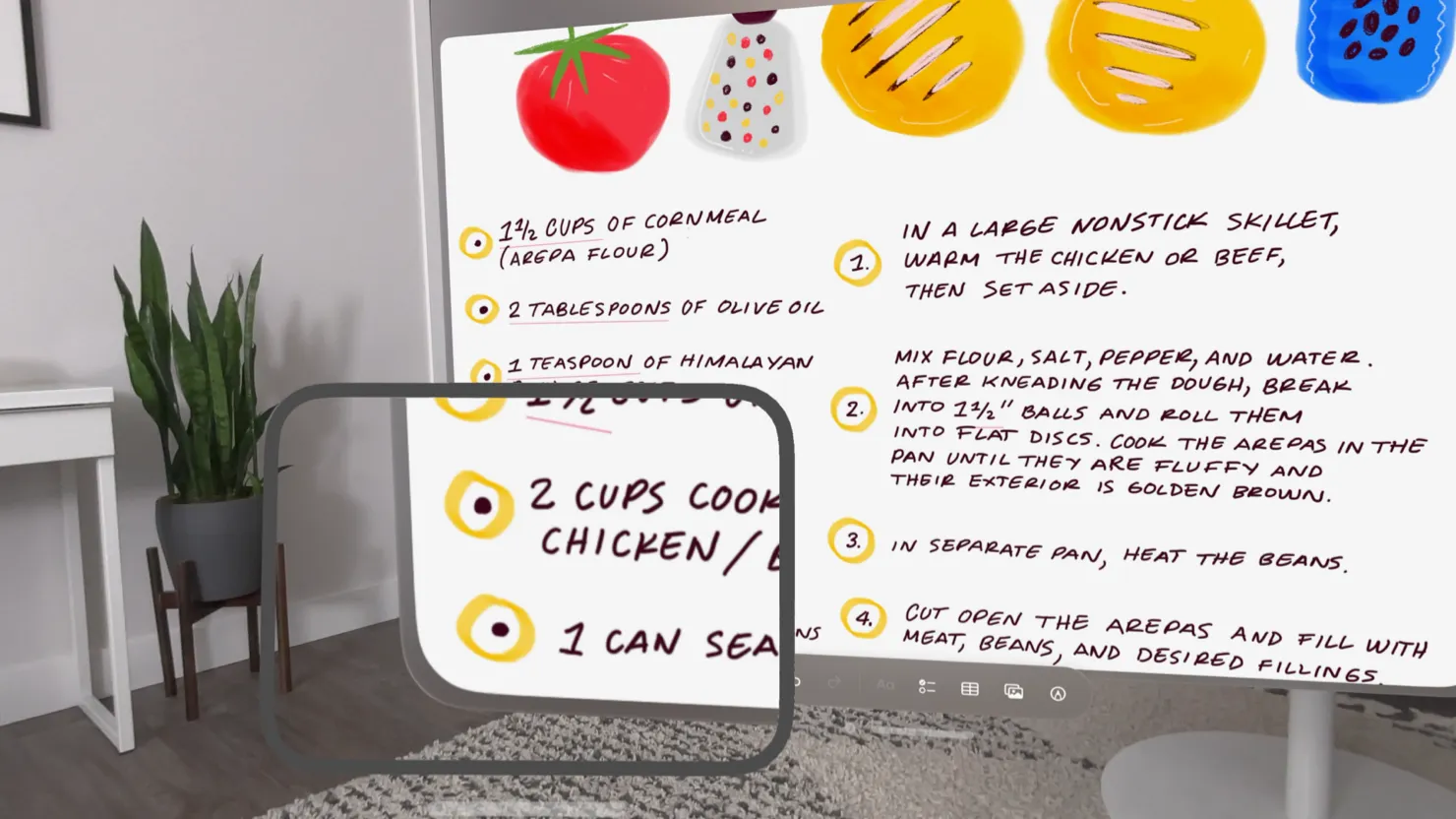
For example, the layout below relies on proximity and centering to imply that each phrase is a caption for the image above it. However, if you don’t tell VoiceOver that each image should be grouped with its phrase, VoiceOver reads, “A large container holding a variety of mangoes. A large container holding many green artichokes. Mangoes come from trees that belong to the genus Mangifera. Artichokes come from a variety of a species of thistle.” This happens because VoiceOver reads elements from top to bottom by default. For developer guidance, see shouldGroupAccessibilityChildren and accessibilityTitleUIElement.
예를 들어, 아래 레이아웃은 각 설명이 그 위에 있는 이미지에 대한 캡션임을 암시하기 위해 근접성과 중앙 배치에 의존합니다. 그러나 각 이미지를 문구로 그룹화해야 한다고 VoiceOver에 지시하지 않으면 VoiceOver는 “다양한 망고가 들어 있는 큰 컨테이너. 많은 녹색 아티초크가 들어 있는 큰 용기. 망고는 Mangifera 속에 속하는 나무에서 나옵니다. 아티초크는 다양한 엉겅퀴 종에서 나옵니다.” 라고 읽습니다. 이는 VoiceOver가 기본적으로 위에서 아래로 요소를 읽기 때문에 발생합니다. 개발자 가이드는 shouldGroupAccessibilityChildren 와accessibilityTitleUIElement를 참고하세요.
→ 관련성이 있는 요소들은 그룹화하여 제공하자.

Tell VoiceOver when onscreen content or layout changes. An unexpected change in content or layout can be very confusing to VoiceOver users, because it means that their mental map of the screen is no longer accurate. It’s crucial to report onscreen changes so that VoiceOver and other assistive technologies can help people update their understanding of the screen. For developer guidance, see UIAccessibility.Notification (UIKit) or NSAccessibility.Notification (AppKit).
화면 콘텐츠나 레이아웃이 변경되면 VoiceOver에게 알려주세요. 콘텐츠나 레이아웃이 예기치 않게 변경되면 VoiceOver 사용자는 화면의 정신 지도가 더 이상 정확하지 않기 때문에 매우 혼란스러울 수 있습니다. VoiceOver 및 기타 보조 기술이 사람들이 화면에 대한 이해를 업데이트하는 데 도움이 되도록 화면 변경 사항을 보고하는 것이 중요합니다. 개발자 가이드는 UIAccessibility.Notification (UIKit) 또는 NSAccessibility.Notification (AppKit)를 참고하세요.
Help people predict when a control opens a different webpage or app. An unexpected change in context can cause confusion and require people to suddenly rebuild their mental model of the onscreen environment. One way to draw attention to a potential change in context is append an ellipsis to a button’s title. Throughout the system, an ellipsis trailing the title is the standard way for a button to communicate that it opens another window or view in which people can complete the action. For example, Mail in iOS and iPadOS appends an ellipsis to the Move Message button, signaling that a separate view opens, listing the destinations people can choose.
다른 웹 페이지나 앱을 여는 컨트롤들을 예측할 수 있도록 도와주세요. 문맥의 예기치 않은 변화는 혼란을 야기할 수 있고 사람들이 갑자기 화면 환경에 대한 그들의 멘탈 모델을 재구축해야 합니다. 문맥의 잠재적 변화에 주의를 끄는 한 가지 방법은 버튼 제목에 줄임표를 추가하는 것입니다. 시스템 전체에서 줄임표는 버튼이 다른 창이나 보기를 열어 사람들이 작업을 완료할 수 있도록 전달하는 표준 방법입니다. 예를 들어 iOS와 iPadOS의 메일 앱은 메시지 이동 버튼에 줄임표를 추가하여 사람들이 선택할 수 있는 목적지를 나열하는 별도의 보기가 열리는 것을 알립니다.
Provide alternative text labels for all important interface elements. Alternative text labels aren’t visible onscreen, but they let VoiceOver audibly describe onscreen elements, making navigation easier for people with visual disabilities. System-provided controls have useful labels by default, but you need to create labels for custom elements. For example, if you create an accessibility element that represents a custom rating button, you might supply the label “Rate.”
모든 중요한 인터페이스 요소에 대해 대체 텍스트 레이블을 제공하세요. 대체 텍스트 레이블은 화면에 표시되지 않지만 VoiceOver가 화면 요소를 청각적으로 설명해 시각장애가 있는 사람들이 쉽게 탐색할 수 있습니다. 시스템에서 제공하는 컨트롤에는 기본적으로 유용한 레이블이 있지만 커스텀 요소에 대한 레이블은 따로 작성해야 합니다. 예를 들어 커스텀 등급 버튼을 나타내는 접근성 요소를 작성하는 경우 ”등급” 레이블을 제공할 수 있습니다.
Support the VoiceOver rotor when necessary. VoiceOver users can use an onscreen control called the rotor to navigate a document or webpage by headings, links, or other section types. The rotor can also bring up the braille keyboard. You can help VoiceOver users navigate among related items in your app by identifying these items to the rotor. For developer guidance, see UIAccessibilityCustomRotor and NSAccessibilityCustomRotor.
필요한 경우 VoiceOver 로터를 지원하세요. VoiceOver 사용자는 제목, 링크 또는 다른 섹션 유형으로 문서 또는 웹 페이지를 탐색하기 위해 회 전자라는 화면 제어를 사용할 수 있습니다. 로터는 점자 키보드를 들어올릴 수도 있다. VoiceOver 사용자가 회 전자에 이러한 항목을 식별하여 앱의 관련 항목을 탐색하는 데 도움을 줄 수 있습니다. 개발자 가이드는 UIAccessibilityCustomRotor 와 NSAccessibilityCustomRotor를 참고하세요.
역자 첨언
In iPadOS and macOS, make sure people can use the keyboard to navigate and interact with all onscreen components in your app. Ideally, people can turn on Full Keyboard Access and perform every task in your experience using only the keyboard. In addition to accessibility keyboard shortcuts, the system defines a large number of other keyboard shortcuts that many people use all the time. To support all users, it’s important to avoid overriding any system-defined keyboard shortcuts in your app. For guidance, see Keyboards.
iPadOS 및 macOS에서, 사용자가 키보드를 사용하여 앱의 모든 화면 구성 요소를 탐색하고 상호 작용할 수 있는지 확인하세요. 전체 키보드 액세스를 설정하고 키보드만 사용하여 사용자 환경의 모든 작업을 수행할 수 있는 것이 이상적입니다. 접근성 키보드 단축키 외에도, 시스템은 많은 사람들이 항상 사용하는 많은 다른 키보드 단축키를 정의합니다. 모든 사용자를 지원하려면 앱에서 시스템 정의 키보드 단축키를 재정의하지 않는 것이 중요합니다. 자세한 내용은 Keyboards를 참조하세요.
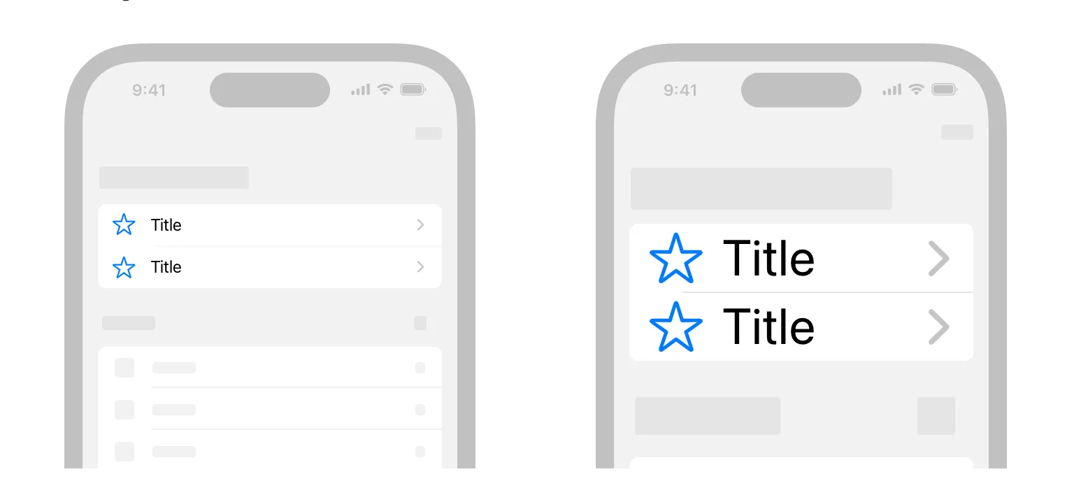
In iOS, iPadOS, tvOS, and watchOS, use Dynamic Type and test that your app’s layout adapts to all font sizes. Dynamic Type lets people pick the font size that works for them. Verify that your design can scale and that both text and glyphs are legible at all font sizes. On iPhone or iPad, for example, turn on Larger Accessibility Text Sizes in Settings > Accessibility > Display & Text Size > Larger Text, and make sure your app remains comfortably readable. You can download the Dynamic Type size tables in the Sketch, Photoshop, and Adobe XD Apple Design Resources for each platform.
iOS, iPadOS, tvOS 및 watchOS에서 앱의 레이아웃이 모든 글꼴 크기에 맞게 조정되도록 동적 타입을 사용하고 테스트하세요. 동적 타입을 사용하면 사용자가 자신에게 적합한 글꼴 크기를 선택할 수 있습니다. 앱 디자인에서 축척이 가능하고 텍스트와 문자가 모두 모든 글꼴 크기에서 읽을 수 있는지 확인합니다. 예를 들어, iPhone 또는 iPad의 경우, 설정 > 접근성 > 디스플레이 및 텍스트 크기 > 더 큰 텍스트에서 내게 필요한 옵션 텍스트 크기를 설정하고 앱을 편안하게 읽을 수 있도록 합니다. Dynamic Type 크기 표는 각 플랫폼의 Sketch, Photoshop 및 Adobe XD의 Apple Design Resources에서 다운로드할 수 있습니다.
위의 설명처럼, 설정에서 텍스트 크기를 조절하였을 경우 나오는 화면
역자 첨언
As font size increases, keep text truncation to a minimum. In general, aim to display as much useful text in the largest accessibility font size as you do in the largest standard font size. Avoid truncating text in scrollable regions unless people can open a separate view to read the rest of the content. You can prevent text truncation in a label by configuring it to use as many lines as needed to display a useful amount of text; for developer guidance, see numberOfLines.
글꼴 크기가 증가할 때 생략되는 텍스트를 최소화하세요. 일반적으로 가장 큰 표준 글꼴 크기에서와 마찬가지로 가장 큰 접근성 글꼴 크기에 유용한 텍스트를 표시하는 것을 목표로 합니다. 사용자가 별도의 보기를 열어 나머지 내용을 읽을 수 없는 경우에는 스크롤 가능한 영역에서 텍스트를 잘라내지 마세요. 유용한 양의 텍스트를 표시하는 데 필요한 만큼의 행을 사용하도록 레이블을 구성하여 레이블의 텍스트 잘라내기를 방지할 수 있습니다. 개발자 가이드는 numberOfLines를 참고하세요.
역자 첨언
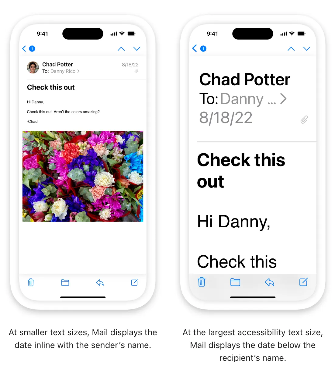
Consider adjusting layout at large font sizes. When font size increases, inline items and container boundaries can crowd text, making it less readable. For example, if you display text inline with secondary items — such as glyphs or timestamps — the text has less horizontal space. At large font sizes, an inline layout might cause text to truncate or result in overlapping text and secondary items. In this case, consider using a stacked layout where the text appears above the secondary items. Similarly, multiple columns of text can become less readable at large font sizes because each column constrains horizontal space. In this case, consider reducing the number of columns when font size increases to avoid text truncation and improve overall readability. For developer guidance, see isAccessibilityCategory.
큰 글꼴 크기에서는 레이아웃을 조정하는 것이 좋습니다. 글꼴 크기가 증가하면 인라인 항목과 컨테이너 경계가 텍스트를 군집화하여 읽을 수 없게 됩니다. 예를 들어, 문자나 타임스탬프와 같은 보조 항목에 줄을 맞춰 텍스트를 표시하는 경우 텍스트의 수평 공간이 줄어듭니다. 글꼴 크기가 크면 인라인 레이아웃으로 인해 텍스트가 잘리거나 텍스트 및 보조 항목이 겹칠 수 있습니다. 이 경우 텍스트가 보조 항목 위에 나타나는 스택형 레이아웃을 사용하는 것이 좋습니다. 마찬가지로, 각 열이 수평 공간을 제한하기 때문에 큰 글꼴 크기에서 텍스트의 여러 열을 읽을 수 없습니다. 이 경우 텍스트 잘림을 방지하고 전체 가독성을 향상시키기 위해 글꼴 크기가 증가할 때 열 수를 줄이는 것이 좋습니다. 개발자 가이드는 isAccessibilityCategory를 참조하세요.
Increase the size of meaningful interface icons as font size increases. If you use interface icons to communicate important information, make sure they are easy to view at larger font sizes, too. When you use SF Symbols, you get icons that scale automatically with Dynamic Type size changes.
글꼴 크기가 증가함에 따라 의미 있는 인터페이스 아이콘의 크기를 늘리세요. 중요한 정보를 전달하기 위해 인터페이스 아이콘을 사용하는 경우, 더 큰 글꼴 크기에서도 쉽게 볼 수 있도록 하세요. SF Symbols를 사용하면 동적 유형 크기가 변경되어 자동으로 확장되는 아이콘이 나타납니다.
Maintain a consistent information hierarchy regardless of the current font size. For example, keep primary elements toward the top of the screen even when the font size is very large, so that people don’t lose track of these elements.
현재 글꼴 크기에 관계없이 일관된 정보 계층을 유지하세요. 예를 들어 글꼴 크기가 매우 큰 경우에도 기본 요소를 화면 맨 위로 유지하여 사용자가 이러한 요소를 추적하지 않도록 합니다.
Prefer regular or heavy font weights in your app. Consider using Regular, Medium, Semibold, or Bold font weights, because they are easier to see. Avoid Ultralight, Thin, and Light font weights, which can be more difficult to see.
앱에서 일반 또는 무거운 글꼴 가중치를 선호하세요. 일반, 중간, 세미볼드 또는 굵은 글꼴 가중치를 사용하는 것이 더 보기 쉽기 때문에 고려해 보세요. 보기가 더 어려울 수 있는 초경량, 얇은 및 가벼운 글꼴 가중치는 피하는 것이 좋습니다.
Ensure your app responds correctly and looks good when people enable bold text. In iOS, iPadOS, tvOS, and watchOS, people turn on the bold text accessibility setting to make text and symbols easier to see. In response, your app should make all text bolder and give all glyphs an increased stroke weight. The system fonts and SF symbols automatically adjust to the bold text accessibility setting.
사람들이 굵은 텍스트를 사용할 때 앱이 올바르게 작동하고 잘 나타나는지 확인하세요. iOS, iPadOS, tvOS, watchOS에서 사용자들은 텍스트와 기호를 더 쉽게 볼 수 있도록 굵은 텍스트 접근성 설정을 활성화합니다. 여러분의 앱은 이에 대응하여 모든 텍스트를 더 굵게 만들고 모든 글리프에 스트로크 가중치를 증가시켜야 합니다. 시스템 글꼴과 SF 기호는 굵은 텍스트 접근성 설정에 자동으로 조정됩니다.
Make sure custom fonts are legible. Custom typefaces can sometimes be difficult to read. Unless your app has a compelling need for a custom font, such as for branding purposes or to create an immersive gaming experience, it’s usually best to use the system fonts. If you do use a custom font, make sure it’s easy to read, even at small sizes.
커스텀 글꼴을 읽을 수 있는지 확인하세요. 사용자 정의 글꼴은 때때로 읽기 어려울 수 있습니다. 브랜딩 목적이나 몰입형 게임 환경과 같은 사용자 지정 글꼴이 앱에 강제적으로 필요한 경우가 아니라면 일반적으로 시스템 글꼴을 사용하는 것이 가장 좋습니다. 사용자 지정 글꼴을 사용하는 경우 작은 크기에서도 쉽게 읽을 수 있는지 확인하세요.
Avoid full text justification. The whitespace created by fully justified text can create patterns that make it difficult for many people to read and focus on the text. Left justification — or right justification in right-to-left languages — provides a framing reference for people with learning and literacy challenges, such as dyslexia.
텍스트를 모두 정렬하는 것은 피하세요. 완전 정렬된 텍스트에 의해 만들어진 공백은 많은 사람들이 텍스트를 읽고 집중하기 어렵게 만드는 패턴을 만들 수 있습니다. 왼쪽 정렬(또는 right-to-left 언어의 오른쪽 정렬)은 난독증과 같은 학습 및 읽기 능력 문제가 있는 사람들에게 프레임 참조를 제공합니다.
역자 첨언
Avoid using italics or all caps for long passages of text. Italics and all caps are great for occasional emphasis, but overuse of these styles makes text hard to read.
텍스트의 긴 구절에는 기울임꼴 또는 모두 대문자를 사용하지 마세요. 이탤릭체와 모든 대문자는 때때로 강조할 때 유용하지만, 이러한 스타일을 과도하게 사용하면 텍스트를 읽기가 어렵습니다.
Don’t rely solely on color to differentiate between objects or communicate important information. If you use color to convey information, be sure to provide text labels or glyph shapes to help everyone perceive it.
사물을 구별하거나 중요한 정보를 전달하기 위해 색상에만 의존하지 마세요. 만약 여러분이 정보를 전달하기 위해 색을 사용한다면, 모든 사람들이 그것을 인식할 수 있도록 텍스트 라벨이나 글리프 모양을 제공해야 합니다.
Prefer system colors for text. When you use system colors in text, it responds correctly to accessibility settings such as Invert Colors and Increase Contrast.
텍스트에 대한 시스템 색상을 선호하세요. 텍스트에서 시스템 색을 사용하면 색 반전 및 대비 증가와 같은 접근성 설정에 올바르게 응답합니다.
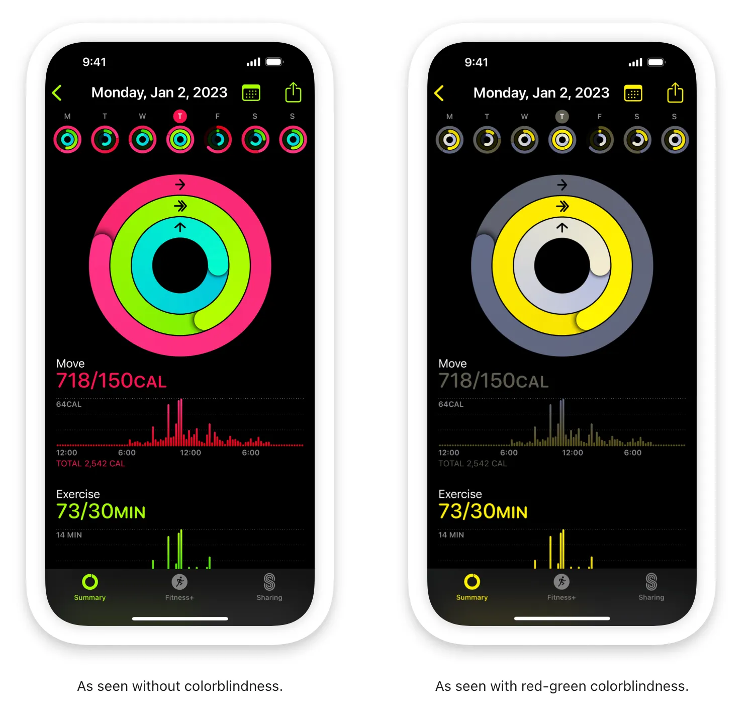
Avoid using color combinations as the only way to distinguish between two states or values. Many colorblind people find it difficult to distinguish blue from orange; other problematic combinations are red and green, red and black, and either red or green combined with gray. When it makes sense to use a combination of colors to communicate states or values, include additional visual indicators so everyone can perceive the information. For example, instead of using red and green circles to indicate offline and online, you could use a red square and a green circle. Some image-editing software includes tools that can help you proof for colorblindness.
두 상태 또는 값을 구별하는 유일한 방법으로 색상 조합을 사용하지 않도록 하세요. 많은 색맹인 사람들은 파란색과 주황색을 구별하는 것을 어려워합니다. 다른 문제가 되는 조합은 빨강과 초록, 빨강과 검정, 그리고 빨강과 초록이 회색과 결합된 것입니다. 상태나 값을 전달하기 위해 색상 조합을 사용하는 것이 타당할 경우, 모든 사람이 정보를 인식할 수 있도록 추가 시각적 표시기를 포함합니다. 예를 들어 빨간색과 녹색 원을 사용하여 오프라인 및 온라인을 표시하는 대신 빨간색 사각형과 녹색 원을 사용할 수 있습니다. 일부 이미지 편집 소프트웨어에는 색맹을 방지하는 데 도움이 되는 도구가 포함되어 있습니다.
Ensure your views respond correctly to Invert Colors. People can turn on Invert Colors when they prefer to view items on a dark background. In the Smart Invert mode of Invert Colors, images, video, and full-color icons (such as app icons and nontemplate images) don’t invert, and dark UI stays dark. Test your app or game to find places where you might need to prevent an image — like a photo in a custom view — from inverting.
화면이 색상 반전에 올바르게 반응하는지 확인하세요. 어두운 배경의 항목을 보는 것을 선호할 때 색 반전을 설정할 수 있습니다. 색상 반전의 스마트 반전 모드에서는 이미지, 비디오 및 전체 색상 아이콘(예를 들어 앱 아이콘 및 템플릿이 아닌 이미지)이 반전되지 않고 어두운 UI가 어둡게 유지됩니다. 앱이나 게임을 테스트하여 커스텀 뷰의 사진과 같이 이미지가 반전되지 않도록 해야 할 곳을 찾으세요.
Use strongly contrasting colors to improve readability. Many factors affect the perception of color, including font size and weight, color brightness, screen resolution, and lighting conditions. When you increase color contrast of visual elements like text, glyphs, and controls, you can help more people use your app in more situations. To find out if the contrast of adjacent colors in your UI meets minimum acceptable levels, you can use Xcode’s Accessibility Inspector or an online color calculator based on the Web Content Accessibility Guidelines (WCAG) color contrast formula. In general, smaller or lighter-weight text needs to have greater contrast to be legible. Use the following values for guidance.
가독성을 향상시키려면 강하게 대비되는 색상을 사용하세요. 글꼴 크기와 무게, 색 밝기, 화면 해상도 및 조명 조건을 포함하여 많은 요소가 색상 인식에 영향을 미칩니다. 텍스트, 글리프 및 컨트롤과 같은 시각적 요소의 색상 대비를 늘리면 더 많은 사람이 더 많은 상황에서 앱을 사용할 수 있도록 도와줄 수 있습니다. UI의 인접 색상 대비가 허용 가능한 최소 수준을 충족하는지 확인하려면 Xcode의 접근성 검사기 또는 Web Content Accessibility Guidelines (WCAG)의 색상 대비 공식을 기반으로 하는 온라인 색 계산기를 사용할 수 있습니다. 일반적으로 더 작거나 가벼운 텍스트는 읽기 쉽도록 대비가 더 커야 한다. 지침으로 다음 값을 사용하세요.
Text size | Text weight | Minimum contrast ratio |
Up to 17 points | All | 4.5:1 |
18 points and larger | All | 3:1 |
All | Bold | 3:1 |
Change blurring and transparency when people turn on Reduce Transparency. For example, make areas of blurred content and translucency mostly opaque. For best results, use a color value in the opaque area that’s different from the original color value you used when the area was blurred or translucent.
투명도 줄이기를 활성화했을 때 흐림 및 투명도를 변경하세요. 예를 들어, 흐린 콘텐츠 및 투명한 부분을 대부분 불투명하게 만드세요. 최상의 결과를 얻으려면 불투명 영역에 사용하는 색상 값은 해당 영역이 흐리거나 투명할 때 사용한 원래 색상 값과 다르게 설정하세요.
Avoid requiring animations unless they’re essential for your experience. In general, let people use your app without relying on any animations.
사용자 경험에 필수적인 애니메이션이 아닌 경우 애니메이션을 요구하지 마세요. 일반적으로, 사람들이 애니메이션에 의존하지 않고 당신의 앱을 사용하도록 하세요.
Play tightened animations when Reduce Motion is on. People can turn on Reduce Motion if they tend to get distracted or experience dizziness or nausea when viewing animations that include effects such as zooming, scaling, spinning, or peripheral motion. In response to this setting, you need to turn off or reduce animations that are known to cause problems (to learn more, see Responsive design for motion). If you use a problematic animation to communicate important information, consider designing a non animated alternative or tightening the physics of the animation to reduce its motion.
동작 줄이기가 켜져 있을 때 축소된 애니메이션을 재생하세요. 줌, 스케일링, 회전 또는 주변 움직임과 같은 효과가 포함된 애니메이션을 볼 때 주의가 산만해지거나 어지러움 또는 메스꺼움을 경험하는 경향이 있는 경우 동작 줄이기를 설정할 수 있습니다. 이 설정에 따라 문제를 일으키는 것으로 알려진 애니메이션을 끄거나 줄여야 합니다(자세한 내용은 Responsive design for motion 을 참고하세요.). 문제가 있는 애니메이션을 사용하여 중요한 정보를 전달하는 경우 애니메이션이 아닌 대안을 설계하거나 애니메이션의 물리적인 움직임을 줄이기 위해 애니메이션의 동작을 줄이는 것을 고려하세요.
For example:
예를 들어:
•
Tighten springs to reduce bounce effects or track 1:1 with the user’s finger
•
스프링을 조여 바운스 효과를 줄이거나 사용자의 손가락으로 1:1 트랙을 돌립니다
•
Avoid animating depth changes in z-axis layers
•
z축 레이어에서 애니메이션 심도 변경은 피하세요.
•
Avoid animating into or out of blurs
•
블러 안팎으로 애니메이션을 적용하지 마십시오.
•
Replace a slide with a fade to avoid motion
•
움직임을 방지하기 위해 슬라이드를 페이드로 바꿉니다
역자첨언
Let people control video and other motion effects. Avoid autoplaying video or effects without also providing a button or other way to control them.
사람들이 비디오 및 기타 모션 효과를 제어할 수 있도록 합니다. 비디오 또는 효과를 제어하는 버튼이나 다른 방법을 제공하지 않고 자동으로 재생하지 마십시오.
Be cautious when displaying moving or blinking elements. Although subtle movement and blinking can draw people’s attention, these effects can also be distracting and they aren’t useful for people with visual disabilities. Worse, some blinking elements can cause epileptic episodes. In all cases, avoid using movement and blinking as the only way to convey information.
움직이거나 깜박이는 요소를 표시할 때는 주의하세요. 미묘한 움직임과 깜빡임은 사람들의 주의를 끌 수 있지만, 이러한 효과는 또한 주의를 산만하게 할 수 있고 시각 장애가 있는 사람들에게는 유용하지 않습니다. 더 최악으로는, 일부 깜빡이는 요소들이 간질 발작을 일으킬 수 있습니다. 모든 경우에 정보를 전달하는 유일한 방법으로 움직임과 깜박임을 사용하지 마세요.
For additional guidance on helping people remain comfortable while they experience motion in your visionOS app, see Motion > visionOS. For developer guidance, see Improving accessibility support in your visionOS app.
visionOS 앱에서 사용자들에게 편안한 모션을 제공하기 위한 추가적인 가이드는 Motion > visionOS를 참고하세요. 개발자 가이드는 Improving accessibility support in your visionOS app를 참고하세요.
No additional considerations for iOS, iPadOS, macOS, tvOS, or watchOS.
iOS, iPadOS, macOS, tvOS 또는 watchOS에 대한 추가 고려 사항은 없습니다.
Avoid anchoring content to the wearer’s head. In addition to making people feel stuck or confined, anchoring content to their head can prevent someone from using Pointer Control to interact with that content. Head-anchored content can also prevent people with low vision from reading it because they can’t move closer to it or position the content inside the Zoom lens.
사용자의 머리에 컨텐츠를 고정시키는 것을 지양하세요. 사용자가 갇힌 느낌이나 제한된 느낌을 받을 뿐만 아니라, 머리에 컨텐츠를 고정하는 것은 상호 작용을 위한 포인터를 사용하는 데 제한을 줄 수 있습니다. 또한 머리에 고정된 컨텐츠는 시력이 낮은 사람들이 해당 컨텐츠를 읽을 수 없게 만들 수 있습니다. 그들은 해당 컨텐츠에 더 가까이 다가가거나 줌 렌즈 내부에 컨텐츠를 배치할 수 없기 때문입니다.
Pointer control - hand
Pointer control - head
Zoom lens
Accessibility modifiers — SwiftUI
Accessibility for UIKit — UIKit
Accessibility for AppKit — AppKit
Change log
작성 날짜 | 작성자 | 수정사항 |
2023/06/07 | 하니 | 초기 번역 |
2023/12/22 | 하니 | visionOS 내용 추가 |
2023/12/29 | 디온 | visionOS 내용 추가 |
2024/1/1 | 하니 | 배포 |