
Color
Judicious use of color can enhance communication, evoke your brand, provide visual continuity, communicate status and feedback, and help people understand information.
색상을 적절하게 사용하면 사용자와의 원활한 커뮤니케이션과 브랜드를 부각할 수 있으며, 사용자에게 시각적 연속성과 상태 및 피드백을 전달하는 등 사용자들이 정보를 이해하는 데 도움을 줄 수 있습니다.

The system defines colors that look good on various backgrounds and appearance modes, and can automatically adapt to vibrancy and accessibility settings. People are familiar with the system colors, and using them is a convenient way to make your experience feel at home on the device.
시스템은 다양한 환경에서 잘 보이는 색상을 보여주며, 자동으로 생동감과 사용자에게 접근성이 좋은 색상을 보여줍니다. 사람들은 시스템이 보여주는 색상에 익숙하기 때문에 시스템 색상을 사용하는 것이 좋습니다.
You may also want to use custom colors to enhance the visual experience of your app or game and express its unique personality. The following guidelines can help you use color in ways that people appreciate, regardless of whether you use system-defined or custom colors.
또한 커스텀 색상을 사용하여 앱 또는 게임의 시각적 경험을 향상하고, 앱의 고유한 개성을 표현할 수도 있습니다. 이번 Color HIG를 통해 개발자, 디자이너들은 사람들에게 만족을 줄 수 있는 색상을 선택하는데 도움을 줄 수 있습니다.
Use color sparingly in nongame apps. In a nongame app, overuse of color can make communication less clear and can be distracting. Prefer using touches of color to call attention to important information or show the relationship between parts of the interface.
게임이 아닌 앱에서는 색상을 보조로 사용하는 것이 좋습니다. 게임이 아닌 일반적인 앱에서 색상을 과하게 사용하면 의미 전달이 잘 되지 않고 주의가 산만해질 수 있습니다. 중요한 정보에 사용자들이 집중할 수 있거나 인터페이스 간의 관계를 나타내기 위해 색상을 사용하는 것이 좋습니다.
→ 게임이 아닌 앱에서는 색상 사용에 특히 더 유의함.
Avoid using the same color to mean different things. Use color consistently throughout your interface, especially when you use it to help communicate information like status or interactivity. For example, an app might use blue to indicate that people can tap text to view more. Even when the app communicates interactivity using a visual indicator that doesn’t rely on color — such as a chevron or arrow icon — using a color other than blue for the interactive text is confusing.
동일한 색상을 다른 의미로 사용하면 안 됩니다. 인터페이스 전체에서 일관되게 색상을 사용하세요. 특히 상태나 중요한 정보를 사용자에게 전달하는 데 색상을 일관되게 사용하는 것이 좋습니다. 예를 들어 파란색 텍스트를 사람들에게 보여주면 이 텍스트를 탭 하여 다른 화면(View)을 더 볼 수 있다는 것을 간접적으로 알려줄 수 있습니다. 앱이 시각적 형태(예: 갈매기 모양 또는 화살표 아이콘)를 사용하여 전달하는 경우에도 파란색 이외의 색상을 사용하게 되면 사람들이 혼란을 느낄 수 있습니다.
Make sure your app’s colors work well in both light and dark appearance modes. With the exception of watchOS, which always uses a pure black background, the platforms offer a dark alternative to the default light appearance. Dark Mode uses a darker color palette for all screens, views, menus, and controls, and can increase vibrancy — a subtle effect that dynamically blends foreground and background colors — to make foreground content stand out against darker backgrounds. System colors automatically support both appearances; if you use a custom color, you need to supply both light and dark variants. For guidance, see Dark Mode.
앱의 색상이 라이트 모드와 다크 모드에 둘 다 잘 적용되는지 확인하세요. 항상 검은색 배경을 사용하는 watchOS를 제외하고 플랫폼은 라이트 모드 외에도 다크 모드를 제공합니다. 다크 모드는 모든 화면, 보기, 메뉴 및 컨트롤에 더 어두운 색상 팔레트를 사용하며 전경색과 배경색을 혼합해 생동감을 높여 전경 콘텐츠가 더 어두운 배경에 비해 눈에 띄게 만들 수 있습니다. 시스템 색상은 자동으로 두 가지 모드에서의 적절한 색을 모두 지원합니다. 커스텀 색상을 사용하는 경우 라이트 모드와 다크 모드에 맞춰 잘 어울리는 색상 팔레트를 모두 제공해야 합니다. 가이드라인은 Dark Mode를 참고하세요.
Test your app’s color scheme under a variety of lighting conditions. Colors can look different when you run your app outside on a sunny day or in dim light. Adjust colors to provide an optimal viewing experience in the majority of use cases.
다양한 조명 조건에서 앱의 색상을 테스트하세요. 화창한 날 야외에서 또는 어두운 조명에서 앱을 실행하면 색상이 다르게 보일 수 있습니다.
Test your app on devices with different displays. For example, the True Tone display — available on certain iPhone, iPad, and Mac models — uses ambient light sensors to automatically adjust the white point of the display to adapt to the lighting conditions of the current environment. Apps that focus primarily on reading, photos, video, and gaming can strengthen or weaken this effect by specifying a white point adaptivity style (for developer guidance, see UIWhitePointAdaptivityStyle). Test tvOS apps on multiple brands of HD and 4K TVs, and with different display settings. You can also test the appearance of your app using different color profiles on a Mac — such as P3 and Standard RGB (sRGB) — by choosing a profile in System Settings > Displays. For guidance, see Color management.
다양한 디스플레이가 있는 기기에서 앱을 테스트하세요. 예를 들어, 특정 iPhone, iPad 및 Mac 모델에서 사용 가능한 True Tone 디스플레이는 주변광 센서를 사용하여 디스플레이의 화이트 포인트를 자동으로 조정하여 맞춥니다. 이렇듯 소설, 사진, 비디오 및 게임 등의 앱은 다양한 디스플레이 설정을 사용하여 tvOS 앱을 여러 브랜드의 HD 및 4K TV에서 테스트를 할 수 있습니다. (개발자 가이드라인은 UIWhitePointAdaptivityStyle을 참고하세요) 시스템 설정 > 디스플레이에서 프로필을 선택하여 Mac에서 P3 및 표준 RGB(sRGB)와 같은 다양한 색상 프로필을 사용하여 앱을 테스트할 수도 있습니다. Color management을 참고하세요.
Consider how artwork and translucency affect nearby colors. Variations in artwork sometimes warrant changes to nearby colors to maintain visual continuity and prevent interface elements from becoming overpowering or underwhelming. Maps, for example, displays a light color scheme when in map mode but switches to a dark color scheme when in satellite mode. Colors can also appear different when placed behind or applied to a translucent element like a toolbar.
삽화와 반투명도가 주변 색상에 어떤 영향을 미치는지 고려하세요. 삽화의 변형으로 인해 주변 색상이 변경되는 경우가 있습니다. 사용자의 시각 연속성을 유지하고, 인터페이스의 요소가 너무 부각되지 않게 하는 것이 좋습니다. 예를 들어 지도는 지도 모드에서 밝은 색상을 보여주지만, 위성 모드에서는 어두운 색상으로 전환합니다. 색상은 툴 바(toolbar)와 같은 반투명 요소 뒤에 배치되거나 적용될 때 다르게 나타날 수도 있습니다.
If your app lets people choose colors, prefer system-provided color controls where available. Using built-in color pickers provides a consistent user experience, in addition to letting people save a set of colors they can access from any app. For developer guidance, see NSColorPanel (macOS), and UIColorWell and UIColorPickerViewController (iOS, iPadOS, and Mac Catalyst).
앱에서 사람들이 색상을 선택할 수 있다면 가능한 시스템에서 제공하는 색상을 사용하는 것이 좋습니다. 기본으로 제공하는 색상 피커(picker)를 사용하면 일관된 사용자 경험을 제공할 뿐만 아니라 사람들이 모든 앱에서 적절한 색상을 저장할 수 있습니다. 개발자 가이드라인은 NSColorPanel (macOS)와 UIColorWell 그리고 UIColorPickerViewController (iOS, iPadOS, and Mac Catalyst)를 참고하세요.
Avoid relying solely on color to differentiate between objects, indicate interactivity, or communicate essential information. When you use color to convey information, be sure to provide the same information in alternative ways so people with color blindness or other visual disabilities can understand it. For example, you can use labels or glyph shapes to identify objects or states.
물체를 구별하거나, 상호 작용을 나타내거나, 필수 정보를 전달하기 위한 방법으로 색상만을 사용하는 것은 좋지 않습니다. 정보를 전달하기 위해 색상을 사용할 때 색맹 또는 기타 시각 장애가 있는 사람들이 이해할 수 있도록 동일한 정보를 다른 방법으로 제공해야 합니다. 예를 들어 레이블이나 글리프(특수문자) 모양을 사용하여 개체나 상태를 식별할 수 있습니다.
→ 다른 아이콘이나 모양을 사용하여, 각 이벤트 유형을 나타내거나 색상 코드 외에도 텍스트 레이블을 제공할 수 있다
Avoid using colors that make it hard to perceive content in your app. For example, insufficient contrast can cause icons and text to blend with the background and make content hard to read, and people who are color blind might not be able to distinguish some color combinations. For guidance, see Color and effects.
앱의 콘텐츠를 인식하기 어렵게 만드는 색상을 사용하지 마세요. 예를 들어 대비가 충분하지 않으면 아이콘과 텍스트가 배경과 섞여 콘텐츠를 읽기 어렵게 만들 수 있으며 색맹인 사람은 인식하지 못할 수 있습니다. Color and effects를 참고하세요.
→ 시각적 능력에 상관없이 모든 사용자들이 당신의 앱에 있는 콘텐츠를 쉽게 인식할 수 있게 하라
Consider how the colors you use might be perceived in other countries and cultures. For example, red communicates danger in some cultures, but has positive connotations in other cultures. Make sure the colors in your app send the message you intend.
사용하는 색상이 다른 국가와 문화에서 어떻게 인식될 수 있는지 고려하세요. 예를 들어 빨간색은 일부 문화권에서는 위험을 나타내지만 다른 문화권에서는 긍정적인 의미를 나타냅니다. 앱의 색상이 의도한 메시지를 전달하는지 확인하세요.
→ 색상을 사용할 때, 국가나 문화에서 어떻게 인식되는 지를 고려할 수 있다.
Avoid hard-coding system color values in your app. Documented color values are for your reference during the app design process. The actual color values may fluctuate from release to release, based on a variety of environmental variables. Use APIs like Color to apply system colors.
앱에서 시스템 색상 값을 하드 코딩하지 마세요. 문서화된 색상 값은 앱 디자인 과정에서 참고용입니다. 실제 색상 값은 다양한 환경 변수에 따라 변동될 수 있습니다. Color와 같은 API를 사용하여 시스템 색상을 적용합니다.
→ 컬러를 문서화하면, 코드의 유지/보수 시 효율성을 높일 수 있음(ex. 디자인 시스템 컬러 팔레트)
iOS and macOS also define sets of dynamic system colors that match the color schemes of standard UI components and automatically adapt to both light and dark appearances. Each dynamic color is semantically defined by its purpose, rather than its appearance or color values. For example, some colors represent view backgrounds at different levels of hierarchy and other colors represent foreground content, such as labels, links, and separators.
iOS 및 macOS는 라이트 모드와 다크 모드에 자동으로 적절한 색상 세트를 적용합니다. 예를 들어, 일부 색상은 다양한 계층에서 배경을 나타내고 다른 색상은 레이블, 링크 및 구분 기호와 같은 콘텐츠를 나타냅니다.
→ XCode에서 제공하는 .xcassets를 사용하여 Dark Mode, Light Mode에 대응할 수 있음.
Avoid replicating dynamic system colors. Dynamic system colors — some of which can be patterns — may fluctuate from release to release, based on a variety of environmental variables.
→ 앱은 고정된 색상 값을 사용하여 이러한 동적 시스템 색상을 복제하지 않으며, 앱이 환경 및 모양 모드의 변화에 계속 적응하도록 할 수 있음.
역자 첨언
Avoid redefining the semantic meanings of dynamic system colors. To ensure a consistent experience and ensure your interface looks great when the appearance of macOS changes in the future, use dynamic system colors as intended.
다이내믹 시스템 컬러(dynamic system colors)의 정의를 재정의하지 마세요. 사람들에게 일관된 경험을 보장하고 의도한 인터페이스를 보여주기 위해 다이내믹 시스템 컬러(dynamic system colors)를 사용하세요.
A color space represents the colors in a color model like RGB or CMYK. Common color spaces — sometimes called gamuts — are sRGB and Display P3.
색상 공간은 RGB 또는 CMYK와 같은 색상 모델의 색상을 나타냅니다. 색역이라고도 하는 일반적인 색 공간은 sRGB와 Display P3입니다.

A color profile describes the colors in a color space using, for example, mathematical formulas or tables of data that map colors to numerical representations. An image embeds its color profile so that a device can interpret the image’s colors correctly and reproduce them on a display.
색상 프로파일은 색상을 숫자 표현에 매핑하는 데이터 테이블 또는 수학 공식을 사용하여 색상 공간의 색을 설명합니다. 이미지는 기기가 이미지의 색상을 올바르게 해석하고 디스플레이에서 재현할 수 있도록 색상 프로필을 포함합니다.
Apply color profiles to your images. Color profiles help ensure that your app’s colors appear as intended on different displays. The sRGB color space produces accurate colors on most displays.
이미지에 색상 프로필을 적용합니다. 색상 프로필을 사용하면 앱의 색상이 다양한 디스플레이에서 의도한 대로 표시될 수 있습니다. sRGB 색상 공간은 대부분의 디스플레이에서 정확한 색상을 생성합니다.
*색상 프로파일: 다른 환경에서 이미지를 다룰 때 색상의 변화를 억제하는 것을 목적으로 한 기능
Use wide color to enhance the visual experience on compatible displays. Wide color displays support a P3 color space, which can produce richer, more saturated colors than sRGB. As a result, photos and videos that use wide color are more lifelike, and visual data and status indicators that use wide color can be more meaningful. When appropriate, use the Display P3 color profile at 16 bits per pixel (per channel) and export images in PNG format. Note that you need to use a wide color display to design wide color images and select P3 colors.
와이드 컬러를 사용하여 호환되는 디스플레이의 시각적 경험을 향상합니다. 와이드 컬러 디스플레이는 sRGB보다 풍부하고 채도가 높은 색상을 생성할 수 있는 P3 색 공간을 지원합니다. 결과적으로 와이드 컬러를 사용하는 사진과 동영상은 보다 생동감 있고, 와이드 컬러를 사용하는 시각적 데이터와 상태 표시기는 사용자에게 더 좋은 경험을 제공해 줍니다. 픽셀당 16비트(채널당)의 디스플레이 P3 색상 프로필을 사용하고 이미지를 PNG 형식으로 내보냅니다. 와이드 컬러 이미지를 디자인하고 P3 색상을 선택하려면 와이드 컬러 디스플레이를 사용해야 합니다.
Provide color space–specific image and color variations if necessary. In general, P3 colors and images appear fine on sRGB displays. Occasionally, it may be hard to distinguish two very similar P3 colors when viewing them on an sRGB display. Gradients that use P3 colors can also sometimes appear clipped on sRGB displays. To avoid these issues and to ensure visual fidelity on both wide color and sRGB displays, you can use the asset catalog of your Xcode project to provide different versions of images and colors for each color space. To learn more, see How to start designing assets in Display P3.
필요한 경우 공간별 이미지 및 색상 변형을 합니다. 일반적으로 P3 색상 및 이미지는 sRGB 디스플레이에서 잘 나타납니다. 때때로 sRGB 디스플레이에서 볼 때 두 개의 매우 유사한 P3 색상을 구별하기 어려울 수 있습니다. P3 색상을 사용하는 그라디언트는 sRGB 디스플레이에서 잘려서 나타날 수도 있습니다. 이러한 문제를 방지하고 와이드 컬러 및 sRGB 디스플레이 보장하기 위해 Xcode 프로젝트의 asset catalog를 사용하여 각 색상 공간에 대해 서로 다른 버전의 이미지와 색상을 제공할 수 있습니다. How to start designing assets in Display P3를 참고하세요
→ 와이드 컬러 및 sRGB 디스플레이 모두에서 일관된 시각적 표현력을 보장하려면, Xcode의 자산 카탈로그를 사용하여 색 공간별 이미지 및 색 변형을 제공함.
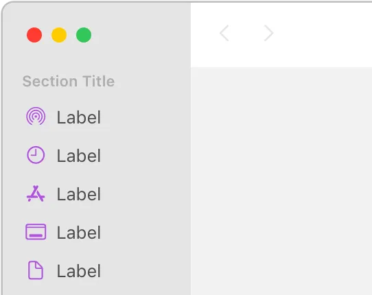
iOS defines two sets of dynamic background colors — system and grouped — each of which contains primary, secondary, and tertiary variants that help you convey a hierarchy of information. In general, use the grouped background colors (systemGroupedBackground, secondarySystemGroupedBackground, and tertiarySystemGroupedBackground) when you have a grouped table view; otherwise, use the system set of background colors (systemBackground, secondarySystemBackground, and tertiarySystemBackground).
iOS는 시스템 및 그룹화된 두 가지 배경색들을 제공합니다. 각 배경색에는 정보 계층 구조를 전달하는 데 도움이 되는 1차, 2차 및 3차 변형이 포함되어 있습니다. 일반적으로 그룹화된 테이블 보기가 있는 경우 그룹화된 배경색(systemGroupedBackground, secondarySystemGroupedBackground, 그리고 tertiarySystemGroupedBackground)을 사용합니다. 그렇지 않으면 시스템 배경색 세트(systemBackground, secondarySystemBackground, 그리고 tertiarySystemBackground)를 사용합니다.
With both sets of background colors, you generally use the variants to indicate hierarchy in the following ways:
•
Primary for the overall view
•
Secondary for grouping content or elements within the overall view
•
Tertiary for grouping content or elements within secondary elements
For foreground content, iOS defines the following dynamic colors:
두 가지 배경색 집합에서 다음과 같은 방식으로 계층 구조를 나타냅니다.
•
전체 View를 위한 기본
•
전체 View 내에서 콘텐츠 또는 요소를 그룹화하기 위한 보조
•
2차 요소 내에서 콘텐츠 또는 요소를 그룹화하기 위한 3차 요소
한눈에 보이는 콘텐츠의 경우 iOS는 다음과 같은 dynamic colors을 정의합니다.
Color | Use for… | UIKit API |
Label | A text label that contains primary content. | |
Secondary label | A text label that contains secondary content. | |
Tertiary label | A text label that contains tertiary content. | |
Quaternary label | A text label that contains quaternary content. | |
Placeholder text | Placeholder text in controls or text views. | |
Separator | A separator that allows some underlying content to be visible. | |
Opaque separator | A separator that doesn’t allow any underlying content to be visible. | |
Link | Text that functions as a link. |
macOS defines the following dynamic system colors (you can also view them in the Developer palette of the standard Color panel):
macOS는 다음과 같은 동적 시스템 색상을 정의합니다 (표준 색상 패널의 개발자 팔레트에서도 볼 수 있습니다):
Color | Use for… | AppKit API |
Alternate selected control text color | The text on a selected surface in a list or table. | |
Alternating content background colors | The backgrounds of alternating rows or columns in a list, table, or collection view. | |
Control accent | The accent color people select in System Settings. | |
Control background color | The background of a large interface element, such as a browser or table. | |
Control color | The surface of a control. | |
Control text color | The text of a control that is available. | |
Current control tint | The system-defined control tint. | |
Unavailable control text color | The text of a control that’s unavailable. | |
Find highlight color | The color of a find indicator. | |
Grid color | The gridlines of an interface element, such as a table. | |
Header text color | The text of a header cell in a table. | |
Highlight color | The virtual light source onscreen. | |
Keyboard focus indicator color | The ring that appears around the currently focused control when using the keyboard for interface navigation. | |
Label color | The text of a label containing primary content. | |
Link color | A link to other content. | |
Placeholder text color | A placeholder string in a control or text view. | |
Quaternary label color | The text of a label of lesser importance than a tertiary label, such as watermark text. | |
Scrubber textured background color | ||
Secondary label color | The text of a label of lesser importance than a primary label, such as a label used to represent a subheading or additional information. | |
Selected content background color | The background for selected content in a key window or view. | |
Selected control color | The surface of a selected control. | |
Selected control text color | The text of a selected control. | |
Selected menu item text color | The text of a selected menu. | |
Selected text background color | The background of selected text. | |
Selected text color | The color for selected text. | |
Separator color | A separator between different sections of content. | |
Shadow color | The virtual shadow cast by a raised object onscreen. | |
Tertiary label color | The text of a label of lesser importance than a secondary label. | |
Text background color | The background color behind text. | |
Text color | The text in a document. | |
Under page background color | The background behind a document’s content. | |
Unemphasized selected content background color | The selected content in a non-key window or view. | |
Unemphasized selected text background color | A background for selected text in a non-key window or view. | |
Unemphasized selected text color | Selected text in a non-key window or view. | |
Window background color | The background of a window. | |
Window frame text color | The text in the window’s title bar area. |
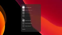
Beginning in macOS 11, you can specify an accent color to customize the appearance of your app’s buttons, selection highlighting, and sidebar icons. The system applies your accent color when the current value in General > Accent color settings is multicolor.
macOS 11부터 accent color(악센트 색상)를 지정하여 앱 버튼, 강조 표시 및 사이드바 아이콘의 모양을 사용자가 원하는 데로 지정할 수 있습니다. 시스템은 일반 강조 색상 설정의 현재 값이 다중 색상(multicolor) 일 경우 경우 악센트 색상(accent color)을 적용합니다
If people set their accent color setting to a value other than multicolor, the system applies their chosen color to the relevant items throughout your app, replacing your accent color. The exception is a sidebar icon that uses a fixed color you specify. Because a fixed-color sidebar icon uses a specific color to provide meaning, the system doesn’t override its color when people change the value of accent color settings. For guidance, see Sidebars.
사람들이 악센트 색상(accent color) 설정을 하면 시스템은 사용자들이 선택한 악센트 색상을 사이드바 아이콘을 제외한 다른 요소에 적용합니다. 왜냐하면 사이드바 아이콘은 사용자에게 색상을 통해 의미를 전달하기 때문입니다. 더 자세한 내용은 Sidebars을 참고하세요.
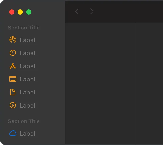
The iCloud icon remains blue, even when the other glyphs use orange.
다른 글리프가 주황색을 사용하더라도 iCloud 아이콘은 파란색으로 유지됩니다.
Consider choosing a limited color palette that coordinates with your app logo. Subtle use of color can help you communicate your brand while deferring to the content.
앱 로고와 조화를 이루는 색상 팔레트를 선택하는 것이 좋습니다. 색상의 세밀한 사용은 콘텐츠의 브랜드를 전달하는 데 도움이 됩니다.
→ 앱 로고에서 사용되는 색상과 조화를 이루는 색상 팔레트를 선택하는 것이 좋다
Avoid using only color to indicate focus. Subtle scaling and responsive animation are the primary ways to denote interactivity when an element is in focus.
사람들을 콘텐츠에 집중시키기 위한 방법으로 색상만을 사용하지 마세요. 색상뿐 아니라 세밀한 크기의 변화와 반응형 애니메이션을 활용해 사람들의 시선을 집중시키고 상호작용 할 수 있습니다.
→ 사람들이 콘텐츠에 집중하게 하는 방법을 다양하게 활용할 수 있음.
Use color sparingly, especially on glass. Standard visionOS windows typically use the system-defined glass material, which lets light and objects from people’s physical surroundings and their space show through. Because the colors in these physical and virtual objects are visible through the glass, they can affect the legibility of colorful app content in the window. Prefer using color in places where it can help call attention to important information or show the relationship between parts of the interface.
특히 유리에는 색상을 아껴서 사용하세요. 표준 비전OS 창은 일반적으로 시스템에서 정의한 유리 재질을 사용하므로 사용자의 물리적 주변 환경과 공간의 빛과 물체가 투과됩니다. 이러한 물리적 및 가상 개체의 색상이 유리를 통해 보이기 때문에 창에 있는 다채로운 앱 콘텐츠의 가독성에 영향을 줄 수 있습니다. 중요한 정보에 주의를 환기시키거나 인터페이스의 각 부분 간의 관계를 보여줄 수 있는 곳에 색상을 사용하는 것을 선호합니다.
Prefer using color in bold text and large areas. Color in lightweight text or small areas can make them harder to see and understand.
굵은 텍스트와 넓은 영역에 색상을 사용하는 것이 좋습니다. 옅은 텍스트나 작은 영역에 색상을 사용하면 보기와 이해가 어려워질 수 있습니다.
Use background color to support existing content or supply additional information.Background color can establish a sense of place and help people recognize key content. For example, in Activity, each infographic view for the Move, Exercise, and Stand Activity rings has a background that matches the color of the ring. Use background color when you have something to communicate, rather than as a solely visual flourish. Avoid using full-screen background color in views that are likely to remain onscreen for long periods of time, such as in a workout or audio-playing app.
배경색을 사용하여 기존 콘텐츠를 지원하거나 추가 정보를 제공할 수 있습니다. 배경색은 장소감을 조성하고 사람들이 주요 콘텐츠를 인식하는 데 도움이 될 수 있습니다. 예를 들어 활동에서 이동, 운동 및 서 있기 활동 링의 각 인포그래픽 보기에는 링의 색상과 일치하는 배경이 있습니다. 배경 색상은 시각적 효과보다는 전달하고자 하는 내용이 있을 때 사용합니다. 운동 또는 오디오 재생 앱과 같이 장시간 화면에 표시될 가능성이 있는 보기에는 전체 화면 배경색을 사용하지 마세요.
Recognize that people might prefer graphic complications to use tinted mode instead of full color. The system can use a single color that’s based on the wearer’s selected color in a graphic complication’s images, gauges, and text. For guidance, see Complications.
사람들은 틴티드 모드를 사용하는 것보다 그래픽 컴플리케이션을 선호할 수 있습니다. 시스템은 그래픽 컴플리케이션의 이미지, 게이지 및 텍스트에서 착용자가 선택한 색상을 기반으로 하는 단일 색상을 사용할 수 있습니다. Complications을 참고하세요.
→ 사람들은 전체모드를 사용하는 것보다 틴티드모드가 사용된 그래픽 컴플리케이션을 선호할 수 있다.
역자 첨언


Color — SwiftUI
UI element colors — UIKit
Color — AppKit

Change log
작성 날짜 | 작성자 | 수정사항 |
2023/05/09 | 조엘 | 초기 번역 |
2023/12/26 | 조엘 | 배포 |