
A consistent layout that adapts to various contexts makes your experience more approachable and helps people enjoy their favorite apps and games on all their devices.
일관된 레이아웃을 사용하여 다양한 문맥에 적응하는 것은 경험을 더 접근 가능하게 만들어주며 사람들이 모든 기기에서 좋아하는 앱과 게임을 즐길 수 있도록 도와줍니다.
→ 일관된 레이아웃을 사용하는 것은 중요하다

The following guidance helps you design content layouts for all platforms. To learn about displaying windows and other content throughout Apple Vision Pro space, see Spatial layout.
다음 가이드는 모든 플랫폼에 대한 콘텐츠 레이아웃을 설계하는 데 도움을 줍니다. Apple Vision Pro 공간 전체에 창 및 기타 콘텐츠를 표시하는 방법에 대해 알아보려면 Spatial layout를 참조하세요.
A layout guide defines a rectangular region that helps you position, align, and space your content on the screen. The system includes predefined layout guides that make it easy to apply standard margins around content and restrict the width of text for optimal readability. You can also define custom layout guides.
레이아웃 가이드(Layout Guide)는 화면에 컨텐츠를 위치시키고 정렬하며 간격을 조정하는 데 도움을 주는 직사각형 영역을 정의하는 것입니다. 시스템에는 컨텐츠 주변의 표준 여백을 적용하고 최적의 가독성을 위해 텍스트 너비를 제한하는 미리 정의된 레이아웃 가이드가 포함되어 있습니다. 또한 사용자 정의 레이아웃 가이드를 정의할 수도 있습니다.
→ 레이아웃 가이드는 화면에 컨텐츠를 정렬하는 데 도움을 주는 영역이며, 미리 정의된 가이드가 시스템에 존재하고 사용자가 직접 가이드를 정의할 수도 있다
A safe area defines the area within a view that isn’t covered by a navigation bar, tab bar, toolbar, or other views a window or scene might provide. Safe areas are essential for avoiding a device’s interactive and display features, like the Dynamic Island on iPhone or the camera housing on some Mac models.
안전 영역(Safe Area)은 네비게이션 바, 탭 바, 툴 바 또는 다른 화면이나 창을 제외한 영역을 의미합니다. 안전 영역은 iPhone의 Dynamic Island나 일부 Mac 모델의 카메라 하우징과 같은 기기의 인터랙티브 및 디스플레이 기능을 방지하기 위해 필수적입니다.
*Dynamic Island : 모양을 바꾸고, 기능을 바꾸고, 시각을 바꾸고, 판도를 바꾸는 iPhone의 새로운 사용법. 각종 알림 및 활동 관련 정보를 한곳에서 인터랙티브한 방식으로 확인할 수 있게 해준다
*카메라 하우징 : 카메라 렌즈, 플래시, 마이크 및 다른 센서들이 포함된 디바이스의 뒷면 상단 부분
→ 안전 영역은 네비게이션 바, 탭 바, 툴 바 또는 컨텐츠가 표시되는 화면 및 창을 제외한 영역을 의미하며, 앱을 디자인할 때 안전 영역을 고려해야 한다
역자 첨언
In iOS, iPadOS, and tvOS, and visionOS, the system defines a collection of traits that characterize variations in the device environment that can affect the way your app displays on the screen. Using SwiftUI or Auto Layout, you can ensure that your interface adapts dynamically to a wide range of traits and contexts, including:
iOS, iPadOS, tvOS 및 visionOS에서 시스템은 화면에 앱이 표시되는 방식에 영향을 줄 수 있는 기기 환경의 변화를 나타내는 특성 모음을 정의합니다. SwiftUI 또는 자동 레이아웃을 사용하면 인터페이스가 다음과 같은 다양한 특성과 상황에 동적으로 적응하도록 할 수 있습니다:
→ 시스템에는 기기 환경의 변화를 나타내는 특성 모음 집합이 정의되어 있어서, SwiftUI와 자동 레이아웃(Auto Layout)을 사용하면 인터페이스가 다음과 같은 다양한 특성과 상황에 동적으로 적응하도록 할 수 있다
•
Different device screen sizes, resolutions, and color spaces
•
다양한 장치의 화면 크기, 해상도 및 색 공간
•
Different device orientations (portrait/landscape)
•
다양한 장치의 방향(세로/가로)
•
Split view
•
분할 보기
•
External display support, Display Zoom, and multitasking modes on iPad
•
iPad의 외부 디스플레이 지원, 디스플레이 확대/축소 및 멀티태스킹 모드
•
Dynamic Type text-size changes
•
동적 유형(Dynamic Type) 텍스트 크기 변경
•
Locale-based internationalization features like left-to-right/right-to-left layout direction, date/time/number formatting, font variation, and text length
•
텍스트 길이, 폰트 변화, 날짜/시간/숫자 형식 지정과 같은 지역 기반 국제화 기능, 왼쪽에서 오른쪽 또는 오른쪽에서 왼쪽으로의 레이아웃 방향 등
•
System feature availability
•
시스템 기능 가용성
역자 첨언
Design a consistent layout that adapts gracefully to context changes, while displaying the same content as much as possible. People expect your experience to work well and remain familiar when they rotate their device, resize a window, add another display, or switch to a different device. Ensure an adaptable interface by respecting system-defined safe areas, margins, and guides and specifying layout modifiers to fine-tune the placement of views in your hierarchy.
가능한 한 동일한 내용을 표시하면서 맥락 변경에 적절하게 적응하는 일관된 레이아웃을 디자인하세요. 사용자들은 기기를 회전하거나 창 크기를 조정하거나 다른 기기로 전환할 때, 사용자의 경험이 잘 작동하고 익숙한 상태를 유지되기를 기대합니다. 시스템에서 정의한 안전 영역, 여백 및 가이드를 존중하고 layout modifiers를 지정하여 뷰의 배치를 정교하게 조정함으로써 적응 가능한 인터페이스를 보장하세요.
→ 맥락 변경에 적절하게 적응하는 일관된 레이아웃을 디자인 해야 한다
역자 첨언
Respect key display and system features in each platform. Safe areas help you accommodate features like the corner radius and sensor housings on various devices, and avoid interfering with interactive system elements like Dynamic Island on iPhone and the Home indicator and app switcher on iPhone and iPad. Safe areas also help you account for interactive components like bars, dynamically repositioning content if sizes change.
각 플랫폼에서 중요한 디스플레이와 시스템 기능을 존중하세요. 안전 영역을 사용하면 다양한 기기의 코너 반경 및 센서 하우징과 같은 기능을 수용하고, iPhone의 Dynamic Island나 iPhone 및 iPad의 Home indicator 및 app switcher와 같은 상호 작용하는 시스템 요소를 방해하지 않도록 도와줍니다. 또한 안전 영역은 또한 바와 같은 대화형 구성 요소를 고려하여 컨텐츠를 동적으로 재배치하여 크기가 변경될 때 맞추는 데도 도움이 됩니다.
*Home indicator : 하단 가장자리에서 홈 버튼을 대신하여 사용자가 홈 화면으로 돌아갈 수 있도록 도와주는 가상 버튼
*App switcher : iOS 기기에서 현재 실행 중인 앱을 보여주는 인터페이스
→ 안전 영역을 사용해, 각 플랫폼에서 디스플레이와 시스템 기능을 존중해야 한다
역자 첨언
Use placement to convey relative importance. People often start by viewing items in reading order — that is, from top to bottom and from the leading to trailing side — so it generally works well to place the most important items near the top and leading side of the window, display, or field of view.
상대적 중요성을 전달하기 위해 배치를 사용하세요. 사람들은 종종 읽기 순서대로 항목을 보기 시작합니다. 즉, 위에서 아래로, 선행 측면에서 후행 측면까지 이동하는 것이므로, 일반적으로 가장 중요한 항목을 창, 디스플레이 또는 시야의 상단 선행 측면 근처에 배치하는 것이 좋습니다.
*Leading side : 일반적으로 화면이나 창에서 왼쪽 (선행 측면)
→ 중요도를 잘 전달하기 위해서, 일반적으로 중요한 항목들을 화면 또는 창의 상단 절반 또는 leading side 근처에 배치함을 잘 이용해야 한다
역자 첨언
Make essential information easy to find by giving it sufficient space. People want to view the most important information right away, so you don’t want to obscure it by crowding it with nonessential details. You can make secondary information available in other parts of the window or display.
중요한 정보에 충분한 공간을 제공하여 쉽게 찾을 수 있도록 하세요. 사람들은 가장 중요한 정보를 즉시 볼 수 있기를 원하기 때문에, 필수적이지 않은 세부 사항들로 지저분하게 가리지 않도록 주의해야 합니다. 보조적인 정보는 다른 창이나 디스플레이의 다른 부분에서 이용할 수 있도록 할 수 있습니다.
→ 보조 정보에는 다른 창이나 디스플레이의 다른 부분에서 이용할 수 있도록 하고, 중요한 정보에는 충분한 공간을 주어 쉽게 찾을 수 있도록 해야 한다
Create visual groupings to help people find the information they want. For example, you might use negative space, background shapes, colors, and materials, or separator lines to display related elements and information in distinct areas.
시각적 그룹을 만들어 사용자가 원하는 정보를 찾을 수 있도록 도와주세요. 예를 들어, negative space, 배경 모양, 색상 및 재료 또는 구분선을 사용하여 관련된 요소와 정보를 구분된 영역에 나타낼 수 있습니다.
*negative space : 빈 공간, 주로 레이아웃에서의 각 요소 사이 간격
→ 관련된 요소와 정보를 시각적 그룹을 통해 구분해, 사용자가 원하는 정보를 찾을 수 있도록 해야 한다
역자 첨언
Use alignment to ease visual scanning and to communicate organization and hierarchy. Alignment makes an app look neat and organized, helps people focus while scrolling, and makes it easier to find information. Indentation and alignment can also help people visualize an information hierarchy.
정렬을 사용하여 시각 주사를 용이하게 하고 구조 및 계층 구조를 전달하세요. 정렬은 앱을 깔끔하고 정리된 것처럼 보이게 해서 사람들이 스크롤하는 동안 집중할 수 있도록 하며, 정보를 더 쉽게 찾을 수 있도록 합니다. 들여쓰기 및 정렬은 정보 계층 구조를 시각화하는 데에도 도움이 됩니다.
*시각 주사(visual scanning) : 눈이 정보를 수집할 수 있도록 해주는 안구 운동 시스템의 일부
→ 사용자가 정보를 더 쉽게 찾을 수 있도록 하기 위해서, 들여쓰기와 정렬을 사용해야 한다
Be prepared for text-size changes. People expect most apps to respond when they choose a different text size. To accommodate text-size changes, you might need to adjust the layout. For guidance on displaying text in your app, see Typography.
텍스트 크기 변경에 대비하세요. 사용자들은 다른 텍스트 크기를 선택할 때 대부분의 앱이 반응하는 것을 기대합니다. 텍스트 크기 변경을 수용하기 위해 레이아웃을 조정해야 할 수도 있습니다. 앱에서 텍스트를 표시하는 방법에 대한 지침은 Typography를 참조하세요.
→ 사용자들이 다양한 텍스트 크기를 선택할 때, 대부분의 앱이 반응하는 것을 기대하니 텍스트 크기 변경에 대비해야 한다
Consider providing visual hints to help people discover content that’s currently hidden. For example, if you can’t display all the items in a large collection at once, you need to indicate that there are additional items that aren’t currently visible. Depending on the platform, you might display parts of items to hint that people can reveal additional content by interacting with the view, such as by scrolling.
사람들이 현재 숨겨진 콘텐츠를 발견하는 데 도움을 주기 위해 시각적인 힌트를 제공하는 것을 고려해 보세요. 예를 들어, 큰 컬렉션의 모든 항목을 동시에 표시할 수 없는 경우, 현재 보이지 않는 추가 항목이 있는 것을 나타내어야 합니다. 플랫폼에 따라, 사람들이 뷰와 상호 작용함으로써 추가 콘텐츠를 공개할 수 있다는 힌트를 주기 위해 항목의 일부를 표시할 수 있습니다. 예를 들면 스크롤링을 통해 추가 콘텐츠를 확인할 수 있다는 것을 암시할 수 있습니다.
→ 보이지 않는 추가 항목의 일부를 표시함으로써, 사용자에게 더 숨겨진 콘텐츠가 있다는 것을 암시해야 한다
Make interactive components easy to discover by providing enough space around them. If interactive components are too close together — or if other content crowds them — the components can be difficult for people to distinguish, which can make your app or game hard to use.
상호작용 컴포넌트 주위에 충분한 공간을 제공하여 사용자가 쉽게 발견할 수 있도록 하세요. 상호작용 컴포넌트가 너무 가까이 위치하거나 다른 콘텐츠로 인해 혼잡하게 배치되면, 컴포넌트를 구별하기 어려워지며 앱 또는 게임의 사용이 어려워질 수 있습니다.
→ interactive components 주위에 충분한 여백을 두어 사용자가 컴포넌트를 구별하기 쉽게 해야 한다
Preview your app on multiple devices, using different orientations, localizations, and text sizes. Although it’s generally best to preview features like wide color on actual devices, you can use Xcode Simulator to check for clipping and other layout issues. For example, if your iOS app supports landscape mode, you can use Simulator to make sure your layouts look great regardless of whether the device rotates left or right.
다양한 방향, 지역화 및 텍스트 크기를 사용하여 여러 장치에서 앱을 미리 보세요. 일반적으로 실제 장치에서 와이드 컬러와 같은 기능을 미리 보는 것이 가장 좋지만 클리핑 및 기타 레이아웃 문제를 확인하기 위해 Xcode Simulator를 사용할 수도 있습니다. 예를 들어, iOS 앱이 가로 모드를 지원하는 경우 Simulator를 사용하여 기기가 왼쪽으로 회전하든 오른쪽으로 회전하든 상관없이 레이아웃이 멋지게 보이도록 할 수 있습니다.
→ 다양한 요소들을 고려해 여러 장치에서 앱을 미리 보며, 요소들에 상관없이 레이아웃이 멋지게 보이도록 해야 한다
When necessary, scale artwork in response to display changes. For example, viewing your app in a different context — such as on a screen with a different aspect ratio — might make your artwork appear cropped, letterboxed, or pillarboxed. If this happens, don’t change the aspect ratio of the artwork; instead, scale it so that important visual content remains visible. In visionOS, the system automatically scales a window when it moves along the z-axis.
필요한 경우, 디스플레이 변경에 대응하여 아트워크를 확대/축소하세요. 예를 들어, 다른 종횡비를 가진 화면에서 앱을 보는 경우, 아트워크가 잘린 상태로 나타나거나 위아래로 검은색 바가 생길 수 있습니다. 이런 경우, 아트워크의 종횡비를 변경하지 말고, 중요한 시각적 콘텐츠가 가시적으로 유지되도록 아트워크를 확대/축소하세요. visionOS에서는 시스템이 z-축을 따라 창이 이동할 때 자동으로 확대/축소됩니다.
→ 화면 크기에 따라 종횡비가 달라 작업물이 잘리는 등의 문제가 발생할 수 있는데, 이 경우에는 종횡비를 변경하지 말고 아트워크 자체의 크기를 확대 및 축소해야 한다
Aim to support both portrait and landscape orientations. People choose different orientations for a variety of reasons, and they generally expect apps to work well in every context. If it’s essential that your app run in a single orientation, don’t tell people to rotate their device to match; if your app doesn’t rotate automatically when someone holds the device in an unsupported orientation, they’ll know instinctively to rotate it. If your app is landscape-only, make sure it runs equally well whether people rotate their device to the left or the right.
세로 방향과 가로 방향을 모두 지원하는 것을 목표로 하세요. 사람들은 다양한 이유로 다른 방향을 선택하며, 일반적으로 앱이 모든 상황에서 잘 작동하기를 기대합니다. 앱이 하나의 방향에서만 실행되어야 하는 경우, 사람들에게 기기를 회전하여 일치시키라고 말하지 마세요. 지원되지 않는 방향으로 기기를 사용할 때 앱이 자동으로 회전하지 않으면, 사용자는 본능적으로 회전시킬 것입니다. 앱이 가로 모드 전용인 경우 장치를 왼쪽으로 회전하든 오른쪽으로 회전하든 동일하게 잘 작동되는지 확인하세요.
→ 기기의 세로 방향과 가로 방향을 모두 지원하는 것을 목표로 해야 하며, 앱이 한 방향에서만 실행되어야 하는 경우, 그 모드를 사용하라고 강요하지 말아야 한다
If your app runs on a specific device, make sure it runs on every screen size for that device.In other words, an iPhone-only app must run on every iPhone screen size and an iPad-only app must run on every iPad screen size. For guidance, see Device screen sizes and orientations.
만약 앱이 특정 기기에서 실행된다면, 해당 기기의 모든 화면 크기에서 실행 되는지 확인하세요. 다시 말해, iPhone 전용 앱은 모든 iPhone 화면 크기에서 실행되어야 하며, iPad 전용 앱은 모든 iPad 화면 크기에서 실행되어야 합니다. 자세한 지침은 Device screen sizes and orientations을 참조하세요.
→ 앱이 특정 기기(iPhone or iPad)에서 실행될 경우 해당 기기의 모든 화면 크기에서 실행되는지 확인해야 한다
Inset full-width buttons. Respect the standard system-defined margins on the sides of full-width buttons. A full-width button at the bottom of the screen generally looks best when it has rounded corners and it aligns with the bottom of the safe area — which also ensures that it doesn’t conflict with the Home indicator.
전체 너비의 버튼을 삽입하세요. 전체 너비의 버튼 옆에는 표준 시스템 정의 여백을 준수하세요. 화면 하단에 있는 전체 너비의 버튼은 일반적으로 둥근 모서리를 가지며 안전 영역의 하단에 정렬되는 것이 가장 좋아 보입니다. 이렇게 함으로써 홈 인디케이터와 충돌하지 않도록 할 수 있습니다.
→ 화면 하단의 전체 너비 버튼은 일반적으로 둥근 모서리를 가지며, 안전 영역의 하단에 정렬시킴으로써, 홈 인디케이터와 충돌하지 않도록 해야 한다
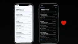
Extend visual content to fill the screen. Make sure backgrounds extend to the edges of the display, and that vertically scrollable layouts, like tables and collections, continue all the way to the bottom.
화면을 가득 채울 수 있도록 시각적 콘텐츠를 확장하세요. 배경이 디스플레이 가장자리까지 확장되도록 하고, 테이블이나 컬렉션과 같은 세로로 스크롤 가능한 레이아웃은 하단까지 계속해서 확장되도록 해야 합니다.
→ 시각적 콘텐츠를 확장해, 스크롤이 있어서 내려도 됨을 암시해야 한다
역자 첨언
On iPad, consider placing controls on the sides of the screen in landscape orientation. When controls are on the left and right sides of the screen, people can reach them easily with both hands while they’re holding the device.
iPad에서는 가로 방향으로 화면의 양쪽에 컨트롤을 배치하는 것을 고려하세요. 화면의 왼쪽과 오른쪽에 컨트롤을 배치하면 사용자가 기기를 잡은 상태에서 양손으로 쉽게 접근할 수 있습니다.
→ iPad에서 화면의 양쪽에 컨트롤을 배치한다면, 사용자가 보다 편리하게 컨트롤을 조작할 수 있다
Avoid placing interactive controls at the bottom edge of the screen when possible. Regardless of orientation, people use system gestures at the bottom edge of the display to access features like the Home screen and app switcher, and these gestures may cancel custom gestures you implement in this area. Also avoid placing controls in the far corners of the screen because these areas can be difficult for people to reach comfortably. If your game needs to place controls in the lower portion of the screen — below the safe area — use matching insets when placing them at the top and bottom of the screen, and leave ample space around the Home indicator so people don’t accidentally target it when trying to interact with a control.
가능한 경우 화면 하단 가장자리에 상호작용 가능한 컨트롤을 배치하지 않도록 하세요. 방향에 관계없이, 사람들은 화면 하단 가장자리에서 홈 스크린이나 app switcher와 같은 기능에 액세스하기 위해 시스템 제스처를 사용합니다. 이러한 제스처는 이 영역에 구현한 사용자 정의 제스처를 취소시킬 수 있습니다. 또한 사용자가 편안하게 접근하기 어려울 수 있는 화면 모서리에 컨트롤을 배치하지 마세요. 게임에서 안전 영역 아래의 화면 하단에 컨트롤을 배치해야 하는 경우, 화면 상단과 하단에 해당되는 여백을 일치시키고 홈 인디케이터 주변에 충분한 공간을 남겨 사용자가 컨트롤과 상호작용하려고 할 때 실수로 홈 인디케이터를 선택하지 않도록 해야 합니다.
*시스템 제스처 : 모바일 장치에서 사용되는 특정 동작이나 제어
→ 시스템 제스처가 사용자 정의 제스처를 취소시킬 수 있고, 사용자가 화면 모서리에 편안하게 접근하기 어려울 수 있으니 화면 하단 가장자리에 가능한 컨트롤을 배치하지 않도록 해야 한다
Be prepared for different status bar heights. If you display content below the status bar, you can use the safe area to help dynamically reposition the content as needed.
다양한 상태 표시줄 높이에 대비하세요. 상태 표시줄 아래에 콘텐츠를 표시하는 경우, 필요에 따라 안전 영역을 사용하여 콘텐츠를 동적으로 재배치할 수 있습니다.
→ 기기들에서의 상태 표시줄 크기 차이가 있으니, 다양한 상태 표시줄 높이에 대비해야 한다
역자 첨언
Hide the status bar only when it adds value or enhances your experience. The status bar displays information people find useful and it occupies an area of the screen most apps don’t fully use, so it’s generally a good idea to keep it visible.
상태 표시줄은 가치를 더하거나 사용자 경험을 향상시킬 때에만 숨기세요. 상태 표시줄은 사람들이 유용하게 사용하는 정보를 표시하며, 대부분의 앱이 화면의 해당 영역을 완전히 활용하지 않습니다. 따라서 일반적으로는 상태 표시줄을 보이도록 유지하는 것이 좋은 아이디어입니다.
→ 상태 표시줄은 유용한 정보를 표시하며, 대부분의 앱이 해당 영역을 완전히 활용하지 않기 때문에 일반적으로 보이도록 유지하는 것이 좋다
The safe area defines the area within a view that isn’t covered by a navigation bar, tab bar, toolbar, or other views a view controller might provide.
안전 영역은 뷰 내에서 네비게이션 바, 탭 바, 툴바 또는 뷰 컨트롤러가 제공하는 다른 뷰들에 의해 가려지지 않는 영역을 정의합니다.
iPhone
iPad


iOS 15 and later provides a keyboard layout guide that represents the space the keyboard currently occupies and accounts for safe area insets. Using this guide can help you make the keyboard feel like an integral part of your app, regardless of the type of keyboard people use or where they position it. For developer guidance, see UIKeyboardLayoutGuide.
iOS 15 이상에서는 키보드가 현재 차지하는 공간과 안전 영역 인셋을 고려하는 키보드 레이아웃 가이드를 제공합니다. 이 가이드를 사용하면 사용자가 어떤 종류의 키보드를 사용하든 어디에 위치하든지 간에 키보드가 앱의 중요한 부분으로 느껴지도록 도움을 줄 수 있습니다. 개발자 지침은UIKeyboardLayoutGuide를 참조하십시오.
→ iOS 15 이상에서 키보드 레이아웃 가이드에 대한 설명
역자 첨언

When the keyboard is visible, the layout guide represents its area and position.
키보드가 보일 때, 레이아웃 가이드가 해당 영역과 위치를 나타냅니다.

When the keyboard dismisses, the top of the layout guide matches the bottom of the safe area layout guide.
키보드가 없어지면, 레이아웃 가이드의 상단이 안전 영역 레이아웃 가이드의 하단과 일치합니다.
Avoid placing controls or critical information at the bottom of a window. People often move windows so that the bottom edge is below the bottom of the screen.
창 하단에 컨트롤이나 중요한 정보를 배치하지 마세요. 사람들은 종종 창을 이동하여 하단 가장자리가 화면 하단을 벗어나도록 조정합니다.
→ macOS에서, 종종 가려질 수 있으니 창 하단에 컨트롤이나 중요한 정보를 배치하지 않아야 한다
역자 첨언
TVs vary widely in size. On Apple TV, app layouts don’t automatically adapt to the size of the screen like they do on iPhone or iPad. Instead, apps show the same interface on every display. Take extra care in designing your layout so that it looks great in a variety of screen sizes.
TV는 크기가 매우 다양합니다. Apple TV에서 앱 레이아웃은 iPhone이나 iPad에서처럼 화면 크기에 자동으로 적응하지 않습니다. 대신, 앱은 모든 디스플레이에서 동일한 인터페이스를 보여줍니다. 따라서 다양한 화면 크기에서도 멋지게 보이도록 레이아웃을 디자인할 때 특별히 주의를 기울여야 합니다.
→ TV의 크기는 매우 다양하지만, tvOS에서 앱 레이아웃이 화면 크기에 자동으로 적응하지 않으니 디자인할 때 이를 고려해야 한다
Adhere to the screen’s safe zone. Inset primary content 60 pixels from the top and bottom of the screen, and 80 pixels from the sides. It can be difficult for people to see content that close to the edges, and unintended cropping can occur due to overscanning on older TVs. Allow only partially displayed offscreen content and elements that deliberately flow offscreen to appear outside this zone.
화면의 안전 영역을 지켜야 합니다. 화면의 상단과 하단에서 60픽셀, 측면에서 80픽셀의 여백을 두고 주요 콘텐츠를 넣습니다. 가장자리에 가까운 콘텐츠는 사람들이 볼 때 어려울 수 있으며, 구형 TV에서는 과주사(overscanning)로 인해 의도치 않은 자르기가 발생할 수 있습니다. 부분적으로 표시된 offscreen 콘텐츠와 의도적으로 화면 밖으로 흐르는 요소만이 이 영역 외부에 나타날 수 있도록 하세요.
*과주사(overscanning) : 소거 구간의 주사선이 화면에 나타나지 않도록 주사하는 것
*offscreen 콘텐츠 : 화면에 나오지 않는 콘텐츠
→ tvOS에서 화면의 안전 영역을 지켜, 주요 콘텐츠는 상하단에서 60픽셀, 측면에서 80픽셀의 여백을 두고 넣어야 한다

Include appropriate padding between focusable elements. When you use UIKit and the focus APIs, an element gets bigger when it comes into focus. Consider how elements look when they’re focused, and make sure they don’t unintentionally overlap important information.
포커스 가능한 요소 사이에 적절한 간격을 추가해야 합니다. UIKit 및 포커스 API를 사용할 때 포커스가 되면 요소가 커집니다. 요소들이 포커스 되었을 때의 모습을 고려하고, 중요한 정보와 의도치 않은 겹침이 발생하지 않도록 해야 합니다.
→ 요소들이 포커스 되었을 때의 모습을 고려해, 포커스 가능한 요소 사이에 적절한 간격을 추가해야 한다
역자 첨언

Use layout templates to build media-centered apps and use grids to provide collections of content. If the layout of your media app simply needs to present content beautifully with minimal layout customization, use a predesigned layout template. If your app needs to showcase a collection of content, use a grid to make the content easy to browse at a distance and quick to navigate with the remote.
레이아웃 템플릿을 사용하여 미디어 중심 앱을 만들고 그리드를 사용하여 컨텐츠 모음을 제공합니다. 만약 미디어 앱에서 컨텐츠를 아름답게 보여주는 것이 목적이라 최소한의 레이아웃 수정만 필요한 경우, 미리 디자인된 레이아웃 템플릿을 사용하세요. 앱에서 컨텐츠 모음을 표시해야 하는 경우, 그리드를 사용해 컨텐츠를 격자 형태로 표시하면 사용자가 멀리서도 리모컨으로도 쉽게 탐색하고 빠르게 탐색할 수 있습니다.
→ 미디어 앱에서 컨텐츠만 아름답게 보여주는 것이 목적이라면 레이아웃 템플릿을 사용하면 되고, 컨텐츠 모음을 표시해야 한다면 그리드를 사용하면 된다
Apple TV templates deliver clean, consistent layouts that make content the center of attention. These templates — based on JavaScript and the Apple TV markup language (TVML) — dynamically load and populate with content when people open your app. Templates give you flexibility to create content-rich apps with predefined layouts that look good on the TV screen and are ideal for streaming media.
Apple TV 템플릿은 깔끔하고 일관된 레이아웃을 제공하여 컨텐츠를 주목받는 중심이 되도록 합니다. 이러한 템플릿은 JavaScript와 Apple TV 마크업 언어(TVML)를 기반으로 하며, 사람들이 앱을 열 때 동적으로 컨텐츠를 로드하고 채우게 됩니다. 템플릿을 사용하면 TV 화면에서 보기 좋고 스트리밍 미디어에 이상적인 미리 정의된 레이아웃을 갖춘 컨텐츠 풍부한 앱을 유연하게 생성할 수 있습니다.
→ Apple TV 템플릿에 대한 설명
Choose a template based on its purpose. You can customize a template’s background, color, size, layout, and more, but if your customizations make the template jarring or unrecognizable, consider using a different one or designing a custom interface.
목적에 따라 템플릿을 선택하세요. 템플릿의 배경, 색상, 크기, 레이아웃 등을 사용자 정의할 수 있지만, 사용자 정의가 템플릿을 어색하게 만들거나 알아보기 어렵게 만든다면 다른 템플릿을 사용하거나 사용자 정의 인터페이스를 디자인하는 것을 고려해야 합니다.
→ 목적에 따라 템플릿을 선택해야 한다


Catalog template
Use the catalog template to display groupings of related items, such as genres of movies or TV shows. People view the list of groupings on the left, and focus on one to see its items on the right.
카탈로그 템플릿을 사용하여 영화 또는 TV 쇼의 장르와 같은 관련 항목의 그룹을 표시할 수 있습니다. 사람들은 왼쪽에 있는 그룹 목록을 보고, 오른쪽에서 해당 그룹의 항목에 집중할 수 있습니다.

Compilation template
The compilation template displays elements contained by an item, such as songs in an album or tracks in a playlist. This template works especially well to display audio-related content.
컴필레이션 템플릿은 앨범 내의 노래나 재생 목록 내의 트랙과 같은 항목에 포함된 요소를 표시합니다. 이 템플릿은 특히 오디오 관련 콘텐츠를 표시하는 데에 효과적입니다.

Descriptive alert template
The descriptive alert template can show a lengthy message that may ask the reader to perform an action, such as agreeing to terms and conditions or reading a licensing agreement.
Show, don’t tell. Whenever possible, avoid descriptive alert text. Aim to present the same information in a more digestible way, such as with images.
Keep alerts short and avoid making people scroll. Reading lots of text on a distant screen strains the eyes and isn’t much fun. Minimize the amount of text your app displays.
If the message is scrollable, position buttons side by side.With this layout, scrolling up and down scrolls the text, while scrolling left and right switches focus between buttons.
설명형 알림 템플릿은 사용자에게 행동을 취하도록 요청하는 긴 메시지를 표시할 수 있습니다. 예를 들어 약관에 동의하거나 라이선스 계약을 읽는 등의 작업을 요구할 수 있습니다.
시각적으로 보여주세요. 가능한 경우 설명형 알림 텍스트를 피하세요. 이미지와 같은 더 소화하기 쉬운 방식으로 동일한 정보를 제공하는 것이 목표입니다.
알림은 짧게 유지하고 스크롤을 피하세요. 먼 화면에서 많은 텍스트를 읽는 것은 눈에 부담을 줄 뿐만 아니라 재미도 없습니다. 앱이 표시하는 텍스트 양을 최소화하세요.
메시지가 스크롤 가능한 경우, 버튼을 옆에 배치하세요. 이 레이아웃에서는 위아래로 스크롤하면 텍스트가 스크롤되며, 좌우로 스크롤하면 버튼 사이의 포커스가 전환됩니다.

Form template
The form template displays a keyboard and one or more text fields where viewers can enter information, such as a name or an email address. See also Entering data.
양식 템플릿은 키보드와 하나 이상의 텍스트 필드를 표시하여 뷰어가 정보를 입력할 수 있는 곳입니다. 예를 들어 이름이나 이메일 주소와 같은 정보를 입력할 수 있습니다. 데이터 입력을 참조하세요.

List template
The list template shows a list of items on the right, such as movies or TV shows. People focus on one item to view its related content, such as its artwork or description, on the left.
목록 템플릿은 오른쪽에 항목 목록을 표시하며, 예를 들어 영화나 TV 프로그램과 같은 항목을 나열합니다. 사용자는 왼쪽에서 해당 항목과 관련된 콘텐츠를 보기 위해 하나의 항목에 초점을 맞출 수 있습니다. 이러한 콘텐츠에는 아트워크나 설명 등이 포함될 수 있습니다.

Loading template
The loading template temporarily displays a progress indicator and some descriptive text while the server retrieves your content. It lets people know something is happening, so your app doesn’t appear frozen.
Keep loading text concise and informative. If loading is quick, people may not have time to read longer text before it disappears, making them feel like they’ve missed something.
로딩 템플릿은 서버가 콘텐츠를 가져오는 동안 일시적으로 진행 표시기와 일부 설명적인 텍스트를 표시합니다. 이를 통해 사용자에게 어떤 작업이 진행 중임을 알려주어 앱이 멈춘 것처럼 보이지 않도록 합니다.
로딩 텍스트는 간결하고 정보를 전달하는 것이 중요합니다. 로딩이 빠른 경우, 사람들은 텍스트가 사라지기 전에 긴 텍스트를 읽을 시간이 없을 수 있으므로 더 짧은 텍스트를 사용하여 놓치지 않은 느낌을 주는 것이 좋습니다.

Menu bar template
The menu bar template is designed for top-level navigation, such as an entry page to your content. It includes a menu of items across the top. People focus on an item to view related content below the menu.
Keep the menu bar uncluttered. Each additional item you display adds more choices and increases the complexity of your app.
Keep menu items onscreen. When the menu bar is in focus, ensure that all of its items are visible. In general, include seven or fewer items with short labels, to avoid crowding content and causing items to scroll off the screen.
메뉴 바 템플릿은 콘텐츠의 진입 페이지와 같은 최상위 네비게이션을 위해 디자인되었습니다. 이 템플릿은 상단에 항목 메뉴를 포함하고 있습니다. 사용자는 메뉴의 항목을 선택하여 메뉴 아래에 관련 콘텐츠를 보게 됩니다.
메뉴 바를 깔끔하게 유지하세요. 추가로 표시하는 각 항목은 더 많은 선택지와 앱의 복잡성을 증가시킵니다.
메뉴 항목을 화면에 표시하세요. 메뉴 바가 포커스된 경우 모든 항목이 보이도록 해야 합니다. 일반적으로, 짧은 레이블이 있는 7개 이하의 항목을 포함하고, 콘텐츠를 혼잡하게 하지 않고 항목이 화면에서 스크롤되지 않도록 해야 합니다.

Parade template
The parade template shows rotating previews for a focused grouping of content, such as movies or albums in a particular genre. A list of groupings is shown on the right. People focus on one grouping to view noninteractive rotating previews of its elements on the left.
퍼레이드 템플릿은 특정 장르의 영화나 앨범과 같은 콘텐츠 그룹의 회전하는 미리 보기를 보여줍니다. 오른쪽에는 그룹의 목록이 표시됩니다. 사용자는 한 그룹에 초점을 맞추어 왼쪽에 있는 요소들의 비대화식 회전 미리 보기를 볼 수 있습니다.

Product template
The product template promotes movies, TV shows, or other products. It typically includes a product image, background, and descriptive information. A shelf below the product content displays related products, and people can scroll down to bring up more information, like cast and crew listings, ratings, and reviews.
If you customize the background, make sure it doesn’t clash with your other content. Consider image and text colors carefully before customizing the background. By default, the background displays a blurred copy of your product image, producing a complementary visual effect.
제품 템플릿은 영화, TV 쇼 또는 기타 제품을 홍보하는 데 사용됩니다. 일반적으로 제품 이미지, 배경 및 설명적인 정보가 포함됩니다. 제품 콘텐츠 아래에는 관련 제품이 표시되는 선반이 있으며, 사용자는 스크롤을 내려 더 많은 정보(출연진 목록, 평점, 리뷰 등)를 볼 수 있습니다.
배경을 사용자 정의하는 경우 다른 콘텐츠와 충돌하지 않도록 해야 합니다. 배경을 사용자 정의하기 전에 이미지와 텍스트 색상을 신중히 고려해야 합니다. 기본적으로 배경은 제품 이미지의 흐린 사본을 표시하여 보완적인 시각 효과를 제공합니다.

Product bundle template
The product bundle template promotes a series of related TV shows, movies, and other products. It typically includes an image, background, and descriptive information. A shelf below the content displays the products the bundle contains, such as the episodes of a TV season. People can scroll down to bring up more information, such as cast and crew listings, ratings, and reviews.
제품 번들 템플릿은 관련된 TV 쇼, 영화 및 기타 제품의 시리즈를 홍보하는 데 사용됩니다. 일반적으로 이미지, 배경 및 설명적인 정보가 포함됩니다. 콘텐츠 아래에는 번들에 포함된 제품들(예: TV 시즌의 에피소드)이 표시되는 선반이 있습니다. 사용자는 스크롤을 내려 추가 정보(출연진 목록, 평점, 리뷰 등)를 볼 수 있습니다.

Rating template
The rating template lets people adjust the rating of a particular item, such as a movie or a song.
평점 템플릿은 사람들이 특정 아이템(예: 영화 또는 노래)의 평점을 조정할 수 있도록 해줍니다.

Search template
The search template lets people search your content and view results. It includes a search field, a keyboard, and a list of results.
검색 템플릿은 사람들이 내용을 검색하고 결과를 확인할 수 있도록 해줍니다. 이 템플릿에는 검색 필드, 키보드, 그리고 결과 목록이 포함됩니다.

Stack template
The stack template displays groups of products — such as different genres of movies — in rows. Each group of products displays directly beneath the previous group.
스택 템플릿은 다양한 제품 그룹 (예: 영화 장르)을 행으로 나타냅니다. 각 제품 그룹은 이전 그룹 바로 아래에 표시됩니다.
Customize templates tastefully. Layout templates are highly customizable; you have control over the background, tinting, size, layout, and more. As you design your app, defer to content whenever possible, avoiding customizations that appear distracting, jarring, or obtrusive.
템플릿을 세련되게 사용자 정의하세요. 레이아웃 템플릿은 매우 많은 사용자 정의가 가능합니다. 배경, 색조, 크기, 레이아웃 등을 조정할 수 있습니다. 앱을 디자인할 때 가능한 한 컨텐츠를 우선으로 고려하고, 주의를 분산시키거나 혼란스러운 사용자 정의를 피하도록 해야 합니다.
→ 배경, 색조, 크기, 레이아웃 등을 조정해 템플릿을 세련되게 사용자 정의해야 한다
Understand a template’s purpose before using it. If your customizations make the underlying template unrecognizable, consider using a different template or building a custom interface.
템플릿을 사용하기 전에 목적을 이해하세요. 기본 템플릿을 알아볼 수 없게 만드는 사용자 정의 템플릿이 있다면, 다른 템플릿을 사용하거나 사용자 정의 인터페이스를 구축하는 것을 고려해야 합니다.
→ 템플릿을 사용하기 전에 목적을 이해해서 기본 템플릿을 알아볼 수 없게 만드는 사용자 정의 템플릿이 있을 때, 사용하지 않도록 해야 한다
역자 첨언
The following grid layouts provide an optimal viewing experience. Be sure to use appropriate spacing between unfocused rows and columns to prevent overlap when an item is brought into focus.
다음과 같은 그리드 레이아웃은 최적의 화면 표시 경험을 제공합니다. 항목이 포커스되었을 때 오버랩이 발생하지 않도록 포커스가 아닌 행과 열 사이에 적절한 간격을 사용해야 합니다.
→ 최적의 화면 표시 경험을 제공하는 그리드 레이아웃에 대한 설명
If you use the UIKit collection view flow element, the number of columns in a grid is automatically determined based on the width and spacing of your content. For developer guidance, see UICollectionViewFlowLayout.
UIKit의 collection view 플로우 요소를 사용하면 그리드의 열 수는 컨텐츠의 너비와 간격에 따라 자동으로 결정됩니다. 자세한 개발자 지침은 UICollectionViewFlowLayout를 참조하세요.
→ UIKit의 collection view flow 요소를 사용하면 그리드의 열 수가 자동으로 결정된다
역자 첨언

Two-column grid
Attribute | Value |
Unfocused content width
(포커스 되지 않은 컨텐츠 폭) | 860 pt |
Horizontal spacing
(수평 간격) | 40 pt |
Minimum vertical spacing
(최소 수직 간격) | 100 pt |

Three-column grid
Attribute | Value |
Unfocused content width | 560 pt |
Horizontal spacing | 40 pt |
Minimum vertical spacing | 100 pt |

Four-column grid
Attribute | Value |
Unfocused content width | 410 pt |
Horizontal spacing | 40 pt |
Minimum vertical spacing | 100 pt |

Five-column grid
Attribute | Value |
Unfocused content width | 320 pt |
Horizontal spacing | 40 pt |
Minimum vertical spacing | 100 pt |

Six-column grid
Attribute | Value |
Unfocused content width | 260 pt |
Horizontal spacing | 40 pt |
Minimum vertical spacing | 100 pt |

Seven-column grid
Attribute | Value |
Unfocused content width | 217 pt |
Horizontal spacing | 40 pt |
Minimum vertical spacing | 100 pt |

Eight-column grid
Attribute | Value |
Unfocused content width | 184 pt |
Horizontal spacing | 40 pt |
Minimum vertical spacing | 100 pt |

Nine-column grid
Attribute | Value |
Unfocused content width | 160 pt |
Horizontal spacing | 40 pt |
Minimum vertical spacing | 100 pt |
Include additional vertical spacing for titled rows. If a row has a title, provide enough spacing between the bottom of the previous unfocused row and the center of the title to avoid crowding. Also provide spacing between the bottom of the title and the top of the unfocused items in the row.
제목이 있는 행에 대해서는 추가적인 수직 간격을 포함해야 합니다. 만약 행에 제목이 있는 경우, 포커스가 맞지 않는 이전 행의 맨 아래와 제목의 중심 사이에 충분한 간격을 제공하여 혼잡을 피해야 합니다. 또한, 제목의 맨 아래와 포커스 되지 않은 행의 항목들의 맨 위 사이에도 간격을 제공해야 합니다.
→ 제목이 있는 행에 대해서 추가로 수직 간격을 포함해야 한다
Use consistent spacing. When content isn’t consistently spaced, it no longer looks like a grid and it’s harder for people to scan.
일관된 간격을 사용해야 합니다. 콘텐츠 간격이 일관되지 않으면 그리드처럼 보이지 않으며, 사용자들이 스캔하기 어려워집니다.
→ 그리드처럼 보이게 하기 위해 콘텐츠 사이에 일관된 간격을 사용해야 한다
Make partially hidden content look symmetrical. To help direct attention to the fully visible content, keep partially hidden offscreen content the same width on each side of the screen.
부분적으로 숨겨진 콘텐츠를 대칭적으로 보이도록 만드세요. 완전히 표시되는 콘텐츠에 주의를 집중시키기 위해, 화면의 양쪽에 부분적으로 가려진 콘텐츠의 너비를 동일하게 유지하세요.
→ 완전히 표시되는 콘텐츠에 사용자의 주의를 집중시키기 위해, 일부가 숨겨진 콘텐츠는 대칭적으로 보이게 만들어야 한다
역자 첨언
The guidance below can help you lay out content within the windows of your visionOS app or game, making it feel familiar and easy to use. For guidance on displaying windows in space and best practices for using depth, scale, and field of view in your visionOS app, see Spatial layout. To learn more about visionOS window components, see Windows > visionOS.
아래의 지침은 visionOS 앱이나 게임의 창 내에서 콘텐츠를 배치하여, 익숙하고 사용하기 쉽게 만들어줄 수 있게 도와줄 수 있습니다. 공간에 창을 표시하고, 깊이, 크기, 시야각을 활용하는 데 대한 가이드와 visionOS 앱에서의 최적 동작에 대한 지침은 Spatial layout을 참조하세요. visionOS 창 컴포넌트에 대해 자세히 알아보려면 Windows > visionOS를 참조하세요.
→ visionOS 지침에 대한 요약

Note
When you add depth to content in a standard window, the content extends beyond the window’s bounds along the z-axis. If content extends too far along the z-axis, the system clips it.
표준 창에 깊이를 추가할 때, 콘텐츠는 z축을 따라 창의 경계를 넘어갑니다. 그러나 콘텐츠가 z축을 따라 너무 멀리 확장되면 시스템에서는 이를 자르게 됩니다.
역자 첨언
Keep a window’s content within its bounds. In visionOS, the system displays window controls just outside a window’s bounds in the XY plane. For example, the Share menu appears above the window and the controls for resizing, moving, and closing the window appear below it. Letting 2D or 3D content encroach on these areas can make the system-provided controls, especially those below the window, difficult for people to use.
창의 콘텐츠는 창의 경계 내에서 유지하세요. visionOS에서 시스템은 창의 바깥쪽에 XY 평면에서 창 컨트롤을 표시합니다. 예를 들어, 공유 메뉴는 창 위쪽에 나타나고, 창 크기 조정, 이동, 닫기 등의 컨트롤은 아래쪽에 나타납니다. 2D 또는 3D 콘텐츠가 이러한 영역에 침범하면 시스템에서 제공하는 컨트롤, 특히 창 아래쪽의 컨트롤을 사용하기 어렵게 만들 수 있습니다.
→ 창의 콘텐츠가 창의 경계를 벗어나게 된다면, 메뉴 컨트롤을 사용하기 어렵게 되니 콘텐츠가 창을 벗어나지 않도록 해야 한다
Consider centering the most important content and controls in your app. It can be easier for people to discover and interact with content when it’s near the middle of a window, especially when the window is large.
앱에서 가장 중요한 콘텐츠와 컨트롤을 가운데 정렬하는 것을 고려하세요. 특히 창이 큰 경우에는 콘텐츠가 창 중앙에 가까울 때 사용자가 발견하고 상호작용 하기가 더 쉬울 수 있습니다.
→ 사용자가 상호작용 하기 쉽도록 가장 중요한 콘텐츠와 컨트롤을 가운데 정렬하는 것을 고려해야 한다
Make a window’s interactive components easy for people to focus. You need to include enough space around an interactive component so that focusing it is easy and comfortable, and to prevent the system-provided hover effect from obscuring other content. For example, place buttons so their centers are at least 60 points apart. For guidance, see Eyes, Spatial layout, and Buttons > visionOS.
창의 상호작용 컴포넌트에 사용자가 집중하기 쉽도록 하세요. 상호작용 컴포넌트 주위에 충분한 공간을 포함하여 컴포넌트에 집중하는 것이 쉽고 편안하며, 시스템에서 제공하는 호버 효과가 다른 콘텐츠를 가리지 않도록 해야 합니다. 예를 들어, 버튼을 배치할 때 버튼의 중심이 최소한 60 포인트 이상 떨어져 있도록 하세요. 가이드라인은 Eyes, Spatial layout, Buttons > visionOS.를 참조하세요.
→ 창의 컴포넌트 주위에 충분한 공간을 포함하고, 호버 효과가 다른 콘텐츠를 가리지 않도록 하는 등 상호작용 컴포넌트에 사용자가 집중하기 쉽도록 해야 한다
역자 첨언
If you need to display additional controls that don’t belong within a window, use an ornament. An ornament lets you offer app controls that remain visually associated with a window without interfering with the system-provided controls. For example, a window’s toolbar and tab bar appear as ornaments. For guidance, see Ornaments.
만약 창 내부에 속하지 않는 추가적인 컨트롤을 표시해야 할 경우, 오너먼트(ornament)를 사용하세요. 오너먼트는 시스템에서 제공하는 컨트롤에 방해되지 않으면서도 창과 시각적으로 연결된 앱 컨트롤을 제공할 수 있는 도구입니다. 예를 들어, 창의 툴바와 탭 바는 오너먼트로 표시됩니다. 자세한 가이드는 Ornaments를 참조하세요.
→ 창 내부에 속하지 않는 추가적인 컨트롤을 표시해야 할 경우, 오너먼트를 사용하면 된다
Design your content to extend from one edge of the screen to the other. The Apple Watch bezel provides a natural visual padding around your content. To avoid wasting valuable space, consider minimizing the padding between elements.
컨텐츠를 화면의 한 가장자리에서 다른 가장자리까지 확장하도록 디자인해야 합니다. Apple Watch의 베젤은 컨텐츠 주변에 자연스러운 시각적인 여백을 제공합니다. 가치있는 공간을 낭비하지 않기 위해 요소 사이의 여백을 최소화하는 것을 고려해 보세요. 이렇게 하면 더 많은 컨텐츠를 화면에 효과적으로 배치할 수 있고, 사용자에게 더 많은 정보를 제공할 수 있습니다.
→ 더 많은 컨텐츠를 제공하고, 화면에 효과적으로 배치하기 위해서 요소 사이의 여백을 최소화하며 full width에 맞춰 디자인해야 한다

Avoid placing more than two or three controls side by side in your interface. As a general rule, display no more than three buttons that contain glyphs — or two buttons that contain text — in a row. Although it’s usually better to let text buttons span the full width of the screen, two side-by-side buttons with short text labels can also work well, as long as the screen doesn’t scroll.
인터페이스에서는 한 줄에 두 개 초과의 컨트롤을 나란히 배치하는 것을 피해야 합니다. 일반적으로, 한 줄에는 글리프를 포함하는 버튼은 최대 세 개까지, 텍스트를 포함하는 버튼은 최대 두 개까지만 표시하는 것이 좋습니다. 텍스트 버튼은 일반적으로 화면의 전체 너비를 차지하도록 하는 것이 좋지만, 화면이 스크롤되지 않는 한 줄에 두 개의 짧은 텍스트 레이블이 있는 버튼도 잘 작동할 수 있습니다.
*글리프 : 아이콘 또는 기호로 표시되는 작은 그래픽 요소
→ watchOS에서 한 줄에 두 개 이상의 컨트롤을 나란히 배치하는 것을 피해야 한다

Support autorotation in views people might want to show others. When people flip their wrist away, apps typically respond to the motion by sleeping the display, but in some cases it makes sense to autorotate the content. For example, a wearer might want to show an image to a friend or display a QR code to a reader. For developer guidance, see isAutorotating.
사용자가 다른 사람에게 보여주고자 하는 뷰에서 자동 회전을 지원하세요. 사용자가 손목을 돌려서 화면을 꺼두는 경우, 앱은 일반적으로 화면을 절전 상태로 전환하지만, 일부 경우에는 콘텐츠를 자동으로 회전시키는 것이 유용할 수 있습니다. 예를 들어 착용자가 친구에게 이미지를 보여주거나 판독기에 QR 코드를 표시하고자 할 수 있습니다. 개발자 가이드는 isAutorotating을 참조하세요.
→ 사용자가 다른 사람에게 보여주고자 하는 뷰에서 자동 회전을 지원해야 한다
Device | Dimensions (portrait) |
12.9” iPad Pro | 1024x1366 pt (2048x2732 px @2x) |
11” iPad Pro | 834x1194 pt (1668x2388 px @2x) |
10.5” iPad Pro | 834x1194 pt (1668x2388 px @2x) |
9.7” iPad Pro | 768x1024 pt (1536x2048 px @2x) |
7.9” iPad mini | 768x1024 pt (1536x2048 px @2x) |
10.5” iPad Air | 834x1112 pt (1668x2224 px @2x) |
9.7” iPad Air | 768x1024 pt (1536x2048 px @2x) |
10.2” iPad | 810x1080 pt (1620x2160 px @2x) |
9.7” iPad | 768x1024 pt (1536x2048 px @2x) |
iPhone 14 Pro Max | 430x932 pt (1290x2796 px @3x) |
iPhone 14 Pro | 393x852 pt (1179x2556 px @3x) |
iPhone 14 Plus | 428x926 pt (1284x2778 px @3x) |
iPhone 14 | 390x844 pt (1170x2532 px @3x) |
iPhone 13 Pro Max | 428x926 pt (1284x2778 px @3x) |
iPhone 13 Pro | 390x844 pt (1170x2532 px @3x) |
iPhone 13 | 390x844 pt (1170x2532 px @3x) |
iPhone 13 mini | 375x812 pt (1125x2436 px @3x) |
iPhone 12 Pro Max | 428x926 pt (1284x2778 px @3x) |
iPhone 12 Pro | 390x844 pt (1170x2532 px @3x) |
iPhone 12 | 390x844 pt (1170x2532 px @3x) |
iPhone 12 mini | 375x812 pt (1125x2436 px @3x) |
iPhone 11 Pro Max | 414x896 pt (1242x2688 px @3x) |
iPhone 11 Pro | 375x812 pt (1125x2436 px @3x) |
iPhone 11 | 414x896 pt (828x1792 px @2x) |
iPhone XS Max | 414x896 pt (1242x2688 px @3x) |
iPhone XS | 375x812 pt (1125x2436 px @3x) |
iPhone XR | 414x896 pt (828x1792 px @2x) |
iPhone X | 375x812 pt (1125x2436 px @3x) |
iPhone 8 Plus | 414x736 pt (1080x1920 px @3x) |
iPhone 8 | 375x667 pt (750x1334 px @2x) |
iPhone 7 Plus | 414x736 pt (1080x1920 px @3x) |
iPhone 7 | 375x667 pt (750x1334 px @2x) |
iPhone 6s Plus | 414x736 pt (1080x1920 px @3x) |
iPhone 6s | 375x667 pt (750x1334 px @2x) |
iPhone 6 Plus | 414x736 pt (1080x1920 px @3x) |
iPhone 6 | 375x667 pt (750x1334 px @2x) |
4.7” iPhone SE | 375x667 pt (750x1334 px @2x) |
4” iPhone SE | 320x568 pt (640x1136 px @2x) |
iPod touch 5th generation and later | 320x568 pt (640x1136 px @2x) |
Note
All scale factors in the table above are UIKit scale factors, which may differ from native scale factors. For developer guidance, see scale and nativeScale.
모든 테이블에서 나열된 모든 스케일 팩터는 UIKit 스케일 팩터이며, 이는 기본 스케일 팩터와 다를 수 있습니다. 개발자 가이드에 따라 scale과 nativeScale을 참조하여 사용해야 합니다.
*UIKit scale factor : UIKit scale factors는 UIKit에서 사용되는 화면 스케일을 나타내는 값입니다. 이 값은 Retina 디스플레이와 같이 고해상도 디스플레이에서 픽셀 밀도를 나타냅니다.
Different size class combinations apply to the full-screen experience on different devices, based on screen size.
크기가 다른 기기에서는 화면 크기에 따라 전체 화면 경험에 다른 크기 클래스 조합이 적용됩니다.
역자 첨언

Device | Portrait orientation (세로 방향) | Landscape orientation (가로 방향) |
12.9” iPad Pro | Regular width, regular height | Regular width, regular height |
11” iPad Pro | Regular width, regular height | Regular width, regular height |
10.5” iPad Pro | Regular width, regular height | Regular width, regular height |
9.7” iPad | Regular width, regular height | Regular width, regular height |
7.9” iPad mini | Regular width, regular height | Regular width, regular height |
iPhone 14 Pro Max | Compact width, regular height | Regular width, compact height |
iPhone 14 Pro | Compact width, regular height | Compact width, compact height |
iPhone 14 Plus | Compact width, regular height | Regular width, compact height |
iPhone 14 | Compact width, regular height | Compact width, compact height |
iPhone 13 Pro Max | Compact width, regular height | Regular width, compact height |
iPhone 13 Pro | Compact width, regular height | Compact width, compact height |
iPhone 13 | Compact width, regular height | Compact width, compact height |
iPhone 13 mini | Compact width, regular height | Compact width, compact height |
iPhone 12 Pro Max | Compact width, regular height | Regular width, compact height |
iPhone 12 Pro | Compact width, regular height | Compact width, compact height |
iPhone 12 | Compact width, regular height | Compact width, compact height |
iPhone 12 mini | Compact width, regular height | Compact width, compact height |
iPhone 11 Pro Max | Compact width, regular height | Regular width, compact height |
iPhone 11 Pro | Compact width, regular height | Compact width, compact height |
iPhone 11 | Compact width, regular height | Regular width, compact height |
iPhone XS Max | Compact width, regular height | Regular width, compact height |
iPhone XS | Compact width, regular height | Compact width, compact height |
iPhone XR | Compact width, regular height | Regular width, compact height |
iPhone X | Compact width, regular height | Compact width, compact height |
iPhone 8 Plus | Compact width, regular height | Regular width, compact height |
iPhone 8 | Compact width, regular height | Compact width, compact height |
iPhone 7 Plus | Compact width, regular height | Regular width, compact height |
iPhone 7 | Compact width, regular height | Compact width, compact height |
iPhone 6s Plus | Compact width, regular height | Regular width, compact height |
iPhone 6s | Compact width, regular height | Compact width, compact height |
iPhone SE | Compact width, regular height | Compact width, compact height |
iPod touch 5th generation and later | Compact width, regular height | Compact width, compact height |
iPad에서도 앱 또는 게임이 멀티태스킹 구성에서 실행될 때 크기 클래스가 적용됩니다.

2/3 split view

1/2 split view

1/3 split view
Device | Mode | Portrait orientation (세로 방향) | Landscape orientation (가로 방향) |
12.9” iPad Pro | 2/3 split view | Compact width, regular height | Regular width, regular height |
1/2 split view | N/A | Regular width, regular height | |
1/3 split view | Compact width, regular height | Compact width, regular height | |
11” iPad Pro | 2/3 split view | Compact width, regular height | Regular width, regular height |
1/2 split view | N/A | Compact width, regular height | |
1/3 split view | Compact width, regular height | Compact width, regular height | |
10.5” iPad Pro | 2/3 split view | Compact width, regular height | Regular width, regular height |
1/2 split view | N/A | Compact width, regular height | |
1/3 split view | Compact width, regular height | Compact width, regular height | |
9.7” iPad | 2/3 split view | Compact width, regular height | Regular width, regular height |
1/2 split view | N/A | Compact width, regular height | |
1/3 split view | Compact width, regular height | Compact width, regular height | |
7.9” iPad mini 4 | 2/3 split view | Compact width, regular height | Regular width, regular height |
1/2 split view | N/A | Compact width, regular height | |
1/3 split view | Compact width, regular height | Compact width, regular height |
Series | Screen size | Width (pixels) | Height (pixels) |
Apple Watch Ultra | 49mm | 410 | 502 |
7 and later | 41mm | 352 | 430 |
7 and later | 45mm | 396 | 484 |
4, 5, and 6 | 40mm | 324 | 394 |
4, 5, and 6 | 44mm | 368 | 448 |
1, 2, and 3 | 38mm | 272 | 340 |
1, 2, and 3 | 42mm | 312 | 390 |
UITraitCollection — UIKit
UITraitEnvironment — UIKit

Change Log
작성 날짜 | 작성자 | 수정사항 |
2023/05/23 | 린 | 초기 번역 |
2023/12/22 | 린 | 배포 |