
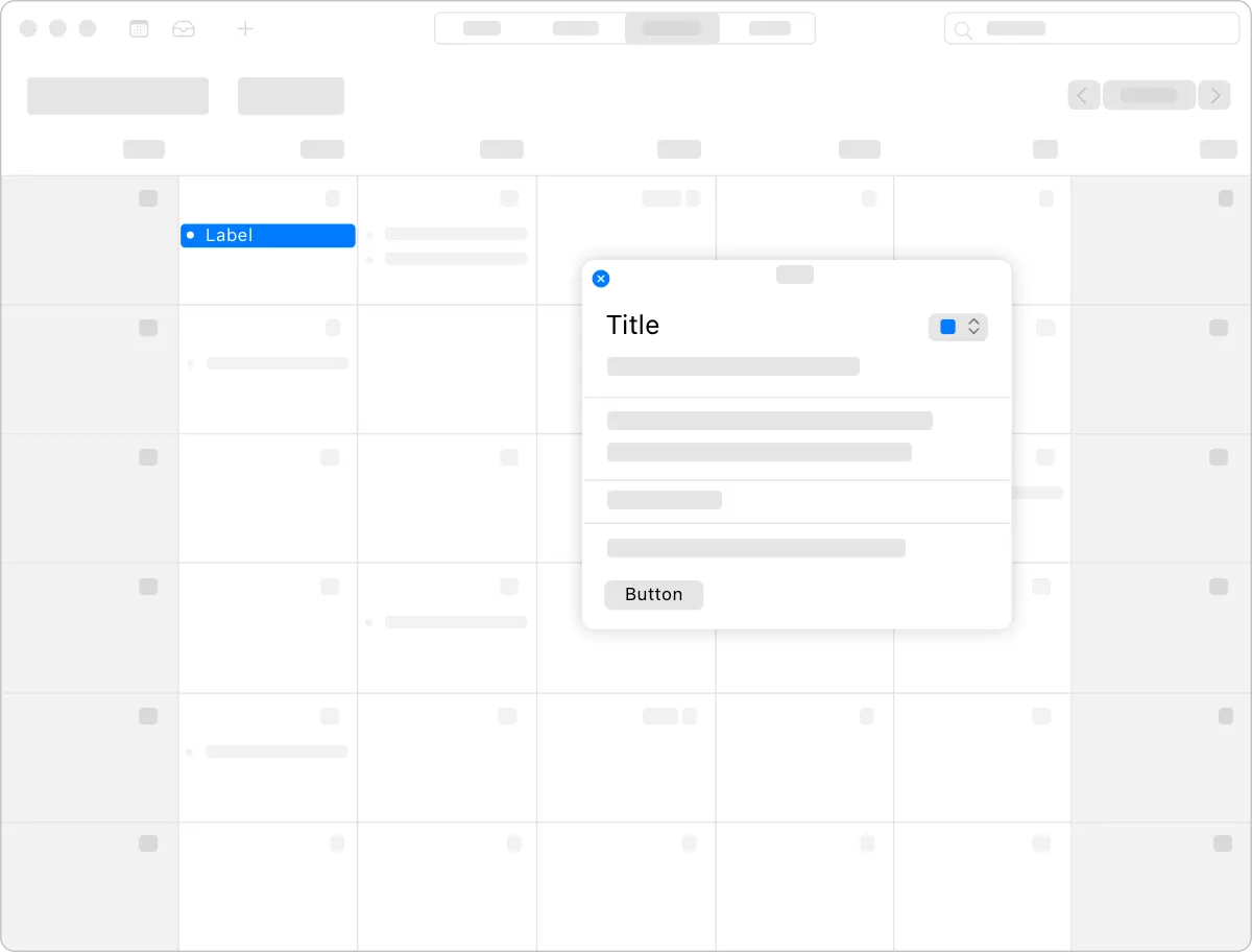
A popover is a transient view that appears above other content when people click or tap a control or interactive area.
팝오버는 사용자가 컨트롤 또는 대화형 영역을 클릭하거나 누를 때 다른 내용 위에 나타나는 일시적인 뷰입니다.
Use a popover to expose a small amount of information or functionality. Because a popover disappears after people interact with it, limit the amount of functionality in the popover to a few related tasks. For example, a calendar event popover makes it easy for people to change the date or time of an event, or to move it to another calendar. The popover disappears after the change, letting people continue reviewing the events on their calendar.
팝오버를 사용하여 적은 양의 정보 또는 기능을 노출할 수 있습니다. 사람들이 상호 작용한 후에는 팝업이 사라지므로 해당 팝업의 기능 양을 몇 가지 관련 작업으로 제한합니다. 예를 들어, 일정관리 이벤트 팝업을 사용하면 사람들이 이벤트의 날짜 또는 시간을 쉽게 변경하거나 다른 일정관리로 이동할 수 있습니다. 이 팝업은 변경 후에 사라지므로 사람들이 일정관리의 이벤트를 계속 검토할 수 있습니다.
역자첨언
Consider using popovers when you want more room for content. Views like sidebars and panels take up a lot of space. If you need content only temporarily, displaying it in a popover can help streamline your interface.
콘텐츠를 더 많이 사용하고 싶을 때는 팝오버를 사용하는 것을 고려해 보십시오. 사이드바나 패널과 같은 뷰는 많은 공간을 차지합니다. 콘텐츠가 일시적으로만 필요한 경우에는 이를 팝오버에 표시하면 인터페이스를 간소화하는 데 도움이 될 수 있습니다.
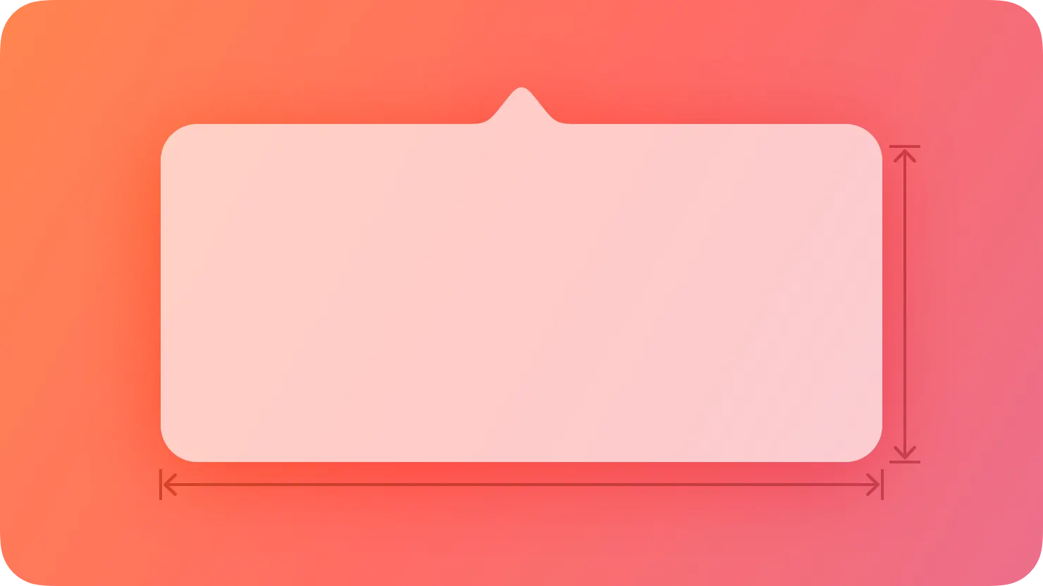
Position popovers appropriately. Make sure a popover’s arrow points as directly as possible to the element that revealed it. Ideally, a popover doesn’t cover the element that revealed it or any essential content people may need to see while using it.
팝오버를 적절하게 배치합니다. 팝오버의 화살표가 노출된 요소를 가능한 한 직접적으로 가리켜야 합니다. 이상적으로, 팝오버는 노출된 요소나 사용 중에 사람들이 봐야 할 필수적인 내용을 가리지 않습니다.
Use a Close button for confirmation and guidance only. A Close button, including Cancel or Done, is worth including if it provides clarity, like exiting with or without saving changes. Otherwise, a popover generally closes when people click or tap outside its bounds or select an item in the popover. If multiple selections are possible, make sure the popover remains open until people explicitly dismiss it or they click or tap outside its bounds.
닫기 버튼은 확인 및 안내에만 사용하십시오. 취소 또는 완료를 포함한 닫기 버튼은 변경 내용을 저장하거나 저장하지 않고 종료하는 것과 같이 명확성을 제공하는 경우 포함할 가치가 있습니다. 그렇지 않으면 일반적으로 사람들이 경계를 벗어나거나 또는 팝오버의 항목을 선택할 때 팝오버가 닫힙니다. 여러 선택이 가능한 경우 사람들이 명시적으로 취소하거나 경계를 벗어나거나 클릭할 때까지 팝오버가 열려 있는지 확인하십시오.
→ 팝오버 밖을 터치하거나, 팝오버의 항목이 선택될 때, 닫히도록 설계하라.
Always save work when automatically closing a nonmodal popover. People can unintentionally dismiss a nonmodal popover by clicking or tapping outside its bounds. Discard people’s work only when they click or tap an explicit Cancel button.
논모달 팝오버를 자동으로 닫을 때 항상 작업을 저장합니다. 사용자는 논모달 팝업을 클릭하거나 범위를 벗어나면 의도치 않게 삭제할 수 있습니다. 명시적 취소 버튼을 클릭하거나 누를 때만 사용자의 작업을 삭제합니다.
→ 밖을 누르면 닫히는 논모달 팝오버는 항상 작업을 저장해라.
Show one popover at a time. Displaying multiple popovers clutters the interface and causes confusion. Never show a cascade or hierarchy of popovers, in which one emerges from another. If you need to show a new popover, close the open one first.
한 번에 하나의 팝오버를 표시합니다. 여러 개의 팝업을 표시하면 인터페이스가 어수선해지고 혼란이 발생합니다. 한 팝업이 다른 팝오버에서 나타나는 계단식 또는 계층 구조를 절대로 표시하지 마십시오. 새로운 팝오버를 표시해야 하는 경우 먼저 열려 있는 팝오버를 닫으십시오.
Don’t show another view over a popover. Make sure nothing displays on top of a popover, except for an alert.
팝오버 위에 다른 뷰를 표시하지 마십시오. Alert을 제외하고 팝업 위에 표시되는 것이 없는지 확인하십시오.
When possible, let people close one popover and open another with a single click or tap. Avoiding extra gestures is especially desirable when several different bar buttons each open a popover.
가능할 때, 한 번의 클릭 또는 탭으로 사람들이 한 팝오버를 닫고 다른 팝오버를 열도록 합니다. 여러 개의 다른 막대 버튼이 각각 팝오버를 열 때 추가적인 제스처를 피하는 것이 특히 좋습니다.
Avoid making a popover too big. Make a popover only big enough to display its contents and point to the place it came from. If necessary, the system can adjust the size of a popover to ensure it fits well in the interface.
팝오버를 너무 크게 만들지 마십시오. 내용물이 표시될 수 있을 정도의 크기로만 팝오버를 만들고, 팝오버가 생성된 위치를 가리키세요. 필요한 경우 시스템은 팝업의 크기를 조정하여 인터페이스에 잘 맞도록 할 수 있습니다.
Provide a smooth transition when changing the size of a popover. Some popovers provide both condensed and expanded views of the same information. If you adjust the size of a popover, animate the change to avoid giving the impression that a new popover replaced the old one.
팝오버의 크기를 변경할 때 부드러운 전환을 적용하세요. 일부 팝오버는 동일한 정보의 축약된 보기와 확장된 보기를 모두 제공합니다. 팝오버의 크기를 조정할 경우 기존 팝오버가 대체되었다는 인상을 주지 않도록 변경 내용을 애니메이션화하십시오.
Avoid using the word popover in help documentation. Instead, refer to a specific task or selection. For example, instead of “Select the Show button at the bottom of the popover,” you might write “Select the Show button.”
도움말 문서에서 팝오버라는 단어를 사용하지 않도록 하십시오. 대신 특정 작업이나 선택 항목을 참조하십시오. 예를 들어 "팝오버 맨 아래에 있는 표시 버튼 선택" 대신 "표시 버튼 선택"이라고 쓸 수 있습니다
Avoid using a popover to show a warning. People can miss a popover or accidentally close it. If you need to warn people, use an alert instead.
No additional considerations for visionOS. Not supported in tvOS or watchOS.
Avoid displaying popovers in compact views. Make your app or game dynamically adjust its layout based on the size class of the content area. Reserve popovers for wide views; for compact views, use all available screen space by presenting information in a full-screen modal view like a sheet instead. For related guidance, see Modality.
콤팩트 뷰에 팝오버를 표시하지 마십시오. 내용 영역의 크기 클래스에 따라 앱이나 게임의 레이아웃을 동적으로 조정할 수 있습니다. 넓은 뷰에 대해 팝오버를 제공하고, 콤팩트 뷰의 경우 시트처럼 전체 화면 모드 보기로 정보를 표시하여 사용 가능한 모든 화면 공간을 사용합니다. 관련 지침은 촬영장비를 참조하십시오.
→ 작은 뷰에서는 팝오버를 사용하지 말아라.
You can make a popover detachable in macOS, which becomes a separate panel when people drag it. The panel remains visible onscreen while people interact with other content.
macOS에서 팝오버를 분리할 수 있도록 할 수 있으며, 이는 사람들이 드래그할 때 별도의 패널이 됩니다. 사람들이 다른 콘텐츠와 상호 작용하는 동안에도 패널은 화면에 계속 표시됩니다.
Consider letting people detach a popover. People might appreciate being able to convert a popover into a panel if they want to view other information while the popover remains visible.
사람들이 팝오버를 분리하도록 하는 것을 고려해 보십시오. 사람들은 팝오버가 보이는 동안 다른 정보를 보고 싶다면 해당 팝오버를 패널로 변환하는 것을 선호할 수 있습니다.
Make minimal appearance changes to a detached popover. A panel that looks similar to the original popover helps people maintain context.
분리된 팝오버에 최소한의 모양 변경을 합니다. 원래 팝오버와 유사한 패널은 사람들이 상황을 유지할 수 있도록 도와줍니다.
→ 분리된 팝오버가 기존 팝오버의 모양과 거의 같도록 유지해야 한다.
UIPopoverPresentationController — UIKit
NSPopover — AppKit
Change Log
작성 날짜 | 작성자 | 수정사항 |
2023/10/30 | 규니 | 초기 번역 |
2023/12/22 | 규니 | 배포 |