Machine learning is a powerful and versatile tool that can help you improve existing experiences and create new ones that people love.

In addition to providing familiar features like image recognition and content recommendations, your app can use machine learning to forge deep connections with people and help them accomplish more with less effort.
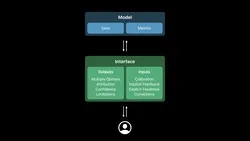
Machine learning apps use models to perform tasks like recognizing images or finding relationships among numerical data. A great machine learning app depends on well-designed models as much as it depends on a well-designed UI and user experience. For insight into the process of designing models, see Create ML.
As you design your models, keep the intended experience of your app in mind. It can take a long time to adjust the behavior of models, so be prepared to change the way you use data and metrics if the app experience needs to change.
Designing the UI and user experience of a machine learning app can be uniquely challenging. Because a machine learning app bases its behavior on the data it receives — reacting to changing information and conditions — you can’t design specific reactions to a static set of scenarios. Instead, you design the experience by teaching the app how to interpret data and react accordingly.
To help you meet this challenge, first consider the role that machine learning plays in your app. Defining the role of machine learning in your app can help you discover areas in which you can explore the ways machine learning can affect the experience your app provides.
Use the machine learning role you identify to help you define ways your app can receive and display data. There are several patterns — grouped into inputs and outputs — that provide guidance in areas such as getting feedback, displaying data, handling mistakes, and supporting corrections. Use the guidance in these patterns to help you integrate machine learning into your app in ways that people appreciate.
Machine learning systems vary widely, and the ways an app can use machine learning vary widely, too. As you approach the design of your app, think about how its features use machine learning in each of the following areas.
If an app can still work without the feature that machine learning supports, machine learning is complementary to the app; otherwise, it’s a critical dependency. For example:
•
The keyboard uses machine learning to provide QuickType suggestions. Because the keyboard still works without these suggestions, machine learning plays a complementary role in the app.
•
Face ID relies on machine learning to perform accurate face recognition. Without machine learning, Face ID would not work.
In general, the more critical an app feature is, the more people need accurate and reliable results. On the other hand, if a complementary feature delivers results that aren’t always of the highest quality, people might be more forgiving.
Machine learning results depend on data. To make good design decisions, you need to know as much as possible about the types of data your app feature needs. In general, the more sensitive the data, the more serious the consequences of inaccurate or unreliable results. For example:
•
If a health app misinterprets data and incorrectly recommends a visit to the doctor, people are likely to experience anxiety and may lose trust in the app.
•
If a music app misinterprets data and recommends an artist that people don’t like, they’re likely to view the result as an inconsequential mistake.
As with critical app features, features that use sensitive data must prioritize accuracy and reliability. Regardless of the sensitivity of the data, all apps must protect user privacy at all times.
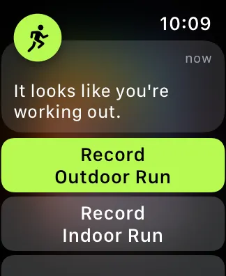
A proactive app feature provides results without people requesting it to do so. Proactive features can prompt new tasks and interactions by providing unexpected, sometimes serendipitous results. In contrast, a reactive app feature provides results when people ask for them or when they take certain actions. Reactive features typically help people as they perform their current task. For example:
•
QuickType suggests words in reaction to what people type.
•
Siri Suggestions can proactively suggest a shortcut based on people’s recent routines.
Because people don’t ask for the results that a proactive feature provides, they may have less tolerance for low-quality information. To reduce the possibility that people will find proactive results intrusive or irrelevant, you may need to use additional data for the feature.
Apps may use machine learning to support visible or invisible features. People are usually aware of visible app features because such features tend to offer suggestions or choices that people view and interact with. For example, a visible keyboard feature tries to guess the word that people are typing and presents the most likely words in a list from which people choose.
As the name suggests, an invisible feature provides results that aren’t obvious to people. For example, the keyboard learns how people type over time so it can optimize the tap area for each key and help them make fewer typing mistakes. Because this app feature improves the typing experience without requiring people to make choices, many people aren’t aware that the feature exists.
People’s impression of the reliability of results can differ depending on whether a feature is visible or invisible. With a visible feature, people form an opinion about the feature’s reliability as they choose from its results. It’s harder for an invisible feature to communicate its reliability — and potentially receive feedback — because people may not be aware of the feature at all.
All machine learning models can improve, but some improve dynamically, as people interact with the app feature, and others improve offline and affect the feature only when the app updates. For example:
•
Face ID improves dynamically as people’s faces gradually change over time.
•
Photos improves its object recognition capabilities with every new iOS release.
In addition to the frequency of app updates, static or dynamic improvements can affect other parts of the user experience, too. For example, dynamic features often incorporate forms of calibration and feedback (either implicit or explicit), whereas static features might not.
Explicit feedback provides actionable information your app can use to improve the content and experience it presents to people. Unlike implicit feedback — which is information an app gleans from user actions — explicit feedback is information people provide in response to a specific request from the app.
Favoriting — marking an item for quick access in the future — and social feedback — expressing emotions towards others — are common user interactions that seem like mechanisms that supply explicit feedback. However, these tools actually provide implicit feedback because they don’t support app-specific requests. People use favoriting and social feedback to accomplish their own goals and apps can gather implicit feedback from these interactions.
Request explicit feedback only when necessary. People must take action to provide explicit feedback, so it’s best to avoid requesting it if possible. Instead, consider using implicit feedback to learn how people interact with your app without asking them to do extra work.
Always make providing explicit feedback a voluntary task. You want to communicate that explicit feedback can help improve the experience without making people feel that providing it is mandatory.
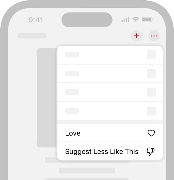
Don’t ask for both positive and negative feedback. Good suggestions don’t require any feedback, so you don’t want to imply that people need to give positive feedback on all the results they like. Instead, give people the opportunity to provide negative feedback on results they don’t like so that you can improve the experience.
Use simple, direct language to describe each explicit feedback option and its consequences.Avoid using imprecise terms such as dislike because such terms don’t convey consequences and can be hard to translate. Instead, describe each option in a way that helps people understand what happens when they choose the option, such as:
•
Suggest less pop music
•
Suggest more thrillers
•
Mute politics for a week
Add icons to an option description if it helps people understand it. Icons can help clarify or emphasize part of an option description. Avoid using an icon by itself, because it might not be clear enough to communicate granularity or consequences.
Consider offering multiple options when requesting explicit feedback. Providing multiple options can give people a sense of control and help them identify unwanted suggestions and remove them from your app. To help people provide feedback, consider offering options that become progressively more specific so that it’s easy for people to clarify their response.
Act immediately when you receive explicit feedback and persist the resulting changes. For example, if people identify content they don’t want to see, that the content instantly disappears from their view and doesn’t appear elsewhere in your app. When you react immediately to feedback and show that your app remembers it, you build people’s trust in the value of providing it.
Consider using explicit feedback to help improve when and where you show results. For example, people might like a result, but they may not want to see it at certain times or in certain contexts. Explicit feedback on when and where to show results can help you fine-tune the experience people have in your app.
Implicit feedback is information that arises as people interact with your app’s features. Unlike the specific responses you get from explicit feedback, implicit feedback gives you a wide range of information about user behavior and preferences. Although incorporating implicit feedback isn’t required for a great machine learning app, the feedback can help you improve your app’s user experience without asking people to do any extra work.
Always secure people’s information. Implicit feedback can gather potentially sensitive user information, so you must be particularly careful to maintain strict controls on user privacy.
Help people control their information. As an app developer, you know that the more you understand about the behavior of your users — both within your app and in other apps — the more you can improve the experience your app provides. Although most people understand the benefits of making their information available to multiple apps, they may still be surprised when things they do in one app affect experiences they have in a different app. Worse, people may assume that apps are sharing their private information, which can cause them to lose trust in the apps. It’s important to tell people how your app gets and shares their information and to give people ways to restrict the flow of their information.
Don’t let implicit feedback decrease people’s opportunities to explore. Implicit feedback tends to reinforce people’s behavior, which can improve the user experience in the short term, but may worsen it in the long term. For example, it might seem like a good idea to give people a set of suggestions that matches all the things they’re interested in now, but doing so doesn’t encourage them to explore new things.
When possible, use multiple feedback signals to improve suggestions and mitigate mistakes.Implicit feedback is indirect, so it can be difficult to discern a person’s actual intent in the information you gather. For example, if someone views a photo, shares it in a message, and adds it to a shared album, it doesn’t necessarily mean they have positive feelings about the photo. Incorporate implicit feedback from multiple sources and interactions to help you avoid misinterpreting people’s intentions.
Consider withholding private or sensitive suggestions. People often share their accounts and devices with others, or switch from using a personal device to a communal one. If your app receives implicit feedback related to private or sensitive topics, avoid offering recommendations based on that feedback.
Prioritize recent feedback. People’s tastes can change frequently, so base your recommendations on recent implicit feedback. For example, Face ID prioritizes recent facial input because it’s most likely to represent what the person looks like now. If recent feedback isn’t available, you can fall back to historical feedback.
Use feedback to update predictions on a cadence that matches the person’s mental model of the feature. For example, people expect typing suggestions to update immediately as they’re typing. On the other hand, giving people continuously updated song recommendations makes it hard to consider individual songs and could make them feel rushed or overwhelmed.
Be prepared for changes in implicit feedback when you make changes to your app’s UI. Even small UI changes can lead to noticeable changes in the amount and types of implicit feedback. For example, changing the location of a button can affect how people use it, even if there’s no change in the benefit they get from the button’s action. Take such changes into account when interpreting the implicit feedback you receive from interactions in your app.
Beware of confirmation bias. Implicit feedback is constrained by what people can actually see and do in your app and other apps — it rarely gives you insight into new things they might like to do. Avoid relying solely on implicit feedback to inform your results.
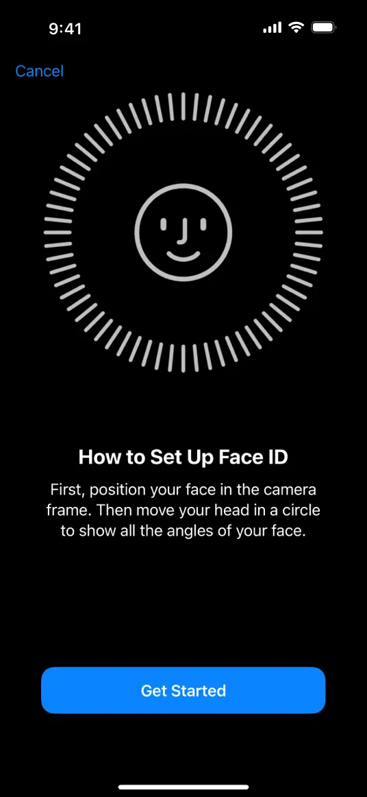
Calibration is a process during which people provide information that an app feature needs before it can function. To use Face ID, for example, a person must first scan their face.
In general, only use calibration when your feature can’t function without that initial information. If your feature can work without calibration, consider using other ways to gather the information you need, such as implicit feedback or possibly explicit feedback.
Always secure people’s information. During calibration, people may provide sensitive information and you must make sure it remains secure.
Be clear about why you need people’s information. Typically, calibration is required before people can use a feature, so it’s essential that they understand the value of providing their information. As you briefly describe how people can benefit from your feature, emphasize what it does rather than how it works.
Collect only the most essential information. Designing a unique experience that requests a minimal amount of information can make people more comfortable participating in the process and increase their trust in your app.
Avoid asking people to participate in calibration more than once. Also, it’s best when calibration occurs early in the user experience. As people continue using your app or feature, you can use implicit or explicit feedback to evolve your information about them without asking them to participate again. An exception is a feature that needs calibration with an object instead of a person. For example, an app that helps people improve their baseball swing might need to calibrate with each new baseball field.
Make calibration quick and easy. Even a brief calibration experience takes time and requires effort from people. An ideal calibration experience makes it easy for people to respond, without compromising the quality of the information they provide. The following guidelines can help you create a streamlined calibration experience.
•
Prioritize getting a few pieces of important information and infer the rest from other sources or by getting people’s feedback.
•
Avoid asking for information that most people would have to look up.
•
Avoid asking people to perform actions that might be difficult.
Make sure people know how to perform calibration successfully. After people decide to participate in calibration, give them an explicit goal and show their progress towards it. For example, Face ID calibration briefly describes what people need to do and changes the appearance of the tick marks encircling the face as people progress through scanning.
Immediately provide assistance if progress stalls. When progress stalls, people can feel stuck or powerless, and they may lose trust in your app. In this situation, it’s crucial to give people actionable recommendations that quickly get them back on track. As you provide this guidance, never imply that something’s wrong or that people are at fault, and never leave people without a clear next step.
Confirm success. The moment people successfully complete calibration, reward their time and effort by giving them a clear path towards using the feature. Providing an explicit completion to the calibration experience reinforces the unique nature of the experience and helps people switch their focus to your feature.
Let people cancel calibration at any time. Make sure you give people an easy way to cancel the experience at any point and avoid implying any judgement about their choice. There’s no need to provide any messaging that mentions the canceled calibration, because the next time people attempt to use the feature, they’ll have another chance to participate.
Give people a way to update or remove information they provided during calibration. Letting people edit their information gives them more control and can lead them to have greater trust in your app. Although the calibration experience can help people edit their responses, it’s a good idea to let people edit their information outside of the calibration experience so that they feel free to make changes at any time.
People use corrections to fix mistakes that apps make. For example, if a photo app automatically crops a photo in a way people don’t like, they can correct the mistake by cropping the photo in a different way.

Give people familiar, easy ways to make corrections. When your app makes a mistake, you don’t want people to be confused about how to correct it. You can avoid causing confusion by showing the steps your app takes as it performs the automated task. For example, Photos highlights the controls it uses to auto-crop a photograph so that people can use the same controls to refine or undo the results.
Provide immediate value when people make a correction. Reward people’s effort by instantly displaying corrected content, especially when the feature is critical or you’re responding to direct user input. Also, be sure to persist the updates so people don’t have to make the same corrections again.
Let people correct their corrections. Sometimes, people make a correction without realizing that they’ve made a mistake. As you do with all corrections, respond immediately to an updated correction and persist the update.
Always balance the benefits of a feature with the effort required to make a correction. People may not mind when a feature that automates a task makes a mistake, but they’re likely to stop using the feature if it seems easier to perform the task themselves.
Never rely on corrections to make up for low-quality results. Although corrections can reduce the impact of a mistake, depending on them may erode people’s trust in your app and reduce the value of your feature.
Learn from corrections when it makes sense. A correction is a type of implicit feedback that can give you valuable information about ways your app doesn’t meet people’s expectations. Before you use a correction to update your models, make sure that the correction will lead to higher quality results.
When possible, use guided corrections instead of freeform corrections. Guided corrections suggest specific alternatives, so they require less user effort; freeform corrections don’t suggest specific alternatives, so they require more input from people. An example of guided correction is a speech-to-text feature that gives people a list of alternative text completions from which to choose. In contrast, Photos offers freeform correction so that people can adjust the auto-cropping of a photo as they see fit. If it makes sense in your app, you can support a combination of guided and freeform corrections.
It’s inevitable that your app will make mistakes. Although people may not expect perfection, mistakes can damage their experience and decrease their trust in your app. To help you avoid negative consequences, it’s crucial to:
•
Anticipate mistakes. As much as possible, design ways to avoid mistakes and mitigate them when they happen.
•
Help people handle mistakes. Mistakes can have a wide range of consequences, so the tools you provide to handle a mistake must be able to address those consequences.
•
Learn from mistakes when doing so improves your app. In some cases, learning from a mistake might have undesirable effects, such as causing unpredictability in the user experience. When it makes sense, use each mistake as a data point that can refine your machine learning models and improve your app.
There are several machine learning patterns that can help you address mistakes:
•
Limitations help you set people’s expectations about the accuracy of your suggestions.
•
Corrections give people a way to be successful even when your results are wrong.
•
Attribution gives people insight into where suggestions come from, which can help them understand mistakes.
•
Confidence helps you gauge the quality of your results, which can impact how you present them.
Understand the significance of a mistake’s consequences. For example, incorrect keyboard suggestions might annoy people, but suggesting a travel route that results in a missed flight is a serious inconvenience. Show empathy by providing corrective actions or tools that match the seriousness of the mistake.
Make it easy for people to correct frequent or predictable mistakes. If you don’t give people an easy way to correct mistakes, they can lose trust in your app.
Continuously update your feature to reflect people’s evolving interests and preferences and help avoid mistakes. For example, you can use implicit feedback to discover changes in people’s tastes and habits. It’s also a good idea to update your feature with domain-specific information, such as current trends in popular entertainment. Ideally, people don’t have to do any work to benefit from improvements in your app.
When possible, address mistakes without complicating the UI. Some patterns, such as corrections and limitations, tend to integrate seamlessly with an app’s UI, whereas others, like attributions, can be harder to integrate. Balance a pattern’s effect on the UI with its potential for compounding the mistake. For example, if you update the UI with an attribution that turns out to be wrong, the effect of the original mistake is magnified.
Be especially careful to avoid mistakes in proactive features. A proactive feature — like a suggestion based on people’s behaviors — promises valuable results without asking people to do anything to get them. However, because people don’t request a proactive feature, they often have less patience with its mistakes. Mistakes made by proactive features can also cause people to feel that they have less control.
As you work on reducing mistakes in one area, always consider the effect your work has on other areas and overall accuracy. For example, optimizing an image-recognition app to improve how it recognizes dogs might result in a decreased ability to recognize cats. As your models evolve, be prepared for mistakes to evolve, too. Use what you know about people’s preferences to help you determine the areas to work on.
Depending on the design of your feature, it might work best to present a single result or multiple results from which people can choose. Providing multiple options can give people a greater sense of control and can help bridge the gap between your model’s predictions and what people actually want. Multiple options can also encourage people to have realistic expectations about the types of results your app generates.
You might present multiple options to people in the following contexts:
•
Suggested options, a proactive feature that suggests content to people based on the their past interactions. For example, For You recommendations from Apple Music.
•
Requested options, a reactive feature that suggests potential next steps to people based on their recent actions. For example, Quick Type suggestions.
•
Corrections, which are actions people take to fix mistakes your app has made when it’s acting on their behalf. For example, the Photos Auto-Crop feature.
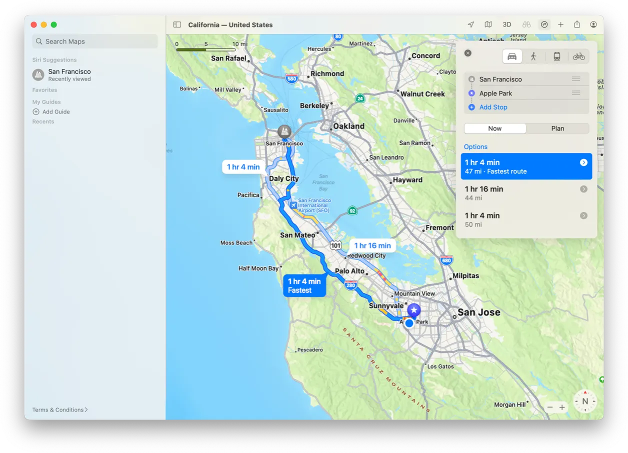
Prefer diverse options. When possible, balance the accuracy of a response with the diversity of multiple options. For example, Apple Maps generally suggests more than one route to a destination, such as a route without tolls, a scenic route, or a route that uses highways. Providing different types of options helps people choose the one that they prefer and can also suggest new items that might interest them.
In general, avoid providing too many options. People must evaluate each option before making a choice, so more options increases cognitive load. When possible, list options on one screen so people don’t have to scroll to find the right one.
List the most likely option first. When you know how your confidence values correlate with the quality of your results, you might use them to rank the options. You might also consider using contextual information, such as the time of day or the current location, to help you determine the most likely option. If it makes sense in your app, select the first option by default so people can quickly achieve their goals without reading through every option.
Make options easy to distinguish and choose. For example, in a routing app, people often need to make route choices quickly to avoid going the wrong way. When options look similar, help people distinguish between them by providing a brief description of each one and taking particular care to highlight the differences. In cases where there are too many options to display in a single view, such as with content recommendations, consider grouping options in categories that people can scan rapidly.
Learn from selections when it makes sense. People give you implicit feedback every time they make a selection. When it doesn’t adversely affect the user experience, use this feedback to refine the options you provide and increase the chance that you’ll present the most likely option first. In general, continuing to offer incorrect results is likely to decrease people’s trust in the quality of your app’s predictions.
Confidence indicates the measure of certainty for a result. Not all models produce confidence values by default, so you might consider generating them if you can use them to improve the user experience of your app.

Although it might seem like higher confidence produces a higher quality result — and therefore a better user experience — it doesn’t necessarily work that way. You need to verify that your confidence values correspond to the quality of your results. For example, you might review values for multiple confidence thresholds or compare values across multiple versions of your app. If you’re not sure how your confidence values correlate with the quality of your results, it’s not a good idea to convey confidence to people.
Know what your confidence values mean before you decide how to present them. For example, people may forgive low-quality results from critical or complementary features — especially when results are accompanied by attribution or other contextual information — but presenting low-quality results in a prominent way is likely to erode trust in your app.
In general, translate confidence values into concepts that people already understand. Simply displaying a confidence value doesn’t necessarily help people understand how it relates to a result. For example, a feature that suggests new music based on a person’s listening habits might calculate that there’s a 97% match between a new song and the songs they usually listen to. However, displaying “97% match” next to the new song as an attribution doesn’t communicate enough information to help people make a choice. In contrast, providing an attribution that clearly identifies the behavior — such as “Because you listen to pop music” — can be more actionable.
In situations where attributions aren’t helpful, consider ranking or ordering the results in a way that implies confidence levels. If you must display confidence directly, consider expressing it in terms of semantic categories. For example, a feature that predicts travel prices might replace ranges of confidence numbers with categories like “high chance” and “low chance” to give context to the values and help people understand and compare the results.
In scenarios where people expect statistical or numerical information, display confidence values that help them interpret the results. For example, weather predictions, sports statistics, and polling numbers are often accompanied by specific values that express the accuracy of the data as an interval or a percentage.
Whenever possible, help people make decisions by conveying confidence in terms of actionable suggestions. Understanding people’s goals is key to expressing confidence in ways that help them make decisions. For example, if your feature predicts when an item will be at its lowest price, you know that people want to optimize how they spend their time and money. For a feature like this, displaying percentages or other numerical confidence values would be less valuable than providing actionable suggestions like “This is a good time to buy,” or “Consider waiting for a better price.”
Consider changing how you present results based on different confidence thresholds. If high or low levels of confidence have a meaningful impact on the ways people can experience the results, it’s a good idea to adapt your presentation accordingly. For example, when confidence is high, the face recognition feature in Photos simply displays the photos that contain a specific person, but when confidence is lower, the feature asks people to confirm whether the photos contain the person before showing more.
When you know that confidence values correspond to result quality, you generally want to avoid showing results when confidence is low. Especially when a feature is proactive and can make unbidden suggestions, poor results can cause people to be annoyed and even lose trust in the feature. For suggestions and proactive features, it’s a good idea to set a confidence threshold below which you don’t offer results.
An attribution expresses the underlying basis or rationale for a result, without explaining exactly how a model works. Depending on the design of your app, you might want to use attributions to impart transparency and give people insight into your results. For example, if your app suggests books for people to read, you might use an attribution like “Because you’ve read mysteries” when you suggest books in the “thrillers” category.

To help you decide whether to include attributions in your app, consider how you want them to affect people. For example, you might want attributions to:
•
Encourage people to change what they do in your app
•
Minimize the impact of mistakes
•
Help people build a mental model of your feature
•
Promote trust in your app over time
Consider using attributions to help people distinguish among results. For example, if you present a set of results as multiple options, including attributions can help people choose an option based on their understanding of the premise that led to it, such as “New books by authors you’ve read.”
Avoid being too specific or too general. Overly specific attributions can make people feel like they have to do additional work to interpret the results, whereas overly general attributions typically don’t provide useful information. In apps that make content recommendations, general attributions can make people feel like your app is not treating them as individuals, but overly specific attributions can make people think that your app is watching them too closely. The best attributions strike a balance between these extremes.
Keep attributions factual and based on objective analysis. To be useful, an attribution needs to help people reason about a result; you don’t want to provoke an emotional response. Don’t provide an attribution that implies understanding or judgment of people’s emotions, preferences, or beliefs. For example, an app that recommends new content to people can use an attribution like “Because you’ve read nonfiction” instead of an attribution like “Because you love nonfiction.”
In general, avoid technical or statistical jargon. In most situations, using percentages, statistics, and other technical jargon doesn’t help people assess the results you provide. The exception to this is when the result itself is of a statistical or technical nature, such as information in the areas of weather, sports, polling and election results, or scientific data.
Every feature — whether it’s based on machine learning or not — has certain limitations to what it can deliver. In general, there are two types of limitations: things a feature can’t do well and things a feature can’t do at all. When there’s a mismatch between people’s expectations about a feature and what the feature can actually accomplish, a limitation can seem like a defect. For example, people might expect:
•
Photos to perform a search that covers every category they can imagine
•
Siri to respond to queries that aren’t well defined, like “What is the meaning of life?”
•
FaceID to work from every angle
An important part of the design process is to identify the scenarios where limitations impact the user experience and design ways to help people work with them. For example:
•
Set people’s expectations before they use the feature.
•
Show people how to get the best results while they’re using the feature.
•
When inferior results occur, explain why so that people can understand the feature better.
Help people establish realistic expectations. When a limitation may have a serious effect on user experience but happens rarely, consider making people aware of the limitation before they use your app or feature. You might describe the limitation in marketing materials or within the feature’s context so that people can decide how they want to rely on the feature. If the effects of a limitation aren’t serious, you can help set people’s expectations by providing attributions.
Demonstrate how to get the best results. If you don’t provide guidance for using a feature, people may assume it’ll do everything they want. When you proactively show people how to get good results, you help them benefit from the feature and establish a more accurate mental model of the feature’s capabilities. There are many ways to show people the best ways to use a feature, such as:
•
Use placeholder text to suggest input. In Photos, the search bar displays the text “Photos, People, Places…” to help people understand what they can search for before they begin typing. Photos also displays a description of how it scans the photo library to offer search suggestions.
•
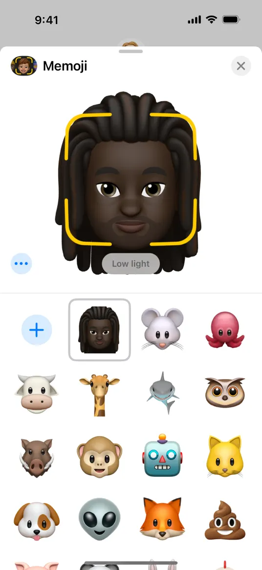
As people interact with the feature, provide feedback on their actions to guide them towards a result without overwhelming them. For example, while people are interacting with Animoji, the feature responds to current conditions and suggests how people can improve their results by adjusting the lighting or moving closer to the camera.
•
Suggest alternative ways to accomplish the goal instead of showing no results. To do this successfully, you need to understand the goal well enough to suggest alternatives that make sense. For example, if people ask Siri to set a timer on a Mac, Siri suggests setting a reminder instead, because timers aren’t available in macOS. This suggestion makes sense because people’s goal is to receive an alert at a certain time.
Explain how limitations can cause unsatisfactory results. People can get frustrated when it seems that your feature works intermittently. Ideally, your feature can recognize and describe the reasons for poor results to make people aware of the limitations and help them to adjust their expectations. For example, Animoji tells people that it doesn’t work well in the dark.
Consider telling people when limitations are resolved. When people use a feature frequently, they learn to avoid the interactions that fail because of the feature’s limitations. When you update your app to remove a limitation, you might want to notify people so that they can adjust their mental model of your feature and return to interactions they’d previously avoided.
No additional considerations for iOS, iPadOS, macOS, tvOS, visionOS, or watchOS.