
A gauge displays a specific numerical value within a range of values.
게이지는 값 범위 내의 특정 숫자 값을 표시합니다.

In addition to indicating the current value in a range, a gauge can provide more context about the range itself. For example, a temperature gauge can use text to identify the highest and lowest temperatures in the range and display a spectrum of colors that visually reinforce the changing values.
게이지는 범위의 현재 값을 나타내는 것 외에도 범위 자체에 대한 추가 컨텍스트를 제공할 수 있습니다. 예를 들어 온도계는 텍스트를 사용하여 범위 내 최고 온도와 최저 온도를 식별하고 변화하는 값을 시각적으로 강조하는 색상 스펙트럼을 표시할 수 있습니다.
A gauge uses a circular or linear path to represent a range of values, mapping the current value to a specific point on the path. A standard gauge displays an indicator that shows the current value’s location; a gauge that uses the capacity style displays a fill that stops at the value’s location on the path.
게이지는 원형 또는 선형 경로를 사용하여 값 범위를 나타내며 현재 값을 경로의 특정 지점에 매핑합니다. 표준 게이지는 현재 값의 위치를 나타내는 표시기를 표시합니다. 용량 스타일을 사용하는 게이지는 경로의 값 위치에서 멈추는 채우기를 표시합니다.
Circular and linear gauges in both standard and capacity styles are also available in a variant that’s visually similar to watchOS complications. This variant — called accessory — works well in iOS Lock Screen widgets and anywhere you want to echo the appearance of complications.
표준 및 용량 스타일의 원형 및 선형 게이지도 watchOS 컴플리케이션과 시각적으로 유사한 변형으로 제공됩니다. 액세서리라고 불리는 이 변형은 iOS 잠금 화면 위젯과 정보 표시 모양을 반영하려는 모든 곳에서 잘 작동합니다.

Write succinct labels that describe the current value and both endpoints of the range. Although not every gauge style displays all labels, VoiceOver reads the visible labels to help people understand the gauge without seeing the screen.
현재 값과 범위의 두 끝점을 설명하는 간결한 레이블을 작성합니다. 모든 게이지 스타일이 모든 레이블을 표시하는 것은 아니지만 VoiceOver는 표시되는 레이블을 읽어서 사용자가 설명 없이 게이지를 이해할 수 있도록 돕습니다. 화면을 보고 있어요.
Consider filling the path with a gradient to help communicate the purpose of the gauge. For example, a temperature gauge might use colors that range from red to blue to represent temperatures that range from hot to cold.
게이지의 목적을 전달하는 데 도움이 되도록 경로를 그라데이션으로 채우는 것이 좋습니다. 예를 들어 온도 게이지는 빨간색에서 파란색까지의 색상을 사용하여 해당 범위의 온도를 나타낼 수 있습니다. 더운 것부터 추운 것까지.
No additional considerations for iOS, iPadOS, visionOS, or watchOS. Not supported in tvOS.
iOS, iPadOS, VisionOS 또는 watchOS에 대한 추가 고려 사항은 없습니다. tvOS에서는 지원되지 않습니다.
In addition to supporting gauges, macOS also defines a level indicator that displays a specific numerical value within a range. You can configure a level indicator to convey capacity, rating, or — rarely — relevance.
게이지 지원 외에도 macOS는 범위 내의 특정 숫자 값을 표시하는 레벨 표시기를 정의합니다. 용량, 등급 또는 드물게 관련성을 전달하도록 수준 표시기를 구성할 수 있습니다.
The capacity style can depict discrete or continuous values.
용량 스타일은 불연속 또는 연속 값을 나타낼 수 있습니다.
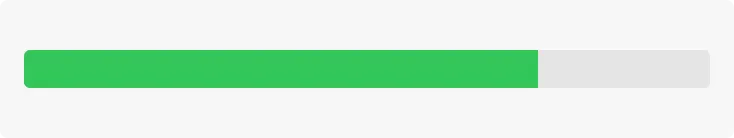
Continuous. A horizontal translucent track that fills with a solid bar to indicate the current value.
연속. 현재 값을 표시하기 위해 단색 막대로 채워지는 수평 반투명 트랙입니다.
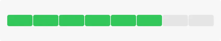
Discrete. A horizontal row of separate, equally sized, rectangular segments. The number of segments matches the total capacity, and the segments fill completely — never partially — with color to indicate the current value.
이산형. 동일한 크기의 개별 직사각형 세그먼트로 구성된 가로 행입니다. 세그먼트 수는 총 용량과 일치하며 세그먼트는 현재 값을 나타내는 색상으로 완전히 채워집니다. 부분적으로 채워지지는 않습니다.
Consider using the continuous style for large ranges. A large value range can make the segments of a discrete capacity indicator too small to be useful.
넓은 범위에는 연속형 스타일을 사용하는 것이 좋습니다. 값 범위가 크면 개별 용량 표시기의 세그먼트가 너무 작아서 유용하지 않을 수 있습니다.
Consider changing the fill color to inform people about significant parts of the range. By default, the fill color for both capacity indicator styles is green. If it makes sense in your app, you can change the fill color when the current value reaches certain levels, such as very low, very high, or just past the middle. You can change the fill color of the entire indicator or you can use the tiered state to show a sequence of several colors in one indicator, as shown below.
범위의 중요한 부분을 사람들에게 알리려면 채우기 색상을 변경하는 것이 좋습니다. 기본적으로 두 용량 표시기 스타일의 채우기 색상은 녹색입니다. 앱에 적합한 경우 현재 값이 매우 낮음, 매우 높음 또는 중간을 지나는 등 특정 수준에 도달하면 채우기 색상을 변경할 수 있습니다. 아래 표시된 것처럼 전체 표시기의 채우기 색상을 변경하거나 계층화된 상태를 사용하여 하나의 표시기에 여러 색상의 시퀀스를 표시할 수 있습니다.
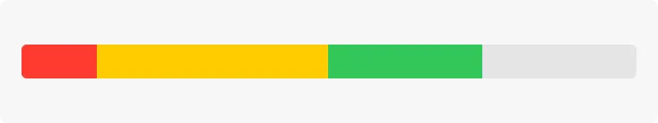
Tiered level appearance
계층화된 레벨의 모습
Although rarely used, the relevance style can communicate relevancy using a shaded horizontal bar. For example, a relevance indicator might appear in a list of search results, helping people visualize the relevancy of the results when sorting or comparing multiple items.
거의 사용되지 않지만 관련성 스타일은 음영 처리된 가로 막대를 사용하여 관련성을 전달할 수 있습니다. 예를 들어 관련성 표시기가 검색 결과 목록에 표시되어 사람들이 여러 항목을 정렬하거나 비교할 때 결과의 관련성을 시각화하는 데 도움이 될 수 있습니다.
Gauge — SwiftUI
NSLevelIndicator — AppKit
Change log
작성 날짜 | 작성자 | 수정사항 |
2023/11/30 | 하니 | 초기 번역 |
2023/12/25 | 하니 | 배포 |