
Organize data in a chart to communicate information with clarity and visual appeal.
데이터를 차트로 구성하여 명확하고 시각적으로 호소력 있게 정보를 전달합니다.
An effective chart highlights a few key pieces of information in a dataset, helping people gain insights and make decisions. For example, people might use a chart to:
효과적인 차트는 데이터셋의 몇 가지 핵심 정보를 강조하여 사람들이 통찰력을 얻고 결정을 내리는 데 도움을 줍니다. 예를 들어 사람들은 차트를 사용하여 다음을 수행할 수 있습니다.
•
Learn how upcoming weather conditions might affect their plans.
•
다가오는 기상 조건이 계획에 어떤 영향을 미칠 수 있는지 알아보세요.
•
Analyze stock prices to understand past performance and discover trends.
•
주가를 분석하여 과거 실적을 파악하고 추세를 파악하세요.
•
Review fitness data to monitor their progress and set new goals.
•
피트니스 데이터를 검토하여 진행 상황을 모니터링하고 새로운 목표를 설정하세요.
To learn about designing charts to enhance your experience, see Charting data; for developer guidance, see Creating a chart using Swift Charts.
→ Chart를 이용하여 데이터셋의 핵심 정보를 표시할 수 있다.
A chart comprises several graphical elements that depict the values in a dataset and convey information about them.
차트는 데이터 세트의 값을 묘사하고 이에 대한 정보를 전달하는 여러 그래픽 요소로 구성됩니다.
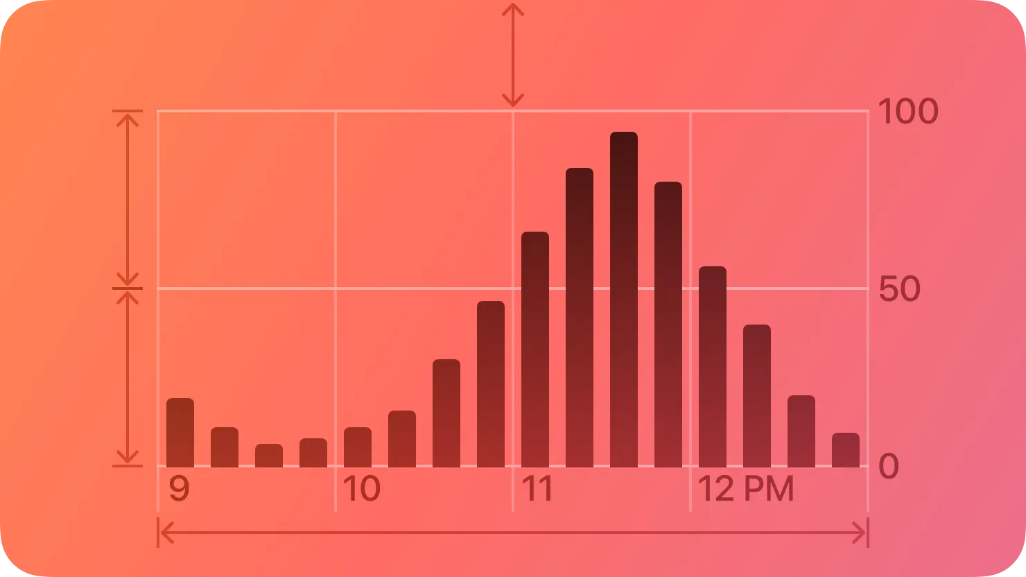
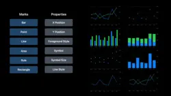
A mark is a visual representation of a data value. You create a chart by supplying one or more series of data values, assigning each value to a mark. To specify the style of chart you want to display — such as bar chart, line chart, or scatter plot — you choose a mark type, such as bar, line, or point (for guidance, see Marks). The general task of depicting individual data values in a chart is called plotting, and the area that contains the marks is called the plot area.
마크는 데이터 값을 시각적으로 표현한 것입니다. 하나 이상의 데이터 값 시리즈를 제공하고 각 값을 마크에 할당하여 차트를 만듭니다. 막대형 차트, 꺾은선형 차트, 분산형 차트 등 표시하려는 차트 스타일을 지정하려면 막대, 선, 포인트 등의 마크 유형을 선택합니다(지침은 마크 참조). 차트에 개별 데이터 값을 표시하는 일반적인 작업을 플로팅 이라고 하며 표시가 포함된 영역을 플롯 영역 이라고 합니다.
→ 마크의 정의, 플로팅, 플롯 영역의 정의
To depict a value, each type of mark uses visual attributes that are determined by a scale, which maps data values like numbers, dates, or categories to visual characteristics like position, color, or height. For example, a bar mark can use a particular height to represent the magnitude of a value and a particular position to represent the time at which the value occurred.
값을 표시하기 위해 각 마크 유형은 숫자, 날짜 또는 범주와 같은 데이터 값을 위치, 색상 또는 높이와 같은 시각적 특성에 매핑하는 척도에 의해 결정되는 시각적 특성을 사용합니다. 예를 들어, 막대 표시는 특정 높이를 사용하여 값의 크기를 나타내고 특정 위치를 사용하여 값이 발생한 시간을 나타낼 수 있습니다.
→ 마크는 데이터를 위치, 색상, 높이로 시각적으로 보여준다.
To give people the context they need to interpret a chart’s visual characteristics, you supply descriptive content that can take a few different forms.
사람들에게 차트의 시각적 특성을 해석하는 데 필요한 컨텍스트를 제공하려면 몇 가지 다른 형식을 취할 수 있는 설명 콘텐츠를 제공해야 합니다.
You can use an axis to help define a frame of reference for the data represented by a set of marks. Many charts display a pair of axes at the edges of the plot area — one horizontal and one vertical — where each axis represents a variable like time, amount, or category.
축을 사용하면 마크 세트로 표시되는 데이터에 대한 참조 프레임을 정의하는 데 도움이 됩니다. 많은 차트는 그림 영역 가장자리에 한 쌍의 축(가로 하나, 세로 하나)을 표시합니다. 여기서 각 축은 시간, 양 또는 범주와 같은 변수를 나타냅니다.
→ 축은 마크 데이터에 대한 프레임 역할!
An axis can include ticks, which are reference points that help people visually locate the position of important values along the axis, such as a 0, 50%, and 100%. Many charts display grid lines that each extend from a tick across the plot area to help people visually estimate a data value when its mark isn’t near an axis.
축에는 0, 50%, 100% 등 축을 따라 중요한 값의 위치를 시각적으로 찾는 데 도움이 되는 참조점인 눈금이 포함될 수 있습니다. 많은 차트에는 표시가 축 근처에 있지 않을 때 사람들이 데이터 값을 시각적으로 추정하는 데 도움이 되도록 플롯 영역을 가로지르는 눈금에서 각각 확장되는 눈금선이 표시됩니다.
→ 축은 눈금을 포함할 수 있으며, 이 눈금은 사람들이 데이터 값을 추정할 수 있도록 돕는다
You also have multiple ways to describe chart elements to help people interpret the data and to highlight the key information you want to communicate. For example, you can supply labels that name items like axes, grid lines, ticks, or marks, and accessibility labels that describe chart elements for people who use assistive technologies. To provide context and additional details, you can create descriptive titles, subtitles, and annotations. When needed, you can also create a legend, which describes chart properties that aren’t related to a mark’s position, such as the use of color or shape to denote different value categories.
또한 사람들이 데이터를 해석하는 데 도움을 주고 전달하려는 주요 정보를 강조 표시하기 위해 차트 요소를 설명하는 다양한 방법이 있습니다. 예를 들어 축, 눈금선, 눈금, 표시와 같은 항목의 이름을 지정하는 레이블과 보조 기술을 사용하는 사람들을 위해 차트 요소를 설명하는 접근성 레이블을 제공할 수 있습니다. 맥락과 추가 세부정보를 제공하기 위해 설명이 포함된 제목, 부제, 주석을 만들 수 있습니다. 필요한 경우 다양한 값 범주를 표시하기 위해 색상이나 모양을 사용하는 등 마크 위치와 관련되지 않은 차트 속성을 설명하는 범례를 만들 수도 있습니다.
→ accessibility를 위해 설명을 추가하고 레이블 제공할 수 있다.
Clear, accurate descriptions can help make a chart more approachable and accessible; to learn about additional ways to improve the accessibility of your chart, see Enhancing the accessibility of a chart.
명확하고 정확한 설명은 차트에 더욱 접근하기 쉽고 접근하기 쉽게 만드는 데 도움이 될 수 있습니다. 차트의 접근성을 향상시키는 추가 방법에 대해 알아보려면 차트의 접근성 향상을 참조하세요.
→ 아래 참조
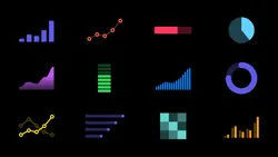
Choose a mark type based on the information you want to communicate about the data. Some of the most familiar mark types are bar, line, and point; for developer guidance on these and other mark types, see Swift Charts.
데이터에 대해 전달하려는 정보를 기반으로 마크 유형을 선택합니다. 가장 친숙한 마크 유형으로는 막대, 선, 점이 있습니다. 이러한 마크 유형과 기타 마크 유형에 대한 개발자 지침은 Swift 차트를 참조하세요 .
Bar marks work well in charts that help people compare values in different categories or view the relative proportions of various parts in a whole. When used to help people understand data that changes over time, bar charts work especially well when each value can represent a sum, like the total number of steps taken in a day.
막대 표시는 사람들이 다양한 범주의 값을 비교하거나 전체적으로 다양한 부분의 상대적 비율을 보는 데 도움이 되는 차트에서 잘 작동합니다. 시간이 지남에 따라 변화하는 데이터를 사람들이 이해하는 데 도움을 주기 위해 막대 차트를 사용하면 각 값이 하루에 걸은 총 걸음 수와 같이 합계를 나타낼 수 있을 때 특히 효과적입니다.

→ Bar marks 는 다양한 범주의 값을 비교하거나 상대적 비율을 볼 때 효과적 (걸음 수 등)
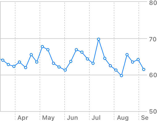
Line marks can also show how values change over time. In a line chart, a line connects all data values in one series of data. The slope of the line reveals the magnitude of change between data values and can help people visualize overall trends.
선 표시는 시간이 지남에 따라 값이 어떻게 변하는지 보여줄 수도 있습니다. 꺾은선형 차트에서 선은 하나의 데이터 계열에 있는 모든 데이터 값을 연결합니다. 선의 기울기는 데이터 값 간의 변화 크기를 나타내며 사람들이 전반적인 추세를 시각화하는 데 도움이 될 수 있습니다.
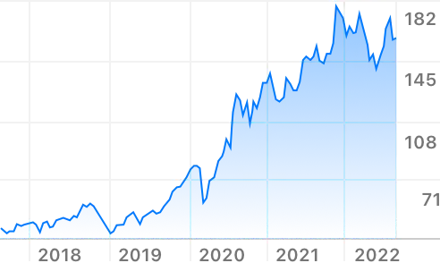
→ Line marks 는 시간이 지남에 따라 어떻게 변하는지, 추세를 시각화할 때 효과적 (주식 등)
Point marks help you depict individual data values as visually distinct marks. A set of point marks can show how two different properties of your data relate to each other, helping people inspect individual data values and identify outliers and clusters.
포인트 마크는 개별 데이터 값을 시각적으로 구별되는 마크로 표현하는 데 도움이 됩니다. 일련의 점 표시는 데이터의 서로 다른 두 가지 속성이 어떻게 연관되어 있는지 보여줌으로써 사람들이 개별 데이터 값을 검사하고 이상치와 클러스터를 식별하는 데 도움을 줍니다.
→ 포인트 마크는 개별 데이터 값을 시각적으로 구별할 때 효과적 (기온 등)
Consider combining mark types when it adds clarity to your chart. For example, if you use a line chart to show a change over time, you might want to add point marks on top of the line to highlight individual data points. By combining points with a line, you can help people understand the overall trend while also drawing their attention to individual values.
차트에 명확성을 더하려면 마크 유형을 결합해 보세요. 예를 들어, 선 차트를 사용하여 시간에 따른 변화를 표시하는 경우 선 위에 점 표시를 추가하여 개별 데이터 요소를 강조할 수 있습니다. 점과 선을 결합하면 사람들이 전반적인 추세를 이해하는 동시에 개별 가치에 관심을 갖도록 도울 수 있습니다.
Use a fixed or dynamic axis range depending on the meaning of your chart. In a fixed range, the upper and lower bounds of the axis never change, whereas in a dynamic range, the upper and lower bounds can vary with the current data. Consider using a fixed range when specific minimum and maximum values are meaningful for all possible data values. For example, people expect a chart that shows a battery’s current charge to have a minimum value of 0% (completely empty) and a maximum value of 100% (completely full).
차트의 의미에 따라 고정 또는 동적 축 범위를 사용합니다. 고정 범위 에서는 축의 상한과 하한이 절대 변하지 않지만, 동적 범위에서는 상한과 하한이 현재 데이터에 따라 달라질 수 있습니다. 가능한 모든 데이터 값에 대해 특정 최소값과 최대값이 의미가 있는 경우 고정 범위를 사용하는 것이 좋습니다. 예를 들어, 사람들은 배터리의 현재 충전량을 보여주는 차트에서 최소값이 0%(완전히 비어 있음)이고 최대값이 100%(완전히 가득 찼음)일 것으로 기대합니다.
→ 고정 범위에서는 상한과 하한이 절대 변하지 않고, 동적 범위에서는 변할 수 있음
역자첨언
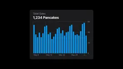
In contrast, consider using a dynamic range when the possible data values can vary widely and you want the marks to fill the available plot area. For example, the upper bound of the Y axis range in the Health app’s Steps chart varies so that the largest number of steps in a particular time period is close to the top of the chart.
반대로, 가능한 데이터 값이 크게 달라질 수 있고 마크가 사용 가능한 플롯 영역을 채우도록 하려면 동적 범위를 사용하는 것이 좋습니다. 예를 들어 건강 앱의 걸음 수 차트에서 Y축 범위의 상한은 특정 기간의 최대 걸음 수가 차트의 상단에 가깝도록 다양합니다.
역자첨언
Define the value of the lower bound based on mark type and chart usage. For example, bar charts can work well when you use zero for the lower bound of the Y axis, because doing so lets people visually compare the relative heights of individual bars to get a reasonable estimate of their values. In contrast, defining a lower bound of zero can sometimes make meaningful differences between values more difficult to discern. For example, a heart rate chart that always uses zero for the lower bound could obscure important differences between resting and active readings because the differences occur in a range that’s far from zero.
마크 유형 및 차트 용도에 따라 하한 값을 정의합니다. 예를 들어, 막대형 차트는 Y축의 하한값에 0을 사용하면 잘 작동합니다. 그렇게 하면 사람들이 개별 막대의 상대적 높이를 시각적으로 비교하여 값을 합리적으로 추정할 수 있기 때문입니다. 대조적으로, 하한을 0으로 정의하면 때로는 값 간의 의미 있는 차이를 식별하기가 더 어려워질 수 있습니다. 예를 들어, 하한값으로 항상 0을 사용하는 심박수 차트는 휴식 중 판독값과 활동적 판독값 간의 중요한 차이를 모호하게 만들 수 있습니다. 차이가 0에서 멀리 떨어진 범위에서 발생하기 때문입니다.
→ 용도와 유형에 따라 하한이 0이 아닐 경우 더 시각적으로 식별이 편할 수도 있다.
Prefer familiar sequences of values in the tick and grid-line labels for an axis. For example, if you use a common number sequence like 0, 5, 10, etc., people are likely to know at a glance that each tick value equals the previous value plus five. Even though a sequence like 1, 6, 11, etc., follows the same rule, it’s not common, so most people are likely to spend extra time thinking about the interval between values.
축의 눈금 및 눈금선 레이블에서 친숙한 값 순서를 선호합니다. 예를 들어, 0, 5, 10 등과 같은 일반적인 숫자 시퀀스를 사용하는 경우 사람들은 각 눈금 값이 이전 값에 5를 더한 것과 같다는 것을 한눈에 알 수 있습니다. 1, 6, 11 등과 같은 수열이 동일한 규칙을 따르더라도 일반적이지 않기 때문에 대부분의 사람들은 값 사이의 간격을 생각하는 데 추가 시간을 소비할 가능성이 높습니다.
→ 사람들이 봤을때 편안한 값으로 눈금 레이블을 설정하여야 한다.
Tailor the appearance of grid lines and labels to a chart’s use cases. Too many grid lines can be visually overwhelming, distracting people from the data; too few grid lines can make it difficult to estimate a mark’s value. To help you determine the appropriate density and visual weight of these elements, consider a chart’s context in the interface, the interactions you support, and the tasks people can do in the chart. For example, if people can inspect individual data points by interacting with a chart, you might use fewer grid lines and light label colors to ensure the data remains visually prominent.
차트 사용 사례에 맞게 눈금선과 레이블의 모양을 조정하세요. 그리드 선이 너무 많으면 시각적으로 부담스러워서 사람들이 데이터에 집중하는 데 방해가 될 수 있습니다. 그리드 선이 너무 적으면 마크 값을 추정하기 어려울 수 있습니다. 이러한 요소의 적절한 밀도와 시각적 가중치를 결정하려면 인터페이스의 차트 컨텍스트, 지원하는 상호 작용 및 사람들이 차트에서 수행할 수 있는 작업을 고려하세요. 예를 들어 사람들이 차트와 상호 작용하여 개별 데이터 포인트를 검사할 수 있는 경우 데이터가 시각적으로 눈에 띄게 유지되도록 더 적은 수의 격자선과 밝은 레이블 색상을 사용할 수 있습니다.
→ 적절한 눈금 간격과 레이블 크기 및 색상을 고려해라.
Write descriptions that help people understand what a chart does before they view it. When you provide information-rich titles and labels that describe the purpose and functionality of a chart, you give people the context they need before they dive in and examine the details. Providing context in this way is especially important for VoiceOver users and those with certain types of cognitive disabilities because they rely on your descriptions to understand the purpose and primary message of your chart before they decide to investigate it further.
사람들이 차트를 보기 전에 차트의 기능을 이해하는 데 도움이 되는 설명을 작성하세요. 차트의 목적과 기능을 설명하는 풍부한 정보의 제목과 레이블을 제공하면 사람들이 자세히 살펴보고 세부 사항을 검토하기 전에 필요한 컨텍스트를 제공할 수 있습니다. 이러한 방식으로 컨텍스트를 제공하는 것은 VoiceOver 사용자와 특정 유형의 인지 장애가 있는 사용자에게 특히 중요합니다. 왜냐하면 그들은 추가 조사를 결정하기 전에 차트의 목적과 주요 메시지를 이해하기 위해 설명에 의존하기 때문입니다.
→ 차트의 데이터 외에도 목적, 기능을 설명하는 제목과 레이블을 제공하면 사람들이 필요한 컨텍스트를 제공받을 수 있다. 특히 이것에만 의존하는 사용자일 경우 더더욱 필요하다.
Summarize the main message of your chart to help make it approachable and useful for everyone. Although a primary reason to use a chart is to display the data that supports the main message, it’s essential to summarize key information so that people can grasp it quickly. For example, Weather provides a title and subtitle that succinctly describe the expected precipitation for the next hour, giving people the most important information without requiring them to examine the details of the chart.
모든 사람이 쉽게 접근하고 유용하게 사용할 수 있도록 차트의 주요 메시지를 요약하세요. 차트를 사용하는 주된 이유는 주요 메시지를 뒷받침하는 데이터를 표시하는 것이지만, 사람들이 빠르게 파악할 수 있도록 핵심 정보를 요약하는 것이 필수적입니다. 예를 들어, Weather는 다음 시간의 예상 강수량을 간결하게 설명하는 제목과 부제를 제공하여 사람들이 차트의 세부 사항을 검토하지 않고도 가장 중요한 정보를 제공합니다.
역자첨언
Establish a consistent visual hierarchy that helps communicate the relative importance of various chart elements. Typically, you want the data itself to be most prominent, while letting the descriptions and axes provide additional context without competing with the data.
다양한 차트 요소의 상대적 중요성을 전달하는 데 도움이 되는 일관된 시각적 계층 구조를 설정합니다. 일반적으로 데이터 자체가 가장 눈에 띄기를 원하며 설명과 축은 데이터와 경쟁하지 않고 추가 컨텍스트를 제공하도록 합니다.
→ 상대적 중요성을 알게 하기 위해 데이터를 가장 눈에 띄게, 그리고 설명과 축은 추가 컨텍스트 느낌으로 제공해라.
In a compact environment, maximize the width of the plot area to give people enough space to comfortably examine a chart. To help important data fit well in a given width, ensure that labels on a vertical axis are as short as possible without losing clarity. You might also consider describing units in other areas of the chart, such as in a title, and placing a longer axis label, such as a category name, inside the plot area when doing so doesn’t obscure important information.
컴팩트한 환경에서는 플롯 영역의 너비를 최대화하여 사람들이 차트를 편안하게 살펴볼 수 있는 충분한 공간을 제공합니다. 중요한 데이터가 지정된 너비에 잘 맞도록 하려면 명확성을 잃지 않으면서 세로 축의 레이블이 최대한 짧아야 합니다. 제목과 같은 차트의 다른 영역에 있는 단위를 설명하고 범주 이름과 같은 긴 축 레이블을 플롯 영역 내부에 배치하는 것이 중요한 정보를 모호하게 하지 않는 경우를 고려할 수도 있습니다.
→ 내부 플롯 영역에 너무 긴 이름의 레이블이 들어갈 경우, 기존 데이터를 제대로 확인 못하는 상황을 만들지 말아라
Make every chart in your app accessible. Charts — like all infographics — need to be fully accessible to everyone, regardless of how they perceive content. For example, it’s essential to support VoiceOver, which describes onscreen content to help people get information and navigate without needing to see the screen (to learn more about VoiceOver, see Vision). In addition to supplying accessibility labels that describe the components of your chart, you can enhance the VoiceOver experience by also using Audio Graphs. Audio graphs provides chart information to VoiceOver, which constructs a set of tones that audibly represent a chart’s data values and their trend; it also lets you present high-level text summaries that provide additional context. For guidance, see Enhancing the accessibility of a chart.
앱의 모든 차트에 접근 가능하도록 만드세요. 모든 인포그래픽과 마찬가지로 차트는 콘텐츠를 인식하는 방식에 관계없이 모든 사람이 완전히 접근할 수 있어야 합니다. 예를 들어, 사람들이 화면을 볼 필요 없이 정보를 얻고 탐색할 수 있도록 화면 콘텐츠를 설명하는 VoiceOver를 지원하는 것이 필수적입니다(VoiceOver에 대한 자세한 내용은 Vision을 참조하세요.). 차트의 구성 요소를 설명하는 접근성 레이블을 제공하는 것 외에도 오디오 그래프를 사용하여 VoiceOver 경험을 향상시킬 수 있습니다. 오디오 그래프는 차트의 데이터 값과 추세를 청각적으로 나타내는 일련의 톤을 구성하는 VoiceOver에 차트 정보를 제공합니다. 또한 추가 컨텍스트를 제공하는 고급 텍스트 요약을 제공할 수도 있습니다. 지침은 Enhancing the accessibility of a chart를 참조하세요.
→ 모든 유저의 접근성을 고려해라
Let people interact with the data when it makes sense, but don’t require interaction to reveal critical information. In Stocks, for example, people are often most interested in a stock’s performance over time, so the app displays a line graph that depicts performance during the time period people choose, such as one day, three months, or five years. If people want to explore additional details, they can drag a vertical indicator through the line graph, revealing the value at the selected time.
사람들이 타당할 때 데이터와 상호 작용할 수 있도록 하되, 중요한 정보를 공개하기 위해 상호 작용이 필요하지는 않습니다. 예를 들어 주식의 경우 사람들은 시간 경과에 따른 주식 성과에 가장 관심이 많은 경우가 많기 때문에 앱은 사람들이 선택한 기간(예: 1일, 3개월, 5년) 동안의 성과를 나타내는 선 그래프를 표시합니다. 추가 세부정보를 탐색하려는 경우 선 그래프를 통해 수직 표시기를 드래그하여 선택한 시간의 값을 표시할 수 있습니다.
→ 유저가 원할 때 인터렉션을 통해 데이터를 확인 할 수 있도록 하라. 하지만 그 전엔 굳이 모든 데이터를 보여줄 필요는 없다.
Make it easy for everyone to interact with a chart. Sometimes, chart marks are too small to target with a finger or a pointer, making your chart hard to use for people with reduced motor control and uncomfortable for everyone. When this is the case, consider expanding the hit target to include the entire plot area, letting people scrub across the area to reveal various values.
누구나 쉽게 차트와 상호 작용할 수 있도록 하세요. 때로는 차트 표시가 손가락이나 포인터로 대상을 지정하기에는 너무 작아서 운동 제어 능력이 떨어지는 사람들이 차트를 사용하기 어렵고 모든 사람에게 불편할 수 있습니다. 이 경우 전체 플롯 영역을 포함하도록 히트 대상을 확장하여 사람들이 해당 영역을 스크러빙하여 다양한 값을 표시할 수 있도록 하는 것이 좋습니다.
→ 차트가 너무 작아서 터치하지 못하는 등의 상황을 제거하라. 확대하여 사용하게 하는 등의 방법으로.
Make an interactive chart easy to navigate when using keyboard commands (including full keyboard access) or Switch Control. By default, these input types tend to visit individual onscreen elements in a linear sequence, such as the sequence of values in a data file. If you want to provide a custom navigation experience in your chart, here are two main ways to do so. The first way is to use accessibility APIs (such as accessibilityRespondsToUserInteraction(_:)) to specify a logical and predictable path through your chart’s information. For example, you might want to let people navigate along the X axis instead of jumping back and forth. The second way — which is particularly useful if you need to present a very large dataset — is to let people move focus among subsets of values instead of navigating through all individual data points. Note that both of these customizations can also enhance the VoiceOver experience, even when your chart isn’t interactive. For guidance, see Navigation.
키보드 명령(전체 키보드 액세스 포함) 또는 스위치 제어를 사용할 때 탐색하기 쉬운 인터렉티브 차트를 만듭니다. 기본적으로 이러한 입력 유형은 데이터 파일의 값 순서와 같이 선형 순서로 개별 화면 요소를 방문하는 경향이 있습니다. 차트에 사용자 정의 탐색 환경을 제공하려는 경우 다음과 같은 두 가지 주요 방법이 있습니다. 첫 번째 방법은 접근성 API(예:accessibilityRespondsToUserInteraction(_:)) 차트 정보를 통해 논리적이고 예측 가능한 경로를 지정합니다. 예를 들어 사람들이 앞뒤로 점프하는 대신 X축을 따라 탐색할 수 있도록 할 수 있습니다. 매우 큰 데이터 세트를 제공해야 하는 경우 특히 유용한 두 번째 방법은 사람들이 모든 개별 데이터 포인트를 탐색하는 대신 값의 하위 집합 간에 초점을 이동할 수 있도록 하는 것입니다. 차트가 인터렉티브가 아닌 경우에도 이러한 사용자 정의 모두 VoiceOver 경험을 향상시킬 수 있습니다. 지침은 Navigation을 참조하세요 .
→ 탐색하기 좋게 만들어라
Help people notice important changes in a chart. For example, if people don’t notice when marks or axes change, they can misread a chart. Animating such changes can help people notice them, but you need to highlight the changes in other ways, too, to ensure that VoiceOver users and people who turn off animations know about them. For developer guidance, see UIAccessibility.Notification (UIKit) or NSAccessibility.Notification (AppKit).
사람들이 차트에서 중요한 변경 사항을 확인할 수 있도록 도와주세요. 예를 들어, 마크나 축이 변경될 때 사람들이 이를 인지하지 못한다면 차트를 잘못 읽을 수 있습니다. 이러한 변경 사항에 애니메이션을 적용하면 사람들이 이를 알아차리는 데 도움이 될 수 있지만 VoiceOver 사용자와 애니메이션을 끄는 사람들이 알 수 있도록 다른 방법으로도 변경 사항을 강조 표시해야 합니다. 개발자 지침은 UIAccessibility.Notification(UIKit) 또는 NSAccessibility.Notification(AppKit)을 참조하세요.
→ 인터페이스의 변화가 있을 때 애니메이션 등을 사용하여 변경사항을 인지시켜라
Align a chart with surrounding interface elements. For example, it often works well to align the leading edge of a chart with the leading edge of other views in a screen. One way to maintain a clean leading edge in a chart is to display the label for each vertical grid line on its trailing side. You might also consider shifting the Y axis to the trailing side of the chart so that its tick labels don’t protrude past the chart’s leading edge. If you end up with a label that doesn’t appear to be associated with anything, you can use a tick to anchor it to a grid line.
주변 인터페이스 요소에 맞춰 차트를 정렬합니다. 예를 들어, 차트의 앞쪽 가장자리를 화면에 있는 다른 보기의 앞쪽 가장자리와 정렬하는 것이 효과적인 경우가 많습니다. 차트의 앞 가장자리를 깔끔하게 유지하는 한 가지 방법은 각 세로 눈금선의 레이블을 뒤편에 표시하는 것입니다. 눈금 레이블이 차트의 앞쪽 가장자리를 지나 튀어나오지 않도록 Y축을 차트의 뒤쪽으로 이동하는 것을 고려할 수도 있습니다. 어떤 것과도 연결되지 않은 것으로 보이는 레이블이 있는 경우 체크 표시를 사용하여 해당 레이블을 그리드 선에 고정할 수 있습니다.
역자첨언
As in all other parts of your interface, using color in a chart can help you clarify information, evoke your brand, and provide visual continuity. For general guidance on using color in ways that everyone can appreciate, see Inclusive color.
인터페이스의 다른 모든 부분과 마찬가지로 차트에 색상을 사용하면 정보를 명확하게 하고 브랜드를 환기시키며 시각적 연속성을 제공하는 데 도움이 됩니다. 모든 사람이 이해할 수 있는 방식으로 색상을 사용하는 방법에 대한 일반적인 가이드는 Inclusive color을 참조하세요.
→ 차트에 색상을 사용하면 좋다
Avoid relying solely on color to differentiate between different pieces of data or communicate essential information in a chart. Using meaningful color in a chart works well to highlight differences and elevate key details, but it’s crucial to include alternative ways to convey this information so that people can use your chart regardless of whether they can discern colors. One way to supplement color is to use different shapes or patterns to depict different parts of data. For example, in addition to using red and black colors, Health uses two different shapes in the point marks that represent the two components of blood pressure.
다양한 데이터를 구별하거나 차트의 필수 정보를 전달하기 위해 색상에만 의존하지 마세요. 차트에 의미 있는 색상을 사용하면 차이점을 강조하고 주요 세부 사항을 향상시키는 데 효과적이지만 사람들이 색상을 식별할 수 있는지 여부에 관계없이 차트를 사용할 수 있도록 이 정보를 전달하는 대체 방법을 포함하는 것이 중요합니다. 색상을 보완하는 한 가지 방법은 다양한 모양이나 패턴을 사용하여 데이터의 다양한 부분을 표현하는 것입니다. 예를 들어 Health에서는 빨간색과 검은색 색상을 사용하는 것 외에도 혈압의 두 가지 구성 요소를 나타내는 점 표시에 두 가지 다른 모양을 사용합니다.
→ 색상에만 의존하진 마세요
역자첨언
Aid comprehension by adding visual separation between contiguous areas of color. For example, in a bar chart that stacks marks in a single row or column, it’s common to assign a different color to each mark. In this design, adding separators between the marks can help people distinguish individual ones.
인접한 색상 영역을 시각적으로 구분하여 이해를 돕습니다. 예를 들어 단일 행이나 열에 마크를 쌓는 막대형 차트에서는 각 마크에 서로 다른 색상을 할당하는 것이 일반적입니다. 이 디자인에서는 마크 사이에 구분 기호를 추가하면 사람들이 개별 마크를 구별하는 데 도움이 될 수 있습니다.
역자첨언
When you use Swift Charts to create a chart, you get a default implementation of Audio graphs, in addition to a default accessibility element for each mark (or group of marks) that describes its value.
Swift Charts를 사용하여 차트를 생성하면 해당 값을 설명하는 각 마크(또는 마크 그룹)에 대한 기본 접근성 요소 외에도 오디오 그래프 의 기본 구현이 제공됩니다.
역자첨언
Consider using Audio Graphs to give VoiceOver users more information about your chart. You can customize the default Audio Graphs implementation that Swift Charts provides by supplying a chart title and descriptive summary that VoiceOver speaks to help people understand the purpose and main features of your chart. If you don’t use Audio Graphs, you need to provide an overview of the chart’s structure and purpose. For example, you need to identify the chart’s type — such as bar or line — explain what each axis represents, and describe details like the upper and lower axis bounds.
VoiceOver 사용자에게 차트에 대한 추가 정보를 제공하려면 오디오 그래프를 사용하는 것이 좋습니다. 사람들이 차트의 목적과 주요 기능을 이해하는 데 도움이 되도록 VoiceOver가 말하는 차트 제목과 설명 요약을 제공하여 Swift Charts가 제공하는 기본 오디오 그래프 구현을 사용자 정의할 수 있습니다. 오디오 그래프를 사용하지 않는 경우 차트의 구조와 목적에 대한 개요를 제공해야 합니다. 예를 들어 막대 또는 선과 같은 차트 유형을 식별하고 각 축이 무엇을 나타내는지 설명하고 위쪽 및 아래쪽 축 경계와 같은 세부정보를 설명해야 합니다.

Important
Unlike an image — which requires one descriptive accessibility label — a chart often needs to offer an accessibility label for each important or interactive element. Depending on the purpose of your chart and the scope and density of its marks, you need to decide whether it’s essential to describe each mark or whether it improves the accessibility experience to describe groups of marks. In some cases, it can make sense to use a single accessibility label that provides a succinct, high-level description of the chart, such as when you use a small version of a chart in a button that reveals a more detailed version.
하나의 설명적인 접근성 레이블이 필요한 이미지와 달리 차트는 중요하거나 대화형 요소 각각에 대해 접근성 레이블을 제공해야 하는 경우가 많습니다. 차트의 목적과 해당 마크의 범위 및 밀도에 따라 각 마크를 설명하는 것이 필수적인지, 아니면 마크 그룹을 설명하여 접근성 환경을 향상시키는지 결정해야 합니다. 더 자세한 버전을 표시하는 버튼에 작은 버전의 차트를 사용하는 경우와 같이 차트에 대한 간결하고 높은 수준의 설명을 제공하는 단일 접근성 레이블을 사용하는 것이 적합한 경우도 있습니다.
→ 차트의 목적과 해당 마크의 범위 및 밀도에 따라 각 마크를 설명할지 마크 그룹을 설명할지 결정해야 한다.
Write accessibility labels that support the purpose of your chart. For example, Maps shows elevation changes for a cycling route using a set of individual bars that each represent the elevation for a small portion of the route. The purpose of the chart is to give people a sense of the terrain for the entire route, not to provide individual elevations. For this reason, Maps provides accessibility labels that summarize the elevation changes in a group of bars; it doesn’t provide an accessibility label per bar. In contrast, Health offers an accessibility label for each bar in the Steps chart, because the purpose of the chart is to give people their actual step count for each tracking period.
차트의 목적을 나타내는 접근성 레이블을 작성하세요. 예를 들어, 지도는 각각 경로의 작은 부분에 대한 고도를 나타내는 개별 막대 세트를 사용하여 자전거 경로의 고도 변화를 표시합니다. 해도의 목적은 개별 고도를 제공하는 것이 아니라 사람들에게 전체 경로에 대한 지형 감각을 제공하는 것입니다. 이러한 이유로 지도에서는 막대 그룹의 고도 변화를 요약하는 접근성 라벨을 제공합니다. 막대별로 접근성 레이블을 제공하지 않습니다. 이와 대조적으로 건강 앱은 걸음 수 차트의 각 막대에 접근성 라벨을 제공합니다. 차트의 목적은 사람들에게 각 추적 기간에 대한 실제 걸음 수를 제공하는 것이기 때문입니다.
역자첨언
The following guidelines can help you write useful accessibility labels for chart elements.
다음 지침은 차트 요소에 대한 유용한 접근성 레이블을 작성하는 데 도움이 될 수 있습니다.
•
Prioritize clarity and comprehensiveness. In general, it’s rarely enough to merely report a data value unless you also include context that helps people understand it, like the date or location that’s associated with it. Aim to concisely describe the context for a value without repeating information that people can get in other ways, like an axis name that Audio Graphs or your overview provides. Follow context-setting information with a succinct description of the element’s details.
•
명확성과 포괄성을 우선시합니다. 일반적으로 데이터 값과 관련된 날짜나 위치 등 사람들이 데이터를 이해하는 데 도움이 되는 컨텍스트를 포함하지 않는 한 단순히 데이터 값을 보고하는 것만으로는 충분하지 않습니다. 오디오 그래프 또는 개요가 제공하는 축 이름과 같이 사람들이 다른 방법으로 얻을 수 있는 정보를 반복하지 않고 값에 대한 컨텍스트를 간결하게 설명하는 것을 목표로 합니다. 요소 세부정보에 대한 간결한 설명과 함께 컨텍스트 설정 정보를 따르세요.
•
Avoid using subjective terms. Subjective words — like rapidly, gradually, and almost — communicate your interpretation of the data. To help people form their own interpretations, use actual values in your descriptions.
•
주관적인 용어 사용을 피하세요. 빠르게, 점차적으로, 거의 같은 주관적인 단어는 데이터에 대한 해석을 전달합니다. 사람들이 자신만의 해석을 할 수 있도록 설명에 실제 값을 사용하십시오.
•
Maximize clarity in data descriptions by avoiding potentially ambiguous formats and abbreviations. For example, using “June 6” is clearer than using “6/6”; similarly, spelling out “60 minutes” or “60 meters” is clearer than using the abbreviation “60m.”
•
모호할 수 있는 형식과 약어를 방지하여 데이터 설명의 명확성을 극대화합니다. 예를 들어, "6월 6일"을 사용하는 것이 "6/6"을 사용하는 것보다 더 명확합니다. 마찬가지로, "60분" 또는 "60미터"라고 표기하는 것이 "60m"라는 약어를 사용하는 것보다 더 명확합니다.
•
Focus on describing what the chart’s details represent, not on what they look like. Consider a chart that uses red and blue colors to help people visually distinguish two different data series. It’s crucial to create accessibility labels that identify what each series represents, but describing the colors that visually represent them can add unnecessary information and be distracting.
•
차트의 세부 사항이 어떻게 보이는지 설명하는 것이 아니라 차트의 세부 사항이 무엇을 나타내는지 설명하는 데 집중하세요. 사람들이 두 개의 서로 다른 데이터 계열을 시각적으로 구별하는 데 도움이 되도록 빨간색과 파란색을 사용하는 차트를 생각해 보세요. 각 시리즈가 무엇을 나타내는지 식별하는 접근성 레이블을 만드는 것이 중요하지만 시각적으로 나타내는 색상을 설명하면 불필요한 정보가 추가되고 주의가 산만해질 수 있습니다.
•
Be consistent throughout your app when referring to a specific axis. For example, if you always mention the X axis first, people can spend less time figuring out which axis is relevant in a description.
•
특정 축을 참조할 때 앱 전체에서 일관성을 유지하세요. 예를 들어 항상 X축을 먼저 언급하면 사람들은 설명에서 어떤 축이 관련되어 있는지 파악하는 데 더 적은 시간을 소비할 수 있습니다.
Hide visible text labels for axes and ticks from assistive technologies. Axis and tick labels help people visually assess trends in a chart and estimate mark values. VoiceOver users can get mark values and trend information through accessibility labels and Audio Graphs, so they don’t generally need the content in the visible labels.
보조 기술에서 축 및 눈금에 대해 표시되는 텍스트 레이블을 숨깁니다. 축 및 눈금 레이블은 사람들이 차트의 추세를 시각적으로 평가하고 표시 값을 추정하는 데 도움이 됩니다. VoiceOver 사용자는 접근성 레이블과 오디오 그래프를 통해 표시 값과 추세 정보를 얻을 수 있으므로 일반적으로 보이는 레이블의 콘텐츠가 필요하지 않습니다.
No additional considerations for iOS, iPadOS, macOS, tvOS, visionOS.
In general, avoid requiring complex chart interactions in your watchOS app. As much as possible, prefer displaying focused, useful information people can get at a glance and supporting simple interactions when they add value. If you also offer a version of your app in another platform, consider using it to display more details and to support additional interactions with your chart. For example, Heart Rate in watchOS displays a chart of the wearer’s heart-rate data for the current day, whereas the Health app on iPhone displays heart-rate data for several different periods of time and lets people examine individual marks.
일반적으로 watchOS 앱에서는 복잡한 차트 상호 작용이 필요하지 않도록 하세요. 가능한 한 사람들이 한 눈에 알아볼 수 있는 집중적이고 유용한 정보를 표시하고 가치를 추가할 때 간단한 상호 작용을 지원하는 것을 선호합니다. 다른 플랫폼에서도 앱 버전을 제공하는 경우 이를 사용하여 더 많은 세부정보를 표시하고 차트와의 추가 상호 작용을 지원하는 것을 고려해 보세요. 예를 들어, watchOS의 심박수는 현재 착용자의 심박수 데이터 차트를 표시하는 반면, iPhone의 건강 앱은 여러 기간의 심박수 데이터를 표시하여 사람들이 개별 표시를 확인할 수 있도록 합니다.
Change log
작성 날짜 | 작성자 | 수정사항 |
2023/09/05 | 하니 | 초기 번역 |
2023/12/25 | 하니 | 배포 |