
Tab bars use bar items to navigate between mutually exclusive panes of content in the same view.
탭 바는 동일한 화면 내에서 상호 배제적인 콘텐츠 패널 간을 이동하는 데 바 아이템(bar items)을 사용합니다.
Tab bars help people understand the different types of information or functionality that a view provides. They also let people quickly switch between sections of the view while preserving the current navigation state within each section.
탭 바는 사람들이 화면이 제공하는 다양한 정보 또는 기능 유형을 이해하는 데 도움을 주며, 각 섹션 내에서 현재의 네비게이션 상태를 유지한 채로 뷰의 섹션 간을 빠르게 전환할 수 있도록 합니다.
역자 첨언
Use a tab bar to support navigation, not to provide actions. A tab bar lets people navigate among different areas of an app, like the Alarm, Stopwatch, and Timer tabs in the Clock app. If you need to provide controls that act on elements in the current view, use a toolbar instead.
탭 바는 네비게이션을 지원하기 위해 사용하며, 동작을 제공하기 위해 사용하면 안 됩니다. 탭 바를 사용하면 사용자가 앱의 다른 영역을 탐색할 수 있게 됩니다. 예를 들어, 시계 앱의 알람, 스톱워치 및 타이머 탭과 같습니다. 현재 뷰의 요소에 영향을 주는 컨트롤을 제공해야 하는 경우에는 대신 툴바(toolbar)를 사용하십시오.
→ 탭 바는 사용자가 앱의 다른 영역을 탐색하고 네비게이션을 지원하기 위해 사용되며, 현재 뷰의 요소에 영향을 주는 컨트롤을 제공할 때는 툴바를 사용해야 한다
역자 첨언
Make sure the tab bar is visible when people navigate to different areas in your app. The exception is a tab bar within a modal view. Because a modal view provides a separate experience that people dismiss when they’re finished, hiding the view’s tab bar doesn’t affect app navigation.
사람들이 앱 내의 다른 영역으로 이동할 때 탭 바가 보이도록 해야 합니다. 예외는 모달 뷰(modal view) 내의 탭 바입니다. 모달 뷰는 사용자가 완료한 후에 닫는 별도의 경험을 제공하므로, 뷰의 탭 바를 숨겨도 앱 네비게이션에 영향을 미치지 않습니다.
→ 모달 뷰는 별도의 경험을 제공하므로 제외하고, 앱 내의 다른 영역으로 이동할 때는 탭 바가 보이도록 해야 한다
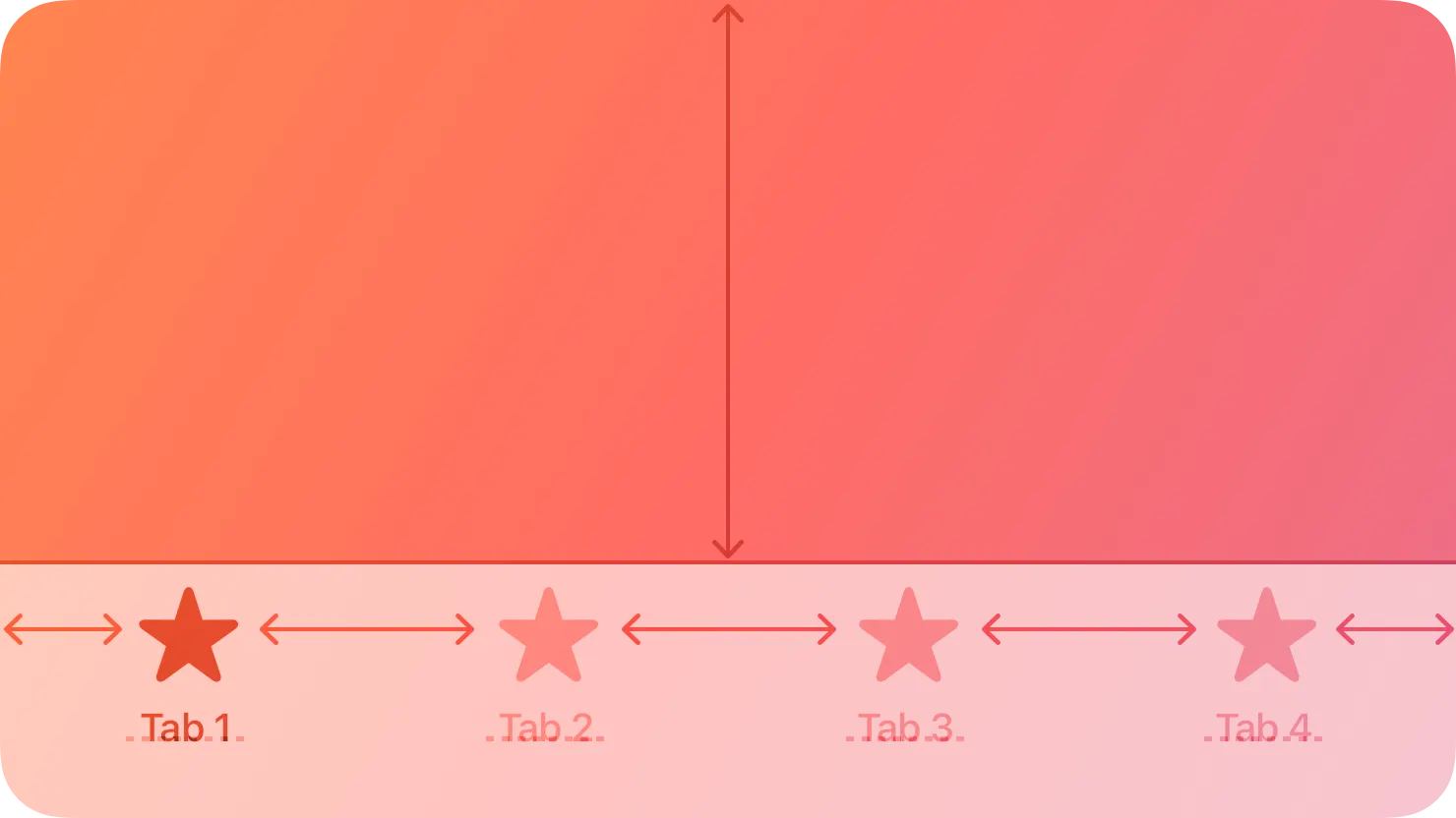
Use the minimum number of tabs required to help people navigate your app. Each additional tab increases the complexity of your app, making it harder for people to locate information. Aim for a few tabs with short titles or icons to avoid crowding and causing labels to truncate. In general, use up to five tabs in iOS and up to six in visionOS, iPadOS, and tvOS.
사용자가 앱을 탐색하는 데 필요한 최소한의 탭을 사용하세요. 추가 탭마다 앱의 복잡성이 증가하며 정보를 찾기 어려워집니다. 레이블이 자르지 않도록, 간결한 제목 또는 아이콘을 가진 몇 개의 탭을 목표로 하고, 일반적으로 iOS에서는 최대 다섯 개의 탭을 사용하고, visionOS, iPadOS 및 tvOS에서는 최대 여섯 개의 탭을 사용하세요.
→ 탭이 많아질수록 앱의 복잡성이 증가하며 정보를 찾기 어려워지니, 최소한의 탭을 사용해야 한다
Keep tabs visible even when their content is unavailable. If tabs are available in some cases but not in others, your app’s interface might appear unstable and unpredictable. When necessary, explain why a tab’s content is unavailable. For example, even when there is no music on an iOS device, the Listen Now tab in the Music app remains available and offers suggestions for downloading music.
콘텐츠가 이용 불가능한 경우에도 탭을 계속해서 표시하세요. 탭이 어떤 경우에는 사용 가능하고 다른 경우에는 사용 불가능한 경우, 앱의 인터페이스가 불안정하고 예측할 수 없어 보일 수 있습니다. 필요한 경우, 탭의 콘텐츠가 이용 불가능한 이유를 설명하세요. 예를 들어, iOS 기기에 음악이 없는 경우에도 음악 앱의 "지금 듣기" 탭은 이용 가능하며 음악 다운로드를 제안합니다.
→ 앱의 인터페이스가 불안정해 보일 수 있으니, 콘텐츠가 이용 불가능한 경우에도 그 이유를 설명하고 탭은 계속해서 표시해야 한다
Use a succinct term for each tab title. A useful tab title aids navigation by clearly describing the type of content or functionality the tab contains. Aim for a single word or a very short phrase, like Music, Shared, Library, or For You. Consider avoiding a generic term like Home, which lacks specificity and can mean different things in different apps.
각 탭 제목에 간결한 용어를 사용하세요. 유용한 탭 제목은 해당 탭이 포함하는 콘텐츠 또는 기능 유형을 명확하게 설명하여 탐색을 돕습니다. 하나의 단어나 매우 짧은 구문(예: 음악, 공유, 라이브러리, 혹은 당신을 위한)을 목표로 하며, "홈"과 같이 일반적인 용어는 특별한 내용을 나타내지 않고 다른 앱에서 다른 의미를 갖을 수 있으므로 피하는 것이 좋습니다.
→ 각 탭 제목에는 하나의 단어나 매우 짧은 구문 등 간결한 용어를 사용해야 한다
Use a badge to communicate unobtrusively. You can display a badge — a red oval containing white text and either a number or an exclamation point — on a tab to indicate that new information associated with that view or mode is available. For guidance, see Notifications.
관심을 끌지 않도록 정보를 전달하기 위해 배지를 사용하세요. 탭에 배지를 표시할 수 있습니다. 이 배지는 해당 뷰나 모드와 관련된 새로운 정보가 사용 가능하다는 것을 나타내는 데 사용됩니다. 이 배지는 일반적으로 빨간 타원형 안에 흰색 텍스트와 숫자 또는 느낌표로 구성되어 있습니다. 자세한 지침은 알림(Notifications)을 참조하세요.
→ 관심을 끌지 않고 정보를 전달하기 위해서 배지를 사용해야 한다
역자 첨언
Not supported in macOS or watchOS.
macOS나 watchOS에서는 지원하지 않습니다.
By default, a tab bar is translucent: It uses a background material only when content appears behind it, removing the material when the view scrolls to the bottom. A tab bar hides when a keyboard is onscreen.
기본적으로 탭 바는 투명합니다: 탭 바는 뒤에 콘텐츠가 나타날 때만 배경 재질을 사용하며, 화면이 아래로 스크롤되면 배경 재질을 제거합니다. 또한 탭 바는 키보드가 화면에 표시될 때 숨겨집니다.
→ 탭 바는 기본적으로 투명해 배경이 없는 것 처럼 보이지만, 뒤에 콘텐츠가 나타날 때 배경 재질이 표시된다
역자 첨언
Avoid overflow tabs whenever possible. Depending on device size and orientation, the number of visible tabs can be smaller than the total number of tabs. If horizontal space limits the number of visible tabs, the trailing tab becomes a More tab, revealing the remaining items in a list on a separate screen. The More tab makes it harder for people to reach and notice content on tabs that are hidden, so try to limit scenarios in your app where this can happen.
가능한 경우 오버플로우 탭을 피하세요. 디바이스 크기와 방향에 따라 표시되는 탭의 수가 총 탭 수보다 작을 수 있습니다. 가로 공간이 제한되어 표시 가능한 탭 수가 제한될 경우, 맨 뒤의 탭은 더보기(More) 탭이 되어 남은 항목을 별도 화면에서 리스트로 표시합니다. 더보기 탭은 숨겨진 탭의 콘텐츠에 접근하고 알림하기 어렵게 만들 수 있으므로 이러한 상황이 발생할 수 있는 앱 시나리오를 제한하려고 노력하세요.
→ 오버플로우 탭이 될 경우, 맨 뒤의 탭은 더보기(More) 탭이 되어 별도 화면에서 리스트로 표시하니 오버플로우 탭을 피해야 한다
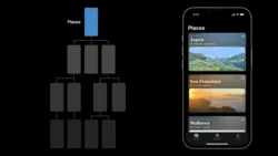
In an iPadOS app, consider using a sidebar instead of a tab bar. Because a sidebar can display a large number of items, it can make navigating an iPad app more efficient. You can also let people customize a sidebar’s items and let them hide it to make more room for content. For guidance, see Sidebars.
iPadOS 앱에서는 탭 바 대신 사이드바를 사용하는 것을 고려해보세요. 사이드바는 많은 항목을 표시할 수 있으므로 iPad 앱에서의 탐색을 더 효율적으로 만들 수 있습니다. 또한 사용자가 사이드바 항목을 사용자 정의하고 숨길 수 있도록하여 콘텐츠에 더 많은 공간을 확보할 수 있습니다. 자세한 내용은 "Sidebars"를 참조하세요.
→ iPadOS 앱에서 탐색을 더 효율적으로 하고 콘텐츠에 더 많은 공간을 확보할 수 있도록 하기 위해 탭 바 대신 사이드바를 사용하는 것을 고려해봐야 한다
역자 첨언
Ensure that tabs affect the view that’s attached to the tab bar, not views elsewhere onscreen. For example, make sure selecting a tab on the left side of a split view doesn’t cause the right side of the split view to change.
탭이 연결된 탭 바에 영향을 미치는 것을 확인하세요. 화면의 다른 곳에 있는 뷰에는 영향을 미치지 않아야 합니다. 예를 들어, 분할 뷰(split view)의 왼쪽에 있는 탭을 선택해도 분할 뷰의 오른쪽 부분이 변경되지 않도록 해야 합니다. 사용자 경험을 일관되게 유지하기 위해 선택한 탭과 해당 탭이 연결된 뷰 사이의 관계를 명확하게 관리해야 합니다.
→ 사용자 경험을 일관되게 유지하기 위해, 선택한 탭은 해당 탭이 연결된 탭 바에만 영향을 미쳐야 한다
Consider using SF Symbols to provide scalable, visually consistent tab bar items. When you use SF Symbols, tab bar items automatically adapt to different contexts. For example, the tab bar can be regular or compact, depending on the current device and orientation. Also, tab bar icons can appear above tab titles in portrait orientation, whereas in landscape, the icons and titles can appear side by side. Prefer filled symbols or icons for consistency with the platform. If your app uses a sidebar instead of a tab bar when it runs on iPad, switch the filled symbols or icons to the outlined variant in the sidebar.
확장 가능하고 시각적으로 일관된 탭 바 항목을 제공하기 위해 SF Symbols를 사용하는 것을 고려하세요. SF Symbols를 사용하면 탭 바 항목이 자동으로 다양한 환경에 적응합니다. 예를 들어, 현재 디바이스 및 방향에 따라 탭 바가 일반적인 모드 또는 콤팩트 모드로 변경될 수 있습니다. 또한 세로 방향에서는 탭 바 아이콘 위에 탭 제목이 나타날 수 있으며, 가로 방향에서는 아이콘과 제목이 옆에 나타날 수 있습니다. 일관성을 위해 플랫폼과 일치하도록 채워진 심볼 또는 아이콘을 선호하세요. iPad에서 탭 바 대신 사이드바를 사용하는 경우, 사이드바에서 채워진 심볼 또는 아이콘을 윤곽 형태로 전환하세요.
→ 확장 가능하고 시각적으로 일관된 탭 바 항목을 제공하기 위해, 자동으로 다양한 환경에 적응하는 SF Symbols를 사용하는 것을 고려해봐야 한다
If you need to create custom tab bar icons using bitmaps, create each icon in two sizes so that the tab bar looks good in both regular and compact environments. Use the following metrics when creating tab bar icons in different shapes. For guidance, see Icons.
비트맵을 사용하여 사용자 정의 탭 바 아이콘을 만들어야 할 경우, 탭 바가 일반적인 환경과 콤팩트 환경에서 모두 잘 보이도록 각 아이콘을 두 가지 크기로 만드는 것이 좋습니다. 아래 메트릭스를 사용하여 다양한 모양의 탭 바 아이콘을 만들 때 참고하세요. 아이콘 디자인에 대한 자세한 지침은 Icons를 참조하세요.
→ 비트맵을 사용해 사용자 정의 탭 바 아이콘을 만들어야 할 경우, 두 가지 크기로 만들어야 한다
역자 첨언
Icon Shape
Regular tab bars
Compact tab bars
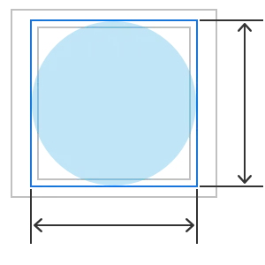
Circle
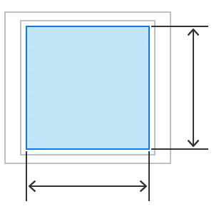
Square
Wide
Tall
25x25 pt | 18x18 pt |
50x50 px @2x | 36x36 px @2x |
75x75 px @3x | 54x54 px @3x |
23x23 pt | 17x17 pt |
46x46 px @2x | 34x34 px @2x |
69x69 px @3x | 51x51 px @3x |
31 pt | 23 pt |
62 px @2x | 46 px @2x |
93 px @3x | 69 px @3x |
28 pt | 20 pt |
56 px @2x | 40 px @2x |
84 px @3x | 60 px @3x |
A tab bar is highly customizable. For example, you can:
탭 바는 매우 사용자 정의할 수 있는 요소입니다. 예를 들어, 다음과 같은 방법으로 사용자 정의할 수 있습니다:
•
Specify a tint, color, or image for the tab bar background
탭 바 배경에 대한 틴트, 색상 또는 이미지 지정
•
Choose a font for tab items, including a different font for the selected item
탭 항목에 대한 폰트 선택, 선택된 항목을 위한 다른 폰트 선택
•
Specify tints for selected and unselected items
선택된 항목과 선택되지 않은 항목에 대한 틴트 지정
•
Add button icons, like settings and search
설정 및 검색과 같은 버튼 아이콘 추가
→ 탭 바의 사용자 정의 옵션을 활용해야 한다
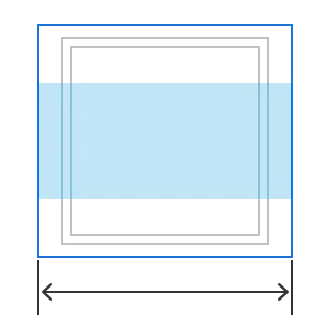
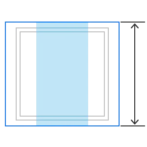
By default, a tab bar is translucent, and only the selected tab is opaque. When people use the remote to focus on the tab bar, the selected tab includes a drop shadow that emphasizes its selected state. The height of a tab bar is 68 points, and its top edge is 46 points from the top of the screen; you can’t change either of these values.
기본적으로 탭 바는 투명하며, 선택한 탭만 불투명(opaque)합니다. 사용자가 원격 제어를 사용하여 탭 바에 초점을 맞출 때, 선택한 탭은 선택된 상태를 강조하는 드롭 셰도우를 포함합니다. 탭 바의 높이는 68 포인트이며, 위쪽 가장자리는 화면 상단에서 46 포인트 떨어져 있습니다. 이러한 값들은 변경할 수 없습니다. 이러한 디자인 요소는 Apple의 휴대폰 또는 태블릿 디바이스에서 일반적으로 사용되며, 일관된 사용자 경험을 제공하기 위해 설정되어 있습니다.
→ 기본적으로 탭 바는 투명하지만, 선택한 탭은 불투명하며 드롭 셰도우를 포함한다
역자 첨언
If there are more items than can fit in the tab bar, the system truncates the rightmost item by applying a fade effect that begins at the right side of the tab bar. If there are enough items to cause scrolling, the system also applies a truncating fade effect that starts from the left side.
탭 바에 수용 가능한 항목보다 더 많은 항목이 있는 경우, 시스템은 탭 바의 오른쪽에서 시작하는 페이드 효과를 적용하여 가장 오른쪽의 항목을 줄입니다. 또한 스크롤이 필요한 항목이 있는 경우, 시스템은 왼쪽에서 시작하는 항목을 줄이는 페이드 효과를 적용합니다.
→ 탭 바에 너무 많은 항목이 있거나 스크롤이 필요한 항목이 있는 경우, 시스템은 페이드 효과를 적용한다
If you use an icon for a tab title, make sure it’s familiar. You can use icons as tab titles to help save space, but only for universally recognized symbols like search or settings. Using an unfamiliar symbol without a descriptive title can confuse people. For guidance, see SF Symbols.
탭 제목에 아이콘을 사용하는 경우, 그 아이콘이 익숙한 것이어야 합니다. 공간을 절약하기 위해 탭 제목에 아이콘을 사용할 수 있지만, 검색 또는 설정과 같이 보편적으로 인식되는 기호에 대해서만 사용해야 합니다. 설명적인 제목 없이 익숙하지 않은 심볼을 사용하면 사용자를 혼동시킬 수 있습니다. 이를 위해 SF Symbols와 같은 가이드라인을 참조하여 익숙하고 이해하기 쉬운 아이콘을 선택하는 것이 중요합니다.
→ 탭 제목에 아이콘을 사용하는 경우, 혼동을 방지하기 위해 사용자에게 익숙한 심볼을 사용해야 한다
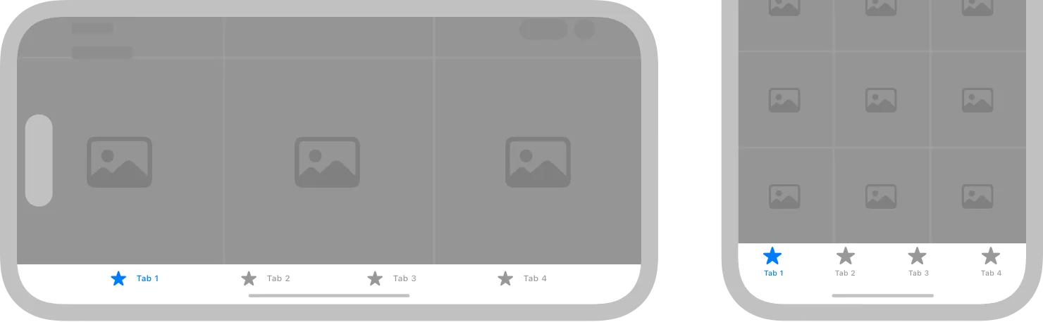
Be aware of tab bar scrolling behaviors. By default, people can scroll the tab bar offscreen when the current tab contains a single main view. You can see examples of this behavior in the Watch Now, Movies, TV Show, Sports, and Kids tabs in the TV app. The exception is when a screen contains a split view, such as the TV app’s Library tab or an app’s Settings screen. In this case, the tab bar remains pinned at the top of the view while people scroll the content within the primary and secondary panes of the split view. Regardless of a tab’s contents, focus always returns to the tab bar at the top of the page when people press Menu on the remote.
탭 바의 스크롤 동작을 주의하세요. 기본적으로 현재 탭에 단일 주요 뷰(main view)가 포함된 경우 사람들은 탭 바를 화면 밖으로 스크롤 할 수 있습니다. 이 동작의 예시는 TV 앱의 "Watch Now", "Movies", "TV Show", "Sports", "Kids" 탭에서 볼 수 있습니다. TV 앱의 "Library" 탭 또는 앱의 설정 화면과 같이 화면에 분할 뷰가 있는 경우에는 예외입니다. 이 경우에는 탭 바가 분할 뷰의 주요 및 보조 패널 내의 콘텐츠를 스크롤하는 동안 화면 상단에 고정됩니다. 탭의 내용에 관계없이 사람들이 리모컨의 “메뉴”를 누를 때 항상 페이지 상단에 있는 탭 바로 돌아갑니다.
→ 현재 탭에 단일 메인 뷰가 포함된 경우, 사람들은 탭 바를 선택하고 스크롤할 수 있다
역자 첨언
In a live-viewing app, organize tabs in a consistent way. For the best experience, organize content in live-streaming apps with tabs in the following order:
•
Live content
•
Cloud DVR or other recorded content
•
Other content
라이브 방송 앱에서 탭을 일관된 방식으로 구성하세요. 라이브 스트리밍 앱의 내용을 가장 좋은 경험을 위해 다음과 같은 순서로 탭으로 구성하세요:
•
라이브 콘텐츠
•
클라우드 DVR 또는 다른 녹화된 콘텐츠
•
기타 콘텐츠
Create a branded logo image to display next to the leading or trailing end of the tab bar, if it makes sense in your app. To ensure enough room between the branded logo image and the edge of the tab bar, place the image within the safe margin. Use the following image size values for guidance:
앱에서 의미가 있다면 탭 바의 선행 또는 후행 끝 옆에 브랜드 로고 이미지를 표시하세요. 브랜드 로고 이미지와 탭 바의 가장자리 사이에 충분한 공간을 확보하기 위해 이미지를 안전한 여백 안에 배치하세요. 아래 이미지 크기 값을 참고로 사용하세요:
→ 의미가 있다면, 탭 바의 앞쪽 혹은 뒤쪽에 브랜드 로고 이미지를 표시해야 한다
Maximum width | Maximum height |
200 pt | 68 pt |
In visionOS, a tab bar is always vertical, floating in a position that’s fixed relative to the window’s leading side. When people look at a tab bar, it automatically expands; to open a specific tab, people focus the tab and tap. While a tab bar is expanded, it can temporarily obscure the content behind it.
visionOS에서는 탭 바가 항상 수직으로 표시되며, 창의 선행 쪽에 대한 고정 위치에서 부동하게 나타납니다. 사용자가 탭 바를 보면 자동으로 확장되며, 특정 탭을 열려면 해당 탭에 포커스를 맞추고 탭을 탭합니다. 탭 바가 확장된 상태에서는 일시적으로 그 뒤의 콘텐츠를 가리킬 수 있습니다.
→ visionOS에서는 탭 바가 항상 수직으로 표시되고, 탭 바를 응시하면 자동으로 확장되며 특정 탭에 포커스를 맞추면 탭을 열 수 있다
Supply a symbol and a text title for each tab. A tab’s symbol is always visible in the tab bar. When people look at the tab bar, the system reveals tab titles, too. Even though the tab bar expands, you need to keep tab titles short so people can read them at a glance.
각 탭에는 심볼(symbol)과 텍스트 제목(title)을 제공하세요. 탭의 심볼은 항상 탭 바에 표시됩니다. 사용자가 탭 바를 보면 시스템은 탭 제목도 표시합니다. 탭 바가 확장되더라도 탭 제목은 한눈에 읽을 수 있도록 짧게 유지해야 합니다. 이렇게 함으로써 사용자가 각 탭의 내용을 쉽게 식별하고 선택할 수 있게 됩니다.
→ 탭의 심볼은 항상 탭 바에 표시되며, 사용자가 탭 바를 보면 탭의 제목도 함께 볼 수 있게 확장되니 각 탭의 심볼 및 텍스트 제목을 모두 제공해야 한다
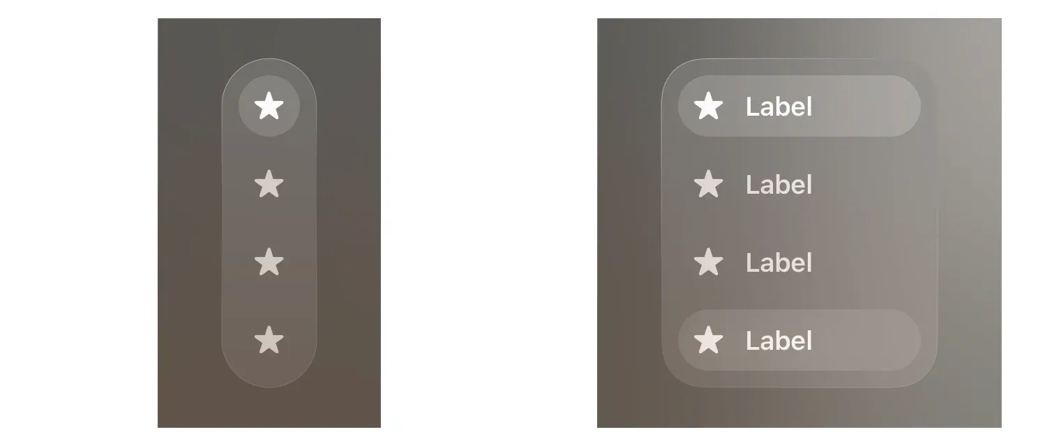
Collapsed
Expanded
If it makes sense in your app, consider using a sidebar within a tab. If your app’s hierarchy is deep, you might want to use a sidebar to support secondary navigation within a tab. If you do this, be sure to prevent selections in the sidebar from changing which tab is currently open.
당신의 앱에서 의미가 있다면, 탭 내에서 사이드바를 사용하는 것을 고려해보세요. 앱의 계층이 깊다면 탭 내에서 보조적인 네비게이션을 지원하기 위해 사이드바를 사용할 수 있습니다. 이렇게 하려면 사이드바의 선택이 현재 열려 있는 탭을 변경하지 않도록 주의하세요.
→ 계층이 깊다면, 보조적인 네비게이션을 지원하기 위해 사이드바를 사용하는 것을 고려해봐야 한다
UITabBar — UIKit

Change Log
작성 날짜 | 작성자 | 수정사항 |
2023/10/25 | 린 | 초기 번역 |
2023/12/22 | 린 | 배포 |