
A widget elevates and displays a small amount of timely, relevant information from your app or game so people can see it at a glance in additional contexts.
위젯은 사용자의 앱이나 게임에서 적시에 관련된 정보를 약간 상승시켜 표시하므로 사용자가 추가적인 상황에서 한눈에 볼 수 있습니다.
Widgets display content and offer specific functionality without requiring people to open your app. People can use widgets to organize and personalize their devices, quickly accessing the information and features they need:
위젯은 사람들이 앱을 열지 않고도 콘텐츠를 표시하고 특정 기능을 제공합니다. 사람들은 위젯을 사용하여 디바이스를 구성하고 개인화하여 필요한 정보와 기능에 빠르게 액세스할 수 있습니다:
•
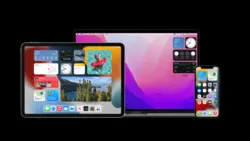
In iOS and iPadOS, widgets appear on the Home Screen, in Today View, and on the Lock Screen.
•
iOS 및 iPadOS에서는 위젯이 홈 화면, 오늘 보기, 잠금 화면에 표시됩니다.
•
In macOS, people place widgets on the desktop and in Notification Center.
•
macOS에서는 위젯을 바탕화면과 알림 센터에 배치합니다.
•
In watchOS, starting with watchOS 10, widgets appear in the Smart Stack when a person turns the Digital Crown.
•
watchOS에서는 watchOS 10부터 디지털 크라운을 돌리면 스마트 스택에 위젯이 나타납니다.
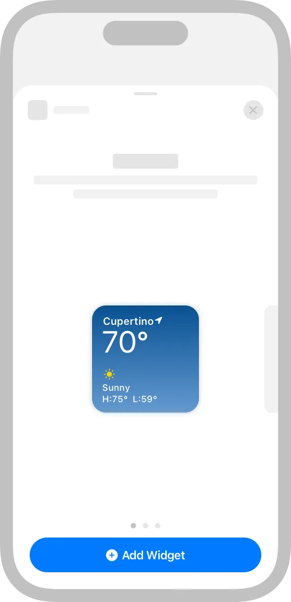
To find widgets, people use the widget gallery. From the gallery’s editing mode, they can make changes to editable widgets, such as choosing a particular location in a Weather widget, or selecting a topic in a News widget.
사람들은 위젯을 찾기 위해 위젯 갤러리를 사용합니다. 갤러리의 편집 모드에서 날씨 위젯에서 특정 위치를 선택하거나 뉴스 위젯에서 주제를 선택하는 등 편집 가능한 위젯을 변경할 수 있습니다.
In iOS and iPadOS, the widget gallery is available in Today View, Home Screen, and Lock Screen editing modes. In macOS, the widget gallery is available on the Desktop and in Notification Center editing mode. Starting with macOS 14, the widget gallery in macOS shows iPhone widgets from devices that use the same Apple ID.
iOS 및 iPadOS에서 위젯 갤러리는 오늘 보기, 홈 화면 및 잠금 화면 편집 모드에서 사용할 수 있습니다. macOS의 경우, 위젯 갤러리는 데스크톱과 알림 센터 편집 모드에서 사용할 수 있습니다. macOS 14부터 macOS의 위젯 갤러리에는 동일한 Apple ID를 사용하는 디바이스의 iPhone 위젯이 표시됩니다.
In watchOS, where the widget gallery is not available, apps offer pre-configured widgets. The system displays up to 10 widgets in the Smart Stack, and people can pin widgets to a fixed position in the Smart Stack.
위젯 갤러리를 사용할 수 없는 watchOS에서는 앱에서 미리 구성된 위젯을 제공합니다. 시스템은 스마트 스택에 최대 10개의 위젯을 표시하며, 사용자는 위젯을 스마트 스택의 고정된 위치에 고정할 수 있습니다.
In iOS and iPadOS, the widget gallery also supports widget stacks, including a Smart Stack. A stack contains up to 10 same-size widgets; people view one widget at a time by scrolling through the stack. In a Smart Stack, the stack automatically rotates its widgets to display the widget that’s most likely to be relevant in the current context. Smart Stacks aren’t available on the Lock Screen on iPhone and iPad. A suggested widget doesn’t stay in the Smart Stack unless people choose to keep it. For developer guidance, see Increasing the visibility of widgets in Smart Stacks.
iOS 및 iPadOS에서 위젯 갤러리는 스마트 스택을 포함한 위젯 스택도 지원합니다. 스택에는 같은 크기의 위젯이 최대 10개까지 포함되며, 사용자는 스택을 스크롤하여 한 번에 하나의 위젯을 볼 수 있습니다. 스마트 스택에서는 스택이 자동으로 위젯을 회전하여 현재 컨텍스트와 가장 관련성이 높은 위젯을 표시합니다. iPhone 및 iPad의 잠금 화면에서는 스마트 스택을 사용할 수 없습니다. 추천 위젯은 사용자가 유지하도록 선택하지 않는 한 스마트 스택에 유지되지 않습니다. 개발자 지침은 스마트 스택에서 위젯의 가시성 높이기를 참조하세요.
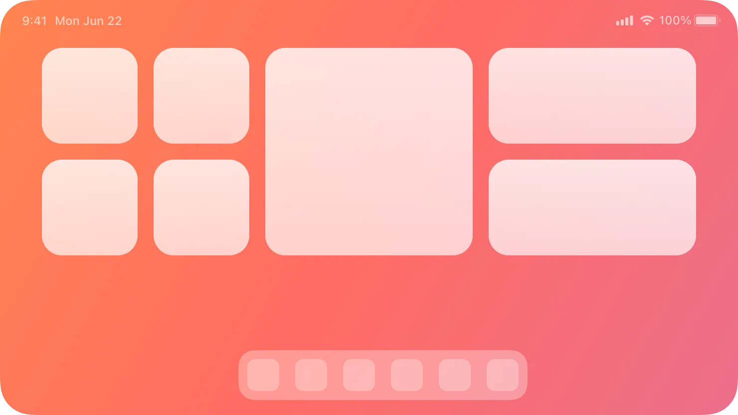
Widgets come in different sizes, ranging from small accessory widgets on the Lock Screen of iPhone and iPad to extra large widgets in iPadOS and macOS.
위젯은 iPhone 및 iPad의 잠금 화면에 있는 작은 액세서리 위젯부터 iPadOS 및 macOS의 초대형 위젯에 이르기까지 다양한 크기로 제공됩니다.
•
•
•
•
The following table shows the available widget sizes for each platform:
다음 표는 각 플랫폼에서 사용 가능한 위젯 크기를 보여줍니다:
Widget size | iPhone | iPad | Apple Watch | Mac |
System small | Home Screen, Today View, and StandBy | Home Screen, Today View, and Lock Screen | No | Desktop and Notification Center |
System medium | Home Screen and Today View | Home Screen and Today View | No | Desktop and Notification Center |
System large | Home Screen and Today View | Home Screen and Today View | No | Desktop and Notification Center |
System extra large | No | Home Screen and Today View | No | Desktop and Notification Center |
Accessory circular | Lock Screen | Lock Screen | Watch complications and in the Smart Stack | No |
Accessory corner | No | No | Watch complications | No |
Accessory rectangular | Lock Screen | Lock Screen | Watch complications and in the Smart Stack | No |
Accessory inline | Lock Screen | Lock Screen | Watch complications | No |
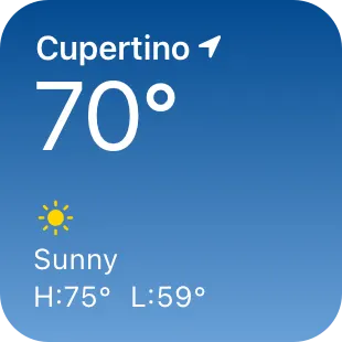
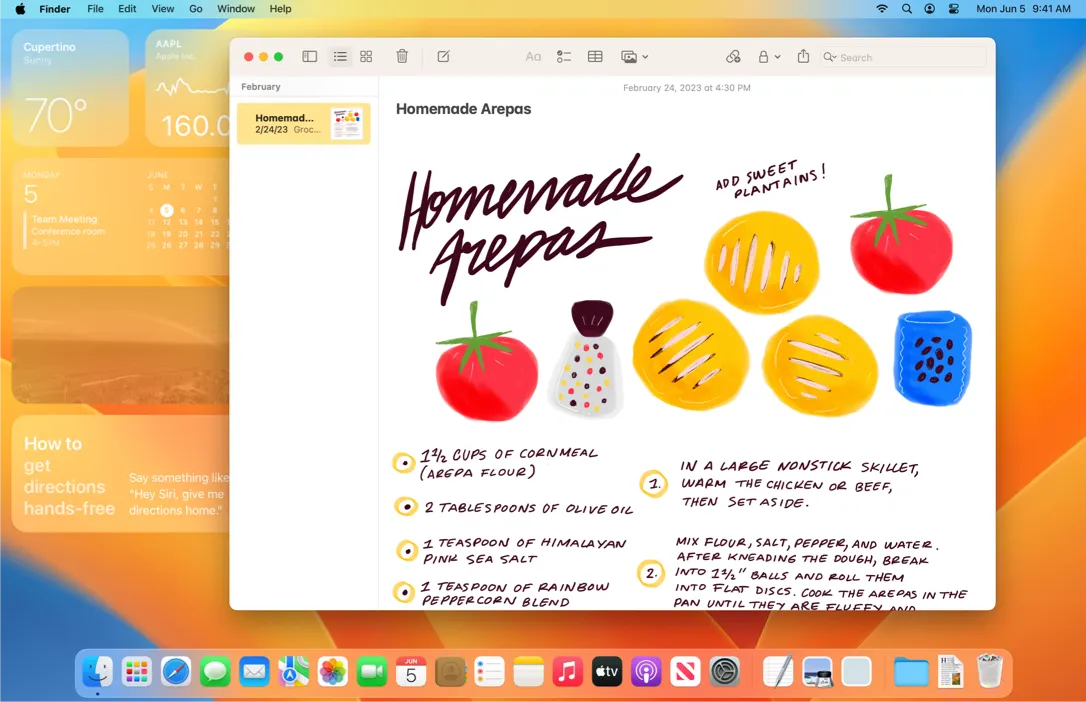
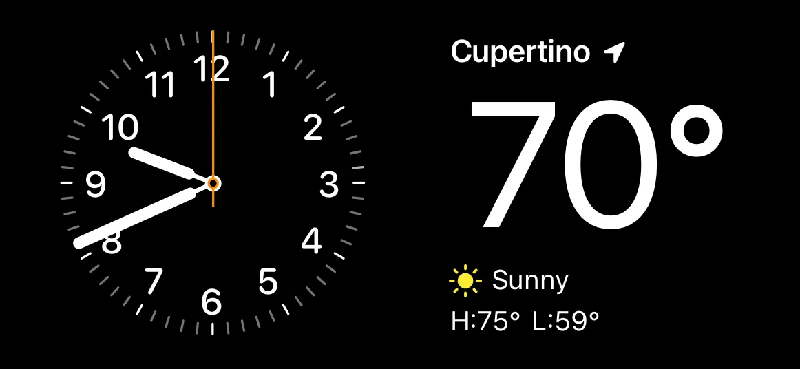
Look for a simple idea that’s clearly related to your app’s main purpose. The first step in the design process is to choose a single idea for your widget. Throughout the process, use that idea to help you include only the most relevant content and functionality in the widget. For example, people who use the Weather app are often most interested in the current high and low temperatures and weather conditions, so the widget for Weather prioritizes this information.
앱의 주요 목적과 명확하게 연관된 간단한 아이디어를 찾아보세요. 디자인 프로세스의 첫 번째 단계는 위젯을 위한 하나의 아이디어를 선택하는 것입니다. 이 과정에서 그 아이디어를 사용하여 위젯에 가장 관련성이 높은 콘텐츠와 기능만 포함할 수 있습니다. 예를 들어, 날씨 앱을 사용하는 사람들은 종종 현재 최고 기온과 최저 기온 및 기상 조건에 가장 관심이 많으므로 날씨 위젯은 이 정보를 우선적으로 표시합니다.
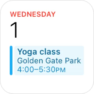
In each size, display only the information that’s directly related to the widget’s main purpose. In larger widgets, you can display more data — or more detailed visualizations of the data — but you don’t want to lose sight of the widget’s primary purpose. For example, all Calendar widgets display a person’s upcoming events. In each size, the widget remains centered on events while expanding the range of information as the size increases.
각 크기마다 위젯의 주요 목적과 직접적으로 관련된 정보만 표시하세요. 큰 위젯에서는 더 많은 데이터를 표시하거나 더 자세한 데이터 시각화를 표시할 수 있지만, 위젯의 주요 목적을 놓치고 싶지는 않을 것입니다. 예를 들어, 모든 캘린더 위젯은 사람의 예정된 이벤트를 표시합니다. 각 크기에서 위젯은 이벤트 중심을 유지하면서 크기가 커질수록 정보 범위를 확장합니다.
Offer your widget in multiple sizes when doing so adds value. In general, avoid simply expanding a smaller widget’s content to fill a larger area. It’s more important to create one widget in the size that works best for the content you want to display than it is to provide the widget in all sizes.
위젯을 여러 가지 크기로 제공하면 가치를 더할 수 있습니다. 일반적으로 작은 위젯의 콘텐츠를 단순히 확장하여 더 큰 영역을 채우는 것은 피하세요. 모든 크기의 위젯을 제공하는 것보다 표시하려는 콘텐츠에 가장 적합한 크기로 하나의 위젯을 만드는 것이 더 중요합니다.
Aim to create a widget that gives people quick access to the content they want. People appreciate widgets that display meaningful content and offer useful actions and deep links to key areas of your app. When a widget merely behaves like an app icon, it offers little additional value and people may be less likely to keep it on their screens.
사람들이 원하는 콘텐츠에 빠르게 액세스할 수 있는 위젯을 만드는 것을 목표로 하세요. 사람들은 의미 있는 콘텐츠를 표시하고 앱의 주요 영역에 대한 유용한 작업과 딥링크를 제공하는 위젯을 선호합니다. 위젯이 단순히 앱 아이콘처럼 작동하는 경우, 추가적인 가치를 제공하지 못하며 사람들이 위젯을 화면에 계속 유지하지 않을 수 있습니다.
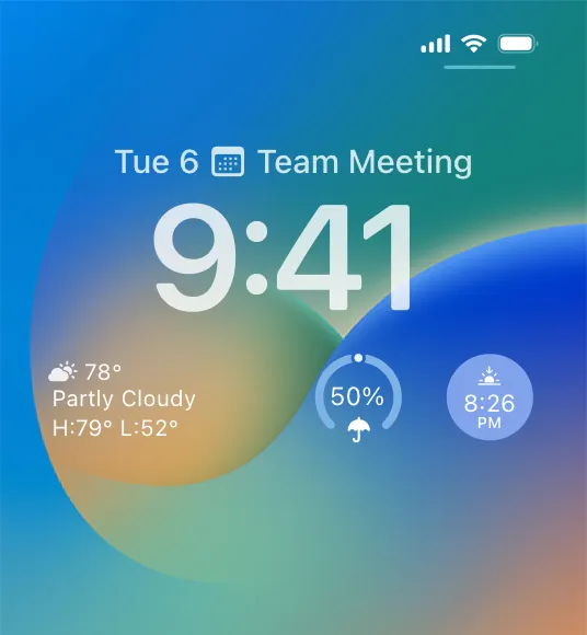
Prefer dynamic information that changes throughout the day. If a widget’s content never appears to change, people may not keep it in a prominent position. Although widgets don’t update from minute to minute, it’s important to find ways to keep their content fresh to invite frequent viewing.
하루 종일 변하는 동적 정보를 선호하세요. 위젯의 콘텐츠가 변하지 않는 것처럼 보이면 사람들은 위젯을 눈에 잘 띄는 위치에 두지 않을 수 있습니다. 위젯이 시시각각 업데이트되지는 않지만, 자주 볼 수 있도록 콘텐츠를 최신 상태로 유지할 수 있는 방법을 찾는 것이 중요합니다.
Look for opportunities to surprise and delight. For example, you might design a unique visual treatment for your calendar widget to display on meaningful occasions, like birthdays or holidays.
놀라움과 즐거움을 줄 수 있는 기회를 찾아보세요. 예를 들어, 생일이나 공휴일과 같은 의미 있는 날에 캘린더 위젯을 표시할 수 있도록 독특한 시각적 처리를 디자인할 수 있습니다.
Let people know when authentication adds value. If your widget provides additional functionality when someone is signed in to your app, make sure people know that. For example, an app that shows upcoming reservations might include a message like “Sign in to view reservations” when people are signed out.
인증이 가치를 더하면 사람들에게 알려주세요. 누군가가 당신의 앱에 로그인했을 때 당신의 위젯이 추가적인 기능을 제공한다면, 그것을 사람들이 확실히 알아야 합니다. 예를 들어, 다가오는 예약을 보여주는 앱은 사람들이 서명했을 때 "예약을 보려면 로그인하세요"와 같은 메시지를 포함할 수 있습니다.
To remain relevant and useful, widgets periodically refresh their information. Widgets don’t support continuous, real-time updates, and the system may adjust the limits for updates depending on various factors.
위젯은 관련성과 유용성을 유지하기 위해 주기적으로 정보를 새로 고칩니다. 위젯은 지속적인 실시간 업데이트를 지원하지 않으며, 시스템에서 다양한 요인에 따라 업데이트 제한을 조정할 수 있습니다.
Keep your widget up to date. Finding the appropriate update frequency for your widget depends on knowing how often the data changes, and estimating when people need to see the new data. For example, a widget that helps people track tides at a beach could provide useful information on an hourly basis, even though tide conditions change constantly. If people are likely to check your widget more frequently than you can update it, consider displaying text that describes when the data was last updated. For developer guidance, see Keeping a widget up to date.
위젯을 최신 상태로 유지하세요. 위젯의 적절한 업데이트 주기를 찾으려면 데이터가 얼마나 자주 변경되는지 파악하고 사람들이 언제 새 데이터를 볼 필요가 있는지 예측해야 합니다. 예를 들어, 사람들이 해변의 조수를 추적하는 데 도움이 되는 위젯은 조수 상태가 수시로 변하더라도 매시간마다 유용한 정보를 제공할 수 있습니다. 사람들이 위젯을 업데이트하는 빈도보다 더 자주 위젯을 확인할 가능성이 높다면 데이터가 마지막으로 업데이트된 시간을 설명하는 텍스트를 표시하는 것이 좋습니다. 개발자 가이드는 위젯을 최신 상태로 유지하기를 참조하세요.
Use system functionality to refresh dates and times in your widget. Widget update frequency is limited, and you can preserve some of your update opportunities by letting the system refresh date and time information.
시스템 기능을 사용하여 위젯의 날짜 및 시간 새로 고침하기 위젯 업데이트 빈도는 제한되어 있으며, 시스템에서 날짜 및 시간 정보를 새로 고치도록 하여 업데이트 기회를 일부 보존할 수 있습니다.
Show content quickly. When you determine the update frequency that fits with the data you display, you don’t need to hide stale data behind placeholder content.
콘텐츠를 빠르게 표시하세요. 표시하는 데이터에 맞는 업데이트 빈도를 결정하면 오래된 데이터를 플레이스홀더 콘텐츠 뒤에 숨길 필요가 없습니다.
Use animated transitions to bring attention to data updates. By default, many SwiftUI views animate content updates. Use standard and custom animations with a duration of up to two seconds to let people know when new information is available or when content displays differently.
애니메이션 전환을 사용하여 데이터 업데이트에 대한 주의를 환기시키세요. 기본적으로 많은 SwiftUI 보기는 콘텐츠 업데이트에 애니메이션을 적용합니다. 최대 2초 길이의 표준 및 사용자 지정 애니메이션을 사용하여 새로운 정보를 사용할 수 있거나 콘텐츠가 다르게 표시되는 시기를 사람들에게 알릴 수 있습니다.
Offer Live Activities to show real-time updates. Widgets don’t show real-time information. If your app allows people to track the progress of a task or event for a limited amount of time with frequent updates, consider offering Live Activities in your app. Widgets and Live Activities use the same underlying frameworks and share design similarities. As a result, it can be a good idea to develop widgets and Live Activities in tandem and reuse code and design components for both features. For design guidance on Live Activities, see Live Activities; for developer guidance, see ActivityKit.
실시간 업데이트를 표시하는 라이브 활동 제공해라. 위젯은 실시간 정보를 표시하지 않습니다. 앱에서 사람들이 제한된 시간 동안 작업이나 이벤트의 진행 상황을 추적하고 자주 업데이트할 수 있도록 허용하는 경우 앱에서 라이브 활동을 제공하는 것이 좋습니다. 위젯과 라이브 활동은 동일한 기본 프레임워크를 사용하며 디자인 유사성을 공유합니다. 따라서 위젯과 라이브 활동을 함께 개발하고 두 기능의 코드와 디자인 컴포넌트를 재사용하는 것이 좋습니다. 라이브 액티비티에 대한 디자인 지침은 라이브 액티비티를 참조하고, 개발자 지침은 ActivityKit을 참조하세요.
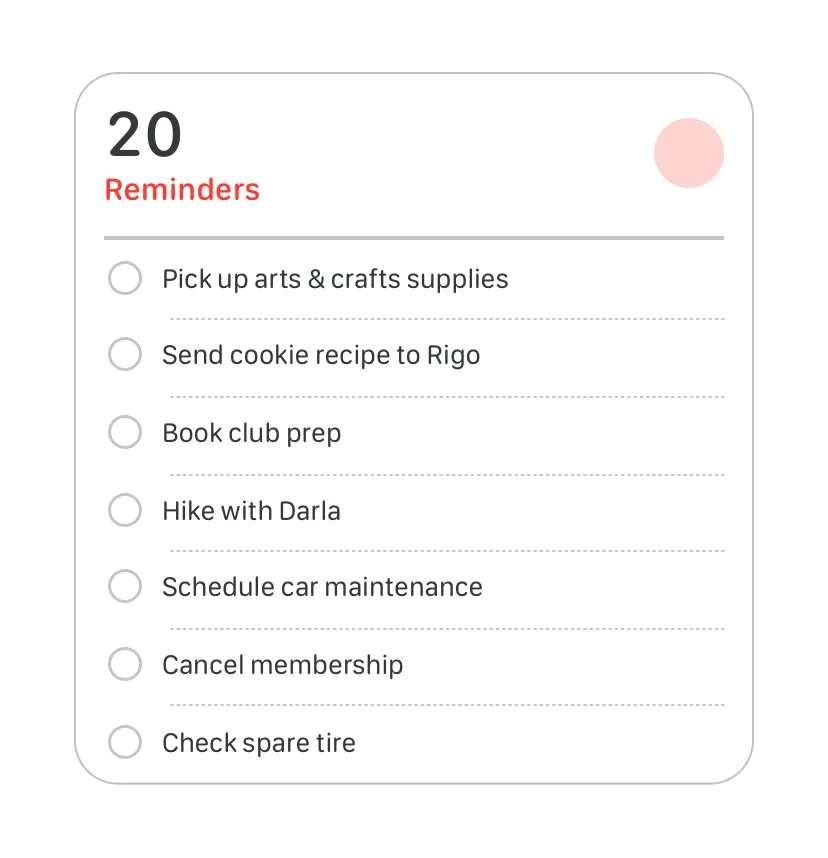
In some cases, people need to edit a widget to ensure it displays the information that’s most useful for them. For example, people choose a stock symbol for a Stocks widget. In contrast, some widgets — like the Podcasts widget — automatically display recent content, so people don’t need to customize them.
어떤 경우에는 사람들이 자신에게 가장 유용한 정보를 표시하도록 위젯을 편집해야 하는 경우도 있습니다. 예를 들어, 사람들은 주식 위젯의 주식 기호를 선택합니다. 반면에 팟캐스트 위젯과 같은 일부 위젯은 자동으로 최근 콘텐츠를 표시하므로 사용자 지정할 필요가 없습니다.
Make editable widgets easy for people to customize. If your widget is editable, avoid requiring too many settings or asking for information that might be hard for people to find. You don’t have to design an editing-mode user interface for your widget because the system automatically generates it for you. For developer guidance, see Making a configurable widget.
사람들이 쉽게 커스터마이징할 수 있도록 수정 가능한 위젯을 만드세요. 위젯을 편집할 수 있는 경우, 너무 많은 설정을 요구하거나 사람들이 찾기 어려운 정보를 요구하지 마세요. 위젯의 편집 모드 사용자 인터페이스는 시스템에서 자동으로 생성되므로 직접 디자인할 필요가 없습니다. 개발자 가이드는 구성 가능한 위젯 만들기를 참조하세요.
People tap or click a widget to launch its corresponding app. Starting with iOS 17, iPadOS 17, and macOS 14, widgets can also include buttons and toggles to offer additional functionality without launching the app. For example, the Reminders widget helps people mark a task as completed, and the widget of an app people use to log their daily caffeine intake could include a button that increases the caffeine total for the day.
위젯을 탭하거나 클릭하면 해당 앱이 실행됩니다. iOS 17, iPadOS 17 및 macOS 14부터 위젯에는 앱을 실행하지 않고도 추가 기능을 제공하는 버튼과 토글이 포함될 수 있습니다. 예를 들어, 알리미 위젯은 사람들이 작업을 완료한 것으로 표시하는 데 도움이 되며, 사람들이 일일 카페인 섭취량을 기록하는 데 사용하는 앱의 위젯에는 하루의 카페인 총량을 늘리는 버튼이 포함될 수 있습니다.
→ 위젯은 앱을 실행하지 않고도 추가 기능을 제공하며 사용자의 일일 카페인 섭취량 등을 기록하는 데 도움이 됩니다.
Incomplete tasks
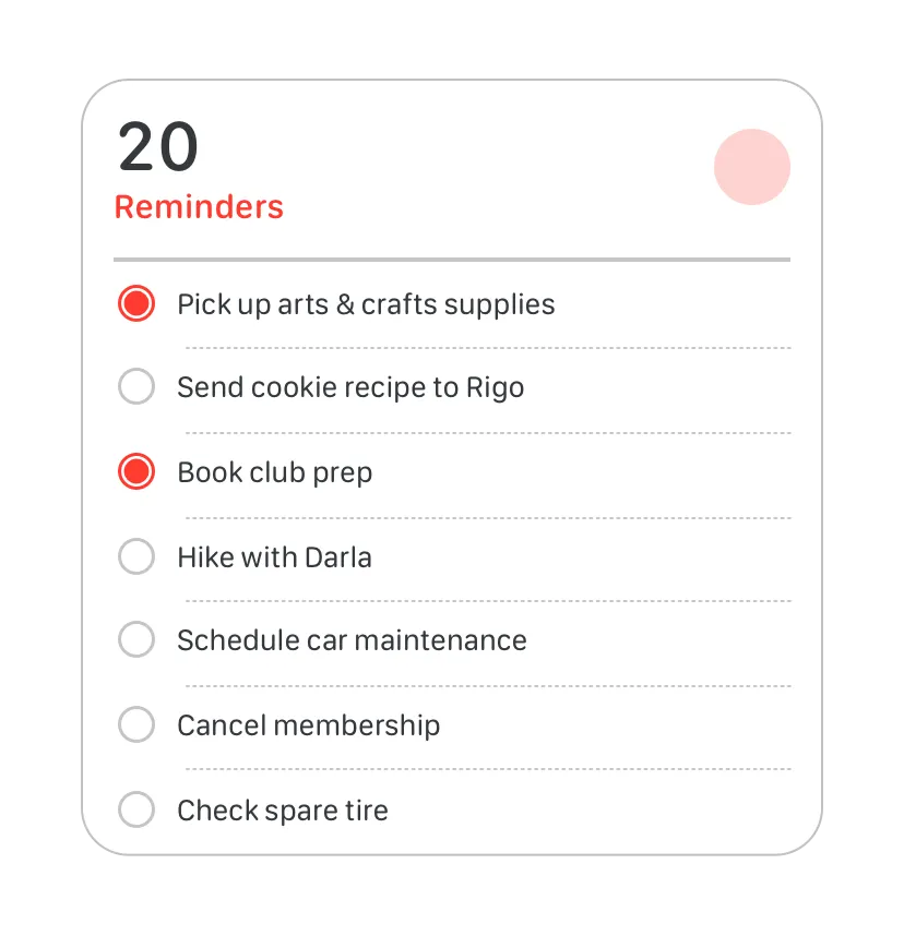
Completed tasks
Offer simple, relevant functionality in a widget, reserving complex functionality for your app.Useful widgets offer an easy way to complete a task or action that’s directly related to its content.
복잡한 기능은 앱에 남겨두고 간단하고 관련성 높은 기능만 위젯으로 제공해라. 유용한 위젯은 콘텐츠와 직접적으로 관련된 작업이나 동작을 쉽게 완료할 수 있는 방법을 제공합니다.
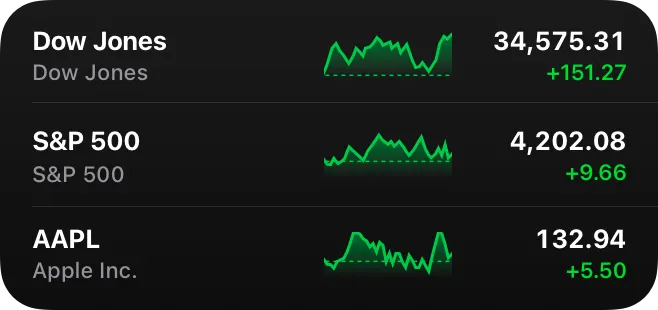
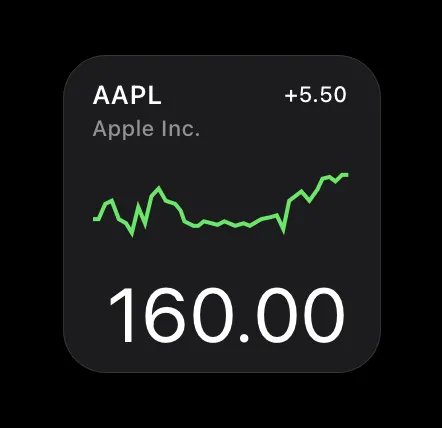
Ensure that a widget interaction opens your app at the right location. When people interact with your widget in areas that aren’t buttons or toggles, the interaction launches your app. Avoid making people navigate to the relevant area in the app, and instead deep link to the place where you offer details and actions that directly relate to the widget’s content. For example, when people click or tap a medium Stocks widget, the Stocks app opens to a page that displays information about the symbol.
위젯 인터랙션이 올바른 위치에서 앱을 열도록 합니다. 사람들이 버튼이나 토글이 아닌 영역에서 위젯과 인터랙션하면 해당 인터랙션으로 앱이 실행됩니다. 사용자가 앱의 관련 영역으로 이동하지 않고 위젯의 콘텐츠와 직접적으로 관련된 세부 정보 및 동작을 제공하는 곳으로 딥링크를 연결하세요. 예를 들어, 사용자가 중간 크기의 주식 위젯을 클릭하거나 탭하면 주식 앱이 해당 종목에 대한 정보를 표시하는 페이지로 열립니다.
→ 위젯 인터랙션은 앱에서 관련된 위치를 열어 사용자가 세부 정보와 동작에 빠르게 접근할 수 있게 합니다.
Provide options for interaction while remaining glanceable and uncluttered. In iOS, iPadOS, and macOS, widgets can offer multiple deep links that open the app and can include controls that perform app functions without launching the app. Multiple interaction targets — SwiftUI links, buttons, and toggles — might make sense for your content, but avoid creating app-like layouts in your widgets. Pay attention to the size of targets and make sure people can tap or click them with confidence and without accidentally performing unintended interactions. Note that inline accessory widgets and widgets in the watchOS Smart Stack offer only one tap target.
한 눈에 보기 쉽고 깔끔하게 보이면서 상호 작용할 수 있는 옵션을 제공합니다. iOS, iPadOS 및 macOS에서 위젯은 앱을 여는 여러 개의 딥링크를 제공할 수 있으며, 앱을 실행하지 않고도 앱 기능을 수행하는 컨트롤을 포함할 수 있습니다. 여러 인터랙션 타겟(SwiftUI 링크, 버튼, 토글)은 콘텐츠에 적합할 수 있지만 위젯에 앱과 같은 레이아웃을 만들지 않도록 주의하세요. 타겟의 크기에 주의를 기울이고 사람들이 의도하지 않은 상호작용을 실수로 수행하지 않고 안심하고 탭하거나 클릭할 수 있도록 하세요. watchOS 스마트 스택의 인라인 액세서리 위젯과 위젯은 하나의 탭 타겟만 제공한다는 점에 유의하세요.
→ 위젯은 깔끔하게 보이면서 한 눈에 보기 쉽게 상호 작용 가능한 옵션을 제공합니다.
Widgets use vivid colors, rich images, and clear, crisp text that’s easy to read at a glance. A unique, beautiful widget not only provides useful information, it can encourage people to feature it on their devices.
위젯은 선명한 색상, 풍부한 이미지, 한 눈에 보기 쉬운 선명하고 또렷한 텍스트를 사용합니다. 독특하고 아름다운 위젯은 유용한 정보를 제공할 뿐만 아니라 사람들이 자신의 디바이스에서 위젯을 사용하도록 유도할 수 있습니다.
Help people recognize your widget by including design elements linked to your brand’s identity. Design elements like brand colors, typeface, and stylized glyphs can make a widget instantly recognizable. Take care to keep brand-related design elements from crowding out useful information or making your widget look out of place in its context.
브랜드 아이덴티티와 연결된 디자인 요소를 포함하여 사람들이 위젯을 쉽게 알아볼 수 있도록 하세요. 브랜드 색상, 서체, 양식화된 글리프와 같은 디자인 요소는 위젯을 즉시 알아볼 수 있게 해줍니다. 브랜드 관련 디자인 요소로 인해 유용한 정보가 가려지거나 위젯이 맥락에 맞지 않게 보이지 않도록 주의하세요.

Note
When a widget appears in Notification Center in macOS or on the Home Screen in iOS, the system displays the app name below it. In Today View, the Lock Screen in iOS, and the iPadOS Home Screen, the app name doesn’t appear below a widget.
macOS의 알림 센터 또는 iOS의 홈 화면에 위젯이 나타나면 시스템에서 위젯 아래에 앱 이름이 표시됩니다. 오늘 보기, iOS의 잠금 화면 및 iPadOS 홈 화면에서는 위젯 아래에 앱 이름이 표시되지 않습니다.
Consider carefully before displaying a logo, wordmark, or app icon in your widget. When you include brand-related design elements like colors and fonts, people seldom need your logo or app icon to help them recognize your widget. Also, the widget gallery displays your app name and icon when it lists the various types and sizes of widgets you offer. In some widgets — for example, those that display content from multiple sources — it may make sense to include a small logo in the top-right corner to subtly identify the app that provides the widget.
위젯에 로고, 워드마크 또는 앱 아이콘을 표시하기 전에 신중하게 고려하세요. 색상, 글꼴 등 브랜드와 관련된 디자인 요소를 포함하면 사람들이 위젯을 인식하는 데 도움이 되는 로고나 앱 아이콘이 거의 필요하지 않습니다. 또한 위젯 갤러리는 제공하는 다양한 유형과 크기의 위젯을 나열할 때 앱 이름과 아이콘을 표시합니다. 일부 위젯(예: 여러 소스의 콘텐츠를 표시하는 위젯)의 경우 위젯을 제공하는 앱을 미묘하게 식별하기 위해 오른쪽 상단 모서리에 작은 로고를 포함하는 것이 좋을 수 있습니다.
→ 위젯 디자인 시 로고나 앱 아이콘을 포함하기 전에 신중히 생각하세요. 브랜드 관련 디자인 요소가 충분하면 이러한 요소가 필요하지 않을 수 있습니다.
Aim for a comfortable density of information. When content appears sparse, the widget can seem unnecessary; when content is too dense, the widget isn’t glanceable. If you have lots of information to include, avoid letting your widget become a collage of items that are difficult to parse. Seek ways to curate the content so that people can grasp the essential parts instantly and view relevant details at a longer look. You might also consider creating a larger widget and looking for places where you can replace text with graphics without losing clarity.
콘텐츠가 드문드문 표시되면 위젯이 불필요하게 보일 수 있고, 콘텐츠가 너무 빽빽하면 위젯이 눈에 잘 띄지 않습니다. 포함할 정보가 많은 경우 위젯이 분석하기 어려운 항목의 콜라주가 되지 않도록 하세요. 사람들이 핵심적인 부분은 바로 파악하고 관련 세부 정보는 길게 보면서 볼 수 있도록 콘텐츠를 큐레이션하는 방법을 모색하세요. 더 큰 위젯을 만들어 명확성을 잃지 않으면서 텍스트를 그래픽으로 대체할 수 있는 위치를 찾는 것도 고려해 볼 수 있습니다.
→ 위젯의 콘텐츠는 너무 듬성듬성하거나 밀집되어서는 안 되며, 정보가 많을 경우 위젯이 복잡해지지 않도록 핵심 내용과 세부 정보를 잘 구분해야 합니다.
Use color judiciously. Beautiful colors draw the eye, but they’re best when they don’t prevent people from absorbing a widget’s information at a glance. Use color to enhance a widget’s appearance without competing with its content. In your asset catalog, you can also specify the colors you want the system to use as it generates your widget’s editing-mode user interface.
색상을 신중하게 사용하세요. 아름다운 색상은 시선을 끌지만, 위젯의 정보를 한눈에 파악하는 데 방해가 되지 않는 것이 가장 좋습니다. 색상을 사용하여 콘텐츠와 경쟁하지 않으면서 위젯의 외관을 향상시킬 수 있습니다. 에셋 카탈로그에서 위젯의 편집 모드 사용자 인터페이스를 생성할 때 시스템에서 사용할 색상을 지정할 수도 있습니다.
Avoid mirroring your widget’s appearance within your app. If your app displays an element that looks like your widget but doesn’t behave like it, people can be confused when the element responds differently when they interact with it. Also, people may be less likely to try other ways to interact with such an element in your app because they expect it to behave like a widget.
앱 내에서 위젯의 외관을 미러링하지 마세요. 앱에 위젯처럼 보이지만 위젯처럼 동작하지 않는 요소가 표시되면 사람들이 해당 요소와 상호작용할 때 다르게 반응하여 혼란스러워할 수 있습니다. 또한 사람들은 위젯처럼 작동할 것으로 기대하기 때문에 앱에서 이러한 요소와 상호 작용하는 다른 방법을 시도할 가능성이 낮아질 수 있습니다.
Widgets scale to adapt to the screen sizes of different devices and onscreen areas. Ensure that your widget looks great on every device by supplying content at appropriate sizes.
위젯은 다양한 디바이스의 화면 크기와 화면 영역에 맞게 조정할 수 있습니다. 적절한 크기로 콘텐츠를 제공하여 모든 디바이스에서 위젯이 멋지게 보이도록 할 수 있습니다.
Design content to look great in all situations by letting the system resize or scale it as necessary. In iOS, the system ensures that your widget looks good on small devices by resizing the content you design for large devices. In iPadOS, the system renders your widget at a large size before scaling it down for display on the Home Screen. As you create design comprehensives for various devices and scale factors, use the values listed in Specifications for guidance; for your production widget, use SwiftUI to ensure flexibility.
→ 시스템이 다양한 디바이스에서 위젯이 잘 보이도록 콘텐츠의 크기를 조정합니다.
Coordinate the corner radius of your content with the corner radius of the widget. To ensure that your content looks good within a widget’s rounded corners, use a SwiftUI container to apply the correct corner radius. For developer guidance, see ContainerRelativeShape.
콘텐츠의 모서리 반경을 위젯의 모서리 반경에 맞춰 조정하세요. 위젯의 둥근 모서리 안에서 콘텐츠가 잘 보이도록 하려면 SwiftUI 컨테이너를 사용하여 올바른 모서리 반경을 적용하세요. 개발자 지침은 'ContainerRelativeShape`를 참조하세요.
Note
In iOS, widgets support Dynamic Type sizes from Large to AX5 when you use Font to choose a system font or custom(_:size:) to choose a custom font. For more information about Dynamic Type sizes, see Specifications
iOS에서 위젯은 글꼴을 사용하여 시스템 글꼴을 선택하거나 사용자 지정 글꼴을 선택하기 위해 사용자 지정(_:size:)을 사용할 때 Large에서 AX5까지 동적 유형 크기를 지원합니다. 동적 유형 크기에 대한 자세한 내용은 사양을 참조하세요.
In general, use standard margins to ensure your content is comfortably legible. Use the standard margin width for widgets — 16 points for most widgets — to avoid crowding the edges of widgets and creating a cluttered appearance. For example, as you place graphics or buttons or you use background shapes to create visual content groupings, you might need to use tighter, custom margins. Setting tight margins of 11 points can work well for those cases. Additionally, note that widgets use smaller margins on the Mac desktop and on the Lock Screen — including in StandBy. For developer guidance, see padding(_:_:).
일반적으로 표준 여백을 사용하여 콘텐츠가 편안하게 보여지도록 하세요. 위젯의 표준 여백 너비(대부분의 위젯에서 16포인트)를 사용하여 위젯의 가장자리가 뭉쳐서 어수선한 모양이 되지 않도록 하세요. 예를 들어 그래픽이나 버튼을 배치하거나 배경 모양을 사용하여 시각적 콘텐츠 그룹을 만들 때는 더 좁은 사용자 지정 여백을 사용해야 할 수 있습니다. 이러한 경우 11포인트의 좁은 여백을 설정하는 것이 효과적일 수 있습니다. 또한 위젯은 대기 모드를 포함하여 Mac 데스크톱과 잠금 화면에서 더 작은 여백을 사용한다는 점에 유의하세요. 개발자 지침은 padding(::)을 참조하세요.
→ 표준 여백을 사용하여 위젯의 가독성을 향상시키고, 어수선함을 방지하세요.
Consider using the system font, text styles, and SF Symbols. Using the system font helps your widget look at home on any platform, while making it easier for you to display great-looking text in a variety of weights, styles, and sizes. Use SF Symbols to align and scale symbols with text that uses the system font. If you need to use a custom font, consider using it sparingly, and be sure it’s easy for people to read at a glance. It often works well to use a custom font for the large text in a widget and SF Pro for the smaller text. For guidance, see Typography and SF Symbols.
시스템 글꼴, 텍스트 스타일 및 SF 심볼 사용을 고려하세요. 시스템 글꼴을 사용하면 어떤 플랫폼에서든 위젯이 잘 어울리면서 다양한 굵기, 스타일 및 크기로 멋진 텍스트를 쉽게 표시할 수 있습니다. SF 심볼을 사용하여 시스템 글꼴을 사용하는 텍스트에 맞춰 심볼을 정렬하고 크기를 조정할 수 있습니다. 사용자 정의 글꼴을 사용해야 하는 경우, 사람들이 한 눈에 쉽게 읽을 수 있도록 글꼴을 아껴서 사용하는 것이 좋습니다. 위젯의 큰 텍스트에는 사용자 정의 글꼴을 사용하고 작은 텍스트에는 SF Pro를 사용하는 것이 효과적일 때가 많습니다. 지침은 타이포그래피 및 SF 심볼을 참조하세요.
→ 시스템 글꼴, 텍스트 스타일, SF 심볼의 사용을 고려하여 위젯이 각 플랫폼에 잘 어울리고, 텍스트를 명확하게 표시하도록 합니다.
Avoid using very small font sizes. In general, display text using fonts at 11 points or larger. Text in a font that’s smaller than 11 points can be too hard for many people too read.
아주 작은 글꼴 크기는 사용하지 마세요. 일반적으로 11포인트 이상의 글꼴을 사용하여 텍스트를 표시하세요. 11포인트보다 작은 글꼴의 텍스트는 많은 사람들이 읽기 어려울 수 있습니다.
Always use text elements in a widget to ensure that your text scales well. In particular, don’t rasterize text — doing so prevents VoiceOver from speaking your content.
텍스트의 크기가 잘 조절되도록 항상 위젯의 텍스트 요소를 사용하세요. 특히 텍스트를 래스터화하지 마세요. 텍스트를 래스터화하면 보이스오버가 콘텐츠를 말할 수 없게 됩니다.
* 래스터화: 벡터 그래픽 형식(쉐이프)으로 설명된 이미지를 래스터 이미지(픽셀, 점 또는 선 시리즈, 함께 표시될 때 도형을 통해 표현된 이미지를 생성하는 작업)로 변환하는 작업임.
For every appearance, a unique, beautiful widget not only provides useful information, it can encourage people to feature it on their devices. Depending on the context in which they appear, widgets can look different. For example:
독특하고 아름다운 위젯은 유용한 정보를 제공할 뿐만 아니라 사람들이 자신의 디바이스에 위젯을 추가하도록 유도할 수 있습니다. 위젯이 표시되는 컨텍스트에 따라 위젯은 다르게 보일 수 있습니다. 예를 들어
•
Color varies from vivid colors to tinted, monochrome colors.
•
색상은 선명한 색상부터 색조가 있는 단색까지 다양합니다.
•
Images vary from rich, full-color images, to monochrome images, to symbols and glyphs only.
For example, a small system widget appears as follows:
•
이미지는 풍부한 풀컬러 이미지부터 흑백 이미지, 기호 및 글리프만 있는 이미지까지 다양합니다.예를 들어 작은 시스템 위젯은 다음과 같이 나타납니다:
•
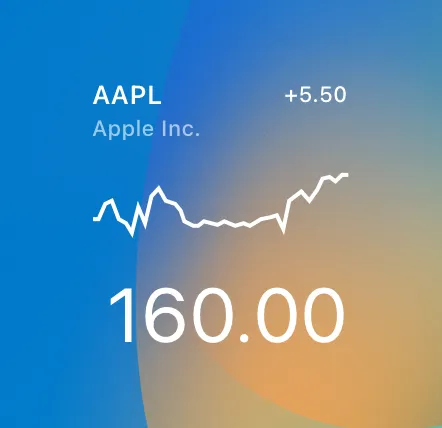
On the Home Screen of iPhone and iPad, the widget takes on a rich, full color appearance that supports Light and Dark Mode.
•
iPhone 및 iPad의 홈 화면에서 위젯은 밝고 어두운 모드를 지원하는 풍부한 풀 컬러로 표시됩니다.
•
On the Lock Screen of iPad, the widget takes on a vibrant appearance.
•
iPad의 잠금 화면에서 위젯이 생생한 모습으로 나타납니다.
•
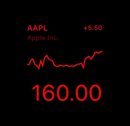
On the Lock Screen of iPhone in StandBy, the widget appears scaled up in size, and uses the vibrant appearance. When the ambient light falls below a threshold, StandBy in Night Mode renders widget content in a monochromatic red tint.
•
대기 모드의 iPhone 잠금 화면에서 위젯은 크기가 확대되어 생동감 있는 모양으로 표시됩니다. 주변 조도가 임계값 아래로 떨어지면 야간 모드의 대기 모드에서는 위젯 콘텐츠가 단색인 빨간색으로 렌더링됩니다.
StandBy
Night Mode
•
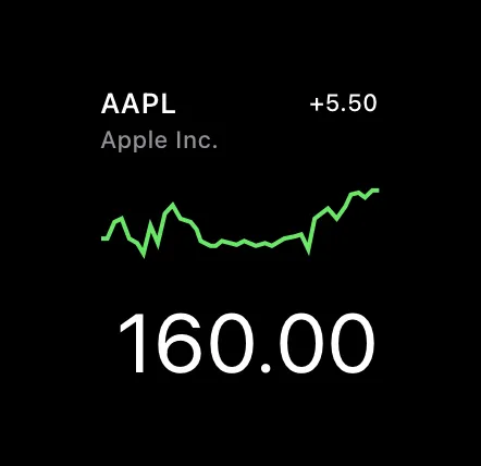
In Notification Center on the Mac, the widget uses rich, full colors and supports both light and dark appearances.
•
Mac의 알림 센터에서 위젯은 풍부한 풀 컬러를 사용하며 밝은 색상과 어두운 색상을 모두 지원합니다.
•
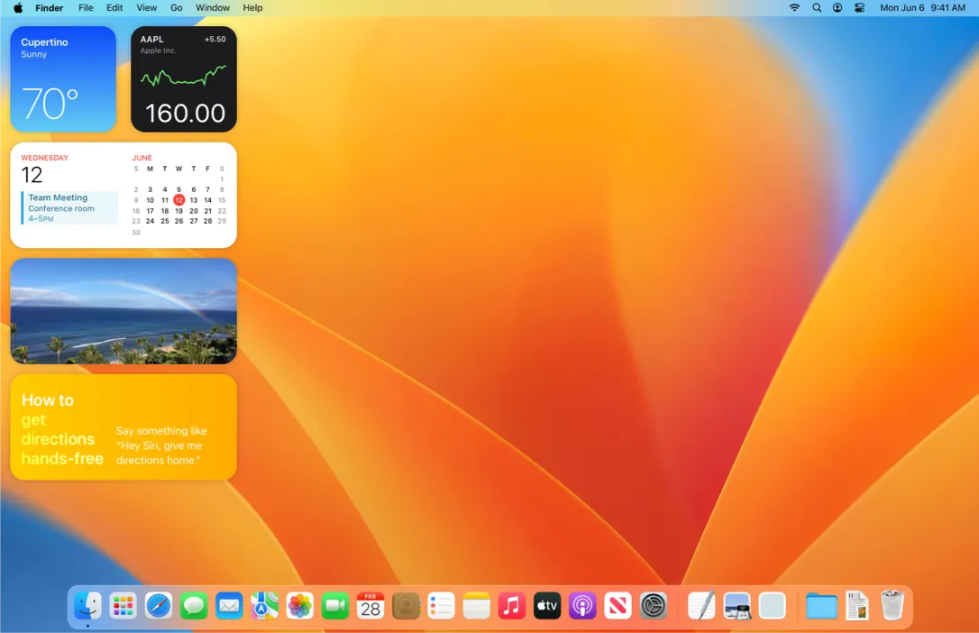
On the Mac desktop, the widget uses rich, full colors when people interact with it. When people interact with apps instead, the widget uses vibrancy and a blurred background to recede.
•
Mac 데스크톱에서 위젯은 사용자가 위젯과 상호 작용할 때 풍부한 풀 컬러를 사용합니다. 대신 사용자가 앱과 상호 작용할 때는 위젯이 생생한 색상과 흐릿한 배경을 사용하여 사라집니다.
Similarly, a rectangular accessory widget appears as follows:
마찬가지로, 직사각형 액세서리 위젯은 다음과 같이 나타납니다:
•
On the Lock Screen of iPhone and iPad, it takes on a vibrant appearance.
•
아이폰과 아이패드의 잠금 화면에서 활기찬 모습을 보여줍니다.
•
On Apple Watch, the widget can appear as a watch complication in both full-color and tinted appearances, and it can also appear in the Smart Stack with a default material background, or custom background content.
•
애플 워치에서 위젯은 풀 컬러 및 틴티드 모양 모두에서 시계 문제로 나타날 수 있으며, 기본 재료 배경 또는 사용자 지정 배경 콘텐츠를 포함하여 스마트 스택에 나타날 수도 있다.
The following table lists the available rendering modes for various types and sizes of widgets. For developer guidance, see Preparing widgets for additional platforms, contexts, and appearances.
다음 표는 위젯의 다양한 유형 및 크기에 대해 사용 가능한 렌더링 모드를 나열한다. 개발자 안내는 추가 플랫폼, 컨텍스트 및 외관에 대한 위젯 준비를 참조한다.
Widget size | Full color | Accented | Vibrant (receded in macOS) |
System small | Yes | No | Yes |
System medium | Yes | No | Yes |
System large | Yes | No | Yes |
System extra large | Yes | No | Yes |
Accessory circular | No | Yes | Yes |
Accessory corner | No | Yes | Yes |
Accessory rectangular | Yes | Yes | Yes |
Accessory inline | No | Yes | Yes |
Support Dark Mode. Ideally, a widget looks great in both the light and dark appearances. In general, avoid displaying dark text on a light background for the dark appearance, or light text on a dark background for the light appearance. When you use the semantic system colors for text and backgrounds, the colors dynamically adapt to the current appearance. You can also support different appearances by putting color variants in your asset catalog. For guidance, see Dark Mode; for developer guidance, see Asset management and Supporting Dark Mode in Your Interface.
다크 모드 지원해라. 이상적으로 위젯은 밝은 모양과 어두운 모양 모두에서 훌륭하다. 일반적으로 어두운 모양의 경우 밝은 배경에 어두운 텍스트를 표시하거나 밝은 모양의 경우 어두운 배경에 밝은 텍스트를 표시하지 않는다. 텍스트 및 배경에 의미 시스템 색상을 사용하면 색상이 현재 모양에 동적으로 적응한다. 또한 색상 변형을 자산 카탈로그에 넣어 다양한 모양을 지원할 수도 있다. 개발자 지침은 다크 모드, 개발자 지침은 인터페이스의 자산 관리 및 지원 다크 모드를 참조하십시오.
→ 위젯은 밝은 모드와 어두운 모드 모두에서 잘 작동해야 하며, 시스템 색상을 사용하면 모양에 동적으로 적응한다.
Support StandBy and Night Mode. In StandBy, the system displays two small system family widgets side-by-side, scaled up so they fill the Lock Screen. Widgets that appear in StandBy typically don’t use rich images or color to convey meaning but instead make use of the additional space by scaling up and rearranging text so people can glance at the widget content from a greater distance. To seamlessly blend with the black background, don’t use background colors for your widget when it appears in StandBy.
스탠바이 및 야간 모드 지원해라. 스탠바이에서 시스템은 두 개의 작은 시스템 계열 위젯을 나란히 보여주며, 이 위젯들은 잠금 화면을 채웁니다.스탠바이에 나타나는 위젯은 일반적으로 의미를 전달하기 위해 풍부한 이미지나 색상을 사용하지 않고, 사용자들이 위젯 내용을 더 먼 거리에서 볼 수 있도록 텍스트를 확대하고 재배열함으로써 추가 공간을 활용합니다. 검은색 배경과 원활하게 조화되기 위해서는 위젯이 스탠바이에 나타날 때 배경 색상을 사용하지 마십시오.
→ 스탠바이 모드와 야간 모드에서 위젯은 배경 색상을 사용하지 않고, 텍스트를 확대 및 재배열해 유저가 더 멀리서도 확인할 수 있게 해야 합니다.
Support StandBy and Night Mode. In StandBy, the system displays two small system family widgets side-by-side, scaled up so they fill the Lock Screen. Widgets that appear in StandBy typically don’t use rich images or color to convey meaning but instead make use of the additional space by scaling up and rearranging text so people can glance at the widget content from a greater distance. To seamlessly blend with the black background, don’t use background colors for your widget when it appears in StandBy.
스탠바이 및 야간 모드 지원해라. 스탠바이에서 시스템은 두 개의 작은 시스템 계열 위젯을 나란히 보여주며, 이 위젯들은 잠금 화면을 채웁니다.스탠바이에 나타나는 위젯은 일반적으로 의미를 전달하기 위해 풍부한 이미지나 색상을 사용하지 않고, 사용자들이 위젯 내용을 더 먼 거리에서 볼 수 있도록 텍스트를 확대하고 재배열함으로써 추가 공간을 활용합니다. 검은색 배경과 원활하게 조화되기 위해서는 위젯이 스탠바이에 나타날 때 배경 색상을 사용하지 마십시오.
In Night Mode, the system applies a red tint to widgets.
야간 모드에서 시스템은 위젯에 빨간색 색조를 적용합니다.
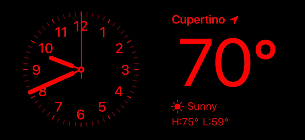
Night Mode
Adjust colors and images for the vibrant rendering mode. The system renders widgets on the Lock Screen and on the Mac desktop using a vibrant, blurred appearance. The opacity of pixels within your image determines the strength of the blurred material effect. Fully transparent pixels let the background wallpaper pass through as–is. When creating assets for the vibrant rendering mode, render content like images, numbers, or text at full opacity. The brightness of pixels determines how vibrant they appear on the Lock Screen: Brighter gray values provide more contrast, and darker values provide less contrast. To establish hierarchy, use white or light gray for the most prominent content and darker grayscale values for secondary elements.
선명한 렌더링 모드를 위해 색상과 이미지를 조정합니다. 시스템은 선명하고 흐릿한 모양을 사용하여 잠금 화면과 맥 바탕 화면에 위젯을 렌더링합니다. 이미지 내 픽셀의 불투명도가 흐릿한 재료 효과의 강도를 결정합니다. 완전히 투명한 픽셀은 배경 배경 배경 화면을 그대로 통과시킵니다. 선명한 렌더링 모드를 위한 자산을 만들 때 이미지, 숫자 또는 텍스트와 같은 콘텐츠를 완전히 불투명하게 렌더링하십시오. 픽셀의 밝기는 잠금 화면에 나타나는 선명도를 결정합니다. 밝은 회색 값은 더 많은 대비를 제공하고 어두운 값은 더 적은 대비를 제공합니다. 계층 구조를 설정하려면 가장 눈에 띄는 콘텐츠는 흰색 또는 밝은 회색을 사용하고 보조 요소는 더 어두운 회색 비율 값을 사용하십시오.
→ 위젯의 선명한 렌더링 모드를 위해 색상과 이미지를 조정합니다.
To make sure images look great in the vibrant rendering mode:
선명한 렌더링 모드에서 이미지가 훌륭한지 확인하려면:
•
Confirm that image content has sufficient contrast in grayscale.
•
이미지 내용이 그레이스케일에서 충분한 대비를 가지고 있는지 확인합니다.
•
Use opaque grayscale values, rather than opacities of white, to achieve the best vibrant material effect.
•
흰색의 불투명도가 아닌 불투명한 계조 값을 사용하여 최상의 선명한 재료 효과를 얻을 수 있습니다.
Support both full color and vibrancy for widgets on the Mac desktop. Widgets that people place on the Mac desktop use rich, full colors when people interact with them; when people switch to using apps, widgets use a vibrant, monochromatic rendering that appears to recede. Be sure to prepare your widget to offer enough contrast to be glanceable and show its information when it takes on the vibrant appearance. Starting in macOS 14, people can also place iPhone widgets on the Mac, so you want to make sure your iPhone widgets support the vibrant appearance in macOS.
Mac 바탕 화면의 위젯을 위해 전체 색상과 생동감을 모두 지원합니다. 사람들이 Mac 바탕 화면에 배치하는 위젯은 사람들과 상호 작용할 때 풍부하고 전체 색상을 사용합니다. 사람들이 앱을 사용하기로 전환할 때 위젯은 후퇴하는 것처럼 보이는 선명한 단색 렌더링을 사용합니다. 위젯이 눈에 띄도록 충분한 대비를 제공하고 선명한 모양을 취할 때 정보를 표시할 수 있도록 준비해야 합니다. macOS 14부터는 사용자가 Mac에 아이폰 위젯을 배치할 수 있으므로 아이폰 위젯이 macOS에서 선명한 모양을 지원하는지 확인해야 합니다.
→ Mac 바탕 화면 위젯은 전체 색상과 생동감을 지원하며, 사용자가 앱 사용으로 전환할 때 선명한 단색 렌더링을 사용합니다.
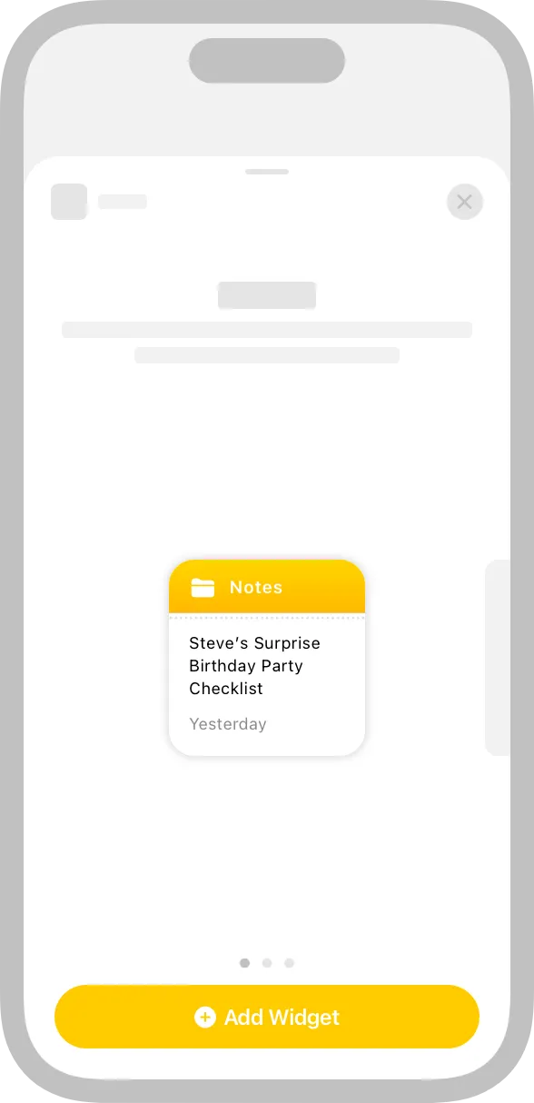
Design a realistic preview to display in the widget gallery. Highlighting your widget’s capabilities — and clearly representing the experiences each widget type or size can provide — helps people make an informed decision. You can display real data in your widget preview, but if the data takes too long to generate or load, display realistic simulated data instead.
위젯 갤러리에 표시할 사실적인 미리보기를 설계합니다. 위젯의 기능을 강조하고 각 위젯 유형 또는 크기가 제공할 수 있는 경험을 명확하게 나타내면 사람들이 정보에 입각한 결정을 내릴 수 있습니다. 위젯 미리 보기에 실제 데이터를 표시할 수 있지만 데이터를 생성하거나 로드하는 데 시간이 너무 오래 걸리는 경우 사실적인 시뮬레이션 데이터를 대신 표시하세요.
Design placeholder content that helps people recognize your widget. An installed widget displays placeholder content while its data loads. You can create an effective placeholder appearance by combining static interface components with semi-opaque shapes that stand in for dynamic content. For example, you can use rectangles of different widths to suggest lines of text, and circles or squares in place of glyphs and images.
사람들이 당신의 위젯을 인식할 수 있도록 도와주는 플레이스홀더 컨텐츠를 디자인합니다. 설치된 위젯은 데이터가 로드되는 동안 플레이스홀더 컨텐츠를 표시합니다. 동적 컨텐츠를 나타내는 반투명 형태의 정적 인터페이스 구성요소를 결합하여 효과적인 플레이스홀더 모양을 만들 수 있습니다. 예를 들어, 다양한 너비의 직사각형을 사용하여 텍스트 라인을 제안하고, 글리프 및 이미지 대신 원형 또는 정사각형을 제안할 수 있습니다.

Write a succinct description of your widget. The widget gallery displays descriptions that help people understand what each widget does. It generally works well to begin a description with an action verb — for example, “See the current weather conditions and forecast for a location” or “Keep track of your upcoming events and meetings.” Avoid including unnecessary phrases that reference the widget itself, like “This widget shows…,” “Use this widget to…,” or “Add this widget.” Use approachable language and sentence-style capitalization.
위젯에 대한 간단한 설명을 작성하십시오. 위젯 갤러리에는 각 위젯이 수행하는 작업을 이해하는 데 도움이 되는 설명이 표시됩니다. 일반적으로 "현재 날씨 조건 및 위치 예측 보기" 또는 "향후 이벤트 및 회의 기록"과 같은 동작 동사로 설명을 시작하는 것이 좋습니다. "이 위젯은 표시...", "이 위젯을 사용하여..." 또는 "이 위젯을 추가"와 같은 위젯 자체를 참조하는 불필요한 구문을 포함하지 마십시오. 접근 가능한 언어와 sentence 스타일 대문자를 사용하십시오.
→ 위젯 갤러리의 설명은 각 위젯의 기능을 이해하는데 도움이 됩니다.
Group your widget’s sizes together, and provide a single description. If your widget is available in multiple sizes, group the sizes together so people don’t think each size is a different widget. Provide a single description of your widget — regardless of how many sizes you offer — to avoid repetition and to help people understand how each size provides a slightly different perspective on the same content and functionality.
위젯의 크기를 함께 그룹화하고 하나의 설명을 제공하십시오. 위젯의 크기가 여러 개인 경우 사용자가 각 크기가 서로 다른 위젯이라고 생각하지 않도록 크기를 함께 그룹화하십시오. 반복을 방지하고 각 크기가 동일한 내용 및 기능에 대해 서로 다른 관점을 제공하는 방법을 이해하는 데 도움이 되도록 제공하는 크기와 상관없이 위젯에 대한 단일 설명을 제공하십시오.
Consider coloring the Add button. After people choose your app in the widget gallery, an Add button appears below the group of widgets you offer. You can specify a color for this button to help remind people of your brand.
추가 버튼에 색을 입히는 것을 고려해 보세요. 위젯 갤러리에서 사람들이 당신의 앱을 선택하면, 당신이 제공하는 위젯 그룹 아래에 추가 버튼이 나타납니다. 이 버튼의 색을 지정하여 사람들에게 당신의 브랜드를 상기시키는 것을 도울 수 있습니다.
No additional considerations for macOS. Not supported in tvOS or visionOS.
macOS에 대한 추가 고려 사항 없음. tvOS나 비전OS에서는 지원되지 않음.
Widgets on the Lock Screen are functionally similar to watch complications and follow design principles for Complications in addition to design principles for widgets. Both support Always-On displays and emphasize glanceable content within their limited space. Provide useful information in your Lock Screen widget, and don’t treat it only as an additional way for people to launch into your app. Additionally, the vibrant rendering mode that widgets on the Lock Screen use is similar to the accented rendering mode for watch complications because they both communicate information without relying on color only. In many cases, a design for complications also works well for widgets on the Lock Screen (and vice versa), so consider creating them in tandem.
기능적으로 잠금 화면의 위젯은 위젯에 대한 디자인 원칙뿐만 아니라 Complexions 에 대한 디자인 원칙도 따른다. 둘 다 Always-On 디스플레이를 지원하고 제한된 공간 내에서 눈에 띄는 콘텐츠를 강조한다. 잠금 화면 위젯에서 유용한 정보를 제공하고 사람들이 앱을 실행하는 추가적인 방법으로만 다루지 마십시오. 또한 잠금 화면 위젯에서 사용하는 선명한 렌더링 모드는 색상에만 의존하지 않고 정보를 전달하기 때문에 시계 문제에 대한 액센트 렌더링 모드와 유사합니다. 많은 경우 문제에 대한 디자인은 잠금 화면의 위젯에서도 잘 작동하므로 동시에 만드는 것을 고려하십시오.
→ 잠금 화면 위젯은 디자인 원칙을 따르며, 주요 정보를 강조하고, 앱 실행을 보조합니다.
Your app can offer widgets on the Lock Screen in three different shapes: as inline text that appears above the clock, and as circular and rectangular shapes that appear below the clock.
앱은 시계 위에 나타나는 인라인 텍스트와 시계 아래에 나타나는 원형 및 직사각형 모양의 세 가지 다른 모양으로 잠금 화면에 위젯을 제공할 수 있습니다.
Support Always-On display. Devices with Always-On display render widgets on the Lock Screen with reduced luminance. Use levels of gray that provide enough contrast in Always-On display, and make sure your content is legible.
Always-On display를 지원합니다. Always-On display가 있는 장치는 휘도가 감소된 잠금 화면에 위젯을 렌더링합니다. Always-On display에서 충분한 대비를 제공하는 회색 레벨을 사용하고 컨텐츠를 읽을 수 있도록 합니다.
For developer guidance, see Creating accessory widgets and watch complications, WidgetRenderingMode, and vibrant.
Provide a colorful background that conveys meaning. By default, widgets in the Smart Stack use a black background. Consider using a custom color that provides additional meaning. For example, the Stocks app uses a red background for falling stock values and a green background if a stock’s value rises.
의미를 전달하는 화려한 배경을 제공합니다. 기본적으로 Smart Stack의 위젯은 검은색 배경을 사용합니다. 추가적인 의미를 제공하는 사용자 지정 색상을 사용하는 것을 고려해 보세요. 예를 들어 Stocks 앱은 주식 가치 하락을 위해 빨간색 배경을 사용하고, 주식 가치가 상승할 경우 초록색 배경을 사용합니다.
As you design your widgets, use the following values for guidance.
위젯을 설계할 때 다음 값을 사용하여 지침을 제공합니다.
Screen size (portrait, pt) | Small (pt) | Medium (pt) | Large (pt) | Circular (pt) | Rectangular (pt) | Inline (pt) |
430×932 | 170x170 | 364x170 | 364x382 | 76x76 | 172x76 | 257x26 |
428x926 | 170x170 | 364x170 | 364x382 | 76x76 | 172x76 | 257x26 |
414x896 | 169x169 | 360x169 | 360x379 | 76x76 | 160x72 | 248x26 |
414x736 | 159x159 | 348x157 | 348x357 | 76x76 | 170x76 | 248x26 |
393x852 | 158x158 | 338x158 | 338x354 | 72x72 | 160x72 | 234x26 |
390x844 | 158x158 | 338x158 | 338x354 | 72x72 | 160x72 | 234x26 |
375x812 | 155x155 | 329x155 | 329x345 | 72x72 | 157x72 | 225x26 |
375x667 | 148x148 | 321x148 | 321x324 | 68x68 | 153x68 | 225x26 |
360x780 | 155x155 | 329x155 | 329x345 | 72x72 | 157x72 | 225x26 |
320x568 | 141x141 | 292x141 | 292x311 | N/A | N/A | N/A |
Screen size (portrait, pt) | Target | Small (pt) | Medium (pt) | Large (pt) | Extra large (pt) |
768x1024 | Canvas | 141x141 | 305.5x141 | 305.5x305.5 | 634.5x305.5 |
Device | 120x120 | 260x120 | 260x260 | 540x260 | |
744x1133 | Canvas | 141x141 | 305.5x141 | 305.5x305.5 | 634.5x305.5 |
Device | 120x120 | 260x120 | 260x260 | 540x260 | |
810x1080 | Canvas | 146x146 | 320.5x146 | 320.5x320.5 | 669x320.5 |
Device | 124x124 | 272x124 | 272x272 | 568x272 | |
820x1180 | Canvas | 155x155 | 342x155 | 342x342 | 715.5x342 |
Device | 136x136 | 300x136 | 300x300 | 628x300 | |
834x1112 | Canvas | 150x150 | 327.5x150 | 327.5x327.5 | 682x327.5 |
Device | 132x132 | 288x132 | 288x288 | 600x288 | |
834x1194 | Canvas | 155x155 | 342x155 | 342x342 | 715.5x342 |
Device | 136x136 | 300x136 | 300x300 | 628x300 | |
954x1373 * | Canvas | 162x162 | 350x162 | 350x350 | 726x350 |
Device | 162x162 | 350x162 | 350x350 | 726x350 | |
970x1389 * | Canvas | 162x162 | 350x162 | 350x350 | 726x350 |
Device | 162x162 | 350x162 | 350x350 | 726x350 | |
1024x1366 | Canvas | 170x170 | 378.5x170 | 378.5x378.5 | 795x378.5 |
Device | 160x160 | 356x160 | 356x356 | 748x356 | |
1192x1590 * | Canvas | 188x188 | 412x188 | 412x412 | 860x412 |
Device | 188x188 | 412x188 | 412x412 | 860x412 |
•
When Display Zoom is set to More Space.
Apple Watch size | Size of a widget in the Smart Stack (pt) |
40mm | 304x139 |
41mm | 330x145 |
44mm | 346x153 |
45mm | 368x161 |
49mm | 382x163 |
Developing a WidgetKit strategy — WidgetKit
Change log
작성 날짜 | 작성자 | 수정사항 |
2023/11/30 | 조엘 | 초기 번역 |
2023/12/26 | 조엘 | 배포 |