
The Apple TV Home Screen provides an area called Top Shelf, which showcases your content in a rich, engaging way while also giving people access to their favorite apps in the Dock.
애플 TV 홈 화면은 "Top Shelf(상단 선반)"라 불리는 영역을 제공하며, 이는 사용자의 콘텐츠를 풍부하고 매력적인 방식으로 전시하는 동시에 사람들이 Dock에서 자주 사용하는 앱에 쉽게 접근할 수 있게 해줍니다.
When you support full-screen Top Shelf, people can swipe through multiple full-screen content views, play trailers and previews, and get more information about your content.
전체 화면 Top Shelf를 지원하면 사용자는 여러 전체 화면 콘텐츠 뷰를 스와이프하여 예고편 및 미리보기를 재생하고 콘텐츠에 대한 자세한 정보를 얻을 수 있습니다.
Top Shelf is a unique opportunity to highlight new, featured, or recommended content and let people jump directly to your app or game to view it. For example, when people select Apple TV in the Dock, full-screen previews immediately begin playing and soon the Dock slides away. As people watch previews for the first show, they can swipe through previews of all other featured shows, stopping to select Play or More Info for a preview that interests them.
Top Shelf는 새로운 콘텐츠, 추천 콘텐츠 등을 강조하고 사용자가 해당 앱이나 게임으로 직접 이동하여 콘텐츠를 확인할 수 있는 독특한 기회를 제공합니다. 예를 들어, 사용자가 독에 Apple TV를 선택하면 전체 화면 미리보기가 즉시 재생되고 곧이어 독이 사라집니다. 사용자가 첫 번째 쇼의 미리보기를 시청하는 동안 다른 특별 쇼들의 미리보기를 스와이프하여 관심 있는 미리보기에 대해 재생 또는 더 많은 정보를 선택할 수 있습니다.
The system defines several layout templates that you can use to give people a compelling Top Shelf experience when they select your app in the Dock. To help you position content, you can download these templates from Apple Design Resources.
시스템은 독에서 앱을 선택했을 때 사용자에게 매력적인 Top Shelf 경험을 제공하기 위한 여러 레이아웃 템플릿을 정의하고 있습니다. 콘텐츠의 위치를 조절하기 위해 이러한 템플릿을 Apple Design Resources에서 다운로드할 수 있습니다.
Help people jump right into your content. Top Shelf provides a path to the content people care about most. Two of the system-provided layout templates — carousel actions and carousel details — each include two buttons by default: A primary button intended to begin playback and a More Info button intended to open your app to a view that displays details about the content.
사용자가 콘텐츠로 직접 이동할 수 있도록 도와주세요. Top Shelf는 사용자가 가장 관심을 가지는 콘텐츠로 가는 경로를 제공합니다. 시스템에서 제공하는 carousel actions 및 carousel details라는 두 가지 레이아웃 템플릿 중 각각은 기본적으로 두 개의 버튼을 포함하고 있습니다. 주요 버튼은 재생을 시작하는 데 사용되며 더 많은 정보 버튼은 콘텐츠에 대한 세부 정보를 표시하는 뷰를 열기 위해 사용됩니다.
Feature new content. For example, showcase new releases or episodes, highlight upcoming movies and shows, and avoid promoting content that people have already purchased, rented, or watched.
새로운 콘텐츠를 특징으로 하세요. 예를 들어, 새로운 릴리스나 에피소드를 소개하고 예정된 영화와 쇼를 강조하며, 이미 구매하거나 빌린 콘텐츠를 홍보하지 않도록 해주세요.
Personalize people’s favorite content. People typically put the apps they use most often into Top Shelf. You can personalize their experience by showing targeted recommendations in the Top Shelf content you supply, letting people resume media playback or jump back into active gameplay.
사용자가 좋아하는 콘텐츠를 개인화하세요. 사용자는 주로 가장 자주 사용하는 앱을 Top Shelf에 넣습니다. Top Shelf에 공급하는 콘텐츠에서 타겟팅된 추천을 보여주어 사용자가 미디어 재생을 재개하거나 게임 플레이를 다시 시작할 수 있도록 개인화된 경험을 제공할 수 있습니다.
Avoid showing advertisements or prices. People put your app into Top Shelf because you’ve already sold them on it, so they may not appreciate seeing lots of ads from your app. Showing purchasable content in the Top Shelf is fine, but prefer putting the focus on new and exciting content, and consider displaying prices only when people show interest.
광고나 가격을 표시하지 마세요. 사용자는 이미 여러분의 앱에 설득되어 있기 때문에 앱에서 많은 광고를 보는 것을 선호하지 않을 수 있습니다. Top Shelf에 구매 가능한 콘텐츠를 표시하는 것은 괜찮지만, 새로운 흥미로운 콘텐츠에 중점을 두고 사용자가 관심을 보일 때에만 가격을 표시하는 것이 좋습니다.
Showcase compelling dynamic content that can help draw people in and encourage them to view more. If necessary, you can supply static images, but people typically prefer a captivating, dynamic Top Shelf experience that features the newest or highest rated content. To provide this experience, prefer creating layered images to display in Top Shelf.
사람들을 끌어들이고 더 많이 보도록 도울 동적인 콘텐츠를 소개하세요. 필요한 경우 정적 이미지를 제공할 수 있지만, 일반적으로 사용자는 최신이나 최고 평가를 받은 콘텐츠를 특징으로 하는 매력적이고 동적인 Top Shelf 경험을 선호합니다. 이 경험을 제공하기 위해 레이어드 이미지를 Top Shelf에 표시하는 것이 좋습니다.
If you don’t provide the recommended full-screen content, supply at least one static image as a fallback. The system displays a static image when your app is in the Dock and in focus and full-screen content is unavailable. tvOS flips and blurs the image, ensuring that it fits into a width of 1920 pixels at the 16:9 aspect ratio. Use the following values for guidance.
권장되는 전체 화면 콘텐츠를 제공하지 않는 경우 적어도 하나의 정적 이미지를 대체로 제공하세요. 시스템은 앱이 독에 있고 포커스되어 있을 때 전체 화면 콘텐츠를 사용할 수 없을 때 정적 이미지를 표시합니다. tvOS는 이미지를 뒤집고 흐리게 표시하여 16:9 비율에서 1920 픽셀의 너비에 맞도록 보장합니다. 가이드로 다음 값들을 사용하세요.
Image size
2320x720 pt (2320x720 px @1x, 4640x1440 px @2x)
Avoid implying interactivity in a static image. A static Top Shelf image isn’t focusable, and you don’t want to make people think it’s interactive.
정적 이미지에서 상호 작용이 일어난다고 암시하지 마세요. 정적 Top Shelf 이미지는 포커스를 받을 수 없으며, 사용자가 상호 작용 가능하다고 오해하게 하고 싶지 않습니다.
Dynamic Top Shelf images can appear in several ways:
•
A carousel of full-screen video and images that includes two buttons and optional details
•
A row of focusable content
•
A set of scrolling banners
동적 Top Shelf 이미지는 여러 가지 방식으로 나타날 수 있습니다.
•
두 개의 버튼과 선택적 세부 정보를 포함한 전체 화면 비디오 및 이미지의 캐러셀
•
포커스 가능한 콘텐츠의 행
•
스크롤링 배너의 세트
The carousel actions layout style focuses on full-screen video and images and includes a few unobtrusive controls that help people see more. This layout style works especially well to showcase content that people already know something about. For example, it’s great for displaying user-generated content, like photos, or new content from a franchise or show that people are likely to enjoy.
캐러셀 작업 레이아웃 스타일은 전체 화면 비디오와 이미지에 중점을 둔 상태로, 사람들이 더 많은 내용을 볼 수 있도록 도와주는 몇 가지 간편한 컨트롤을 포함하고 있습니다. 이 레이아웃 스타일은 특히 이미 어떤 내용에 대해 알고 있는 콘텐츠를 전시하는 데 효과적입니다. 예를 들어, 사용자가 생성한 콘텐츠(사진 등)나 프랜차이즈나 쇼에서 즐길 만한 새로운 콘텐츠를 표시하는 데 좋습니다.
Provide a title. Include a succinct title, like the title of the show or movie or the title of a photo album. If necessary, you can also provide a brief subtitle. For example, a subtitle for a photo album could be a range of dates; a subtitle for an episode could be the name of the show.
제목을 제공하세요. 쇼 또는 영화의 제목이나 포토 앨범의 제목과 같은 간결한 제목을 포함하세요. 필요한 경우 간단한 부제목도 제공할 수 있습니다. 예를 들어, 포토 앨범의 부제목은 날짜 범위일 수 있고, 에피소드의 부제목은 쇼의 이름일 수 있습니다.
This layout style extends the carousel actions layout style, giving you the opportunity to include some information about the content. For example, you might provide information like a plot summary, cast list, and other metadata that helps people decide whether to choose the content.
이 레이아웃 스타일은 캐러셀 작업 레이아웃 스타일을 확장하여 콘텐츠에 대한 일부 정보를 포함할 수 있는 기회를 제공합니다. 예를 들어, 줄거리 요약, 출연진 목록 및 콘텐츠를 선택할지 여부를 결정하는 데 도움이 되는 기타 메타데이터와 같은 정보를 제공할 수 있습니다.
Provide a title that identifies the currently playing content. The content title appears near the top of the screen so it’s easy for people to read it at a glance. Above the title, you can also provide a succinct phrase or app attribution, like “Featured on My App.”
현재 재생 중인 콘텐츠를 식별하는 제목 제공하세요. 콘텐츠 제목은 화면 상단에 가까이 표시되어 사용자가 한눈에 읽을 수 있게 합니다. 제목 위에는 "My App에서 특징"과 같은 간결한 문구나 앱 소속 정보를 제공할 수 있습니다.
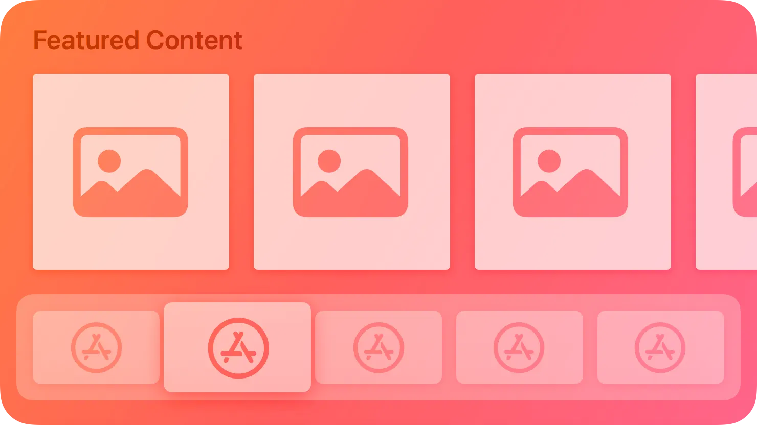
This layout style shows a single labeled row of sectioned content, which can work well to highlight recently viewed content, new content, or favorites. Row content is focusable, which lets people scroll quickly through it. A label appears when an individual piece of content comes into focus, and small movements on the remote’s Touch surface bring the focused image to life. You can also configure a sectioned content row to show multiple labels.
이 레이아웃 스타일은 섹션화된 콘텐츠의 단일 레이블이 있는 행을 보여줍니다. 이는 최근에 본 콘텐츠, 새로운 콘텐츠 또는 즐겨찾는 콘텐츠를 강조하는 데 효과적입니다. 행 콘텐츠는 포커스 가능하여 사용자가 빠르게 스크롤할 수 있게 합니다. 개별 콘텐츠가 포커스에 들어올 때 레이블이 표시되며, 리모트의 터치 표면에서의 작은 움직임이 포커스된 이미지를 활성화시킵니다. 또한 섹션화된 콘텐츠 행을 여러 레이블을 표시하도록 구성할 수도 있습니다.
Provide enough content to constitute a complete row. At a minimum, load enough images in a sectioned content row to span the full width of the screen. In addition, include at least one label for greater platform consistency and to provide additional context.
완전한 행을 형성할 충분한 콘텐츠를 제공하세요. 최소한 섹션화된 콘텐츠 행에 전체 화면 너비에 걸칠만큼의 이미지를 로드하세요. 더불어, 플랫폼 일관성을 유지하고 추가적인 맥락을 제공하기 위해 적어도 하나의 레이블을 포함하세요.
You can use the following image sizes in a sectioned content row.
다음 이미지 크기를 섹션화된 콘텐츠 행에서 사용할 수 있습니다.
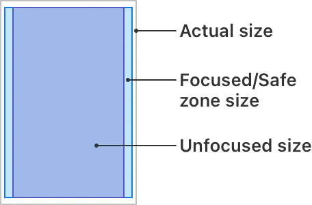
Aspect | Image size |
Actual size | 404x608 pt (404x608 px @1x, 808x1216 px @2x) |
Focused/Safe zone size | 380x570 pt (380x570 px @1x, 760x1140 px @2x) |
Unfocused size | 333x570 pt (333x570 px @1x, 666x1140 px @2x) |
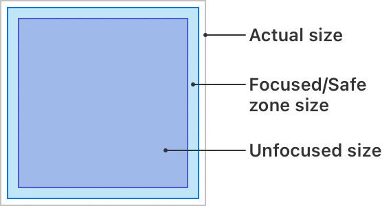
Aspect | Image size |
Actual size | 608x608 pt (608x608 px @1x, 1216x1216 px @2x) |
Focused/Safe zone size | 570x570 pt (570x570 px @1x, 1140x1140 px @2x) |
Unfocused size | 500x500 pt (500x500 px @1x, 1000x1000 px @2x) |
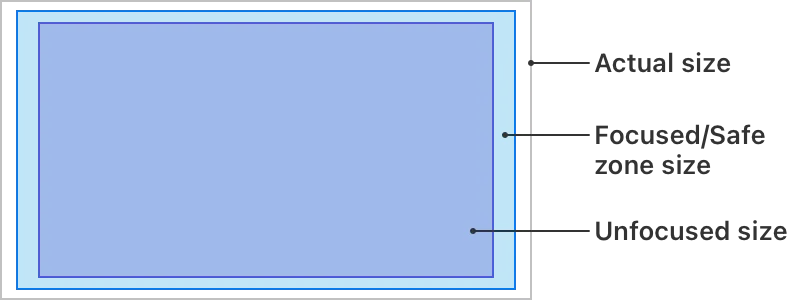
Aspect | Image size |
Actual size | 908x512 pt (908x512 px @1x, 1816x1024 px @2x) |
Focused/Safe zone size | 852x479 pt (852x479 px @1x, 1704x958 px @2x) |
Unfocused size | 782x440 pt (782x440 px @1x, 1564x880 px @2x) |
Be aware of additional scaling when combining image sizes. If your Top Shelf design includes a mixture of image sizes, keep in mind that images will automatically scale up to match the height of the tallest image if necessary. For example, a 16:9 image scales to 500 pixels high if included in a row with a poster or square image.
이미지 크기를 조합할 때 추가적인 스케일링에 주의하세요. Top Shelf 디자인에 이미지 크기를 혼합하는 경우, 이미지는 필요한 경우 가장 큰 이미지의 높이에 맞게 자동으로 확장됩니다. 예를 들어, 16:9 이미지는 포스터나 정사각형 이미지가 포함된 행에 포함되면 높이가 500 픽셀로 확장됩니다.
This layout shows a series of large images, each of which spans almost the entire width of the screen. Apple TV automatically scrolls through these banners on a preset timer until people bring one into focus. The sequence circles back to the beginning after the final image is reached.
이 레이아웃은 거의 전체 화면 너비에 걸쳐있는 일련의 큰 이미지를 보여줍니다. Apple TV는 이러한 배너를 미리 설정된 타이머로 자동으로 스크롤하며, 사람들이 하나를 포커스로 가져올 때까지 계속됩니다. 마지막 이미지에 도달한 후에는 순서가 처음으로 돌아갑니다.
When a banner is in focus, a small, circular gesture on the remote’s Touch surface enacts the system focus effect, animating the item, applying lighting effects, and, if the banner contains layered images, producing a 3D effect. Swiping on the Touch surface pans to the next or previous banner in the sequence. Use this style to showcase rich, captivating content, such as a popular new movie.
배너가 포커스에 있을 때 리모트의 터치 표면에서 작은 원형 제스처가 시스템 포커스 효과를 발생시킵니다. 이로써 항목이 애니메이션되고 조명 효과가 적용되며, 배너에 레이어 이미지가 포함되어 있으면 3D 효과가 생성됩니다. 터치 표면에서 스와이핑하면 시퀀스의 다음 또는 이전 배너로 이동합니다. 이 스타일은 인기 있는 새 영화와 같은 풍부하고 매혹적인 콘텐츠를 전시하는 데 사용합니다.
Provide three to eight images. A minimum of three images is recommended for a scrolling banner to feel effective. More than eight images can make it hard to navigate to a specific image.
3개에서 8개의 이미지를 제공하세요. 스크롤링 배너가 효과적으로 느껴지려면 최소 3개의 이미지를 권장합니다. 8개 이상의 이미지는 특정 이미지로 이동하기 어렵게 만들 수 있습니다.
If you need text, add it to your image. This layout style doesn’t show labels under content, so all text must be part of the image itself. In layered images, consider elevating text by placing it on a dedicated layer above the others. Add the text to the accessibility label of the image too, so VoiceOver can read it.
만약 텍스트가 필요하다면 이미지에 추가하세요. 이 레이아웃 스타일은 콘텐츠 아래 레이블을 표시하지 않으므로 모든 텍스트는 이미지 자체의 일부여야 합니다. 레이어 이미지에서는 텍스트를 다른 레이어 위에 배치하여 높일 수 있습니다. 이미지의 접근성 레이블에도 텍스트를 추가하여 VoiceOver가 읽을 수 있도록 합니다.
Use the following size for a scrolling inset banner image:
스크롤링 인셋 배너 이미지에는 다음 크기를 사용하세요.
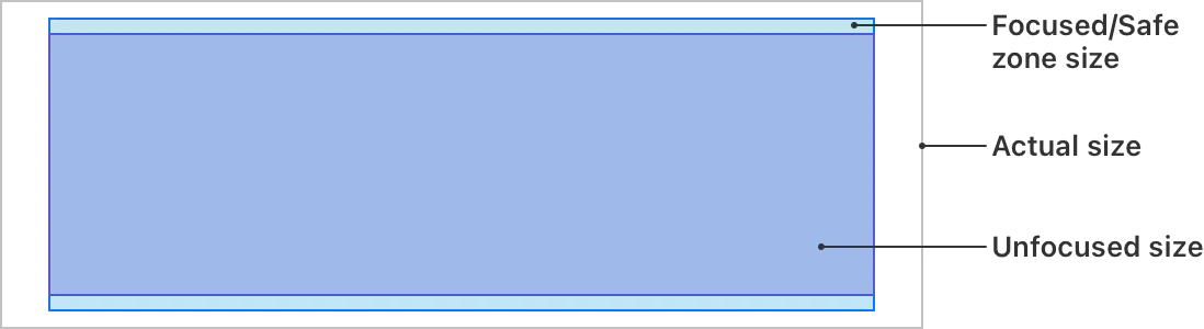
Aspect | Image size |
Actual size | 1940x692 pt (1940x692 px @1x, 3880x1384 px @2x) |
Focused/Safe zone size | 1740x620 pt (1740x620 px @1x, 3480x1240 px @2x) |
Unfocused size | 1740x560 pt (1740x560 px @1x, 3480x1120 px @2x) |
Not supported in iOS, iPadOS, macOS, visionOS, or watchOS.
iOS, iPadOS, macOS, visionOS 또는 watchOS에서는 지원되지 않습니다.
Change log
작성 날짜 | 작성자 | 수정사항 |
2023/11/30 | 시즈 | 초기 번역 |
2023/12/22 | 시즈 | 배포 |