Sign in with Apple provides a fast, private way to sign into apps and websites, giving people a consistent experience they can trust and the convenience of not having to remember multiple accounts and passwords.

Supporting Sign in with Apple lets people use the Apple ID they already have to sign in or sign up, and skip filling out forms, verifying email addresses, and choosing passwords. In cases where you choose to ask for a name and email address, people have the option to share a unique, random email address that automatically relays messages to their personal email address. For developer guidance, see Authentication Services.
You can offer Sign in with Apple in every version of your app or website across all platforms — including non-Apple platforms.
Sign in with Apple makes it easy for people to authenticate with Face ID or Touch ID and has two-factor authentication built in for an added layer of security. Apple doesn’t use Sign in with Apple to profile people or their activity in apps.
Follow these guidelines to offer Sign in with Apple when it’s most convenient for people.
Ask people to sign in only in exchange for value. People need to understand why you’re asking them to sign in, so it can work well to display a brief, approachable description of sign-in benefits. For example, you might want to tell people that signing in lets them personalize the app experience, access additional features, or synchronize data.
Delay sign-in as long as possible. People often abandon apps when they’re forced to sign in before doing anything useful. Give them a chance to familiarize themselves with your app before making a commitment. For example, a live-streaming app could let people explore available content before signing in to stream something.
If you require an account, ask people to set it up before offering any sign-in options. Start by explaining the reasons for requiring an account. Then, after people complete account setup, let them choose a convenient way to sign in to their new account by offering Sign in with Apple and any other sign-in methods you support.
Consider letting people link an existing account to Sign in with Apple. When you support this type of linking, people can get the convenience of using Sign in with Apple while maintaining access to the information in an account they’ve already set up. You can offer account linking before or after people sign in to their existing account. For example:
•
If people share an email address through Sign in with Apple and it matches the address in an existing account, you can suggest that they link Sign in with Apple to that account.
•
If people used an existing user name and password to sign in, you can display an account-linking suggestion in their account’s settings view or another logical place.
In a commerce app, wait until after people make a purchase before asking them to create an account. If you support a guest checkout system, give people a quick way to create an account after the transaction completes. For example, if you support Apple Pay, let people create an account on the order confirmation page. In cases where people have already provided their name and email address during the Apple Pay transaction, you don’t need to ask for this information.

As soon as Sign in with Apple completes, welcome people to their new account. Help people use their new account right away; don’t delay the experience by asking for information that isn’t required.
Indicate when people are currently signed in. You can help people confirm their sign-in method by displaying a phrase like “Using Sign in with Apple” in places like a settings or account interface.
People appreciate Sign in with Apple for its privacy and convenience. Although some apps or websites may require additional information — such as a date of birth or a region of residence — it’s essential to minimize your requests for data as people set up an account. Build on the trust that people have in Sign in with Apple by describing why you need additional data and clearly displaying the data you receive.
Clarify whether the additional data you request is required or just recommended. If the data is legally or contractually required — such as an agreement to terms of service, country or region of residence, birth date, or information required by a region’s real-identity laws — make sure people understand that they must supply the additional information to complete the setup of their account. If additional data isn’t required but can improve the user experience, make sure people know the request is optional and help them understand the benefits of providing the information.
Don’t ask people to supply a password. A key benefit of Sign in with Apple is that people don’t have to create and memorize additional passwords. Unless people have stopped using Sign in with Apple with your app or website, don’t ask for a password.
Avoid asking for a personal email address when people supply a private relay address. Using Sign in with Apple, people can choose to share a private relay address that automatically forwards messages to their verified personal email account. It’s essential to respect this choice and avoid overriding it by asking for a personal email address. If you present customer service, retail, or other experiences that request identification via email address, you can:
•
Make sure that people can view their private relay address in your app or website
•
Direct people to Settings > Apple ID > Password & Security > Apps using Apple ID to retrieve their private relay address
•
Use other identifying values, like an order number or phone number collected as part of a purchase
Give people a chance to engage with your app before asking for optional data. As people use your app, you can help them discover places where they can benefit from sharing more information with you. For example, you might suggest that they provide a contact phone number if they want real-time text updates, or social network information if they want to play games with friends. If people choose not to provide optional information, don’t prevent them from accessing their account or using all the features of your app.
Be transparent about the data you collect. People value knowing how you use the data that they share with you. One way you can be transparent is to welcome people by using the name or email address they shared. Doing this helps establish how you use this information and, for a relay address, shows people where to find it in the future. If you don’t display all the data that people provide, they are likely to wonder why you asked for it.
Apple provides several Sign in with Apple buttons you can use to let people set up an account and sign in. If necessary, you can create a custom button to offer Sign in with Apple; for guidelines, see Creating a custom Sign in with Apple button.
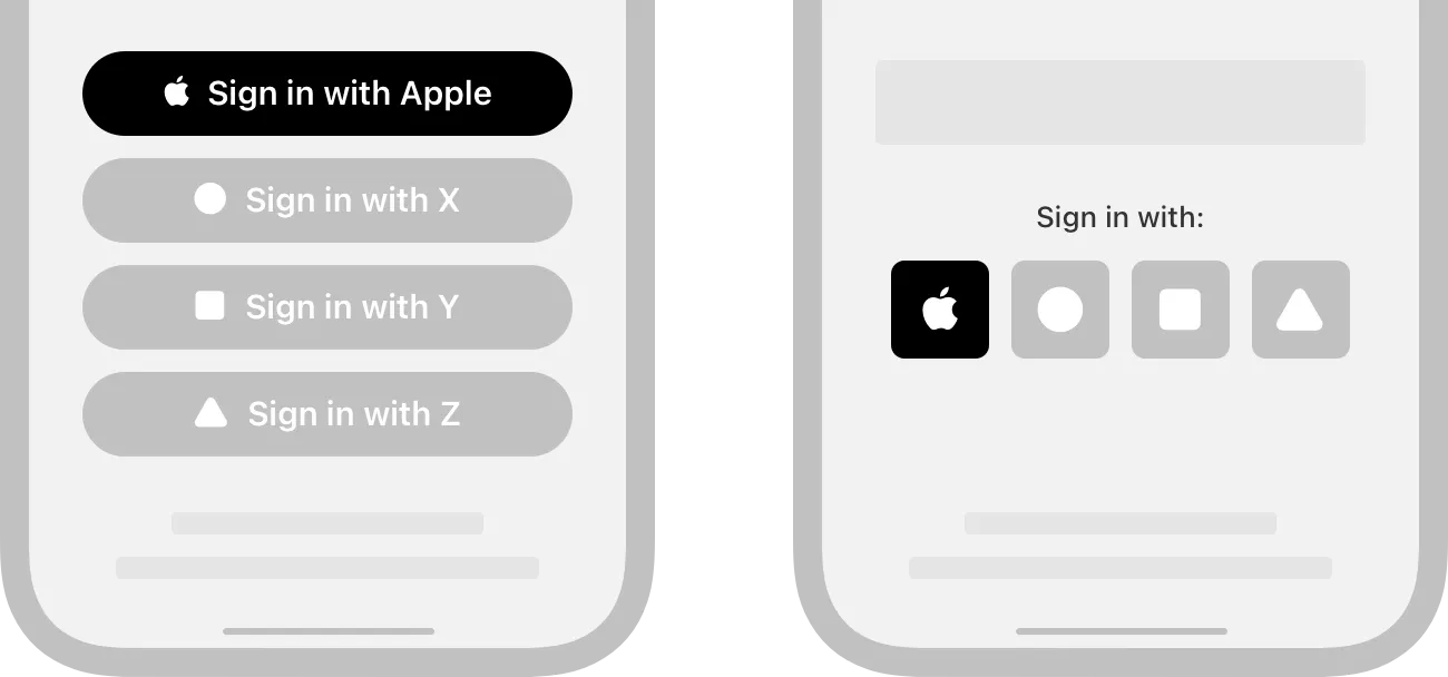
Prominently display a Sign in with Apple button. Make a Sign in with Apple button no smaller than other sign-in buttons, and avoid making people scroll to see the button.
When you use the system-provided APIs to create a Sign in with Apple button, you get the following advantages.
•
A button that’s guaranteed to use an Apple-approved appearance
•
Assurance that the button’s contents maintain ideal proportions as you change its style
•
Automatic translation of the button’s title into the language specified by the device
•
Support for configuring the button’s corner radius to match the style of your UI (iOS, macOS, and web)
•
A system-provided alternative text label that lets VoiceOver describe the button
For developer guidance, see ASAuthorizationAppleIDButton (iOS, macOS, and tvOS), WKInterfaceAuthorizationAppleIDButton (watchOS), and Displaying Sign in with Apple buttons on the web. You can also visit Sign in with Apple button to view and adjust live previews of web-based buttons and get the code.
The system provides several variants of the button title. Depending on the platform on which your content runs, choose the variant that fits the terminology of your sign-in experience and use it consistently throughout your interfaces.
The following button titles are available for iOS, macOS, tvOS, and the web:


For watchOS, the system provides one title: Sign in.

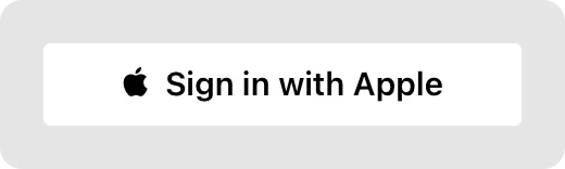
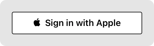
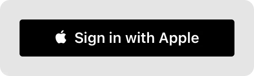
Depending on the platform, the system provides up to three options for the appearance of the Sign in with Apple button: white, white with an outline, and black. Choose the appearance that works best with the background on which the button displays.
The white style is available on all platforms and the web. Use this style on dark backgrounds that provide sufficient contrast.


The white outlined style is available in iOS, macOS, and the web. Use this style on white or light-color backgrounds that don’t provide sufficient contrast with the white button fill. Avoid using this style on a dark or saturated background, because the black outline can add visual clutter; instead, use the white style to contrast with a dark background.


The black style is available on all platforms and the web. Use this style on white or light-color backgrounds that provide sufficient contrast; don’t use it on black or dark backgrounds.


Unlike the black Sign in with Apple button for other platforms, the watchOS button uses a fill color that’s not fully black. To contrast with the pure black background of Apple Watch, the watchOS button uses the system-defined dark gray appearance.

Adjust the corner radius to match the appearance of other buttons in your app. By default, the Sign in with Apple button has rounded corners. In iOS, macOS, and the web, you can change the corner radius to produce a button with square corners or a capsule-shape button. For developer guidance, see cornerRadius (iOS and macOS) and Displaying Sign in with Apple buttons on the web.

Minimum corner radius

Default corner radius

Maximum corner radius
Maintain the minimum button size and margin around the button in iOS, macOS, and the web. Be mindful that the button title may vary in length depending on the locale. Use the following values for guidance.
Minimum width | Minimum height | Minimum margin |
140pt (140px @1x, 280px @2x) | 30pt (30px @1x, 60px @2x) | 1/10 of the button’s height |
If your interface requires it, you can create a custom Sign in with Apple button for iOS, macOS, or the web. For example, you may want to align logos across multiple sign-in buttons, use buttons that display only a logo, or adjust the button’s font, bezel, or background appearance to coordinate with your UI.
Always make sure that people can instantly identify your custom button as a Sign in with Apple button. If your custom button differs too much from the standard one, people may not feel comfortable using it to set up an account or sign in. App Review evaluates all custom Sign in with Apple buttons.
Apple Design Resources provides downloadable Apple logo artwork you can use to create custom Sign in with Apple buttons that display either a logo only or a logo and text. The logo files are available in PNG, SVG, and PDF formats, and the artwork for both types of buttons includes both black and white versions. Here are examples of the black and white logo-only art files, each with a background added for visibility.
All downloadable logo files include padding that simplifies positioning the logo in a button. Logo-only logo files include horizontal and vertical padding that ensures the correct proportion of the logo relative to the button. In addition to padding that keeps the logo and button correctly proportioned, logo files for buttons with text also include horizontal padding that provides a minimum margin between the logo and the button’s leading edge and title.
Use only the logo artwork downloaded from Apple Design Resources; never create a custom Apple logo. As you create a custom Sign in with Apple button, follow these guidelines for using the downloadable logo file:
•
Use the logo file to position the Apple logo in a button; never use the Apple logo as a button.
•
Match the height of the logo file to the height of the button.
•
Don’t crop the logo file.
•
Don’t add vertical padding.
To make sure that your custom button is visually consistent with the system-provided Sign in with Apple button, don’t change the following attributes.
•
Titles. Use only Sign in with Apple, Sign up with Apple, or Continue with Apple.
•
General shape. Buttons that combine the logo with text are always rectangular; logo-only buttons can be circular or rectangular.
•
Logo and title colors. Within a button, both items must be either black or white; don’t use custom colors.
To coordinate with your app design, you can change:
•
Title font. You can also adjust the font’s weight and size.
•
Title case. You can capitalize every letter in the title.
•
Background appearance. The overall color needs to remain black or white. If necessary, you can include a subtle texture or gradient to help the button harmonize with your interface.
•
Button corner radius. You can use a corner radius value that matches the other buttons in your UI.
•
Button bezel and shadow. For example, you can use a stroke to emphasize the button bezel or add a drop shadow.
Choose the format of the logo file based on the height of your button. Because SVG and PDF are vector-based formats, you can use these files in buttons of any height. Use the PNG files only in buttons that are 44 points tall, which is the default (and recommended) button height in iOS. Logos are available in small, medium, and large sizes, so you can match logo sizes in all the sign-up buttons you display.
Prefer the system font for the title — that is, Sign in with Apple, Sign up with Apple, or Continue with Apple. Regardless of the font you choose, the title and button height of your custom button need to use the same proportions that the system uses. Using the system font for example, the title’s font size would be 43% of the button’s height — in other words, the button’s height would be 233% of the title’s font size, rounded to the nearest integer. Here are two examples that show these proportions using different sizes of the system font.


In general, preserve the capitalization style of the title. By default, all variants of the button title capitalize the first word — that is, Sign or Continue — and Apple; all other letters are lowercase. Avoid changing this style unless your interface uses only uppercase.
Keep the title and logo vertically aligned within the button. To do this, vertically align the title to the middle of the button, then add the logo image, making sure its height matches the height of the button. Because the logo image includes top and bottom padding, vertically aligning the title in the button ensures that the title, the logo, and the button stay properly aligned.
Inset the logo if necessary. If you need to horizontally align the Apple logo with other authentication logos, you can adjust the space between the logo and the button’s leading edge.
Maintain a minimum margin between the title and the right edge of the button. Ensure the margin measures at least 8% of the button’s width.
Maintain the minimum button size and margin around the button. Be mindful that the button title may vary in length depending on the locale. Use the following values for guidance.
Minimum width | Minimum height | Minimum margin |
140 pt (140 px @1x, 280 px @2x) | 30 pt (30 px @1x, 60 px @2x) | 1/10 of the button’s height |
Choose the format of the logo file based on the size of your button. The downloadable artwork for logo-only buttons is available in SVG, PDF, and PNG formats. Use the vector-based SVG and PDF formats for buttons of any size; use the PNG format only in buttons that measure 44x44 pt.
Don’t add horizontal padding to a logo-only image. A logo-only Sign in with Apple button always has a 1:1 aspect ratio, and the artwork already includes the correct padding on all sides.
Use a mask to change the default square shape of the logo-only image. For example, you might want to use a circular or rounded rectangular shape to present all logo-only sign-in buttons. Never crop the Apple-provided artwork to decrease its built-in padding or use the logo by itself, and avoid including additional padding.
Rounded rectangle mask
No mask
Circular mask
Maintain a minimum margin around the button. Ensure the margin measures at least 1/10 of the button’s height.
No additional considerations for iOS, iPadOS, macOS, tvOS, visionOS, or watchOS.
Displaying Sign in with Apple buttons on the web — Sign in with Apple