
A text field is a rectangular area in which people enter or edit small, specific pieces of text.
텍스트 필드는 사람들이 작은 구체적인 텍스트를 입력하거나 편집하는 데 사용되는 직사각형 영역입니다.
Use a text field to request a small amount of information, such as a name or an email address. To let people input larger amounts of text, use a text view instead.
Show a hint in a text field to help communicate its purpose. A text field can contain placeholder text — such as “Email” or “Password” — when there’s no other text in the field. Because placeholder text disappears when people start typing, it can also be useful to include a separate label describing the field to remind people of its purpose.
텍스트 필드에 힌트를 표시하여 목적을 전달하세요. 텍스트 필드에는 "이메일" 또는 "비밀번호"와 같은 플레이스홀더 텍스트가 포함될 수 있습니다. 텍스트가 없을 때 플레이스홀더 텍스트가 사라지므로 필드의 목적을 상기시키기 위해 필드를 설명하는 별도의 레이블을 추가하는 것도 유용할 수 있습니다.
Use secure text fields to hide private data. Always use a secure text field when your app asks for sensitive data, such as a password. For developer guidance, see SecureField.
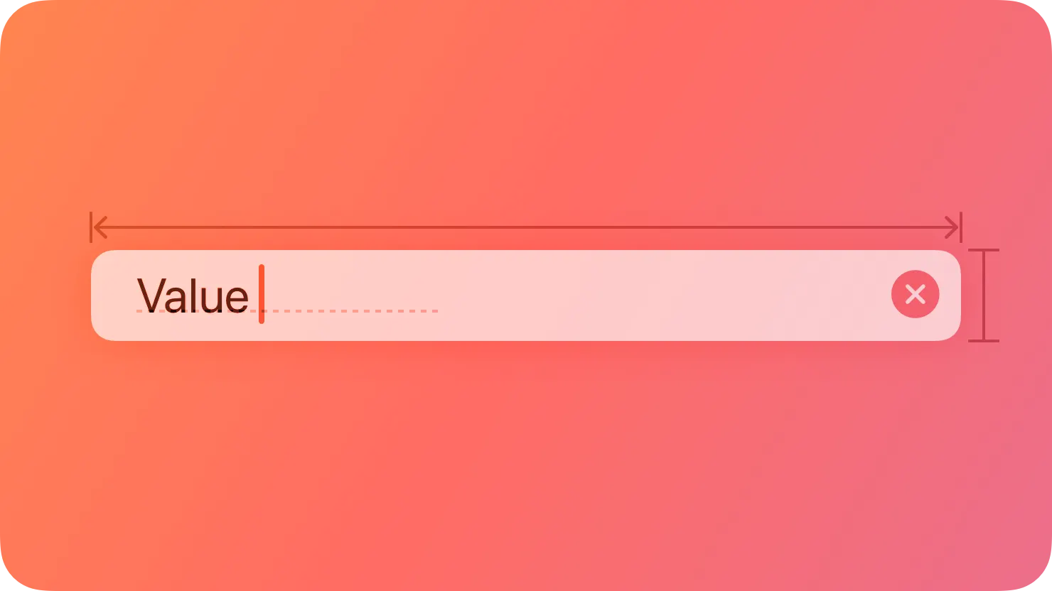
To the extent possible, match the size of a text field to the quantity of anticipated text. The size of a text field helps people visually gauge the amount of information to provide.
가능한 한 텍스트 필드 크기를 예상 텍스트 양에 맞추세요. 텍스트 필드의 크기는 사람들이 제공해야 하는 정보 양을 시각적으로 판단하는 데 도움이 됩니다.
Evenly space multiple text fields. If your layout includes multiple text fields, leave enough space between them so people can easily see which input field belongs with each introductory label. Stack multiple text fields vertically when possible, and use consistent widths to create a more organized layout. For example, the first and last name fields on an address form might be one width, while the address and city fields might be a different width.
여러 텍스트 필드를 고른 간격으로 나누세요. 레이아웃에 여러 텍스트 필드가 포함된 경우 각각의 소개 레이블과 연결된 입력 필드를 쉽게 확인할 수 있도록 충분한 간격을 남겨주세요. 가능한 경우 여러 텍스트 필드를 수직으로 쌓고 더 조직적인 레이아웃을 만들기 위해 일관된 너비를 사용하세요. 예를 들어 주소 폼의 이름 필드와 성 필드는 같은 너비가 될 수 있으며 주소 및 도시 필드는 다른 너비가 될 수 있습니다.
Ensure that tabbing between multiple fields flows as people expect. When tabbing between fields, move focus in a logical sequence. The system attempts to achieve this result automatically, so you won’t need to customize this too often.
여러 필드 간 탭 키를 사용할 때 예상한 대로 이동되도록 보장하세요. 필드 간 탭 키를 사용할 때는 논리적인 순서대로 포커스를 이동하세요. 시스템은 이 결과를 자동으로 달성하려고 시도하므로 이를 자주 사용자 정의할 필요는 없을 것입니다.
Validate fields when it makes sense. For example, if the only legitimate value for a field is a string of digits, your app needs to alert people if they’ve entered characters other than digits. The appropriate time to check the data depends on the context: when entering an email address, it’s best to validate when people switch to another field; when creating a user name or password, validation needs to happen before people switch to another field.
필드를 유효성 검사하세요. 예를 들어 필드에 유효한 값이 숫자 문자열뿐이라면 숫자 이외의 문자를 입력한 경우 앱에서 사용자에게 경고를 표시해야 합니다. 데이터를 확인하는 적절한 시기는 맥락에 따라 다릅니다. 이메일 주소를 입력할 때는 사람들이 다른 필드로 전환할 때 확인하는 것이 가장 좋습니다. 사용자 이름이나 암호를 만들 때는 확인이 다른 필드로 전환하기 전에 이루어져야 합니다.
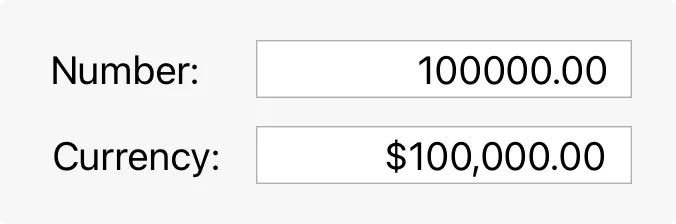
Use a number formatter to help with numeric data. A number formatter automatically configures the text field to accept only numeric values. It can also display the value in a specific way, such as with a certain number of decimal places, as a percentage, or as currency. Don’t assume the actual presentation of data, however, as formatting can vary significantly based on people’s locale.
숫자 데이터 처리를 위해 숫자 포매터를 사용하세요. 숫자 포매터는 텍스트 필드를 자동으로 숫자 값만 허용하도록 구성합니다. 또한 특정 소수 자릿수, 퍼센트로 표시하거나 통화 단위로 표시하는 등 특정한 방식으로 값을 표시할 수 있습니다. 그러나 형식이 사람들의 지역에 따라 크게 다를 수 있으므로 데이터의 실제 표시를 가정하지 마세요.
Formatted text
서식 적용 텍스트
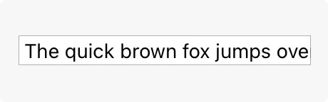
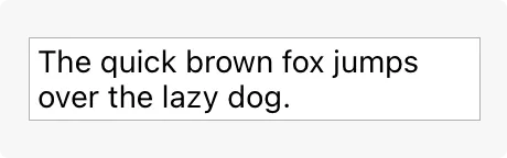
Adjust line breaks according to the needs of the field. By default, the system clips any text extending beyond the bounds of a text field. Alternatively, you can set up a text field to wrap text to a new line at the character or word level, or to truncate (indicated by an ellipsis) at the beginning, middle, or end.
필드의 요구에 따라 줄 바꿈 조정. 기본적으로 시스템은 텍스트 필드 경계를 벗어나는 텍스트를 자르지만, 대체로 텍스트 필드를 문자 또는 단어 수준에서 새 줄로 바꾸거나 시작, 중간 또는 끝에서 생략(말줄임표로 표시)하도록 설정할 수 있습니다.
Clipped text
잘린 텍스트
Wrapped text
줄 바꿈된 텍스트
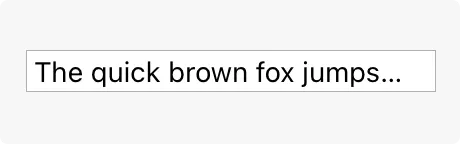
Truncated text
줄임 텍스트
Consider using an expansion tooltip to show the full version of clipped or truncated text. An expansion tooltip behaves like a regular tooltip and appears when someone places the pointer over the field.
클립된 또는 줄임된 텍스트의 전체 버전을 보여주기 위해 확장 툴팁을 사용하는 것을 고려해보세요. 확장 툴팁은 일반적인 툴팁처럼 동작하며 누군가가 해당 필드 위에 포인터를 두면 나타납니다.
역자 첨언
In iOS, iPadOS, tvOS, and visionOS apps, show the appropriate keyboard type. Several different keyboard types are available, each designed to facilitate a different type of input, such as numbers or URLs. To streamline data entry, display the keyboard that’s appropriate for the type of content people are entering. For guidance, see Virtual keyboards.
iOS, iPadOS, tvOS 및 visionOS 앱에서 적절한 키보드 유형을 표시하세요. 여러 가지 다른 키보드 유형이 있으며 각각은 숫자 또는 URL과 같은 다른 유형의 입력을 용이하게 하는 데 사용됩니다. 데이터 입력을 간소화하기 위해 사람들이 입력하는 콘텐츠 유형에 적합한 키보드를 표시하세요. 지침은 가상 키보드를 참조하세요.
Minimize text entry in your tvOS and watchOS apps. Entering long passages of text or filling out numerous text fields is time-consuming on Apple TV and Apple Watch. Minimize text input and consider gathering information more efficiently, such as with buttons.
tvOS 및 watchOS 앱에서 텍스트 입력을 최소화하세요. Apple TV 및 Apple Watch에서 긴 텍스트를 입력하거나 많은 텍스트 필드를 작성하는 것은 시간이 많이 소요됩니다. 텍스트 입력을 최소화하고 버튼과 같은 방법으로 정보를 효율적으로 수집하는 것을 고려하세요.
No additional considerations for tvOS or visionOS.
tvOS 또는 visionOS에서는 추가적으로 고려할 사항이 없습니다.
Display a Clear button in the trailing end of a text field to help people erase their input. When this element is present, people can tap it to clear the text field’s contents, without having to keep tapping the Delete key.
텍스트 필드의 끝 부분에 Clear(지우기) 버튼을 표시하여 사용자가 입력한 내용을 손쉽게 지울 수 있도록 합니다. 이 요소가 있으면 사용자는 텍스트 필드의 내용을 여러 번 삭제 키를 누르지 않고도 터치하여 지울 수 있습니다.
Use images and buttons to provide clarity and functionality in text fields. You can display custom images in both ends of a text field, or you can add a system-provided button, such as the Bookmarks button. In general, use the leading end of a text field to indicate a field’s purpose and the trailing end to offer additional features, such as bookmarking.
이미지와 버튼을 사용하여 텍스트 필드에서 명확성과 기능성을 제공하세요. 텍스트 필드의 양쪽 끝에 사용자 지정 이미지를 표시하거나 책갈피 버튼과 같은 시스템 제공 버튼을 추가할 수 있습니다. 일반적으로 텍스트 필드의 선행 부분을 사용하여 필드의 목적을 나타내고 후행 부분을 책갈피 추가와 같은 추가 기능을 제공하는 데 사용하세요.
Consider using a combo box if you need to pair text input with a list of choices. For related guidance, see Combo boxes.
Present a text field only when necessary. Whenever possible, prefer displaying a list of options rather than requiring text entry.
필요할 때만 텍스트 필드를 표시하십시오. 가능하면 텍스트 입력 대신 옵션 목록을 표시하는 것이 좋습니다.
TextField — SwiftUI
SecureField — SwiftUI
UITextField — UIKit
NSTextField — AppKit
작성 날짜 | 작성자 | 수정사항 |
2023/12/11 | 배찌 | 초기 번역 |